
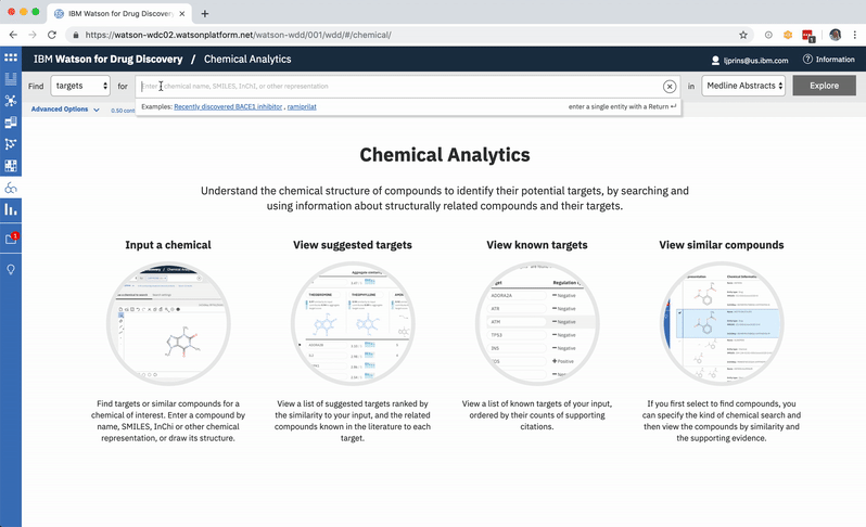
Chemical Analytics
Objective: Design an interface to accommodate and explain the supporting rationale for predicted gene targets for an input compound
Timeframe: 3 weeks
Target users: Biomedical researchers and chemists in pharma and academia
Role: Lead UX designer
Additional team members: 1 research scientist, 1 front-end developer
Opportunities
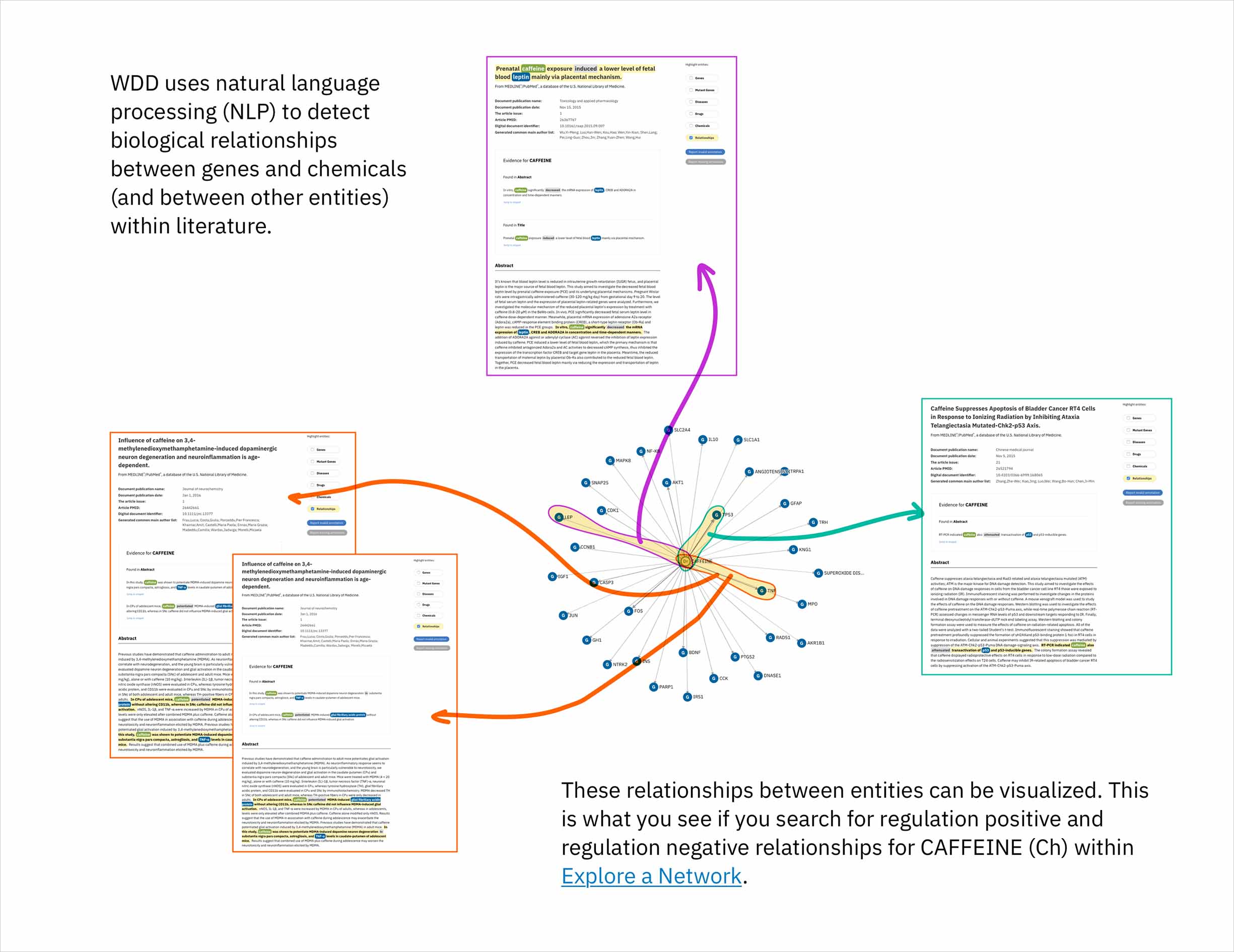
- The cognitive services that comprise Watson identify relationships in scientific literature between genes and compounds. By leveraging a database that draws connections between chemicals according to their structural similarity, the system could predict genes that might be targets for a compound of interest. Predictions would made by finding compounds most similar to the user’s input compound, and then identifying the genes known—according to literature—to be their targets. This novel method by which to suggest possible relationships could help the users of Watson for Drug Discovery (WDD) discover new applications for existing molecules and treatments.
- This new approach to prediction—and its scoring mechanism for ranking results—would need to be explained in the interface. Ideally, I’d be able to visualize each resulting target’s score in a way that spoke to both the chemical similarity and the known relationships that together brought about its rank relative to other potential targets.
Process
I started by learning all that I could about the technology that would be used behind the screen to generate results and predictions. In this case that meant dredging the brain of the research scientist with whom I was collaborating, and then pouring all my learnings onto paper so I could play it back and identify areas where I still had gaps in understanding.
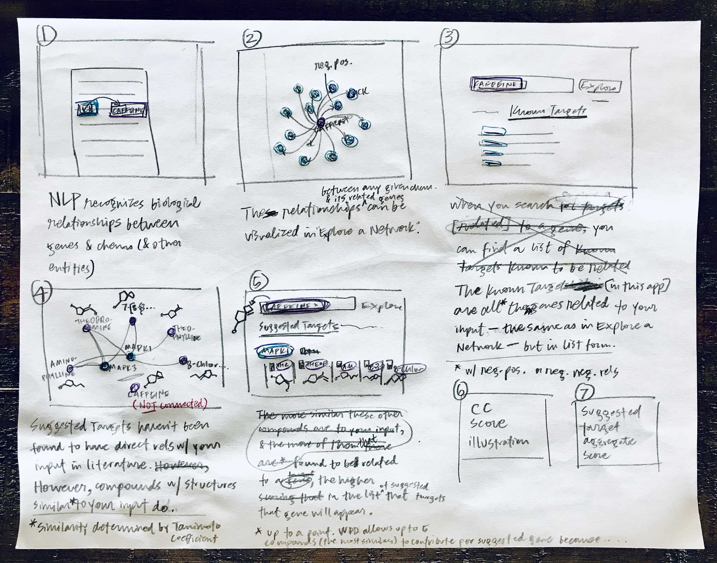
Yes, they’re messy, but these sketches served their purpose in jogging my memory later on when I needed to reference the steps involved in WDD’s new target prediction functionality.
It’s important to me to get feedback from other designers as I begin to explore any problem space and work toward a solution. In this case, that inherently meant that I’d need to provide some context as to how the data was being pulled together to generate the predictions that I would in turn strive to clarify for users. I developed my initial rough sketches into a sequence of low-fidelity storyboards to conceptually illustrate what went on behind the screen, so I could preface design-based feedback sessions with a bit of background.
My research scientist collaborator had built a prototype for internal testing. We decided to get some Watson for Drug Discovery (WDD) users’ first impressions to validate the usefulness of the underlying technological concept, but also to have some insight into what they’d need in the final UI design.
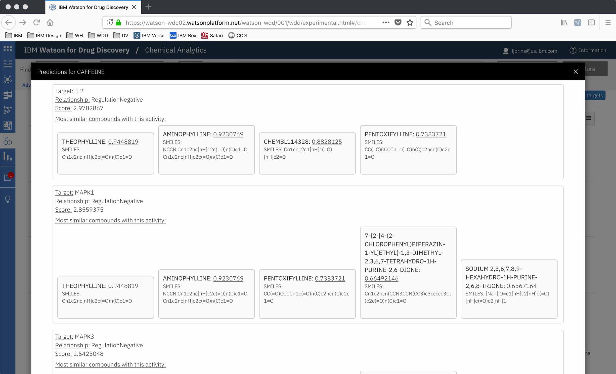
The prototype was a bare bones UI, just enough of a skeleton to show results, scores, and a bit of evidence in the form of which compounds had contributed to the target’s rank. This also meant I could start the interface design from a blank slate!
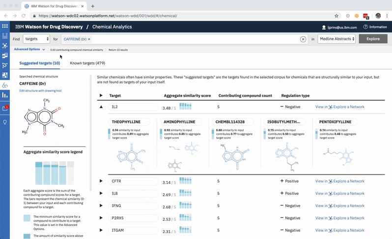
The gene targets suggested for an input chemical are ranked according to a score based on the number of found compounds with structures similar to the input, as well as exactly how similar these contributing compounds are. However, none of this provenance was apparent in the drawn-out decimal digits of the numeric score itself, which proved problematic to potential users.
“I don't understand how those two scores come up to 0.05 … Does that mean it's 5% likely? I don't understand the translation behind it so it's not meaningful to me. Other than assuming a higher number is a better score.”
—WDD user when exploring the Chemical Analytics prototype
Data transparency is one of my primary, personal design philosophies, so I wholeheartedly empathized with our users regarding the obfuscated scores: if they were ever to understand—let alone trust—the predictions we provided them, we’d have to explicitly expose the process and data used. So with pen in hand I set to work exploring ways to reveal the relationships between the count and similarity levels of the contributing compounds supporting each suggested gene.
-
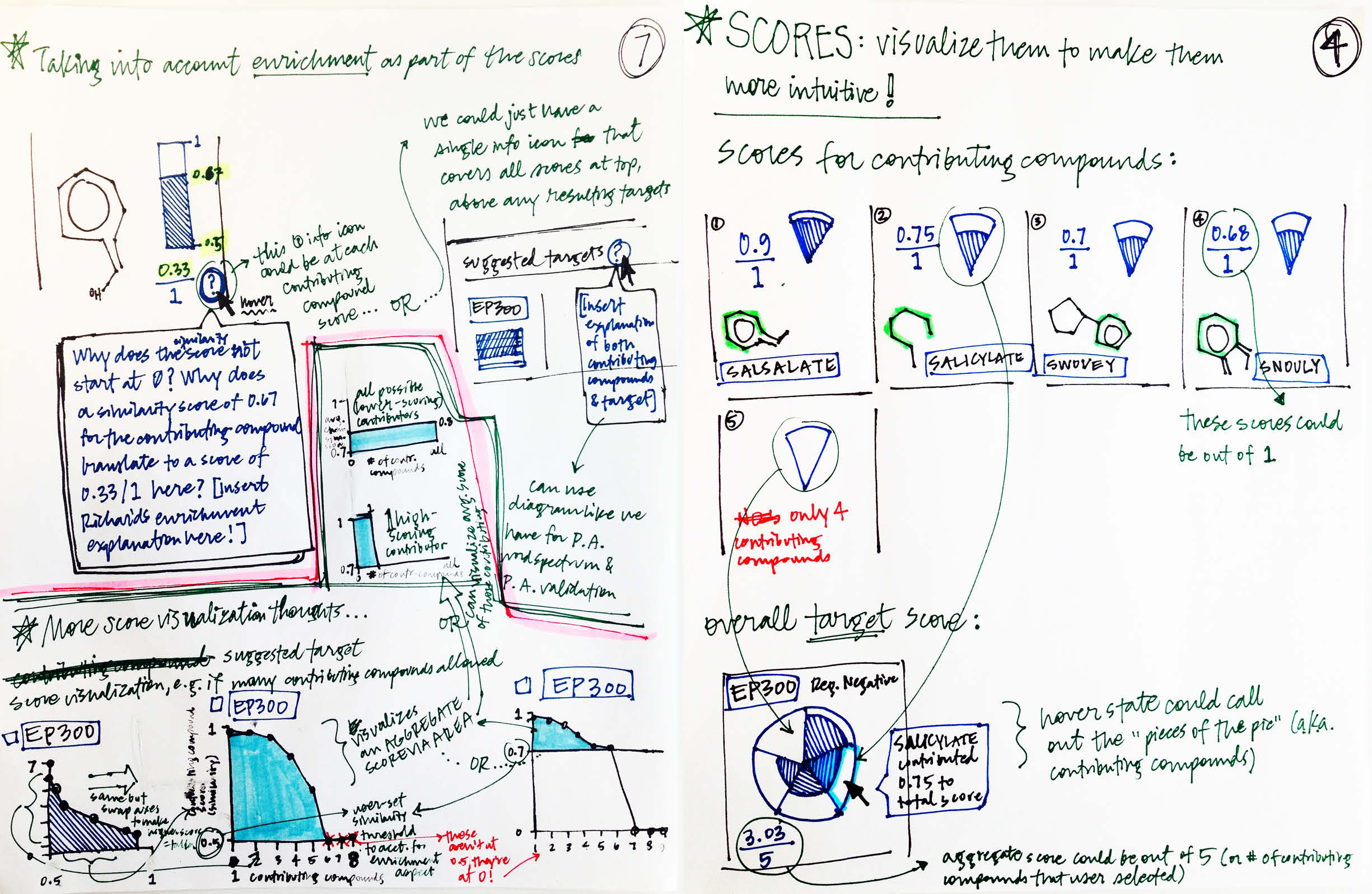
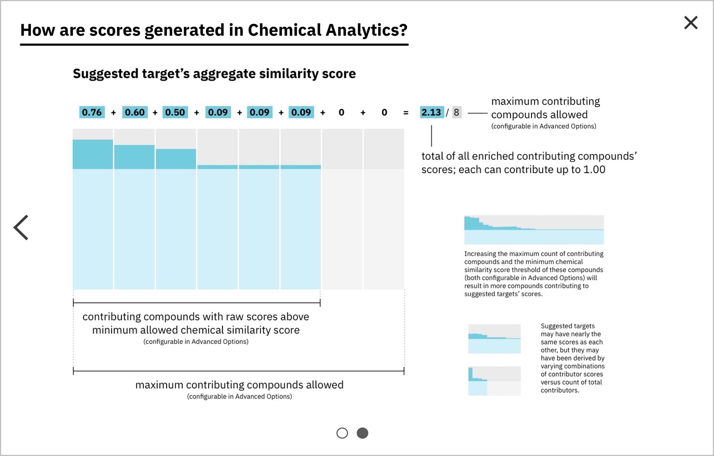
Two predicted targets could share the same score (which also meant they’d tie for rank), but arrive at it in different ways: on one end of the spectrum, a single highly-similar compound could have contributed a great deal to the total score, with few to no other contributors; conversely, the same score could come from many more moderately similar compounds. I felt it was imperative to visualize the score in a way that shed light on this and showed the breakdown of score contributions for each result. I explored putting the total count of contributors along the y-axis and the similarity score contributed by each on the x-axis (left sketches). A pizza slice analogy occurred to me in early iteration: the whole pizza would be divided evenly by the number of compounds allowed to contribute (a setting that I proposed the user would have control over); then each slice would grow towards the edge in accordance with the score contributed. -
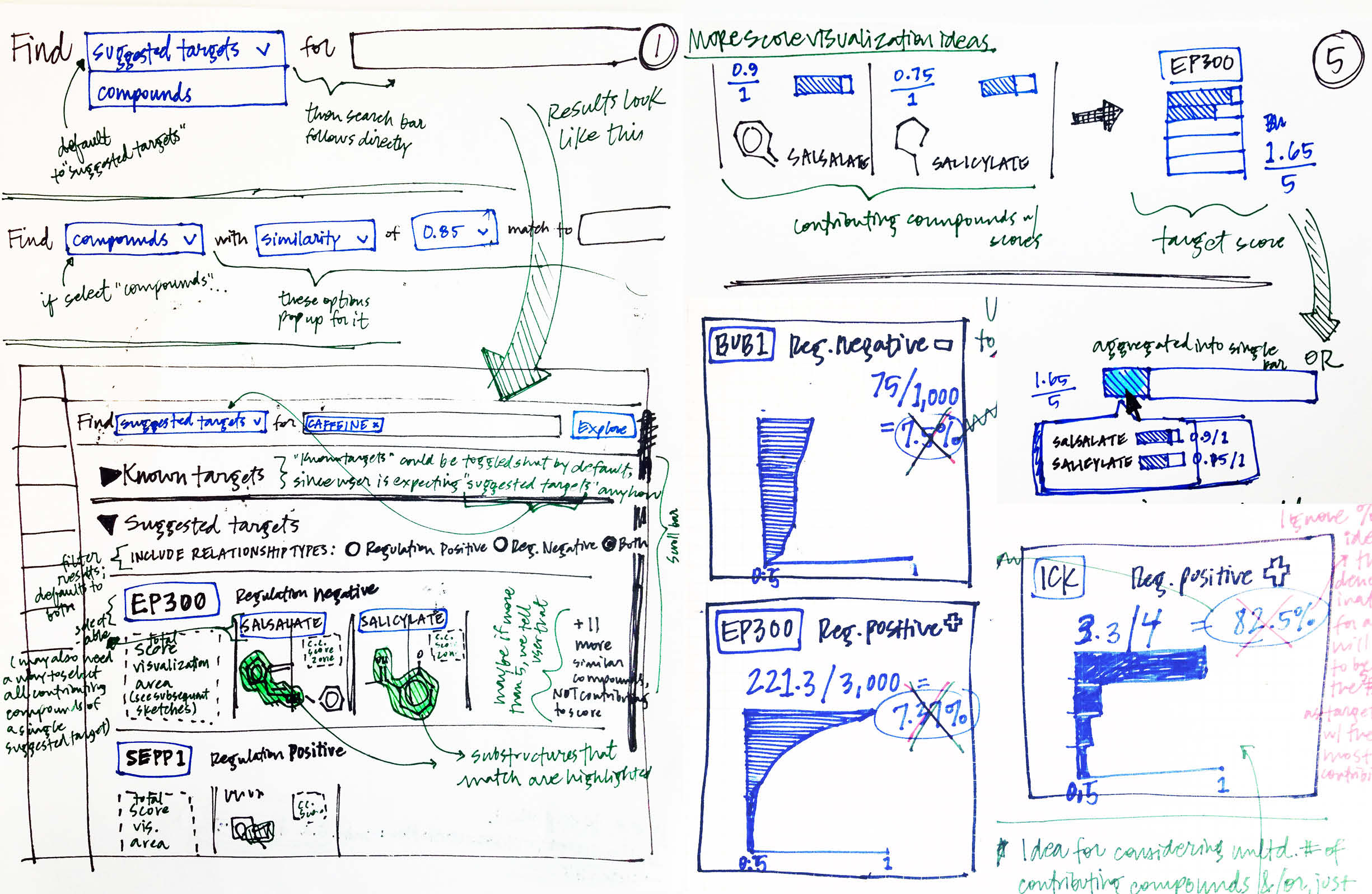
Rather than capping the total compounds permitted to contribute to a gene’s total score, another idea was to allow unlimited compounds. I sketched ways to accommodate massive contribution scores, while maintaining a framework that communicated the score’s breakdown and whether it had been arrived at via a single highly similar compound or multiple less-similar compounds.
Once I’d shared my sketched concepts with my collaborators on the development side, as well as with other designers, I brought some of my more promising ideas forward into the digital realm, and continued to iterate on more detailed aspects of the user’s workflow.
I love to explore on paper before all else. But once I’ve settled into a few possible directions, I take my iterating into the digital realm and try out multiple more nuanced possibilities.
-
After exploring a number of options around possible UI layouts, I settled on these two and built them out with real data I’d gathered from the prototype, so I could consult the front-end developer I was working with. I definitely wanted to include the chemical structure for each compound contributing to the predicted gene’s score so that user’s could see the physical similarity between them and their input chemical, especially since the score was based on structural similarity. I also highlighted the sub-structures in common with the user’s input, as those regions would have been responsible for the compound’s similarity score. -
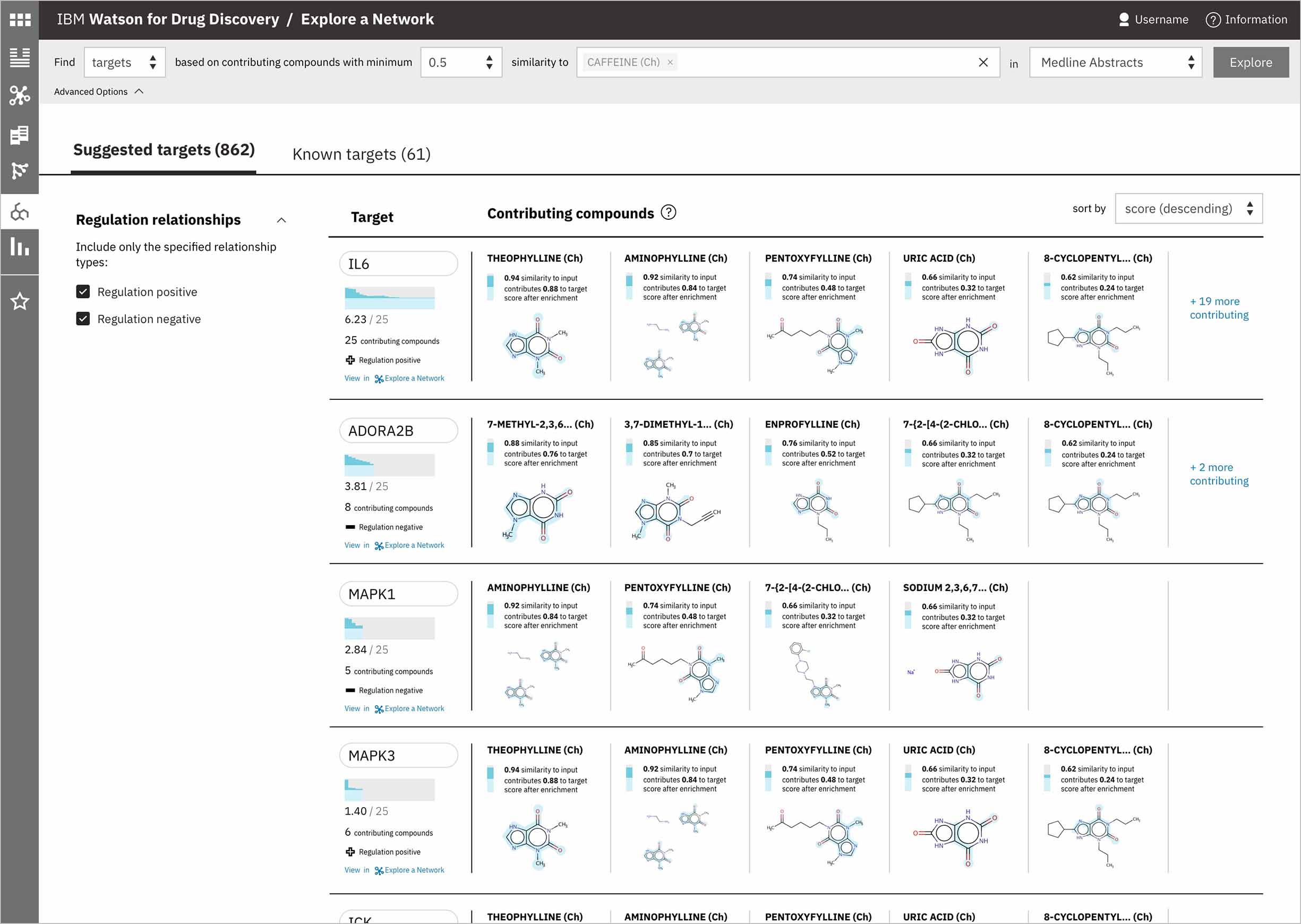
This alternative layout culls together all the meta-data relating to the suggested target itself into a vertical stack of information at the far left, which allows several contributing compounds to be seen simultaneously. Sorting is maintained via a dropdown rather than table columns like in the first iteration.
Outcomes
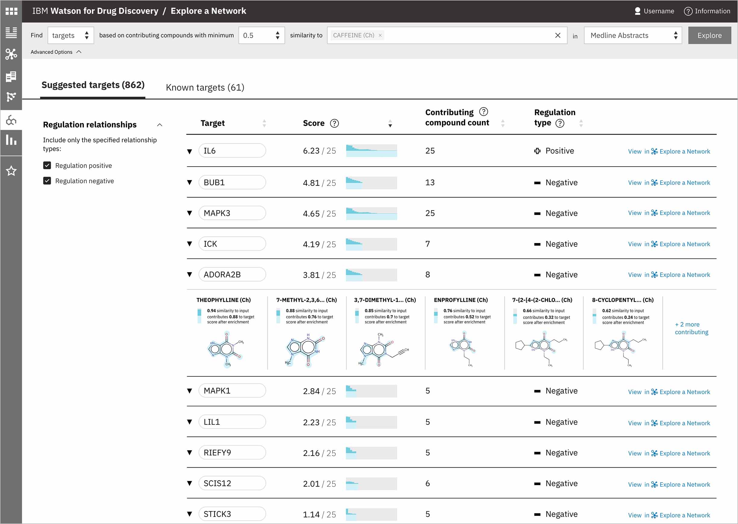
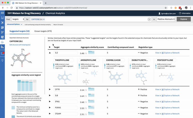
When a user searches CA for a drug’s predicted targets, the resulting table by default displays just the predicted gene’s name, score, and the likely biological relationship type between it and the searched chemical, to facilitate more efficient comparisons. Once a user spots an interesting prediction, however, they can quickly toggle open the row to view its evidence: the compounds similar to their input that are known to effect the suggested gene, and that contributed to its score and rank, are listed by name and shown in structural form.
-
Once the predictions are generated for an input, the compounds contributing to the score for the highest-ranked gene are shown by default. -
The other rows can easily all be opened or closed simultaneously, depending upon whether the user would rather scan the resulting gene’s metadata, or have a more holistic picture of the compounds that led to its rank. -
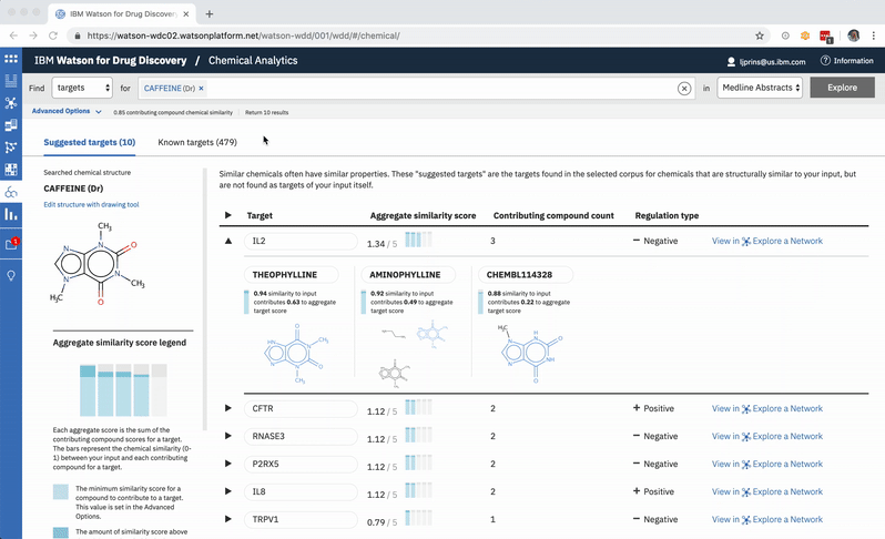
A user can change the minimum similarity threshold, which changes which compounds are available to contribute to any prediction. This in turn can mean the results themselves change, and almost certainly that their scores change as well. -
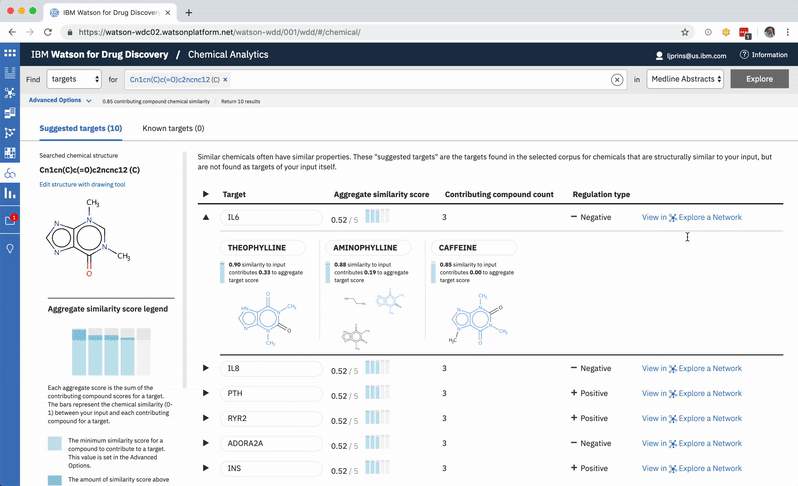
A chemist might wonder how a chemical nearly identical to their input would fare: would it have more predicted targets compared to those already written about in literature? They can easily edit their original input molecule by a few atoms and re-run their search to find out. -
An existing network visualization within WDD allows users to explore even more potential targets: it will surface the known relationships (as found in scientific literature and parsed with NLP) between a user’s original input in CA, the compounds similar to it and known to be related to the suggested targets, and any additional gene targets found to be related to any of the above.
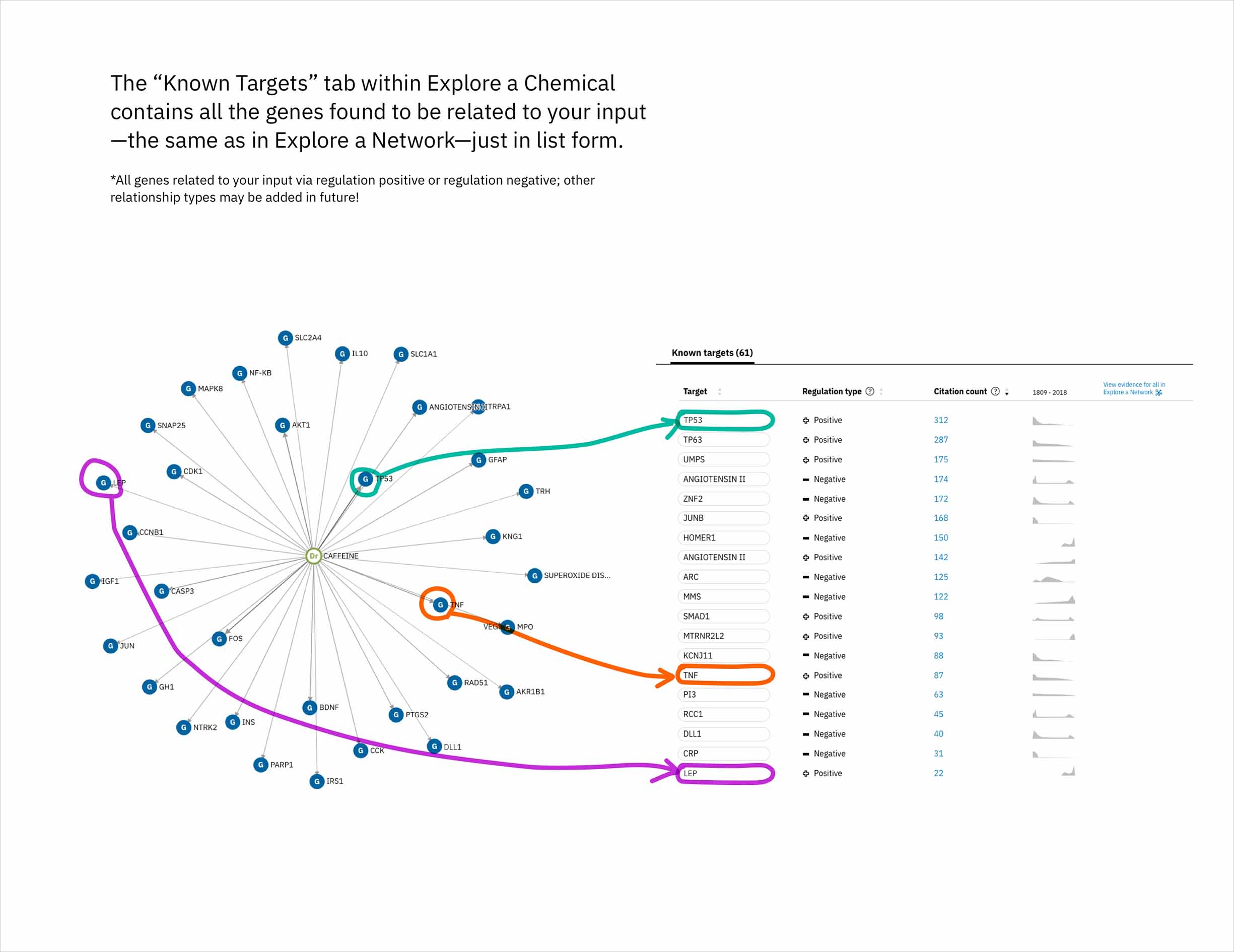
In addition to predicting targets for a chemical of interest, it was important to surface the genes that had already been confirmed in scientific publications to be targets of the drug. This would help to paint a more complete picture of a user’s input chemical relative to both its validated and potential targets. A different querying tool within WDD displays these "known" connections—identified within literature via natural language processing—as a network diagram. In CA it made more sense to present the list of known genes as a table that could be sorted by the number of supporting documents or alphabetically to index targets by name. I included a link in the UI that opens WDD’s network app so users could visually reference the relationships between their input compound and all of its existing targets.
-
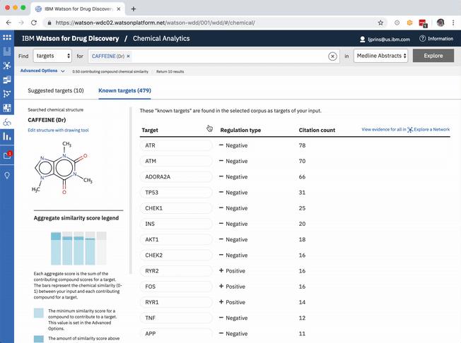
The table of known target is default-sorted by citation count, but a user can choose to sort alphabetically to look for a specific gene of interest, or can cluster by relationship type. -
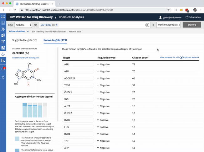
The known targets tab in CA is just a list version of all gene targets known to be related to the users input. It can also be visualized as a network, though, with the input chemical at the center, connected by definition to all resulting genes in the list.
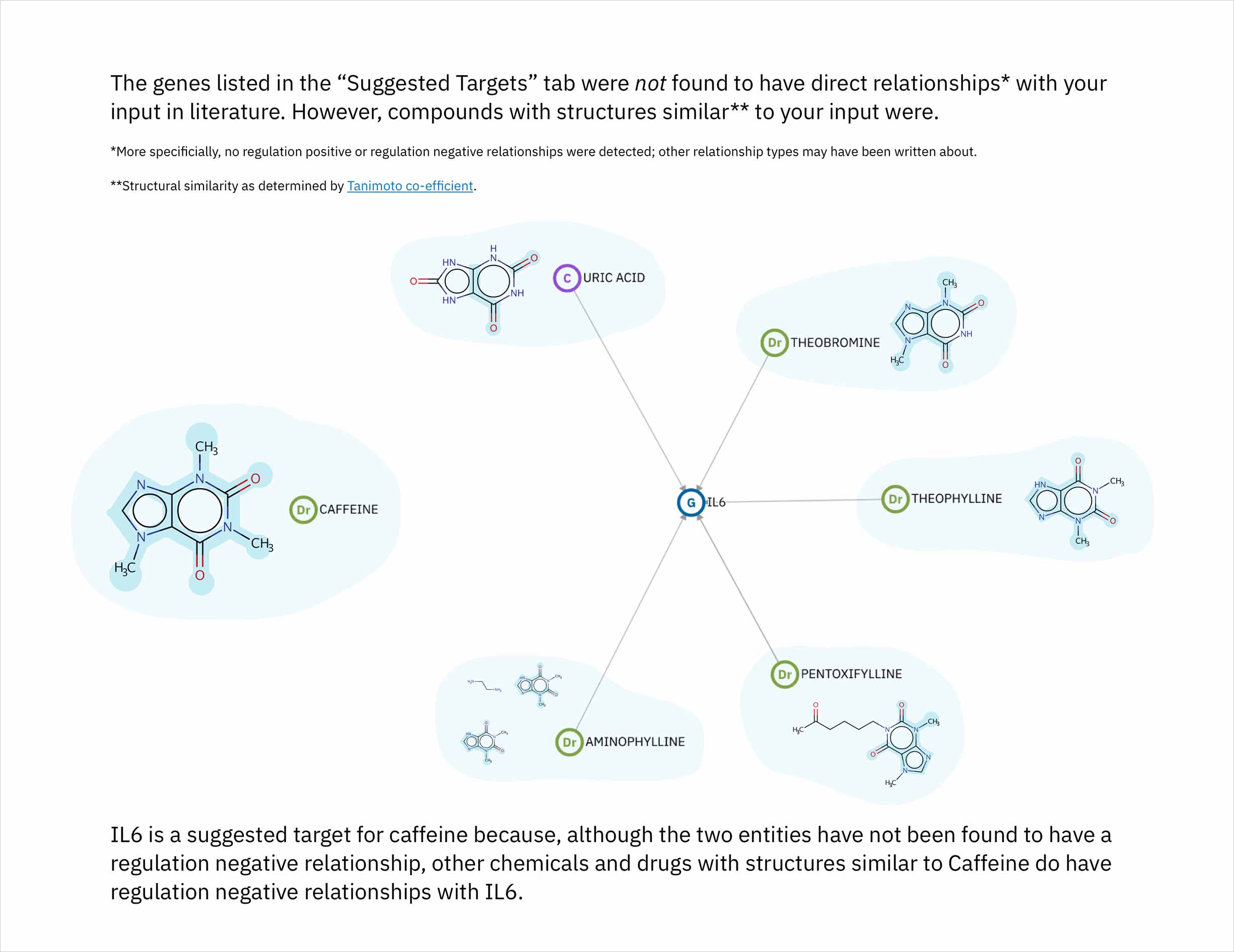
Each compound that contributes to a predicted gene’s score is first assigned its own individual score based on its structural similarity to the user’s input drug. The mathematical method used to calculate similarity between two molecules is called the Tanimoto co-efficient, and its output scores vary between 0 (no similarity) and 1 (identical). But because CA users can set a minimum similarity threshold, which all contributing compounds must equal or surpass, it didn’t quite make sense to simply sum their individual similarity scores into an aggregate “prediction score” for the target that they collectively supported: compounds that only just met the user’s minimum threshold still held the potential to contribute disproportionately high quantities to the total score, unfairly failing to differentiate their contributions enough from near doppelgängers of the input drug. This was especially the case if a user set a very high minimum similarity threshold, which ironically almost always meant that they particularly valued the input of extremely similar compounds over others.
-
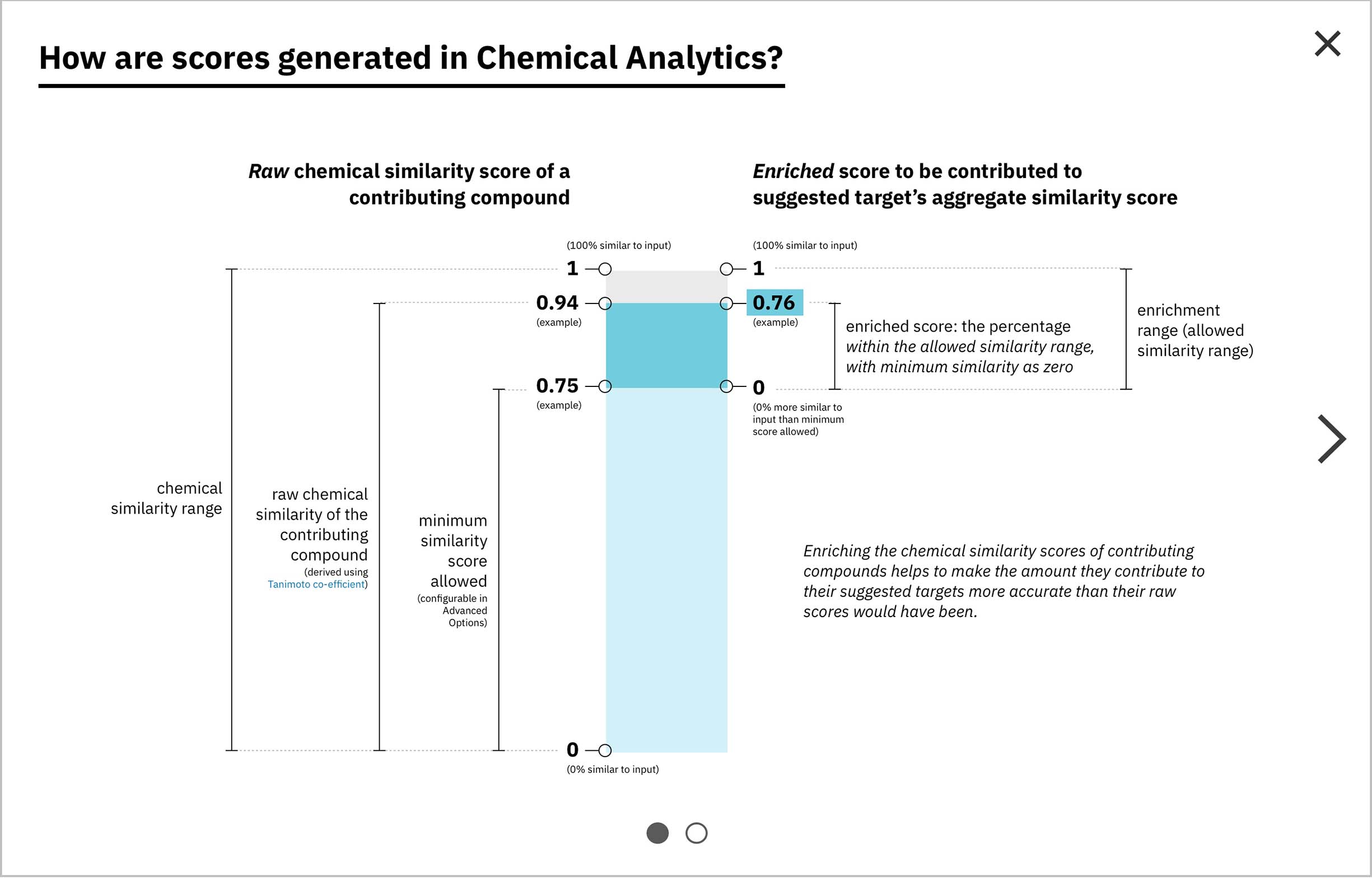
Visually, enrichment is akin to moving the “0” end of the scoring spectrum up to the level of the minimum similarity threshold, without scaling the compounds’ original similarity scores along with it. -
After enrichment, by definition the total score is equal to the amount of darker teal at top (as the numerator) out of the amount of darker gray at top, assuming it continued on behind the teal (as the denominator).
Score enrichment was necessary: the score of each compound that made it through the minimum similarity filter would be recalibrated to reflect its relative proportion beyond the minimum. These scores and the formulas hiding behind them are complex concepts, but I believed that they could be effectively expounded upon via visuals. I built the concept of enrichment into the bars representing both individual and aggregate scores, and developed another score-centric set of sequential illustrations to illuminate the idea.
“Drug prediction for drug-target interaction is a difficult thing to do. I would love to test these [predictions] empirically. The commercial value would be huge. If your software is able to predict and validate anything that is not known, that would be a big, big splash.”
—WDD user when exploring Chemical Analytics post-launch
Once CA launched, I met with some chemists to get their take on both its usefulness as a technology, and its usability from a design perspective. Overall, the feedback has been promising, and has given us ideas for enhancing it in the future even further.
Live + learn
- I vehemently validated an awareness I’d already had prior to this project: that I love to collaborate with others whose strengths differ from my own, but who operate in industries of interest to me. My collaborators on this project and I each had our own expertise, and trusted each other fully to do our jobs. We worked through trade-offs between feasibility and the overall user experience, simultaneously planning future iterations to improve upon the functionality so far provided.
- I built upon previous knowledge I’d actively acquired in other undertakings, around concepts like natural language processing and its accompanying annotators, measures of molecular similarity, and even storytelling.
