
Watson Health Data Vis Guild
Objective: Provide and guide a forum aimed at data vis skill development
Role: Guild lead
Guild members: About 40 at its peak
Opportunities
- Other product teams in IBM had reached out to me for feedback on their data vis designs, and I realized many basic best practices were not being followed; in talking to designers, I realized they were not aware of them. Guild meetings could be a chance to get us all on the same page.
- Designing with data feels intimidating and unfamiliar at first. Intentionally examining effective data visualizations can inspire and provide the context needed to take the first step.
- There are nearly 35 offerings within the Watson Health portfolio. Several employ similar user task models that would benefit from visualization, so sharing our products and patterns could prevent us from repeatedly reinventing the wheel.
Process
Guilds are groups that reach across teams within an organization, allowing common interests, skill sets, and practices to be developed. They’re also intended to break down silos between teams and encourage collaboration and pattern sharing, ultimately serving as an investment in the organization’s efficiency and agility. As such, a guild seemed like a perfect solution to the data vis disparities I’d observed across Watson Health.
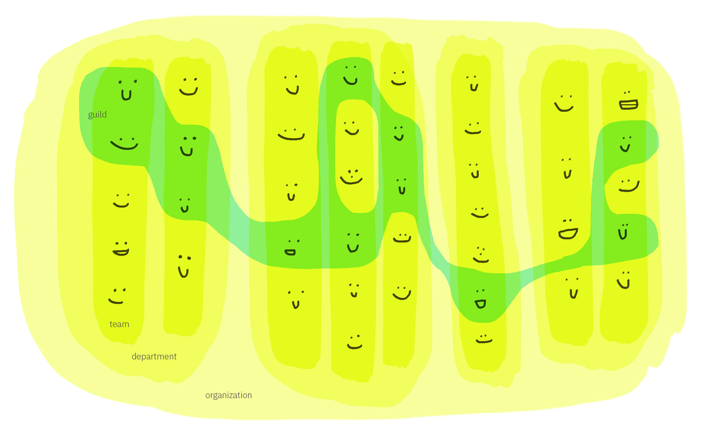
Guilds are amoeba-like, cutting across otherwise hierarchically structured organizations.
The guild needed goals if we were ever to produce tangible outcomes for our products and users. In preparation of the first guild meeting, I identified three high-level objectives to help align our activities. I based these on our users’ needs, our own internal needs as designers spread across distinct teams, and IBM Design’s motto: “works together, works the same, works for me”.
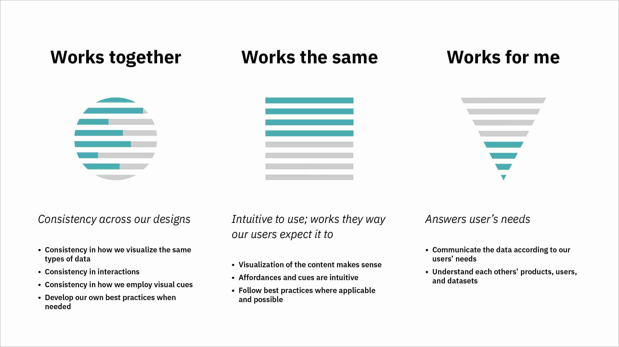
As a guild we would need to establish consistency in our data vis designs across Watson Health, create intuitive visualizations, and most of all, use the available data to answer our users’ needs.
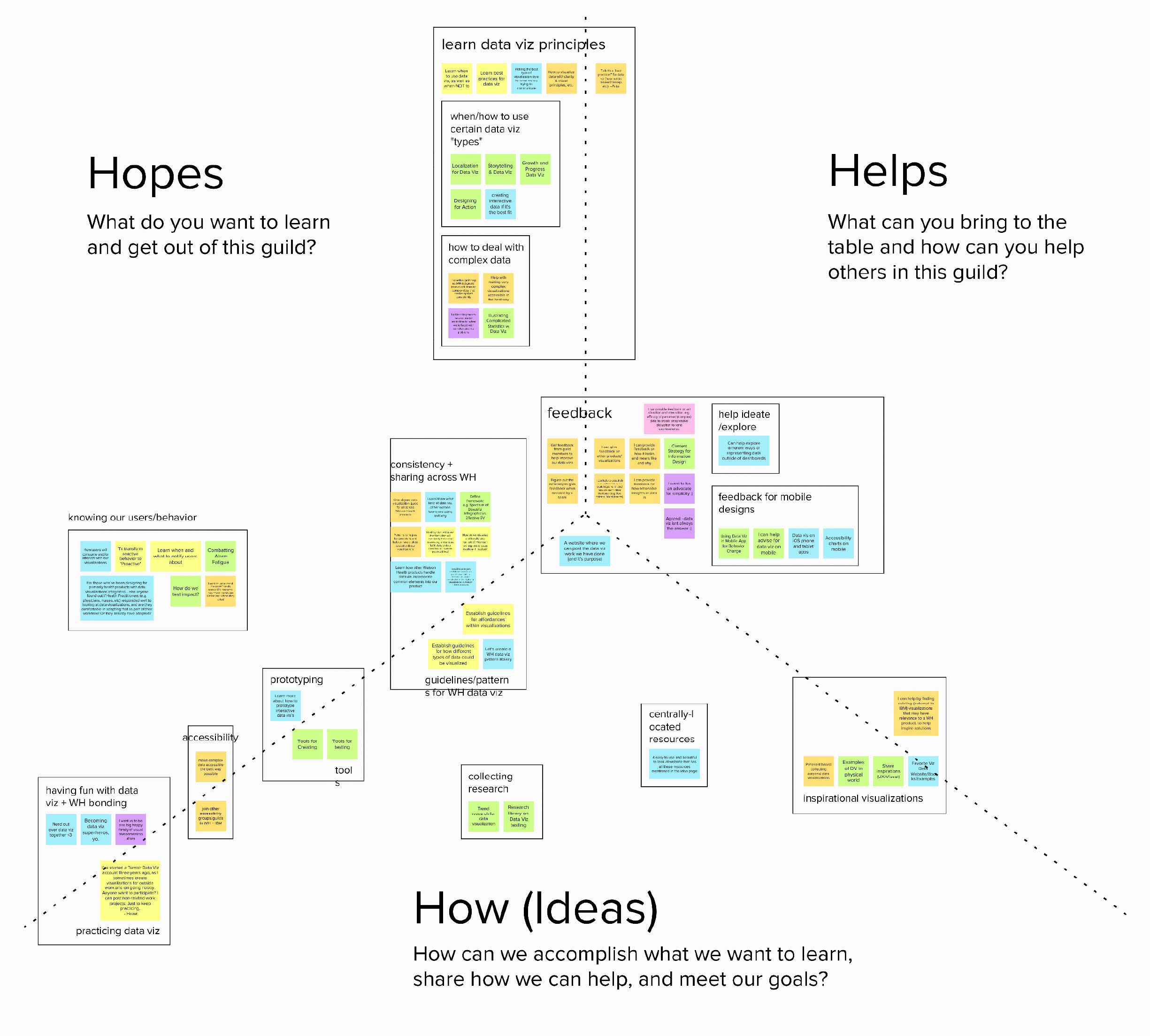
I held the first guild meeting with the intention of collecting others’ input and feedback on these preliminary goals and learning what they wanted to get out of a data vis-themed guild. Mural provided a remote platform with which to collect attendees’ ideas across three dimensions: what they hoped the guild would provide, ways they might be able to contribute, and other ideas for how we could accomplish our intents. After assimilating everyone’s input, it was clear that some themes had surfaced:
- learning data vis best practices and principles
- getting feedback on designs
- establishing consistency across Watson Health products and our practices
- understanding our users’ needs with regard to data
- and maybe my favorite—“nerding out over data vis together” as “one big happy family of visual awesomeness”.
The Watson Health design teams are spread across the world, with large hubs in Dublin, Shanghai, New York, Cambridge, and Austin; this meant our guild meetings and subsequent collaborations would be remote. We used Mural to share ideas during our first call.
Outcomes
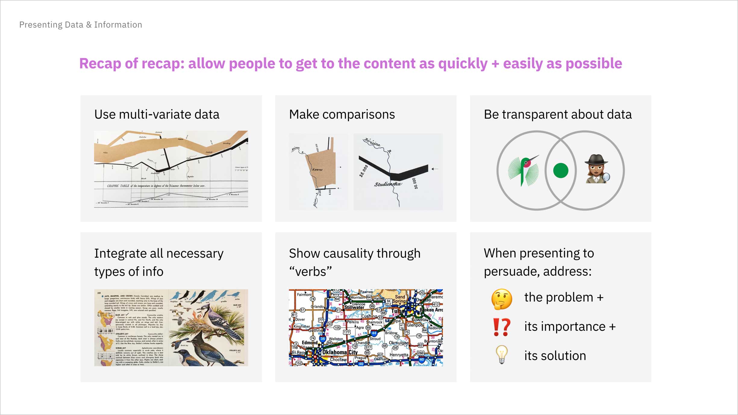
In the following meetings, I attempted to address these themes through a variety of presentation types. I researched and shared data vis-specific topics to more deeply develop our understanding of when and how to employ certain visualization types and organized pattern reviews to keep our teams in alignment.
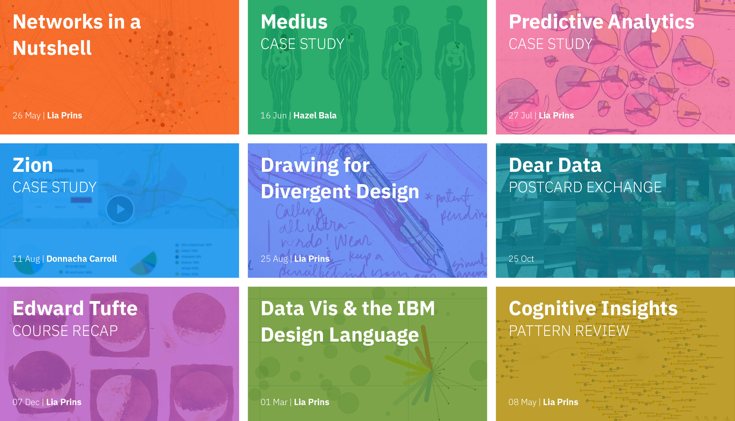
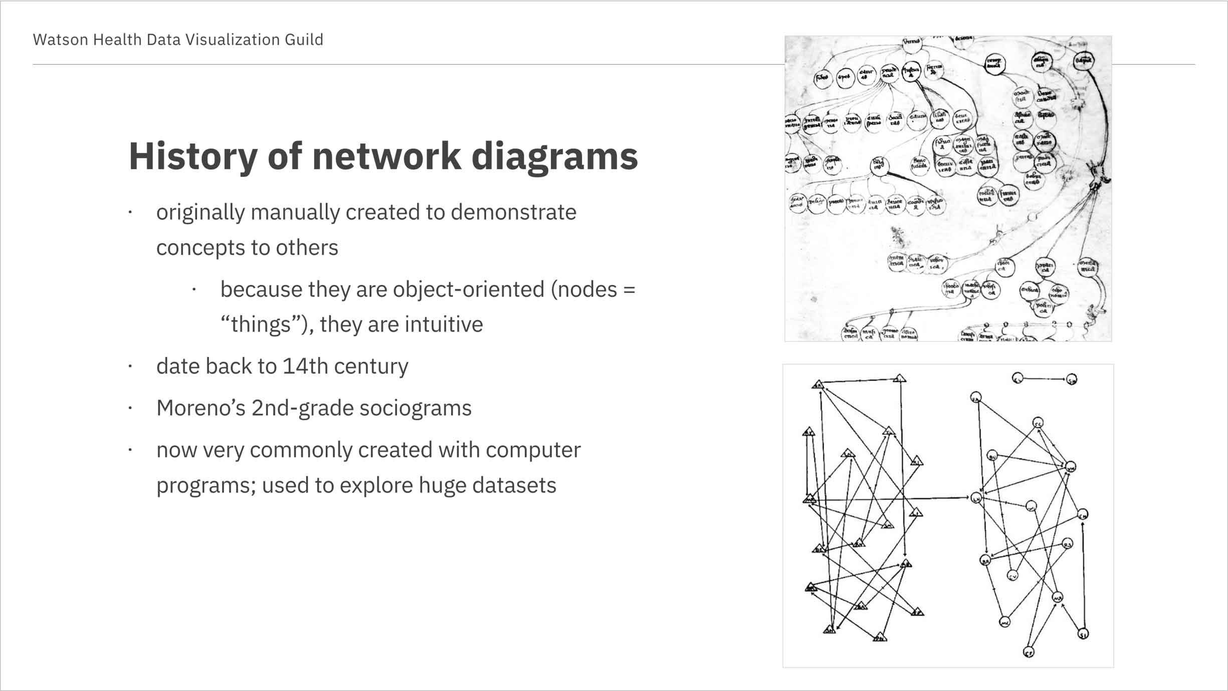
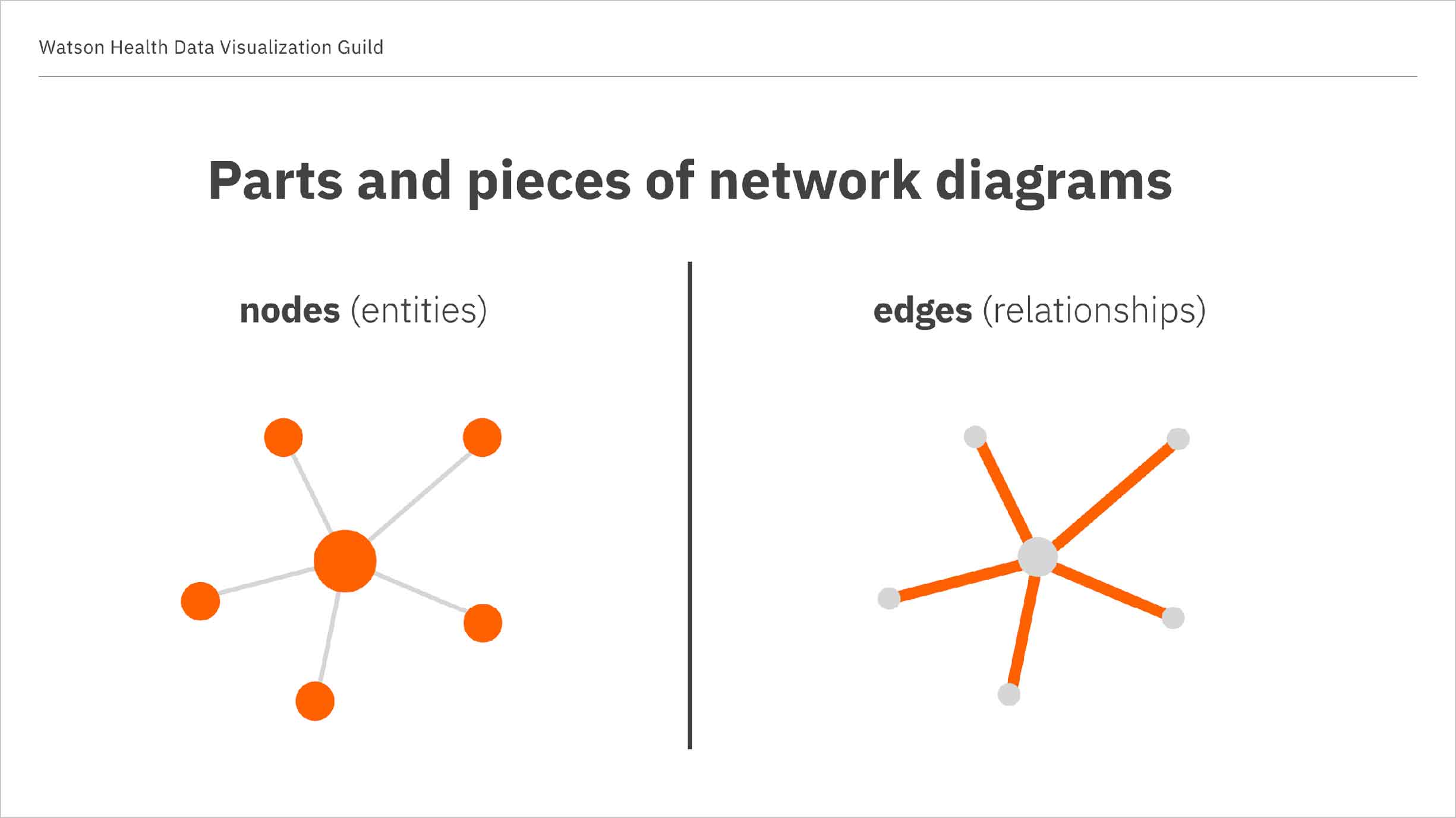
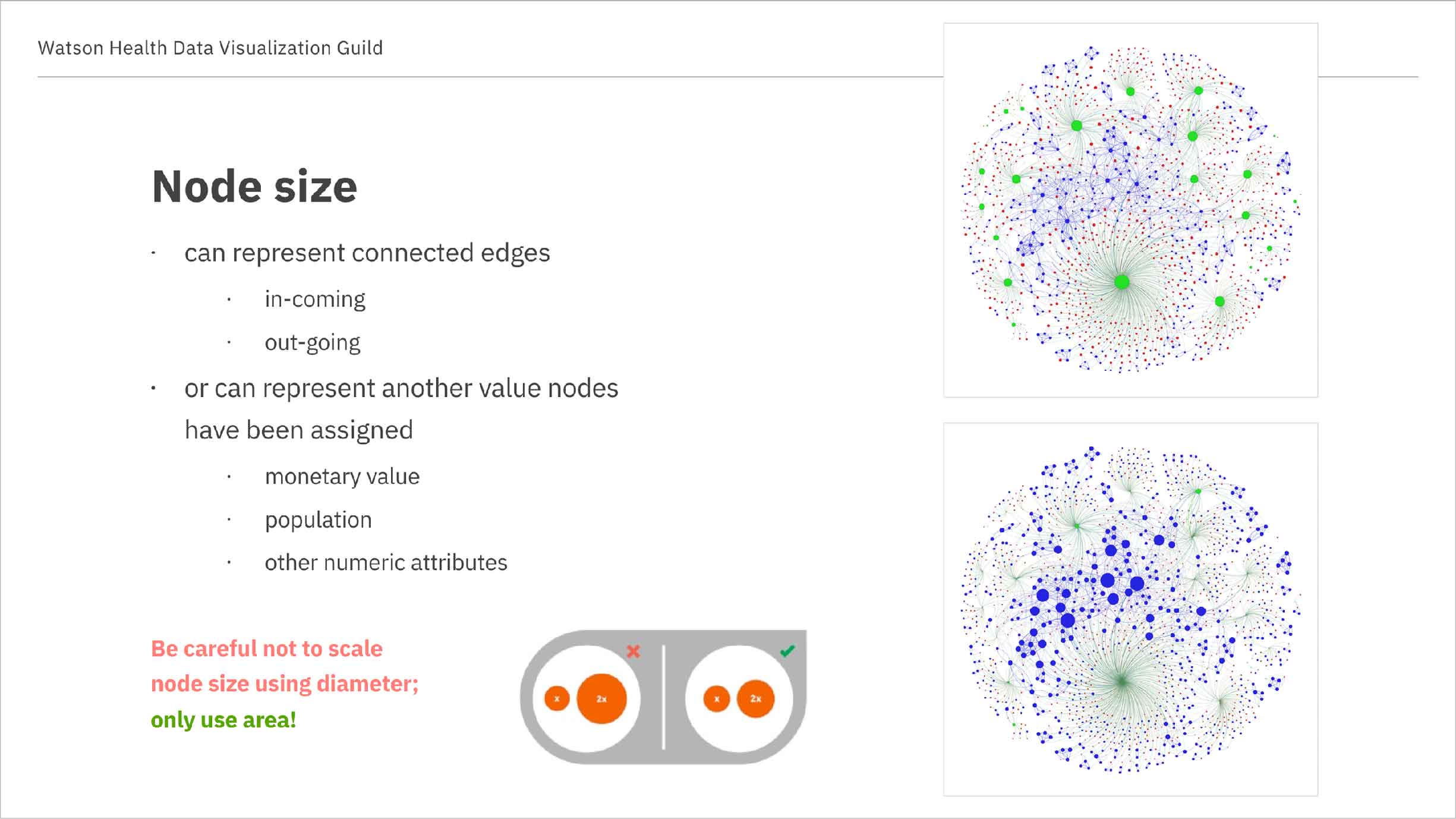
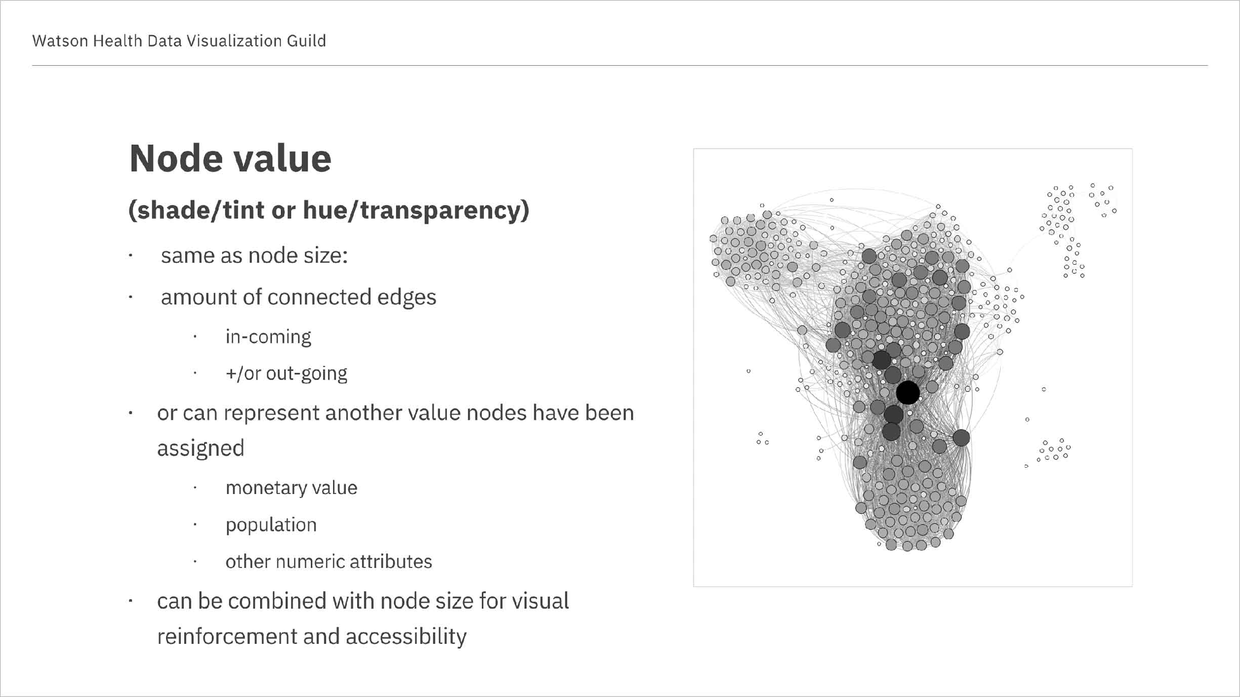
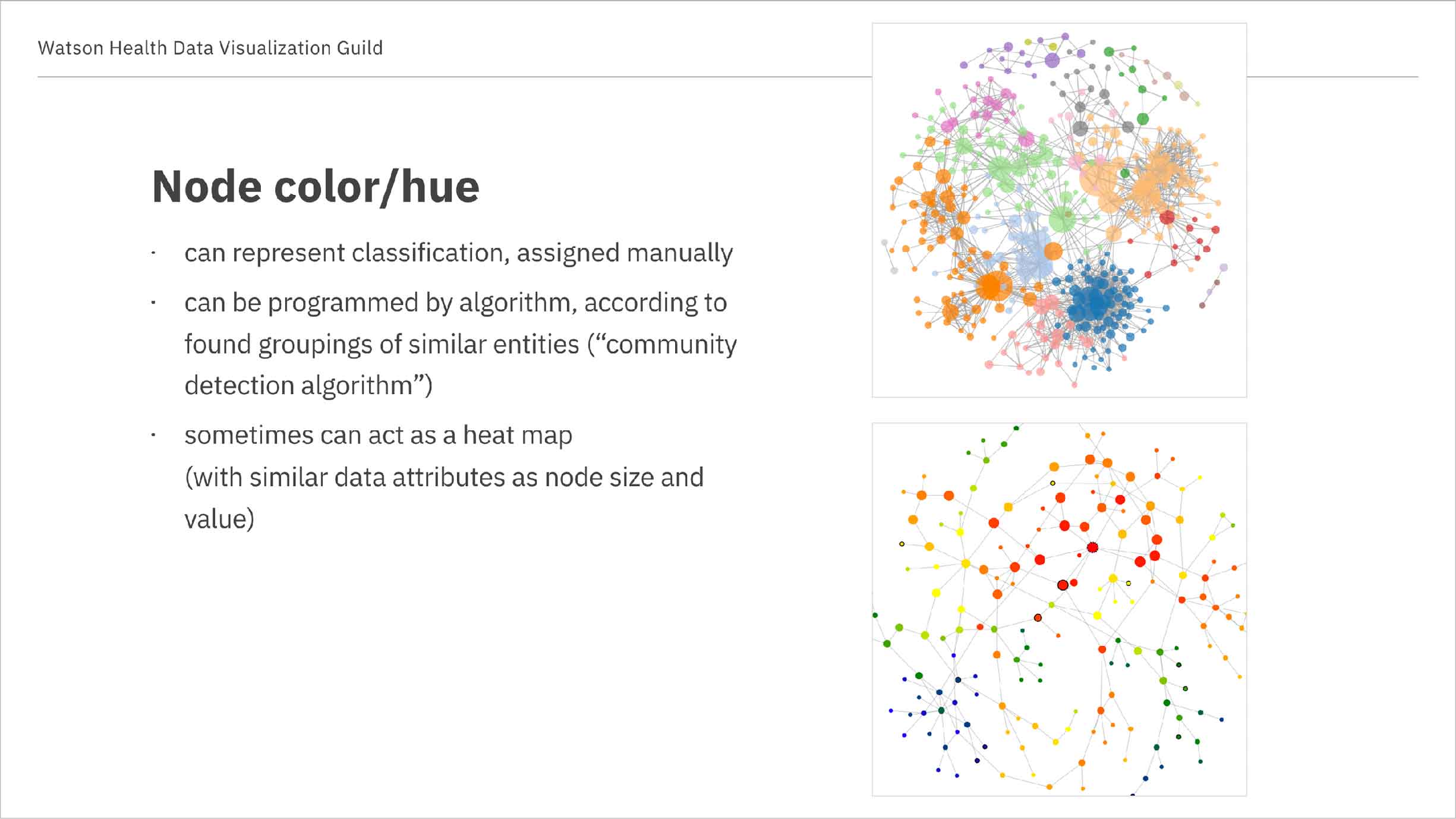
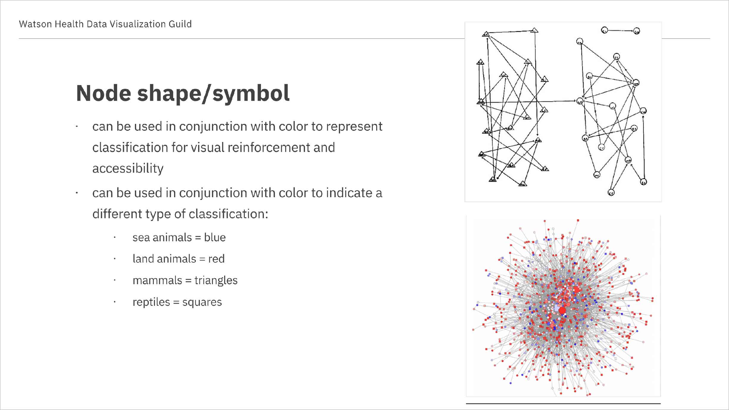
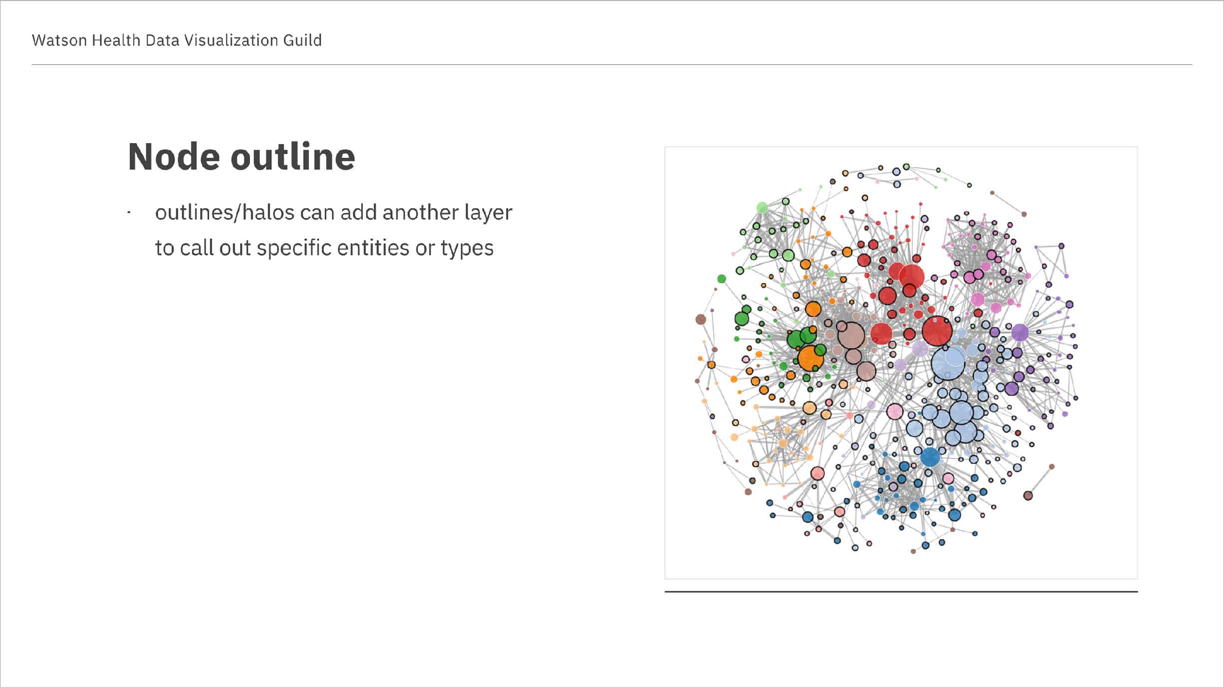
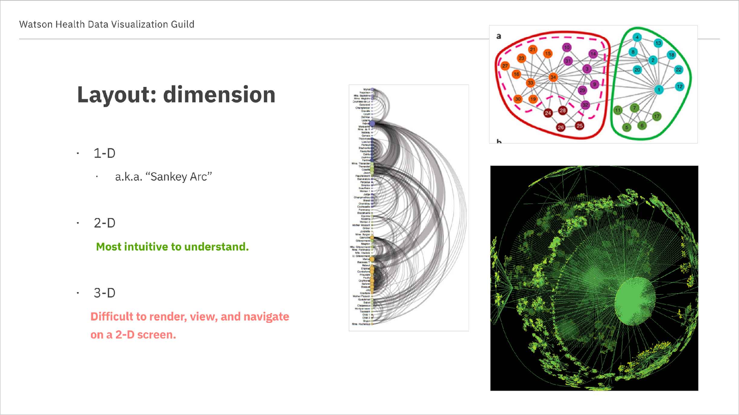
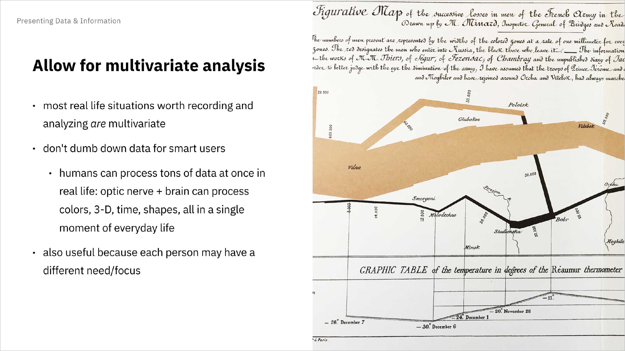
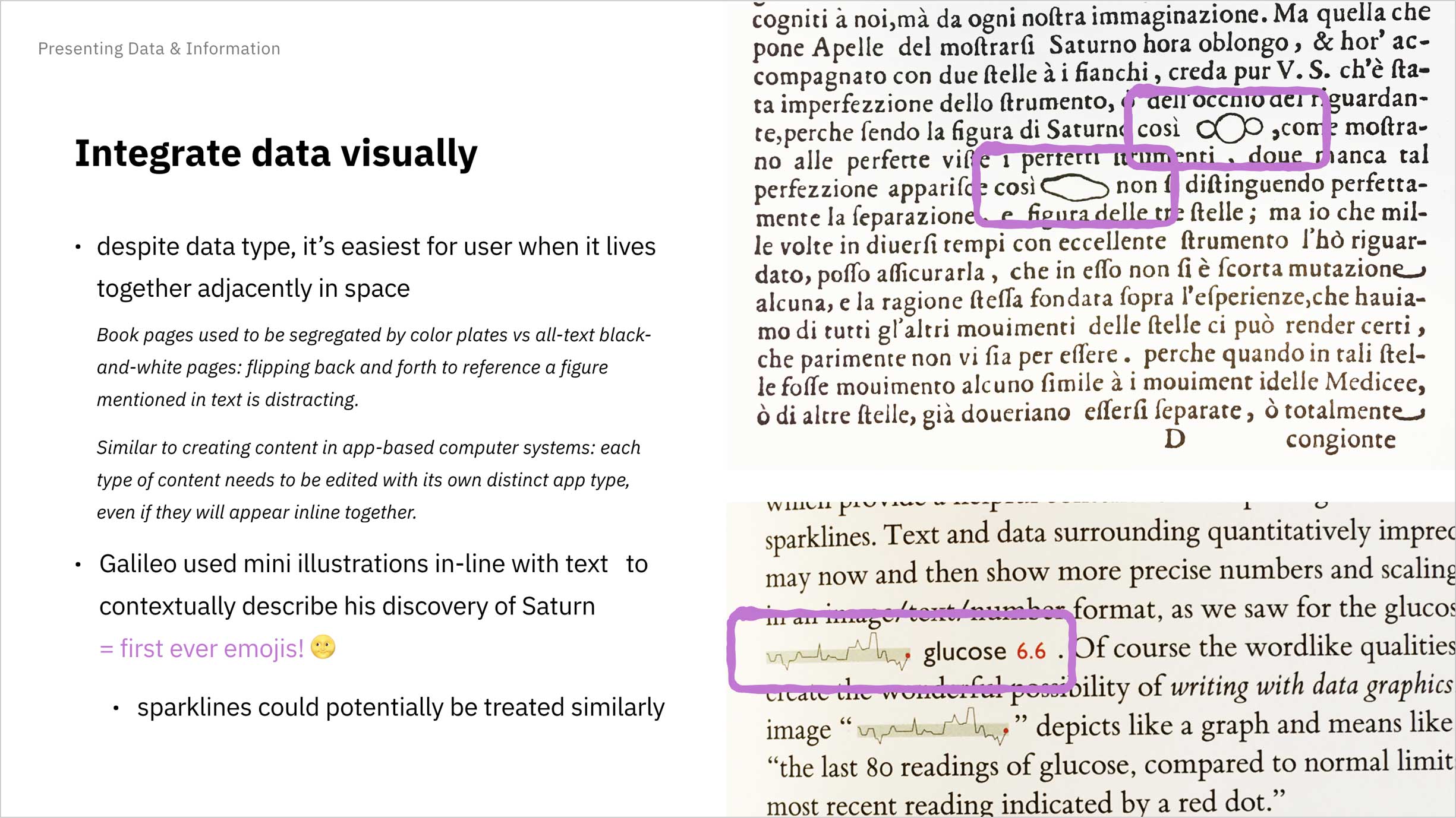
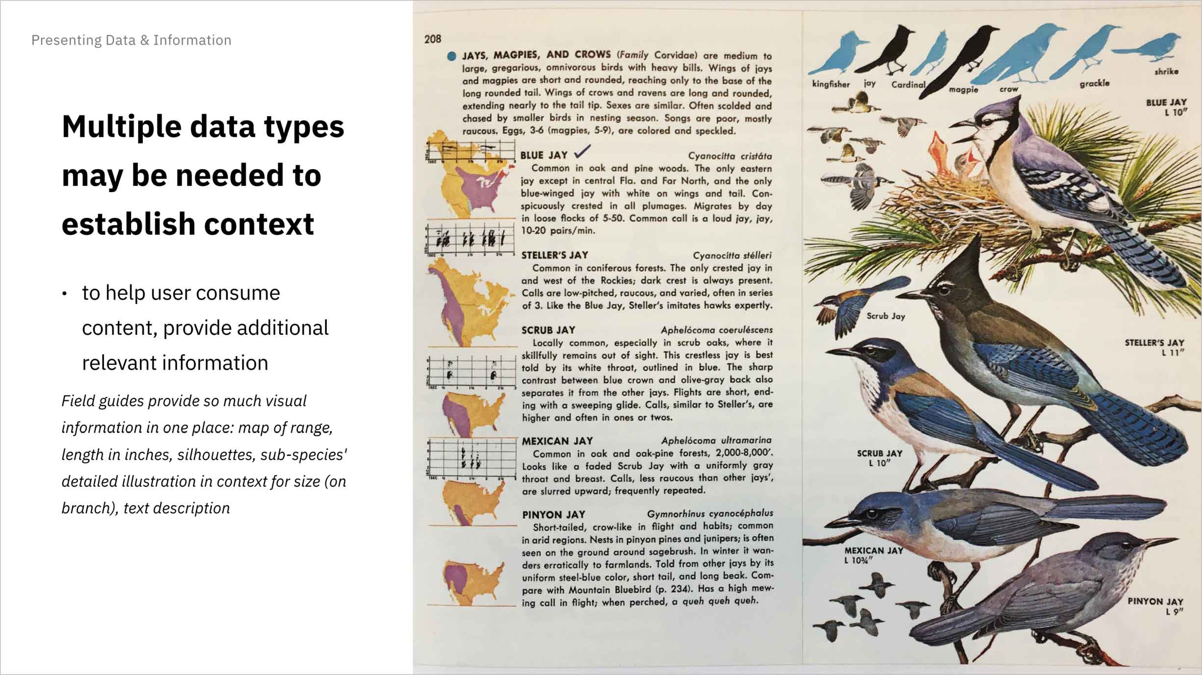
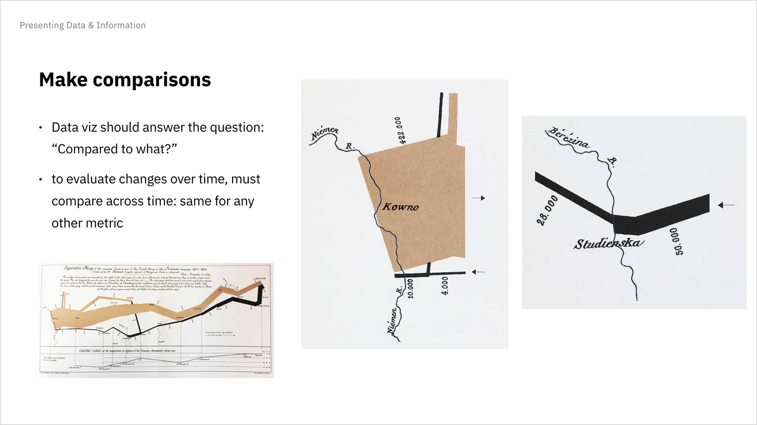
These cover slides represent a sampling of topics addressed during our guild meetings.
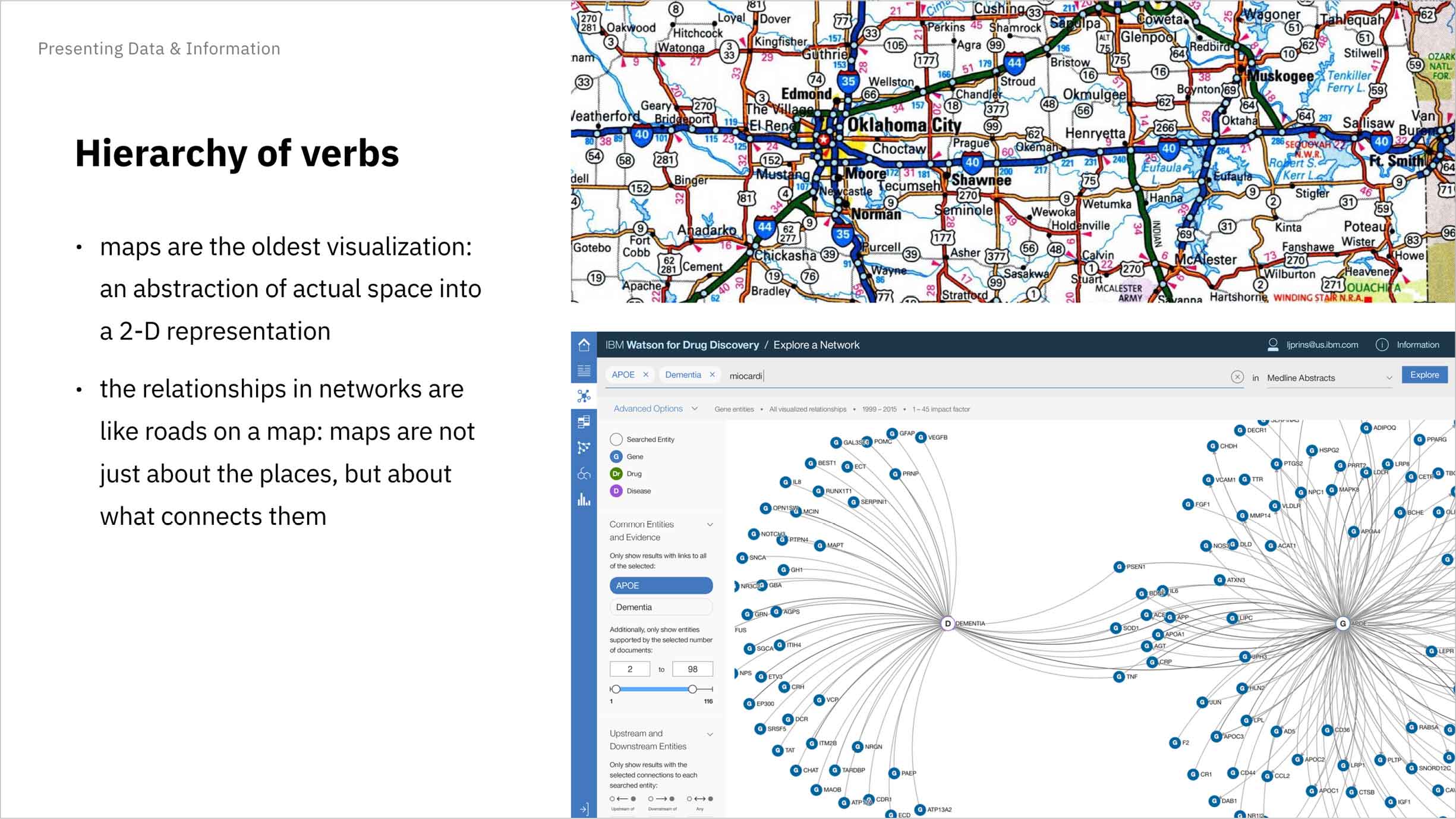
I’d become particularly familiar with and fond of network visualizations while working on Watson for Drug Discovery, a Life Sciences offering that makes good use of networks as querying tools, so I happily made them the subject of my first guild presentation.
I also arranged for other Watson Health teams to present, whose products included or could benefit from visualizations. This way we could provide feedback and collaborate together on potential solutions. These “case studies”, as I called them, were intended to simply be point-in-time presentations so as to minimize the preparation required. I established a Mural template to help guide these sessions and help the presenting product team to provide the proper context for the rest of us in the guild.
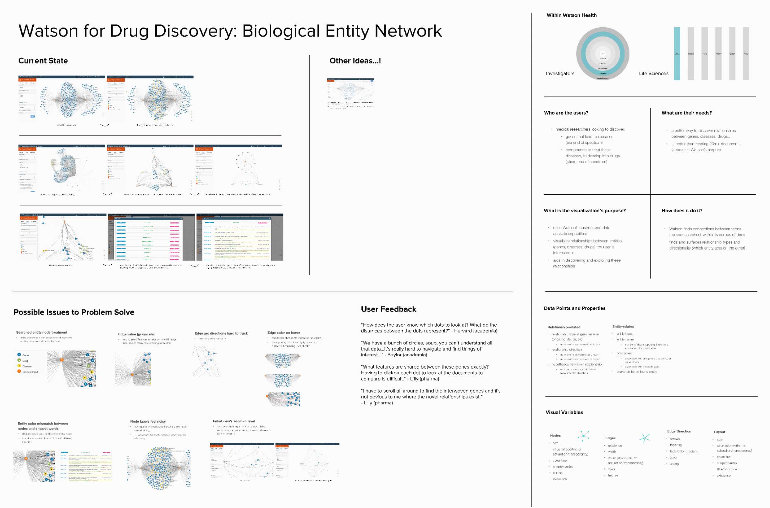
The Mural template for case study presentations includes areas for the presenting teams to share who their users are, where the offering sits in the Watson Health portfolio, how far along it is in its lifecycle, and ways in which the rest of the guild can help to ideate or give feedback.
IBM’s Design Language team had begun work on a set of guidelines to help designers more effectively communicate and visualize aggregate data, calling on Accurat—a design firm specializing in data vis—as consultants. I met with Accurat team member and renowned data vis designer Giorgia Lupi and others to share real use cases and act as an ambassador of the AI and healthcare product spaces. The principles that went into our company’s data vis guidelines needed to account for the complexity that our design teams and our users dealt with daily.
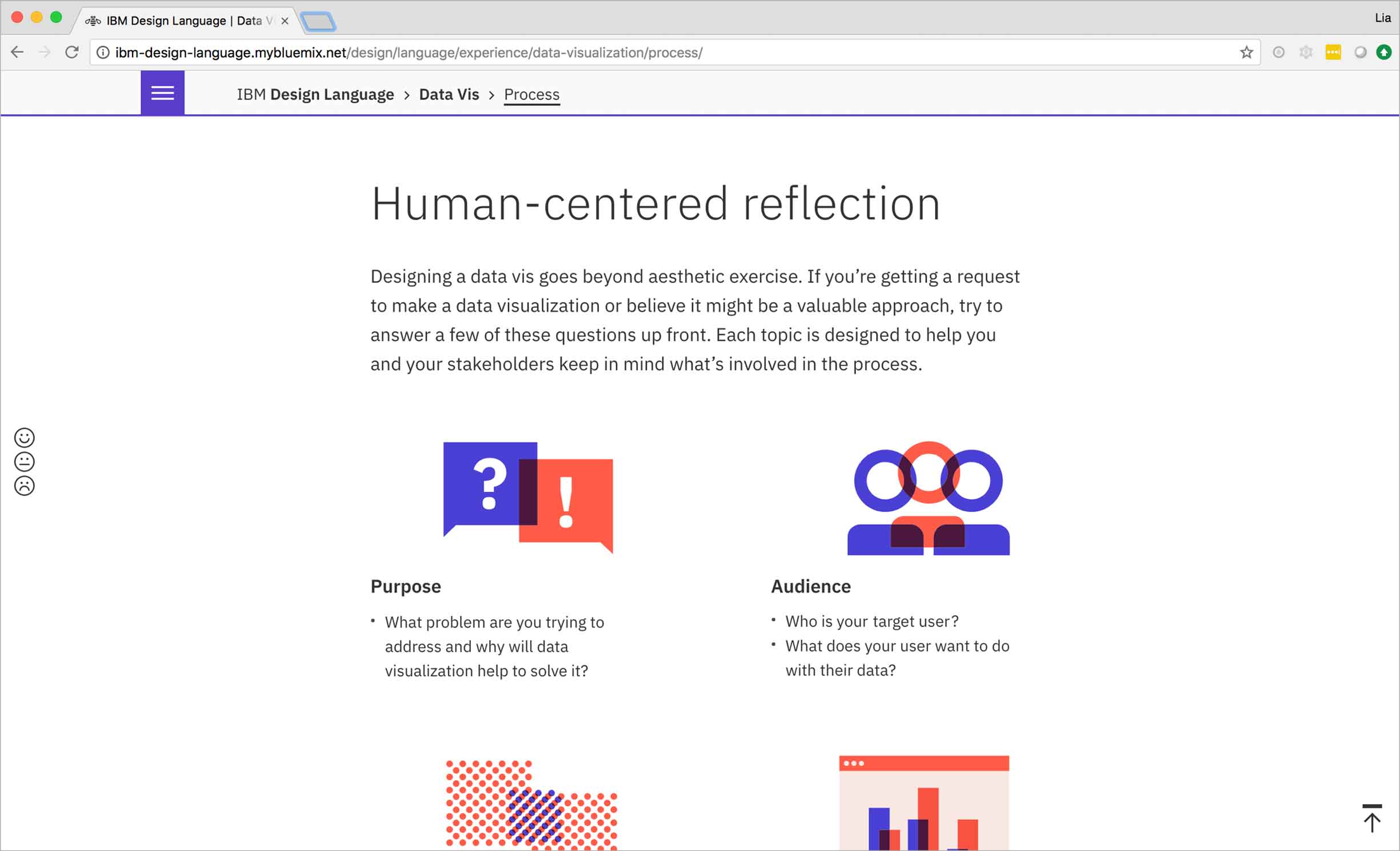
The final guidelines cover principles and process, as well as best practices for animation, interaction, visual style, and other aspects of data design.
The Accurat team gave a talk at IBM’s Austin studio about their vision for the data vis guidelines and also showed some of their own inspiring work, all of which I recorded to share with the other Watson Health locations.
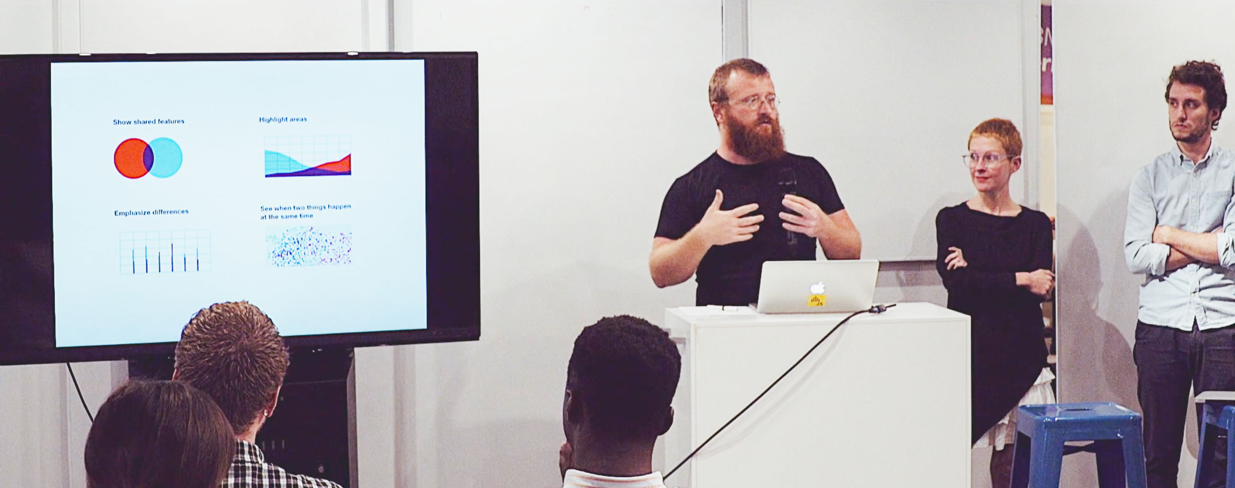
The data-driven design agency Accurat offered up their vis wisdom to the IBM Austin studio.
During Accurat’s presentation, Giorgia Lupi had shown a passion project she’d done with Stephanie Posavec that had come to be called “Dear Data”. They’d mailed each other weekly, hand-made postcards featuring visualized data collected from the seemingly innocuous minutiae of their everyday lives. The incredibly detailed yet organic visualizations revealed subtle traits of their creators through both their content and form.
I wished to have a fellow data vis adorer with which to share such creations, too … and then I realized that I did—potentially a whole guild full of them. A project like this held the potential to unite our members across the distance that physically divided us. So I implemented a Dear Data postcard exchange for the Watson Health studios, featuring prompts relevant to our collective everyday lives like the tools we use to do our jobs and what we listen to when we work or commute.
The Dear Data postcard exchange for the Watson Health studios was set to be a success … until every participant (myself included) accidentally skipped step number 4, and then the mail ate our postcards.
Unfortunately, I’d made a huge mistake in trusting the IBM internal mail system, which is intended to enable the free and safe sending of documents between all of the corporation’s international and seemingly infinite locations. It had seemed so handy at the time—no treks to the post office; no pricey purchases of international stamps. But the cost of convenience turned out to be high: not a single postcard found its way to its addressee, nor back to its sender. And somehow every single one of us had forgotten to photograph our customized creations. The lone survivor was an example postcard I had made to share in advance of the project.
-
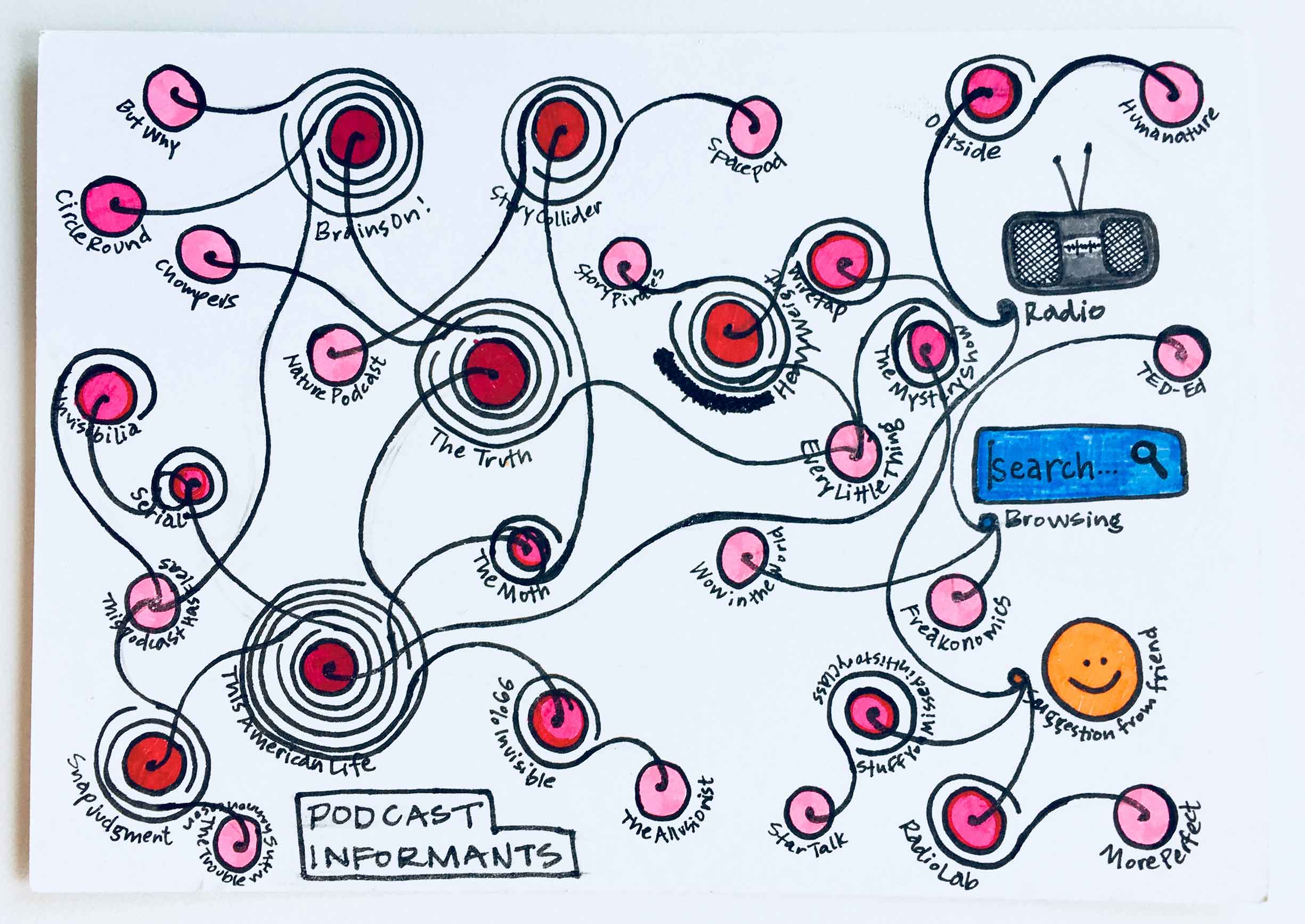
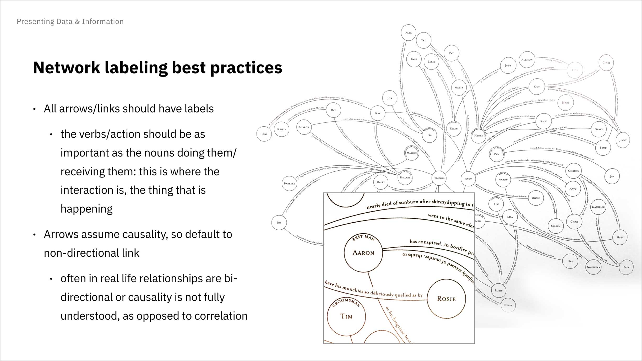
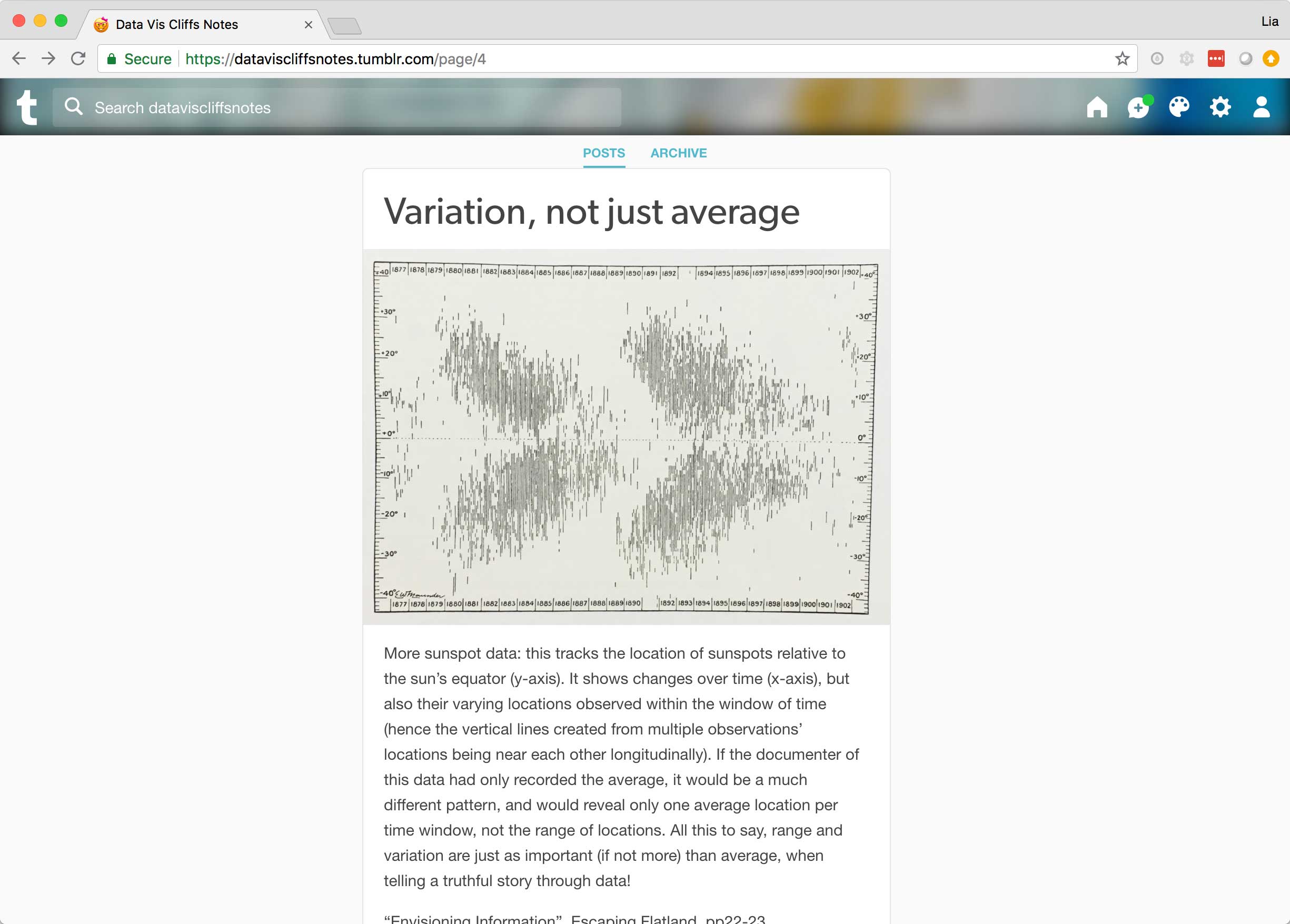
To demonstrate one interpretation of the "audio" prompt, I designed a network visualization that revealed the methods by which I’d discovered my favorite podcasts. Possible podcast origins include the radio, browsing my podcast app, and getting a suggestion from a friend. More likely, though, a podcast itself informed me of another podcast—in the form of a featured story or mention by the host—as indicated by the rings that spiral out from some nodes and connect to others. -
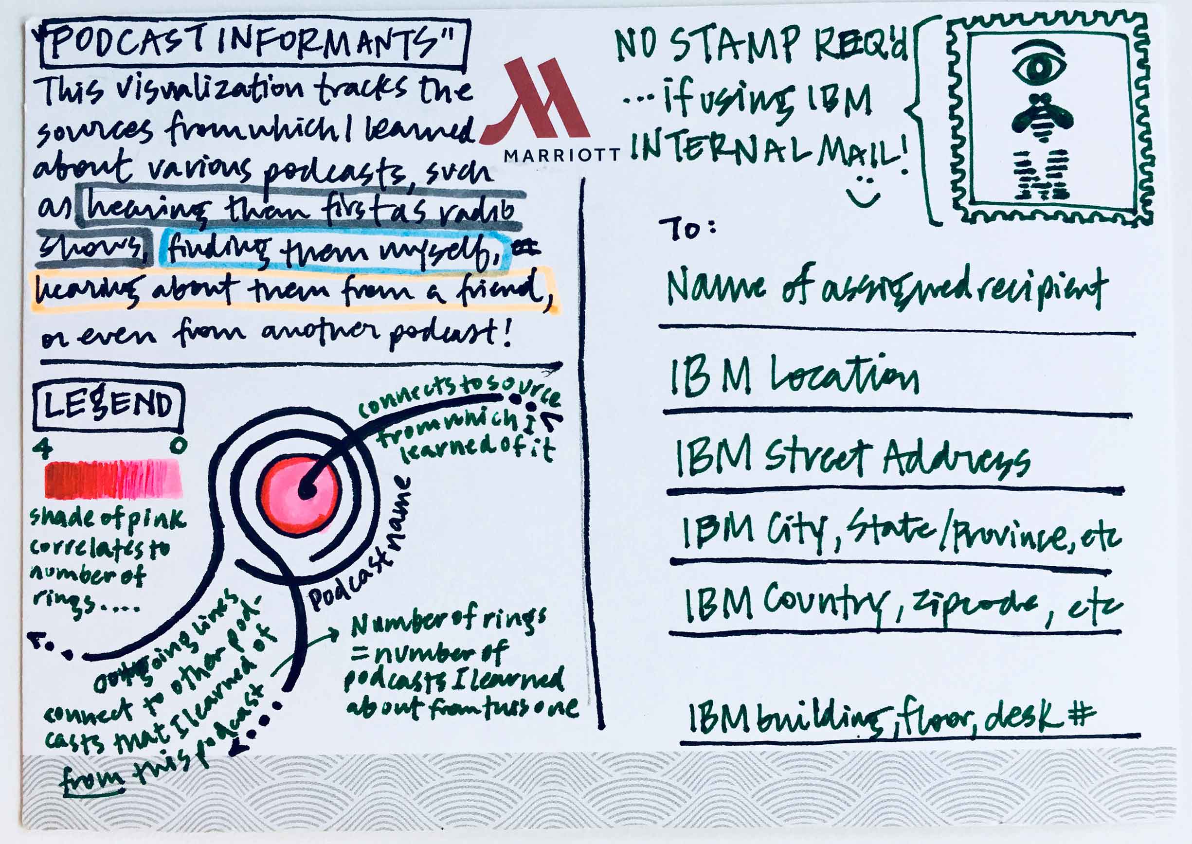
The back of the postcard holds the all-important legend and intent of the visualization. (Special thanks to Marriott and my hotel-amenity-hoarding instincts for the free blank postcard … I knew it would eventually come in handy.)
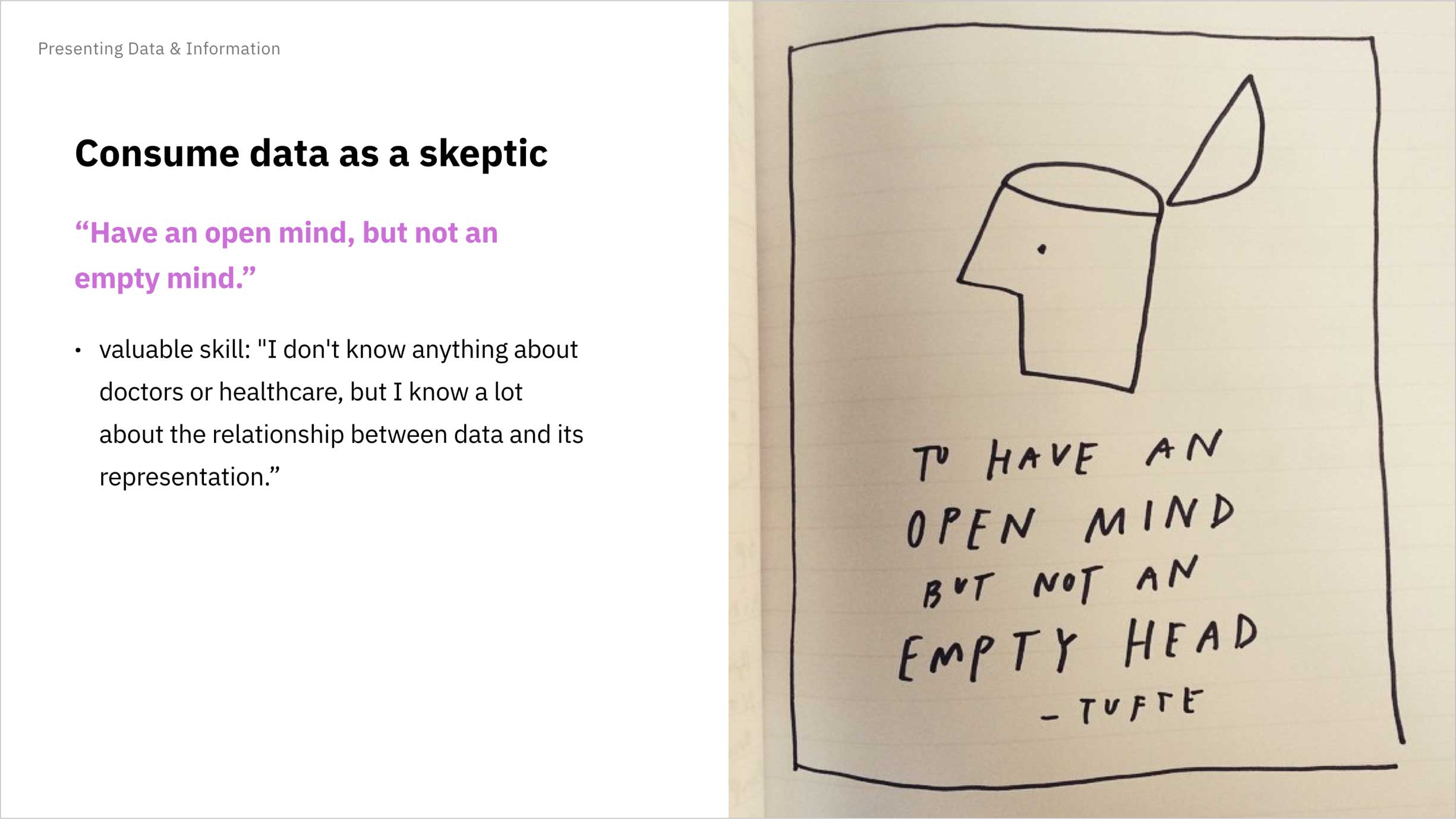
When I learned that Edward Tufte—an acclaimed communicator in the realm of data and information design—would be visiting Austin to give a lecture, I lobbied the Design Director of Watson Health to allow me to attend, promising I’d present my subsequent learnings to the rest of the designers in our department. My pitch resulted in success, and I dutifully recorded all that I could during the day-long session.
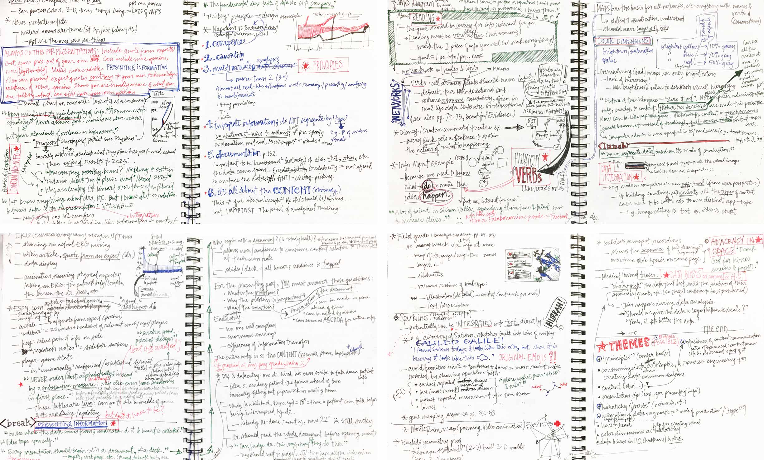
The course covered an abundance of content, as evidenced by my ink-inundated notebook spreads.
After the course, I went to work distilling my notes into insights relevant to the artificial intelligence and healthcare spaces. I presented my takeaways to all Watson Health designers, hoping to raise more interest and awareness in the field of information visualization.

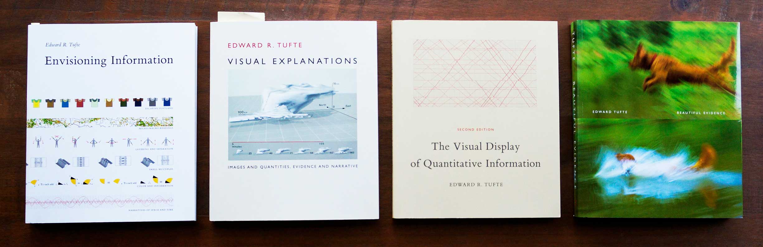
As part of the seminar, I received four books by Tufte. I’d read a few other books centered around data and info vis, and had been sharing my learnings on the Slack channel I’d set up for the guild. I liked the idea of a book club to hold me and others interested accountable. As a community of mutually committed learners, we could discuss what we’d read and how it applied to our projects.
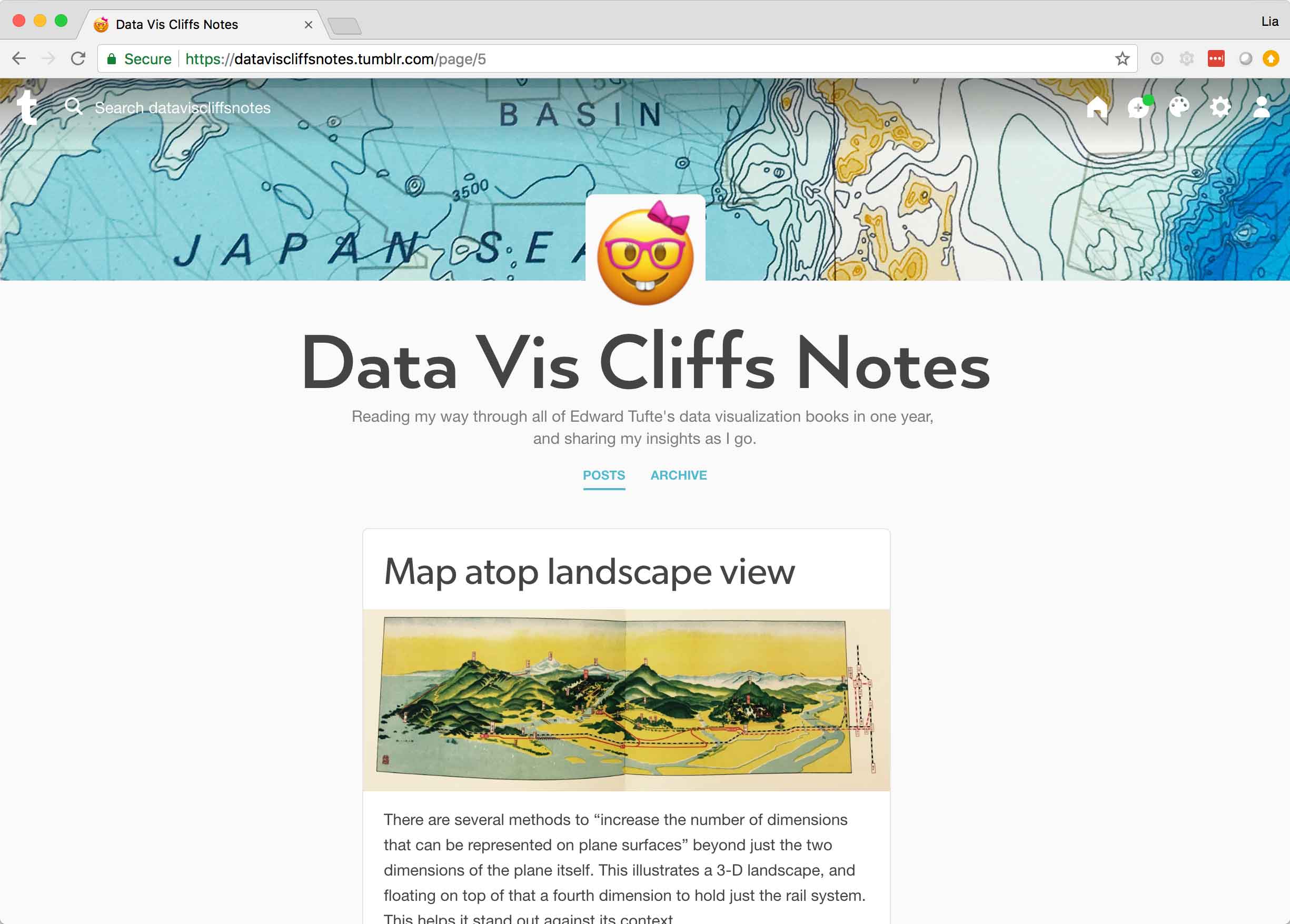
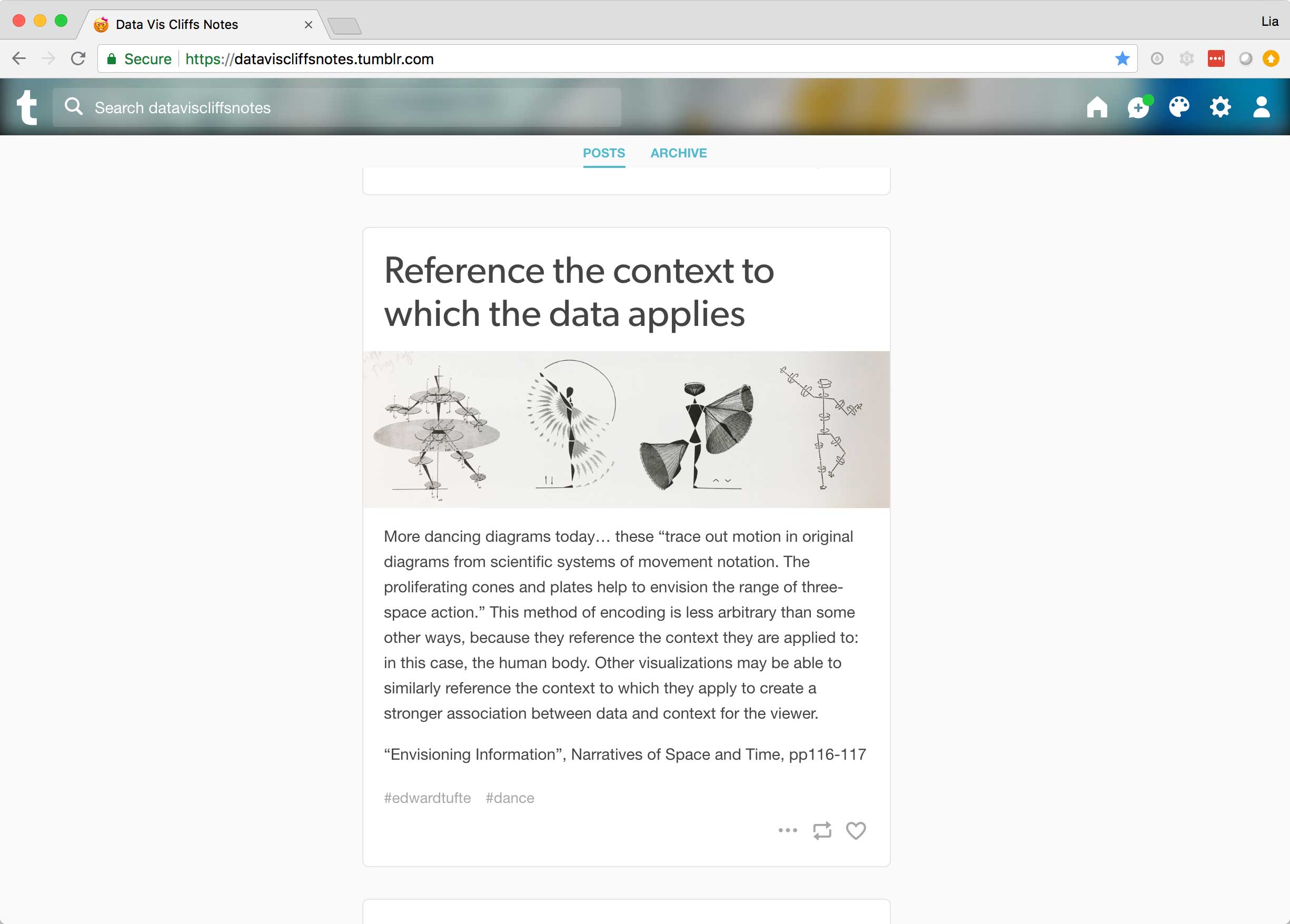
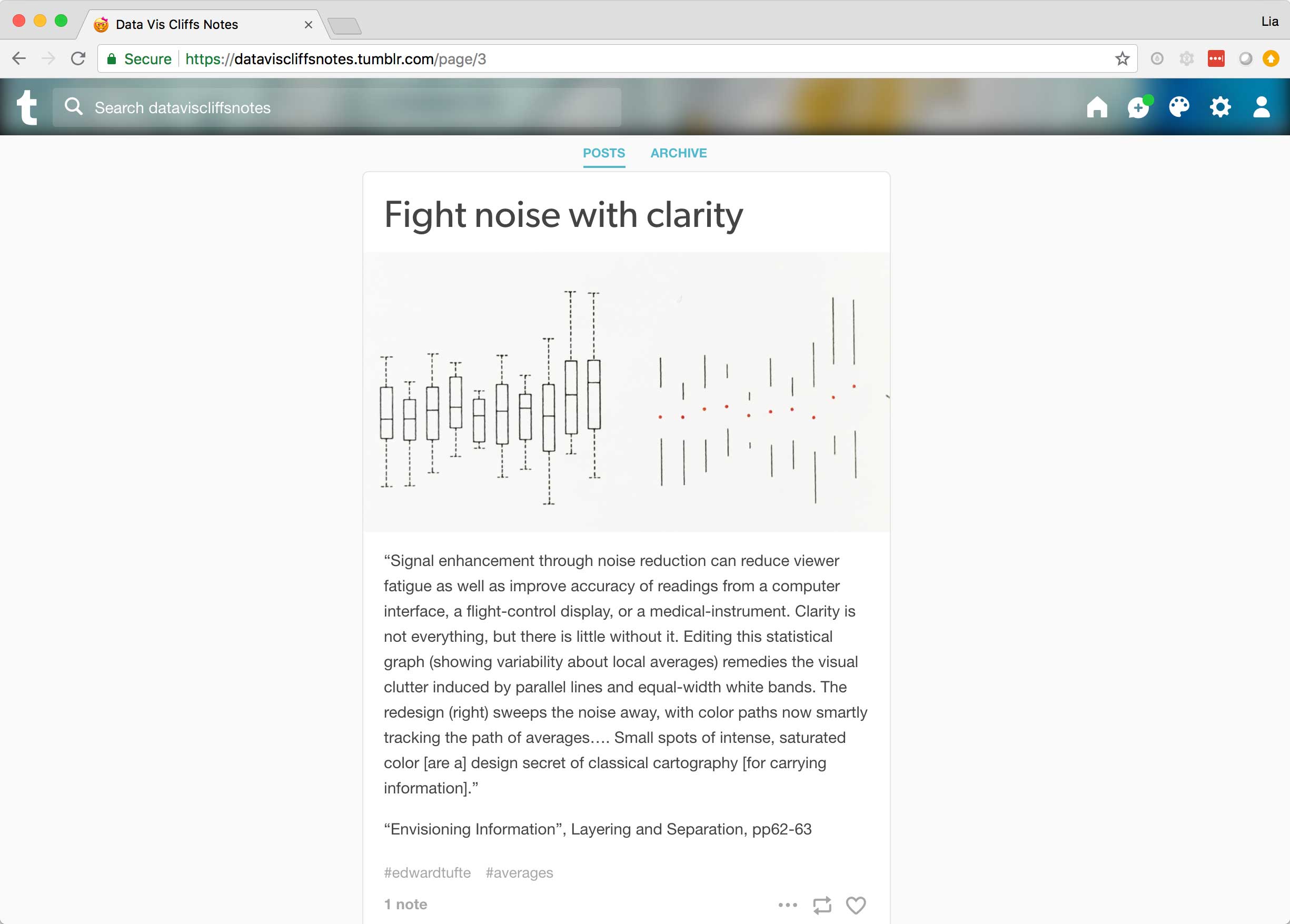
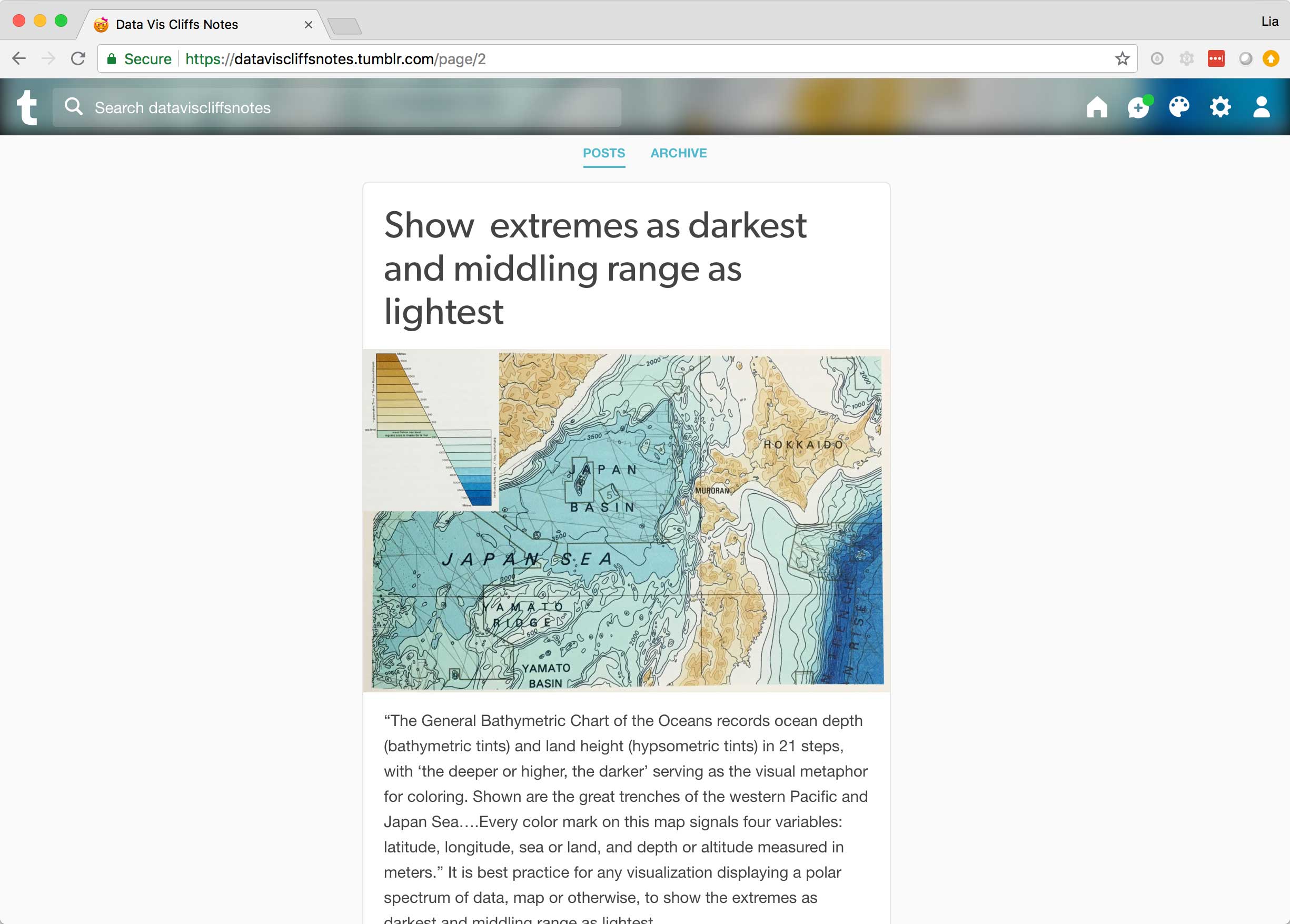
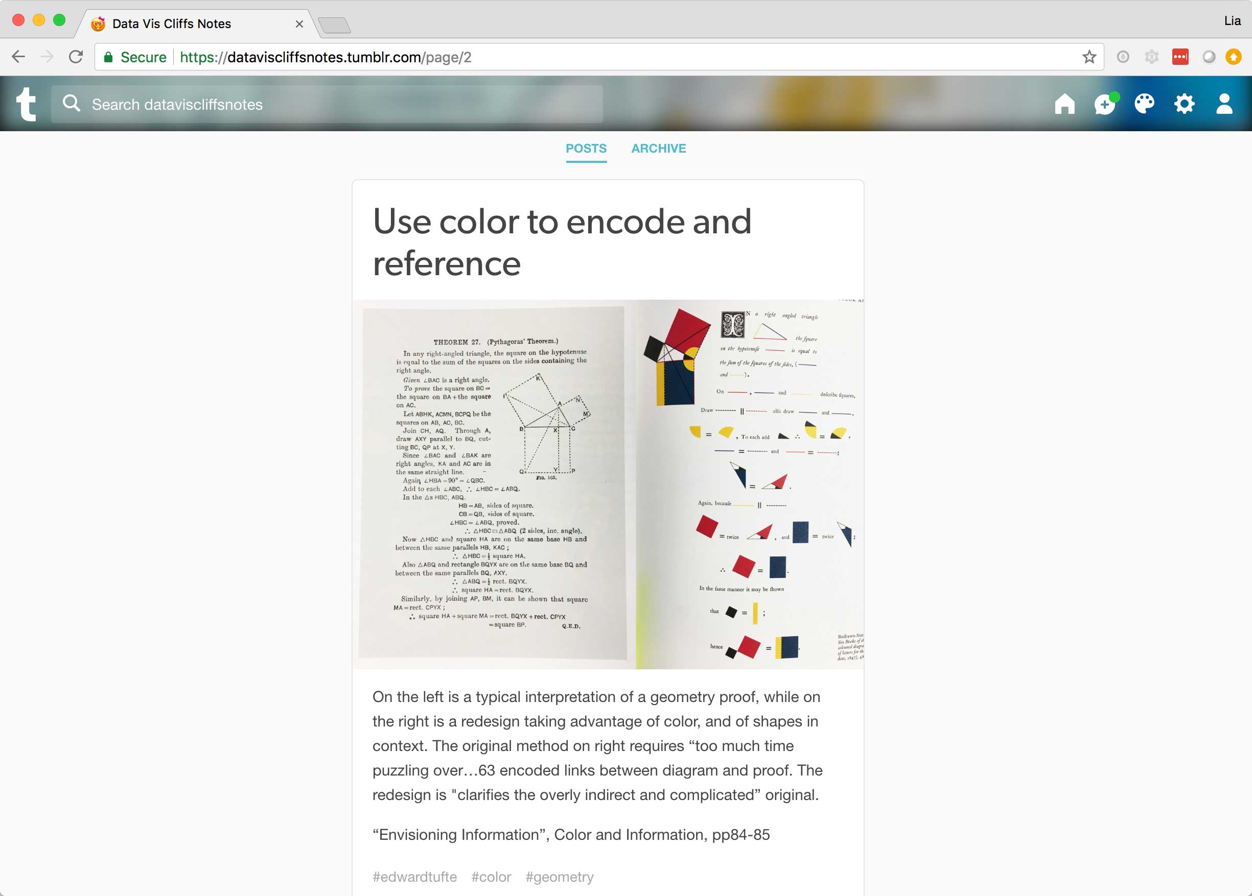
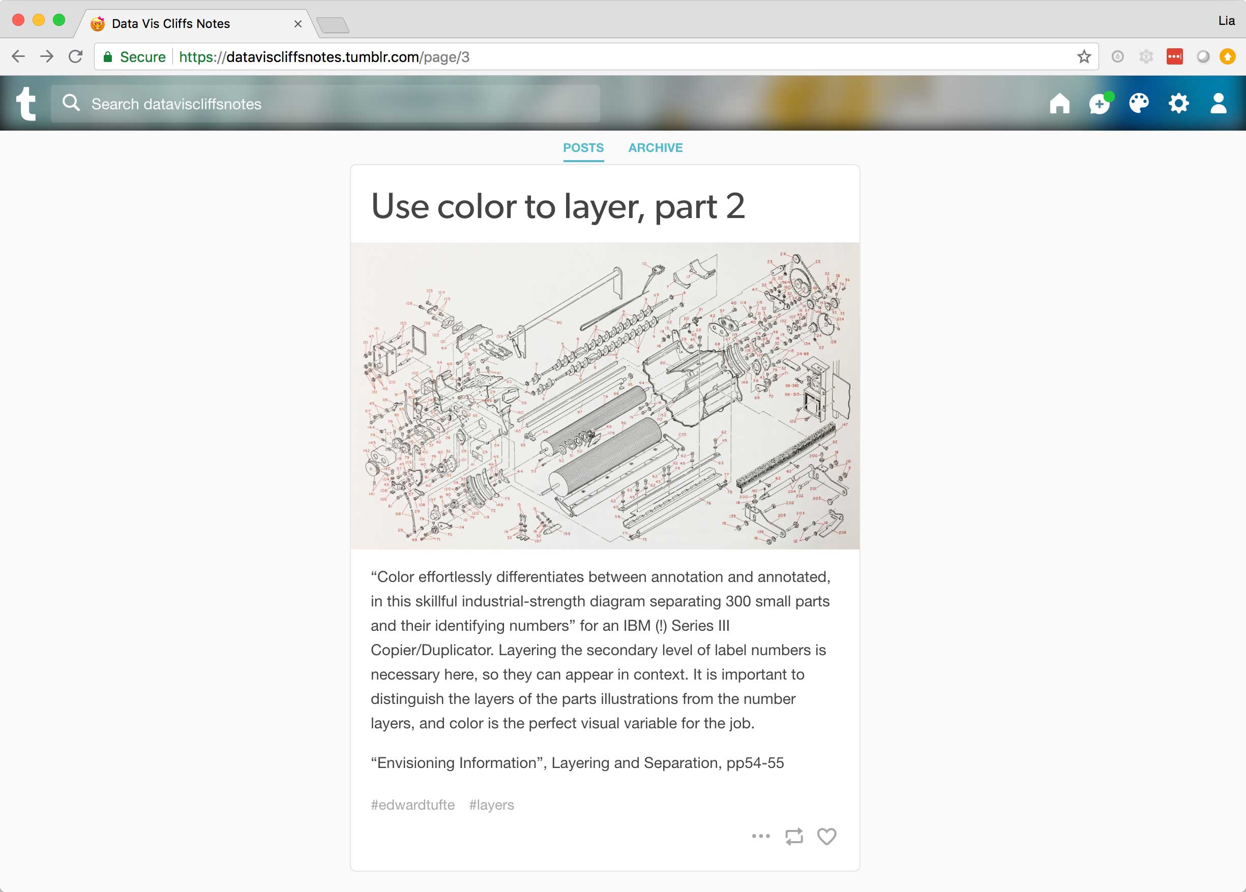
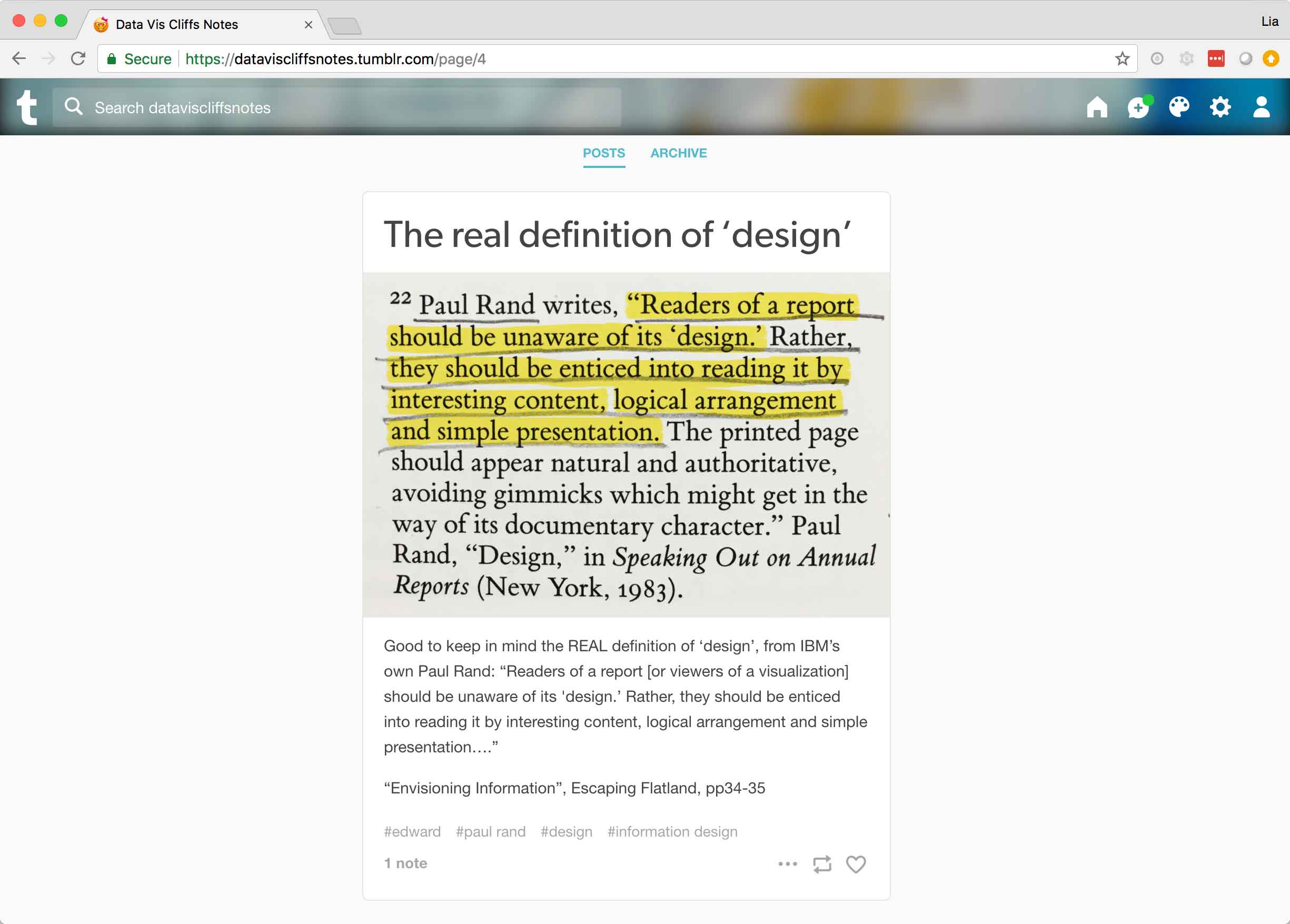
Tufte’s books—as well as others I’ve read within the information visualization genre—are dense. I eventually established a sustainable pace, committing to read a single spread per workday in detail. I’d take thorough notes and assess the content’s relevance to my responsibilities as a UX designer. Rather than posting my takeaways on the guild’s Slack channel everyday, I decided to share these observations online via Tumblr where anyone could easily access them in a simple, organized format. My posts relied on a single, telling image along with a brief explanation or provocation, and aimed to make the insights contained in these heady tomes more approachable for all my fellow data vis designers or those new to the field.
Live + learn
- In addition to the small matter of our handmade visualizations going missing, the postcard exchange I organized across Watson Health encountered another obstacle. Nearly everyone in the guild (and others who didn’t regularly attend) signed up to participate, but far fewer actually followed through and created postcards. Rather than simply assigning a send-off date, pitching the idea as a workshop would have been far more fun: we could all gather in our respective studios to make by hand together, bounce ideas off of each other, and get inspiration.
- Learning a new skill or staying up to speed with an existing one can be cumbersome within the hectic walls of the workplace. In my attempt to make data vis a part of my regular routine, I discovered several extremely ineffective methods and abandoned my quest more than once. But everything is a prototype, requiring failure, iteration, and refinement. I finally found an approach that worked for me: whenever a meeting starts late or I need a break from my work routine, I seize a few minutes to read just one spread of a book on the topic I’m trying to master at the moment. Over the course of the past year, intentionally allocating my spare moments in this way has provided the time I needed to finish three books.
