The Study of Life
Objective: Create a capstone project of my own design
Timeframe: 5 weeks
Target users: High school biology students
Opportunities
- I wanted to reveal the relevance of science by reducing the degrees of separation between lessons and their bearing on my would-be readers’ futures.
- The physicality of textbooks poses problems: their sheer size inhibits them from becoming part of regular routines—like bus rides and coffee shop stops—where their content could otherwise be consumed more efficiently and enjoyably. They’re also dense by design, necessarily packing as much as possible into fewer physical pages, resulting in a high text-to-imagery ratio. It seemed to me that tablets, combined with thoughtful design, held the potential to liberate textbooks from these particular issues.
- Materials like textbooks reach a multitude of students. But if they’re ever to educate effectively at this scale, their approaches must be diverse enough to broach all of these students’ varied learning styles.
Process
I started by examining several existing biology books, both physical and digital. The photos and diagrams alongside their text-filled pages pulled me in, but once they had my attention, their chaotically arranged elements distracted me. Visual information was bottlenecked by the limitations of the static page it inhabited, forced to appear—overwhelmingly—all at once, rather than reveal itself as a carefully paced sequence.
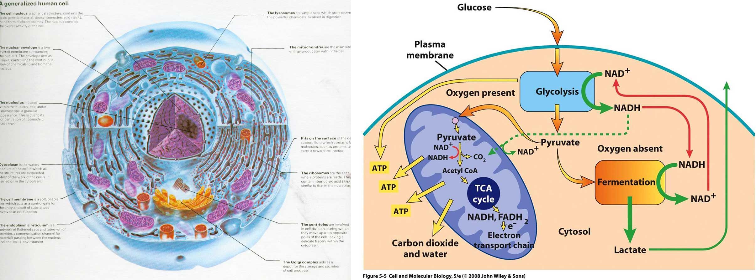
Labels and lines crowded the white space of an illustration I found within a bound book. But the tablet-specific textbook I looked at offered no improvement: arrows galore attempted to illustrate a sequential biochemical process in a single static image that left me wondering where to look first.
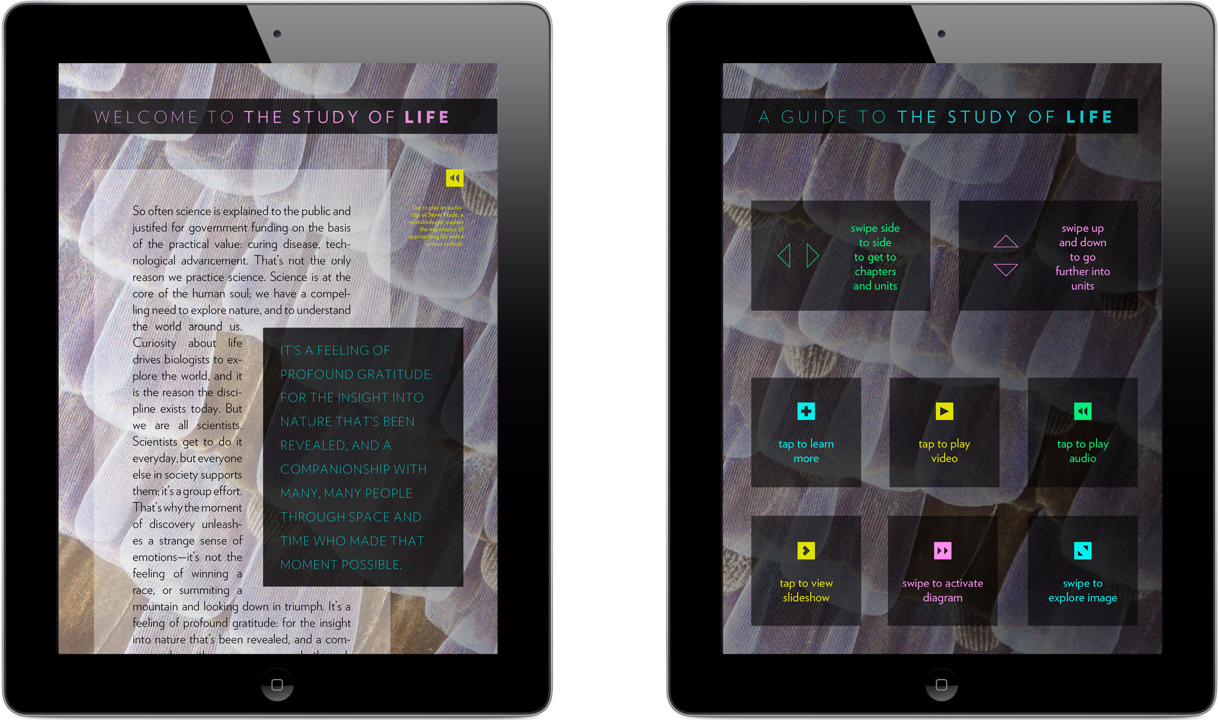
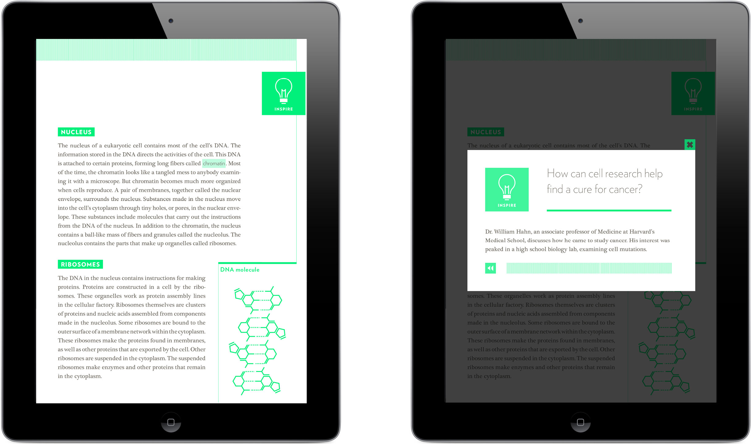
Visual storytelling, then, could potentially play a crucial role in improving the intake of information, but so might narrative. A podcast episode I’d heard many months earlier eloquently and compellingly summed up the values intrinsic to the pursuit of scientific discovery, and had instantly crystalized my personal motive to make the resulting knowledge more consumable. I decided to open my book with an audio clip and transcript of the talk, as an introduction to the scientific process.
Listen for yourself to neuroscientist Doug Fields’ inspiring account as told to the Story Collider podcast.
I located a chapter’s worth of open-source text introducing cells as the building blocks of life, and set to work restructuring it. Once I had sorted the text into a roughly linear framework, I began to identify areas that would benefit from some sort of visual assistance in order to be better understood or engaged with.
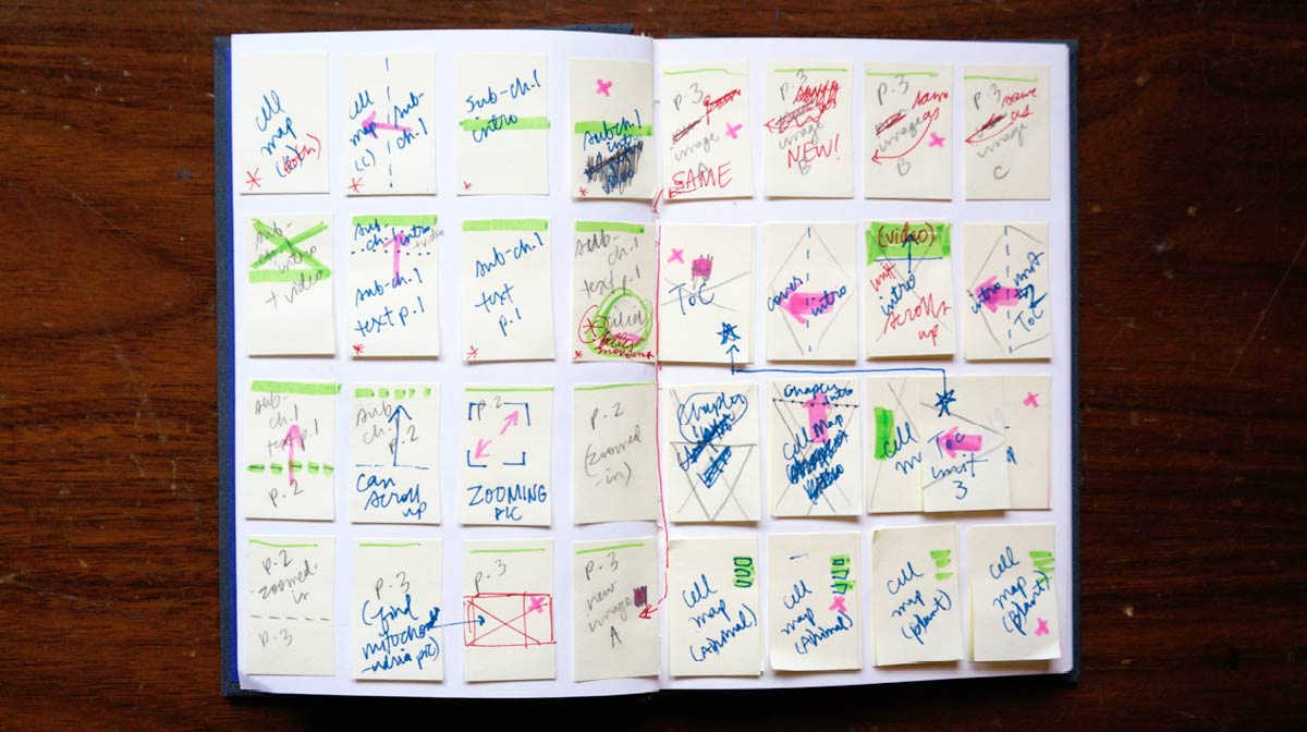
Post Its were the ideal material with which to chart out a flexible outline: I assigned each chunk of content and its associated media a tiny sticky note all its own that I could then neurotically arrange and re-arrange as I iterated on the visual pacing and progression of the chapter as a whole.
My own interest and appreciation of biology informed the visual style of my book. I knew I wanted it to exude energy like the science it would teach about, but I also needed it to feel grown-up, not patronizing or childish, so I looked for visual inspiration outside of existing textbooks—in magazines, online, and even from nature documentaries.
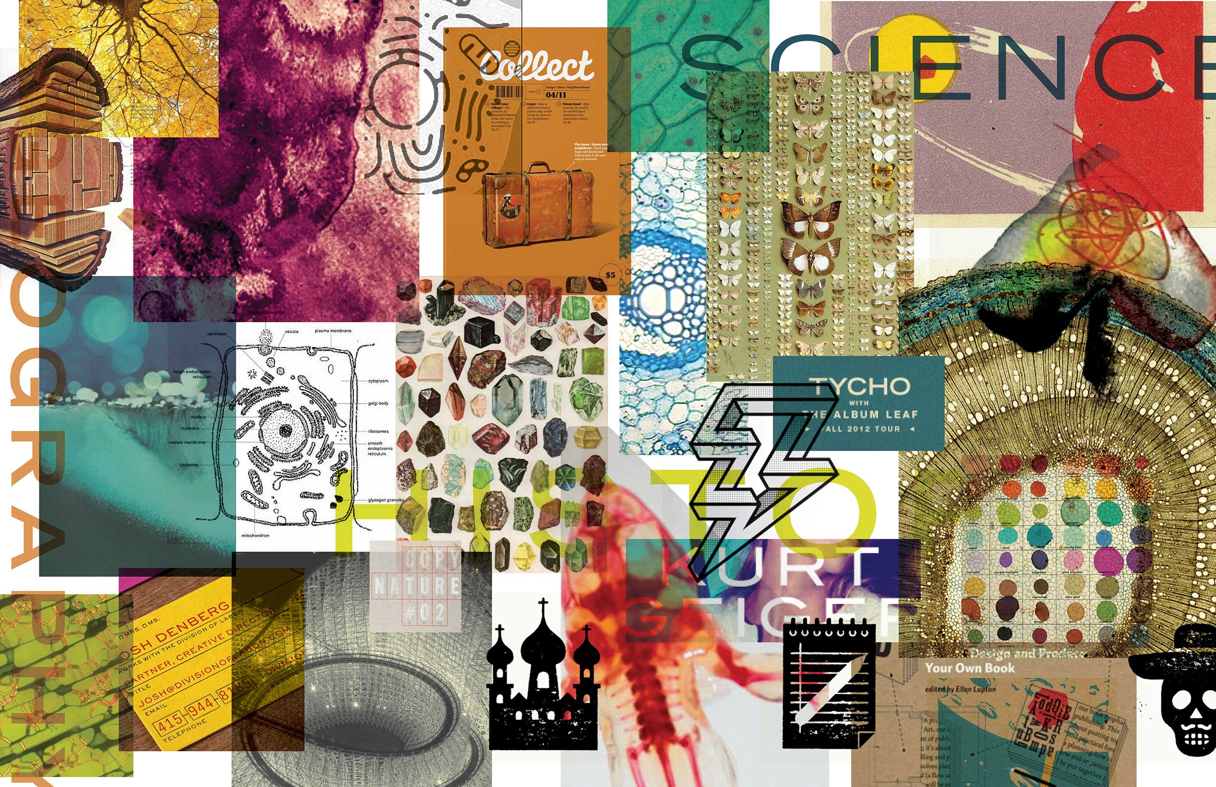
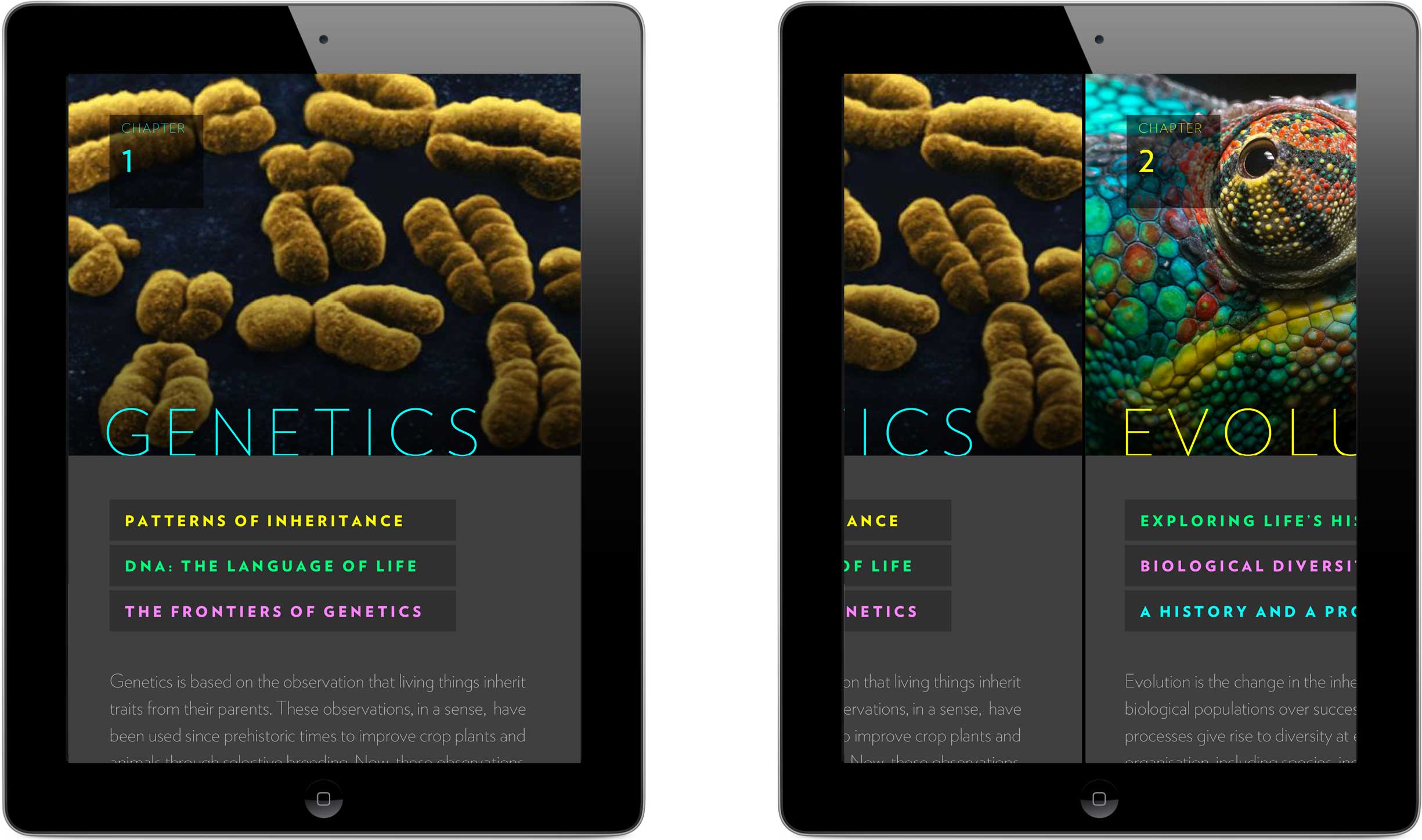
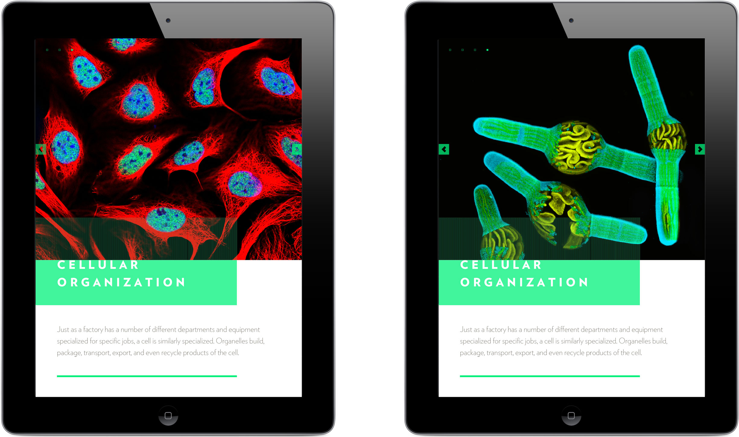
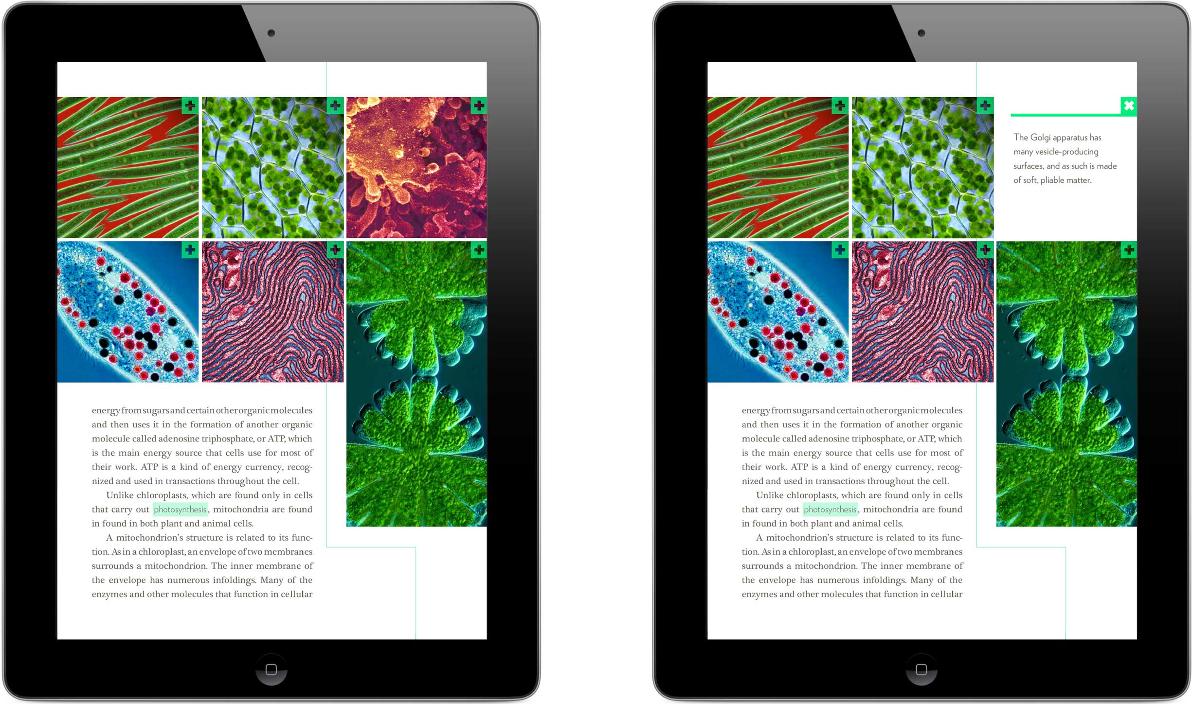
Photos featuring bold colors and varying textures appealed to me for the energy they conveyed; their zoomed-in subject matter and uncommon camera angles suggested new outlooks on our seemingly familiar world.
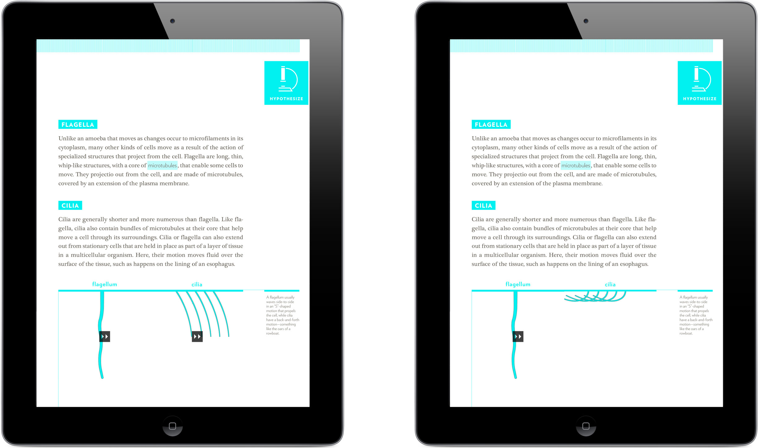
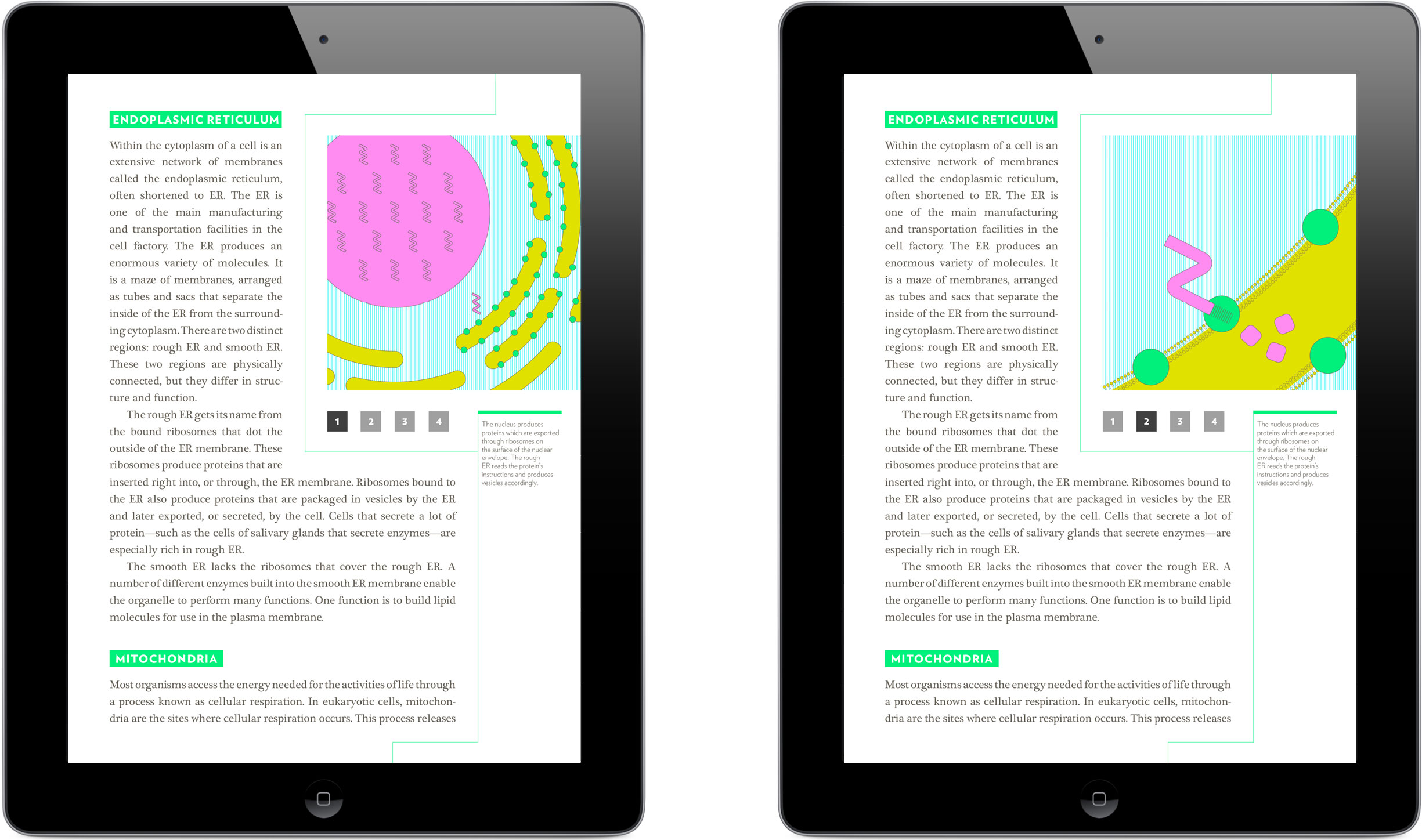
I used Adobe InDesign’s Digital Publishing Suite to design and export my book chapter, taking advantage of the technology to bring my illustrations to life with interaction. Some single-celled organisms use small hair-like structures called cilia to navigate their environment; this movement-centric concept seemed to beg to be animated in some way. I decided to build the motion of these cilia into a flipbook-like module that the user could flick through.
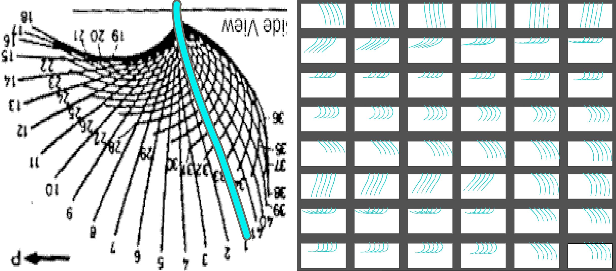
I was fortunate enough to find a diagram mapping out the motion of a single cilium, step-by-step. I traced each of its phases to an individual artboard before exporting as a series of images, uploading to InDesign, and creating the flipbook interaction.
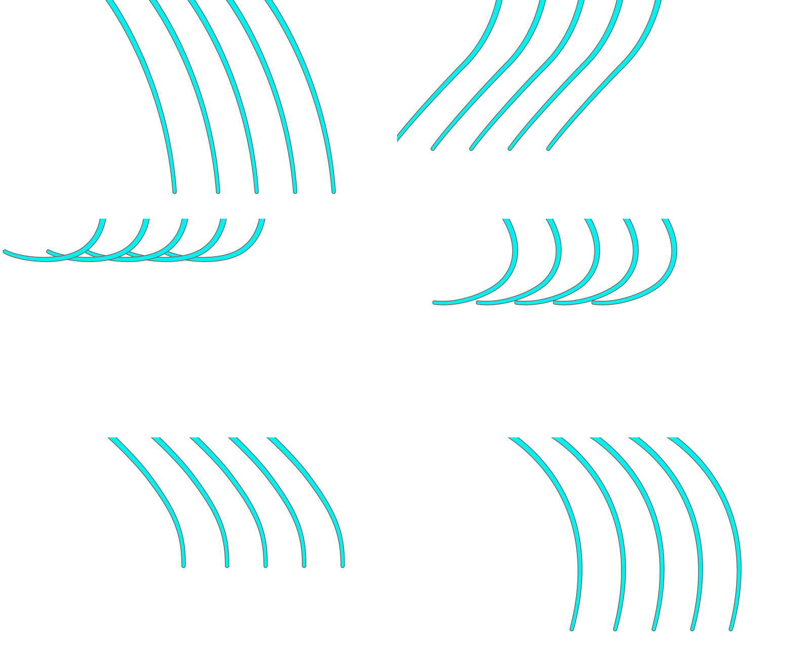
The speed of the user’s swipe controls the rate at which the flipbook frames animate: a fast flick reveals cilia’s efficiency and elegance as a biological device for movement, while a slower drag of the finger affords the opportunity to more closely study the motion’s mechanics.
After designing each interactive element for my book chapter, I identified the tablet gestures they necessitated from the user, and explored how to visually indicate which gesture was required where. I wanted each action to be clear, but also for the icons’ styles to fit together cohesively.
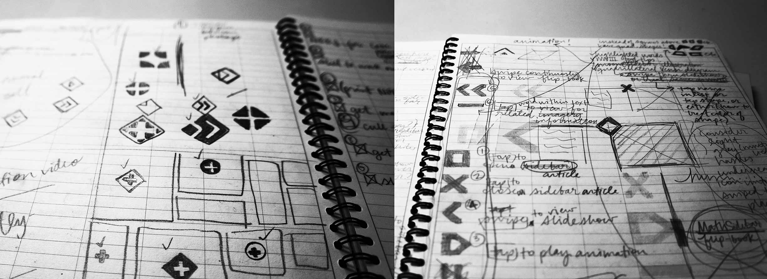
My first phase for creating anything involves what I call “drawing for divergence”: I sketch ideas with a focus on quantity, attempting to explore as many differing directions as I can.
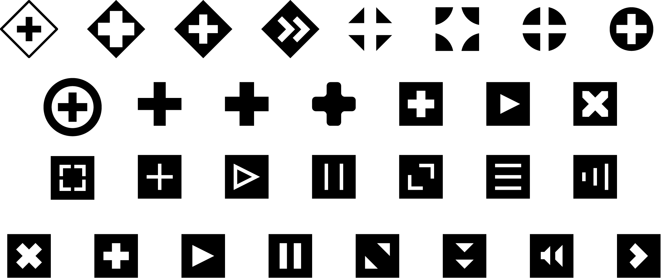
When I move from paper to computer, I filter out less feasible ideas and eventually converge on a decisive direction. The icons on the bottom row made the final cut, in part because they were most readable when overlaid on their busy backgrounds of photos and illustrations.
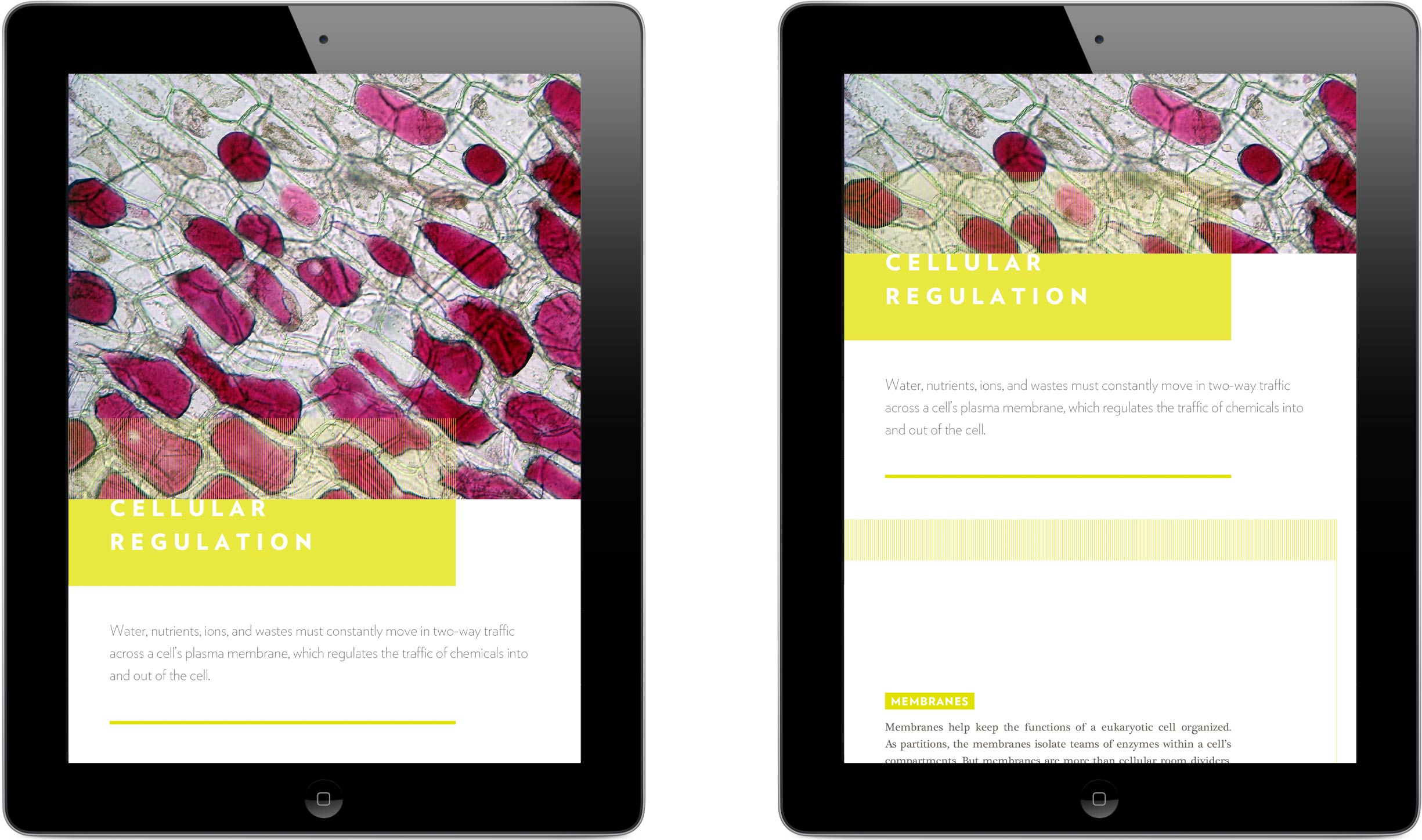
I developed and relied on a strong grid system, type scale, and color palette to keep the various elements of my design cohesive and structured.
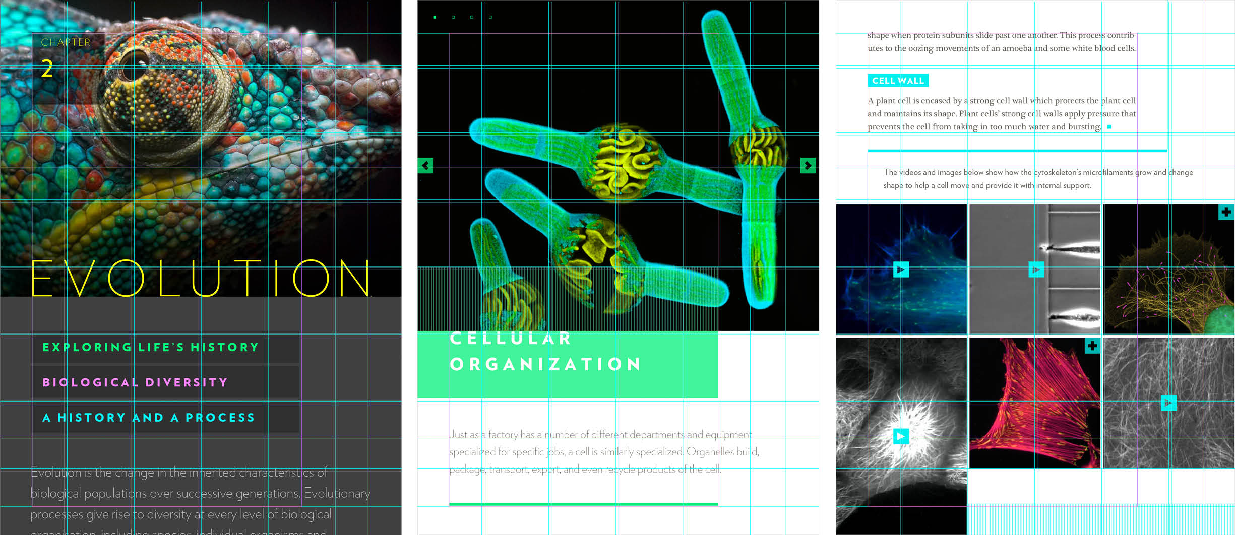
I used two overlapping grids to account for both imagery (the aqua lines) and body copy (a purple box offset to the left).
Outcomes
Biology is, at its very essence, the study of life. My awareness and appreciation of this informed not only my book’s title, but also its imagery, interactions, and visual style. Life grows, adapts, changes, and moves; such a stimulating subject matter practically implored me to present it vibrantly and vigorously.
A biology textbook designed for a tablet, The Study of Life enlightens high school students through a range of approaches including stories, interviews with professionals in the field, interactive diagrams, and videos.
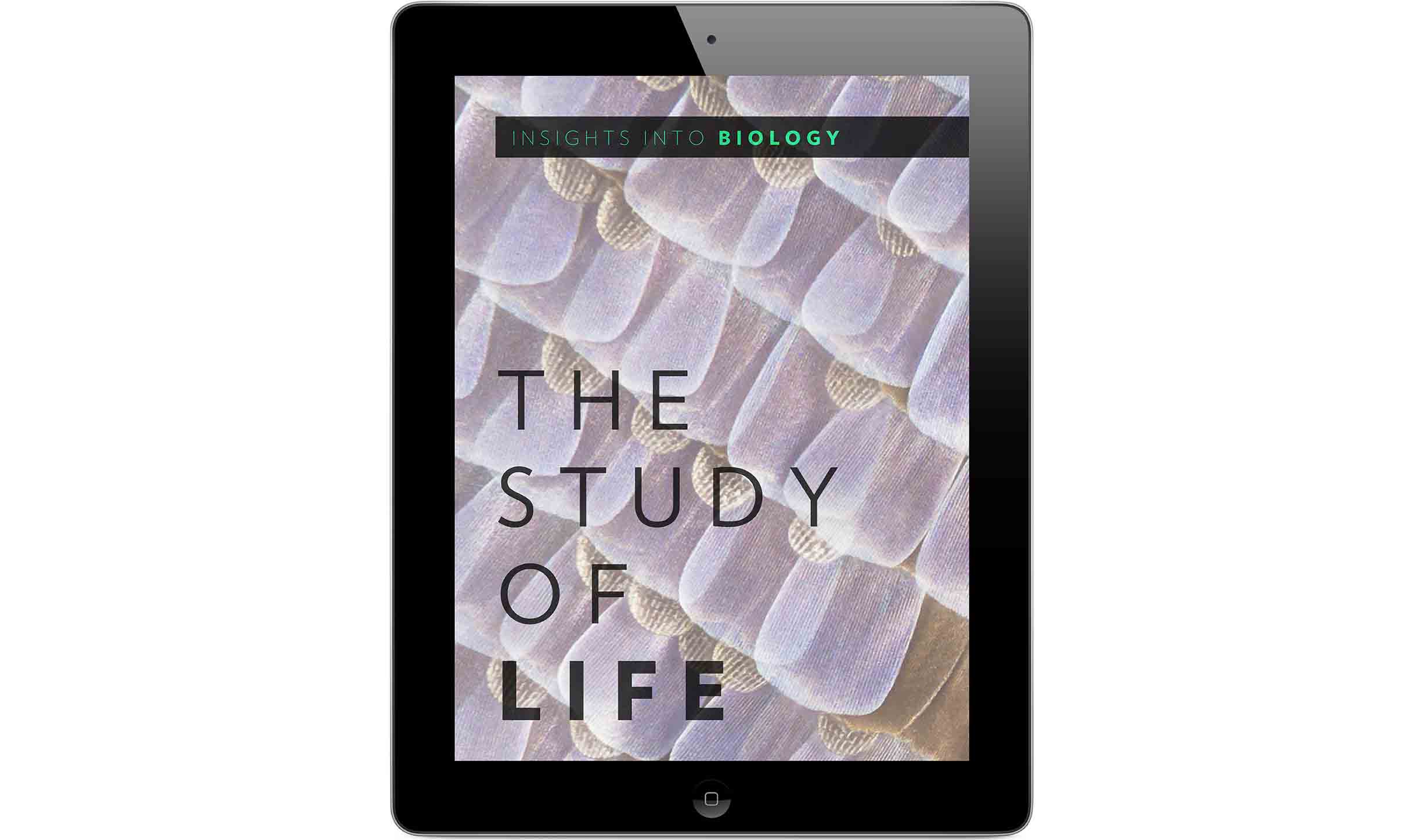
When explained effectively, biology becomes a topic that everyone can relate to, as it reveals insights into every bit of the world around us. The butterfly wing on the cover exemplifies how a seemingly simple subject can reveal delightful details when examined more closely.
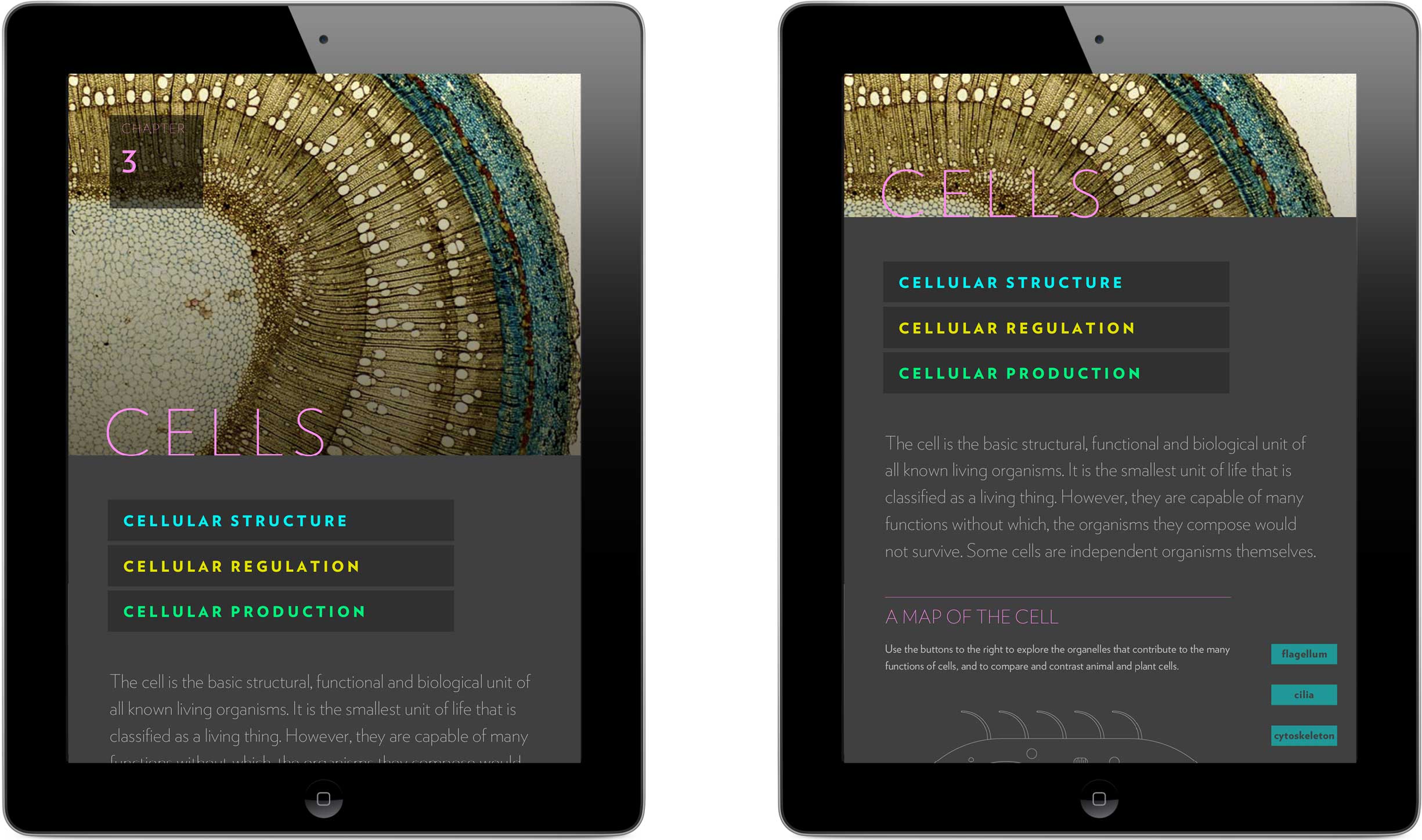
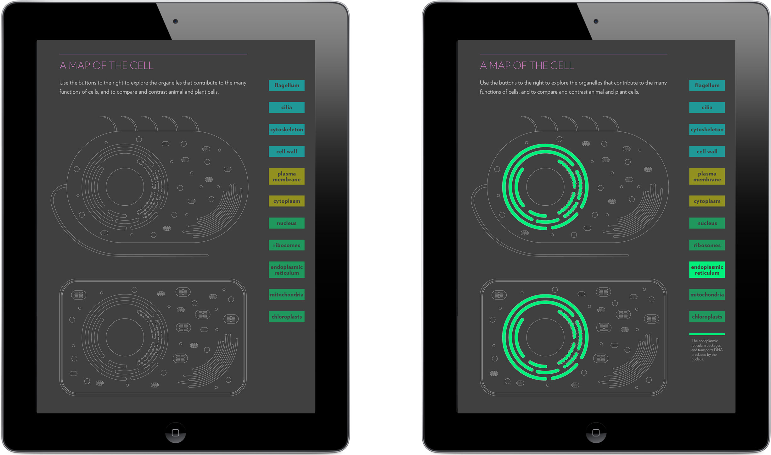
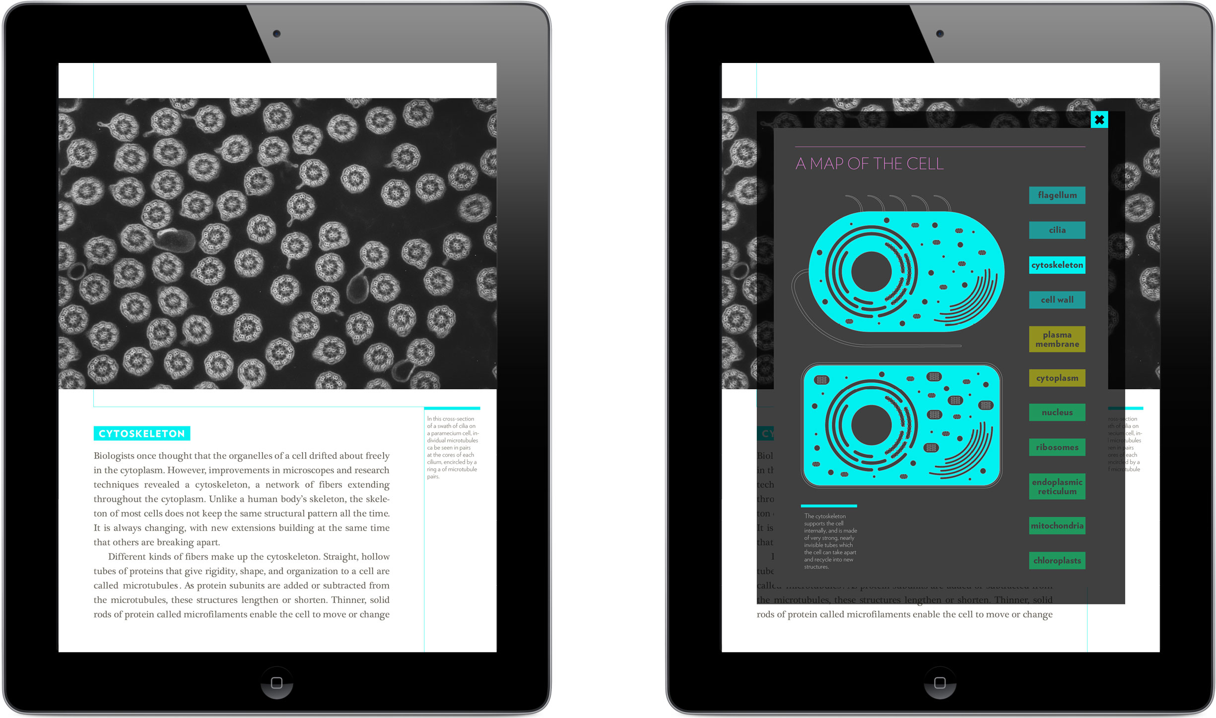
I structured the text to act as a tour of the cell, its concepts tangibly rooted in and organized by the responsibilities and functions managed by each of the cell’s organelles. An interactive map of the cell allows students to see how the next idea they’ll be learning fits into the bigger picture of the cell and its systems as a whole.
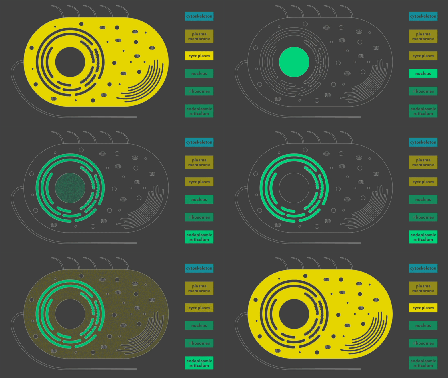
Readers can open the cell map from any section of text to see the associated anatomical component highlighted and can interact with the map’s legend to explore other organelles.
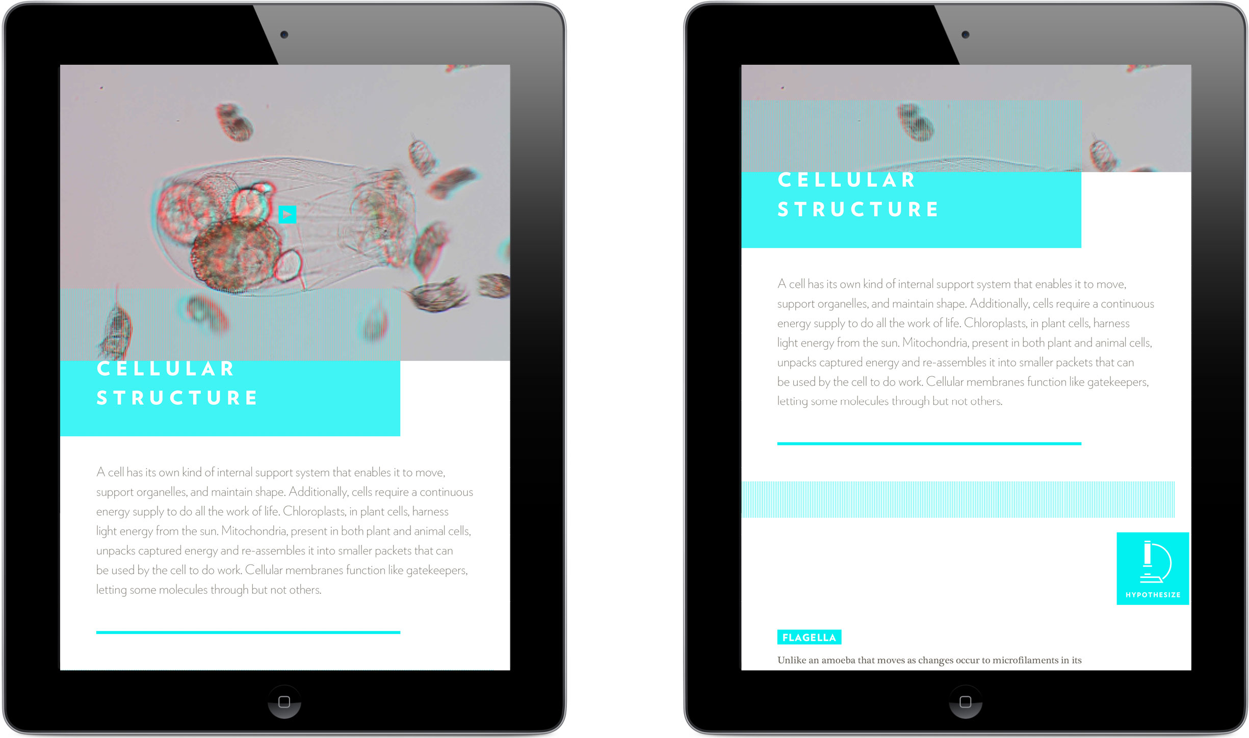
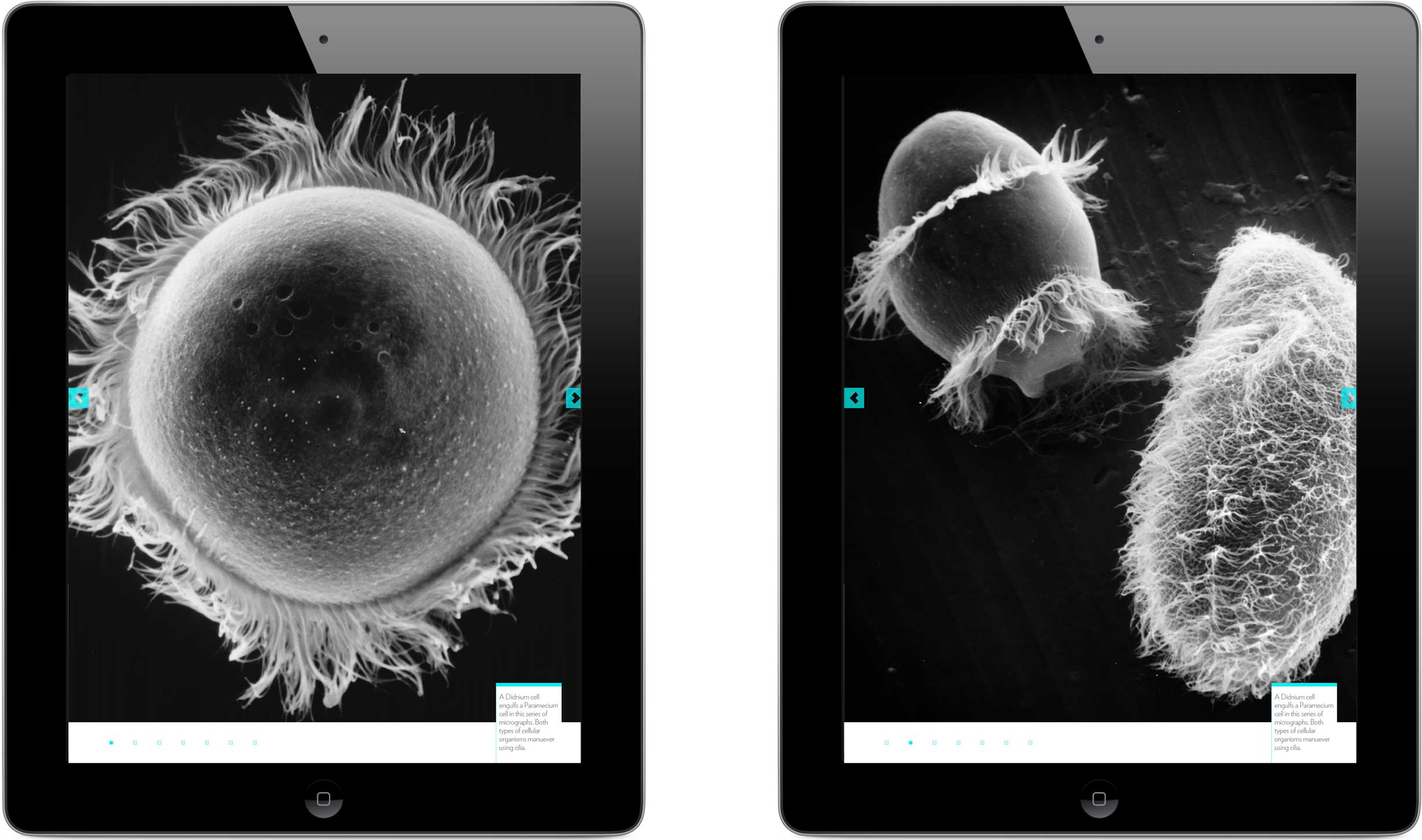
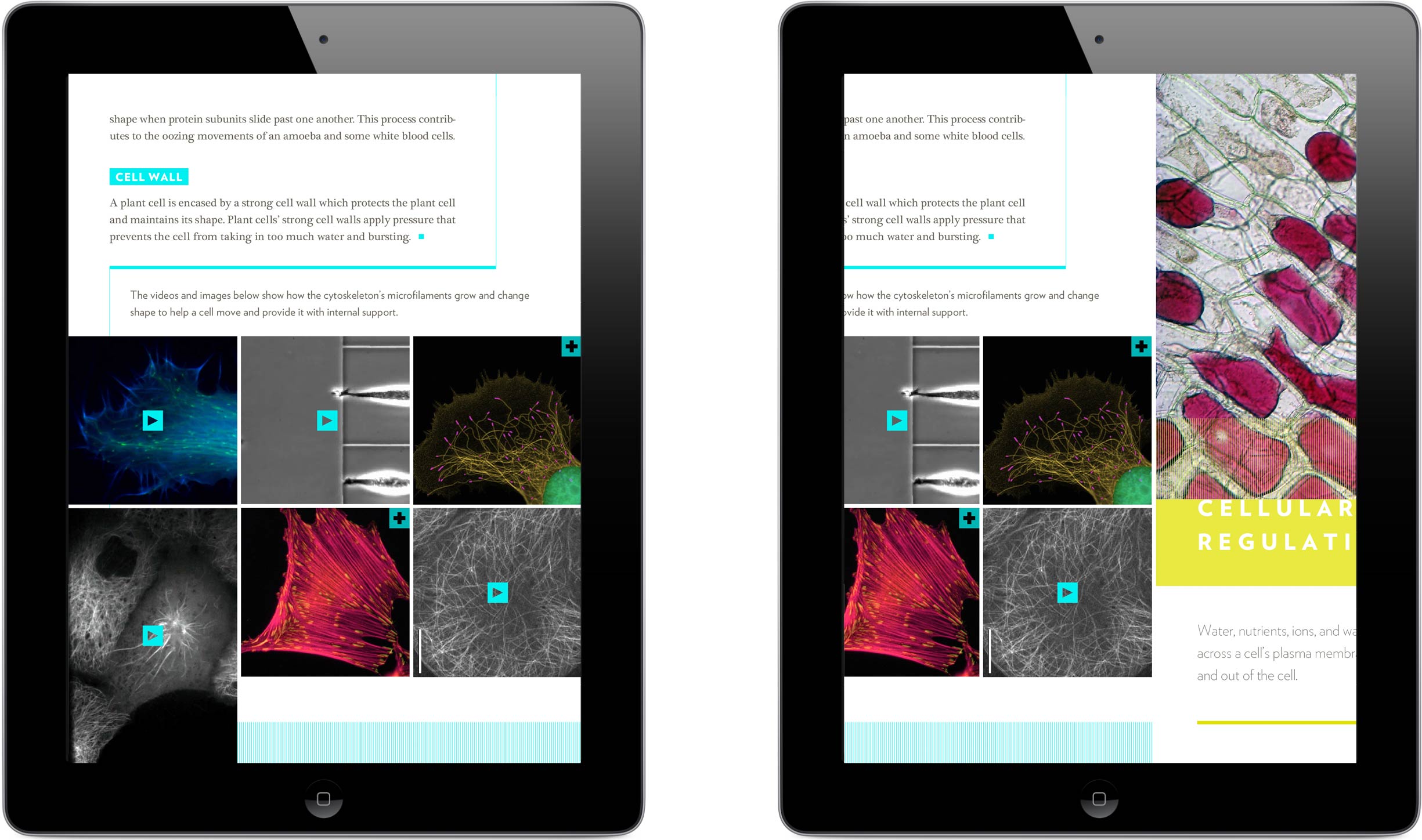
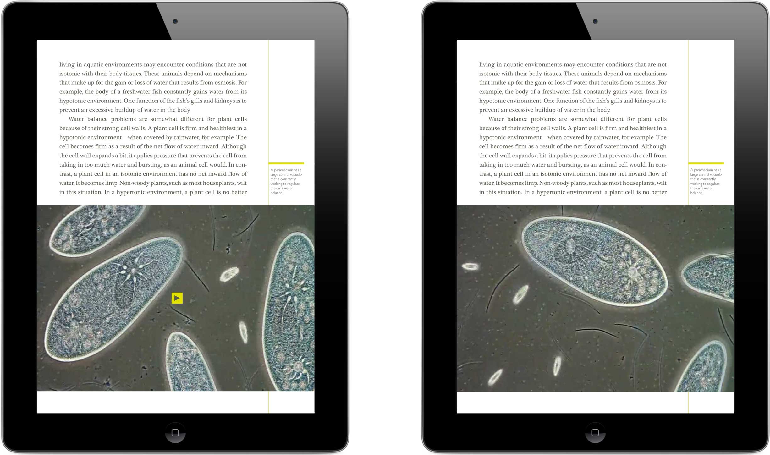
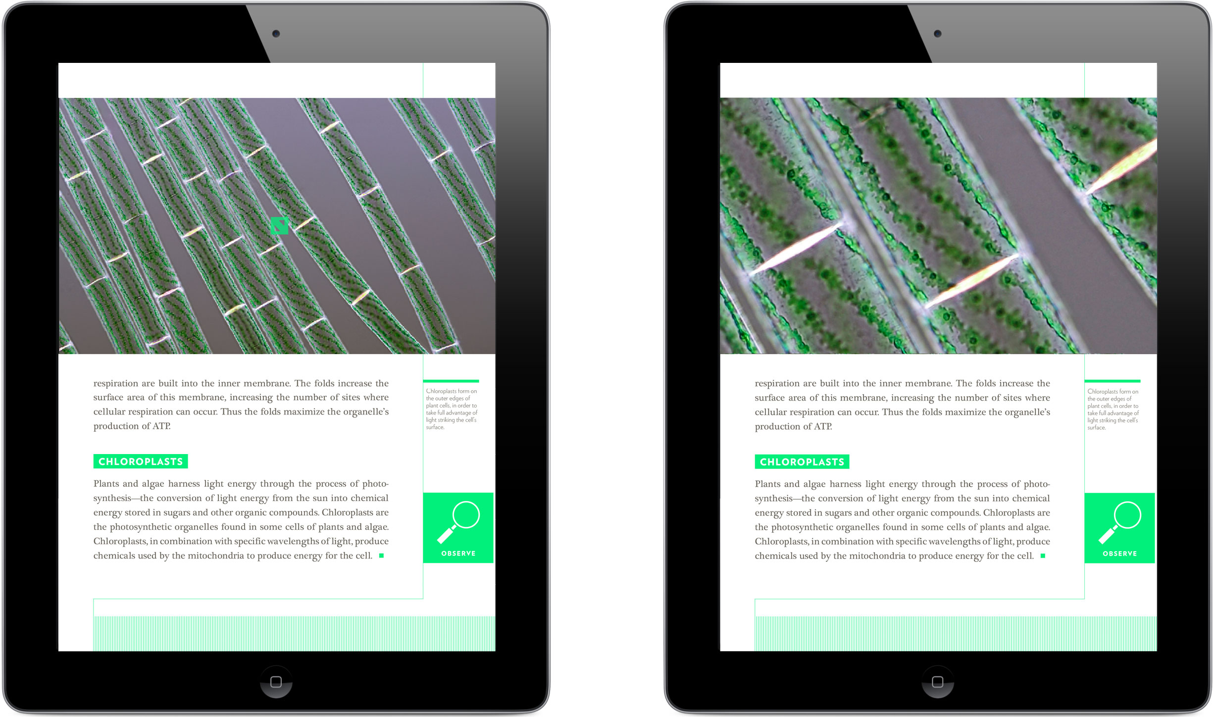
I chose high-resolution photos whenever I could, building in pan-and-zoom functionalities to mimic the operations of a microscope.
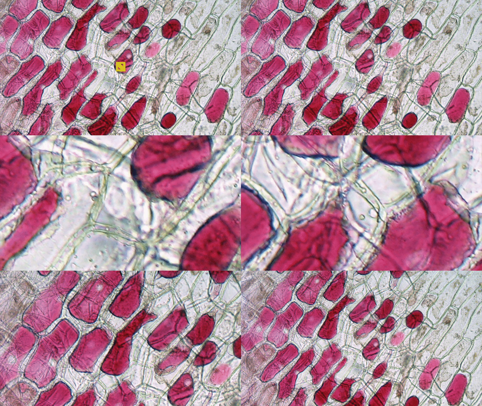
In addition to its convenience and portability, the iPad-as-microscope holds another advantage over its analog counterpart, in its virtual inability to self-destructively crush a glass slide cover slip beneath a fragile and exorbitantly priced lens … no need to keep track of the coarse- versus fine-focus knobs anymore! (Please note that this does not preclude the iPad screen itself from breaking if dropped.)
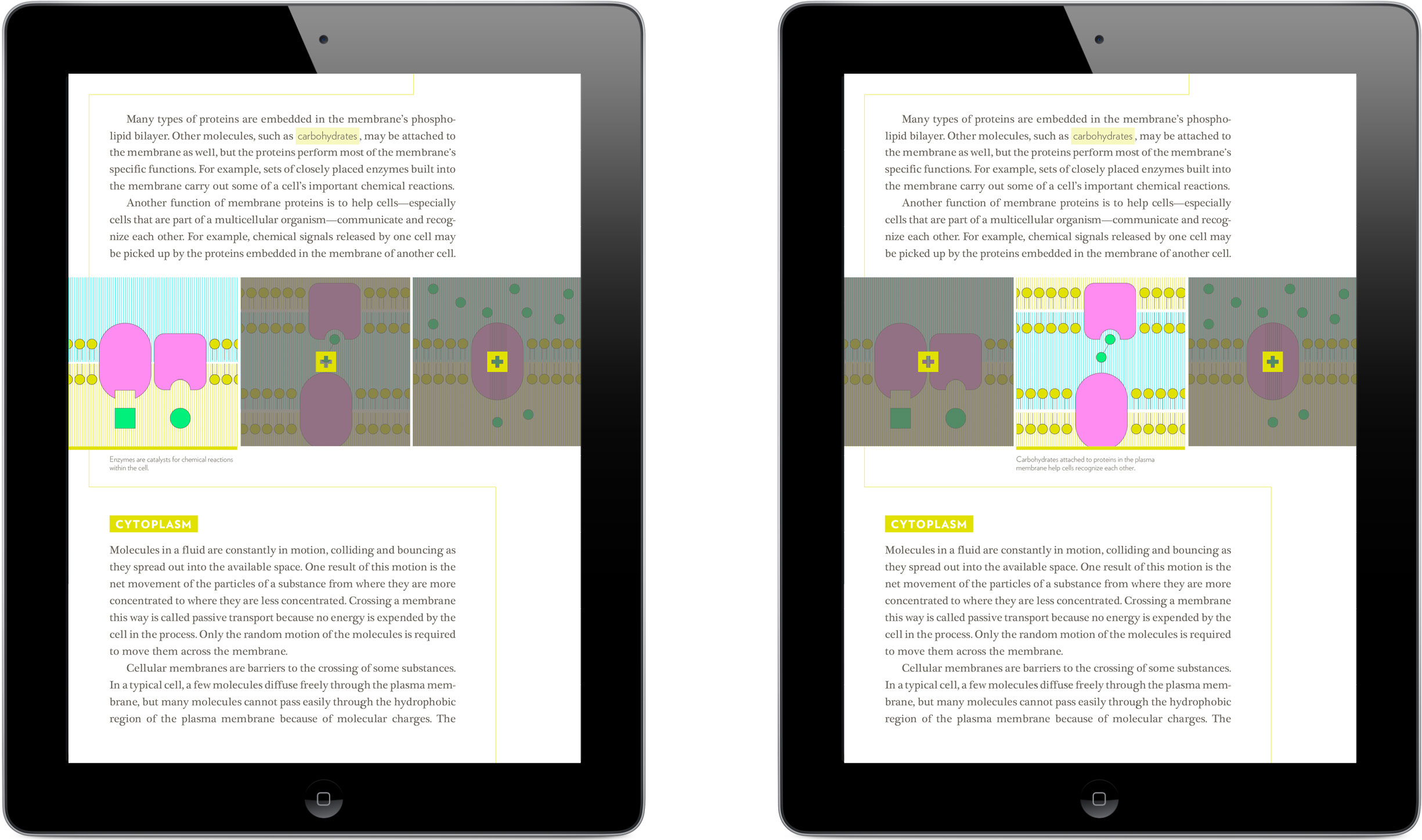
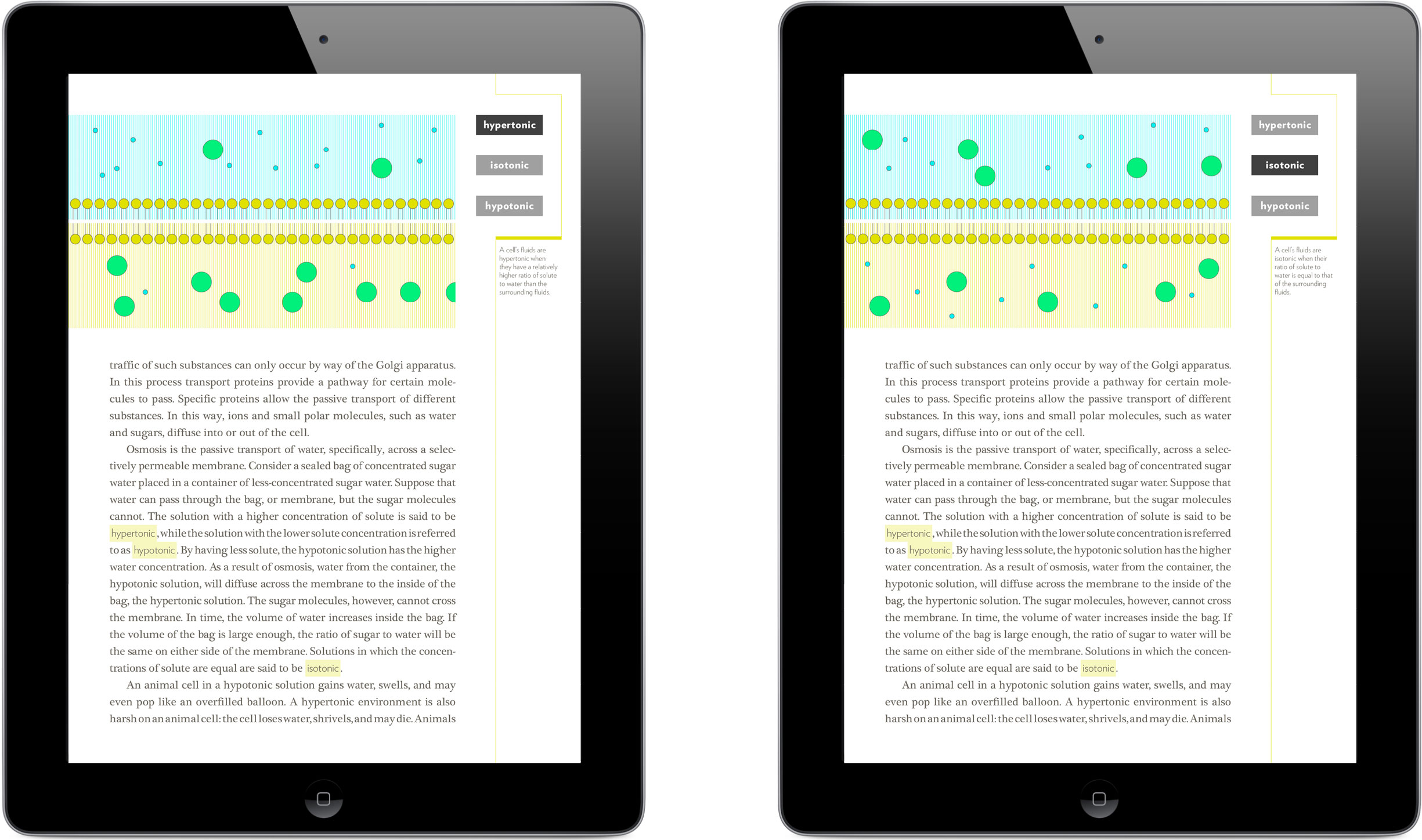
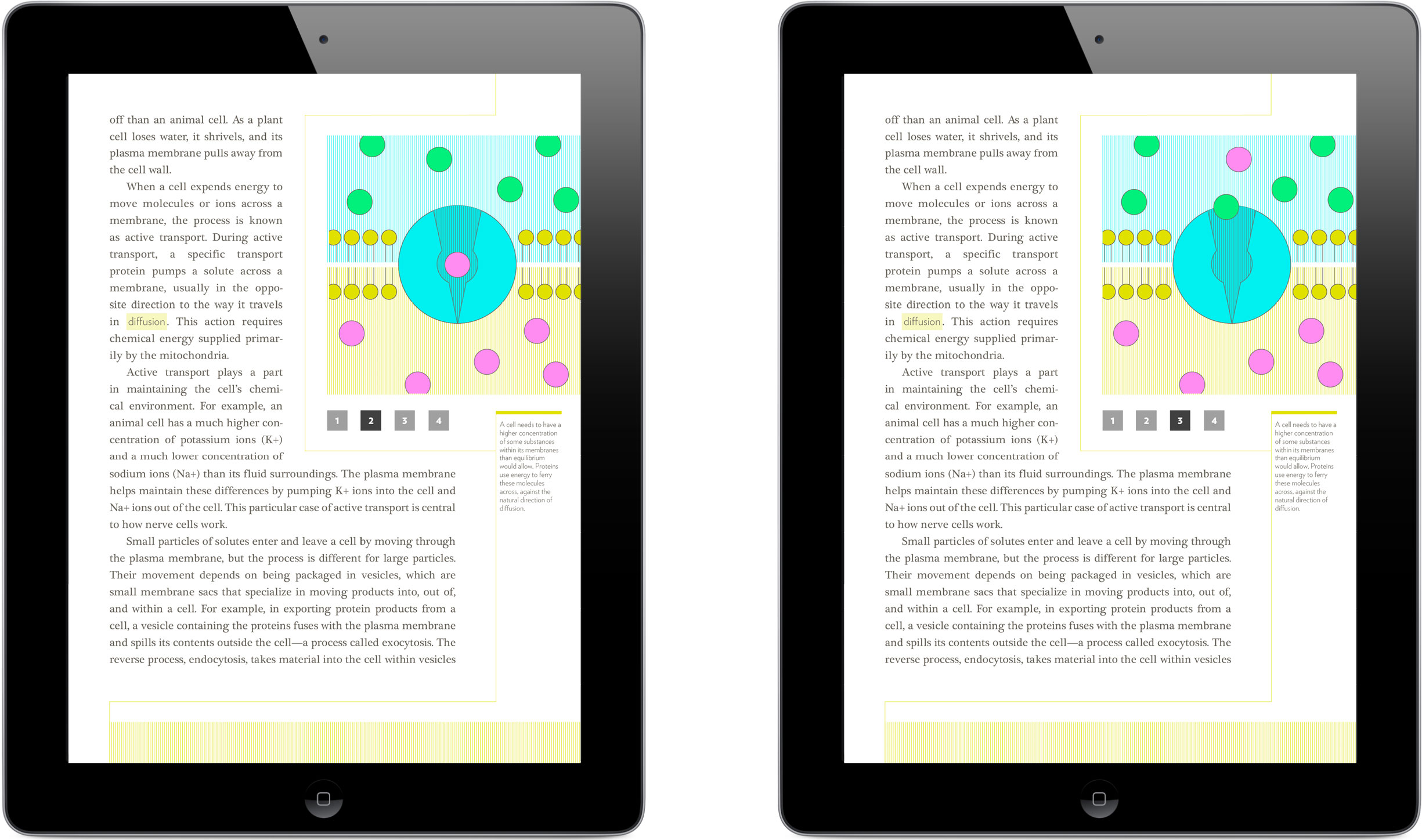
Several cell-related concepts, such as osmosis and protein transport, were too abstract or even imperceptibly microscopic to benefit from found photography. In these cases I created step-by-step illustrations, giving the user the control to move through each stage at their own pace.
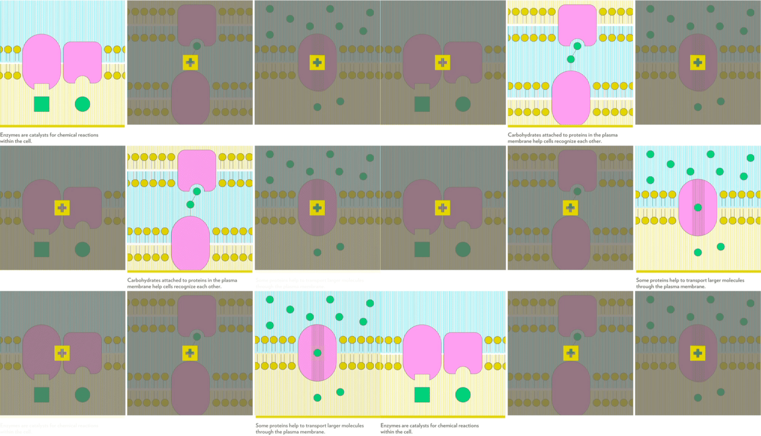
These illustrations portray three distinct functions of phospholipid-embedded proteins.
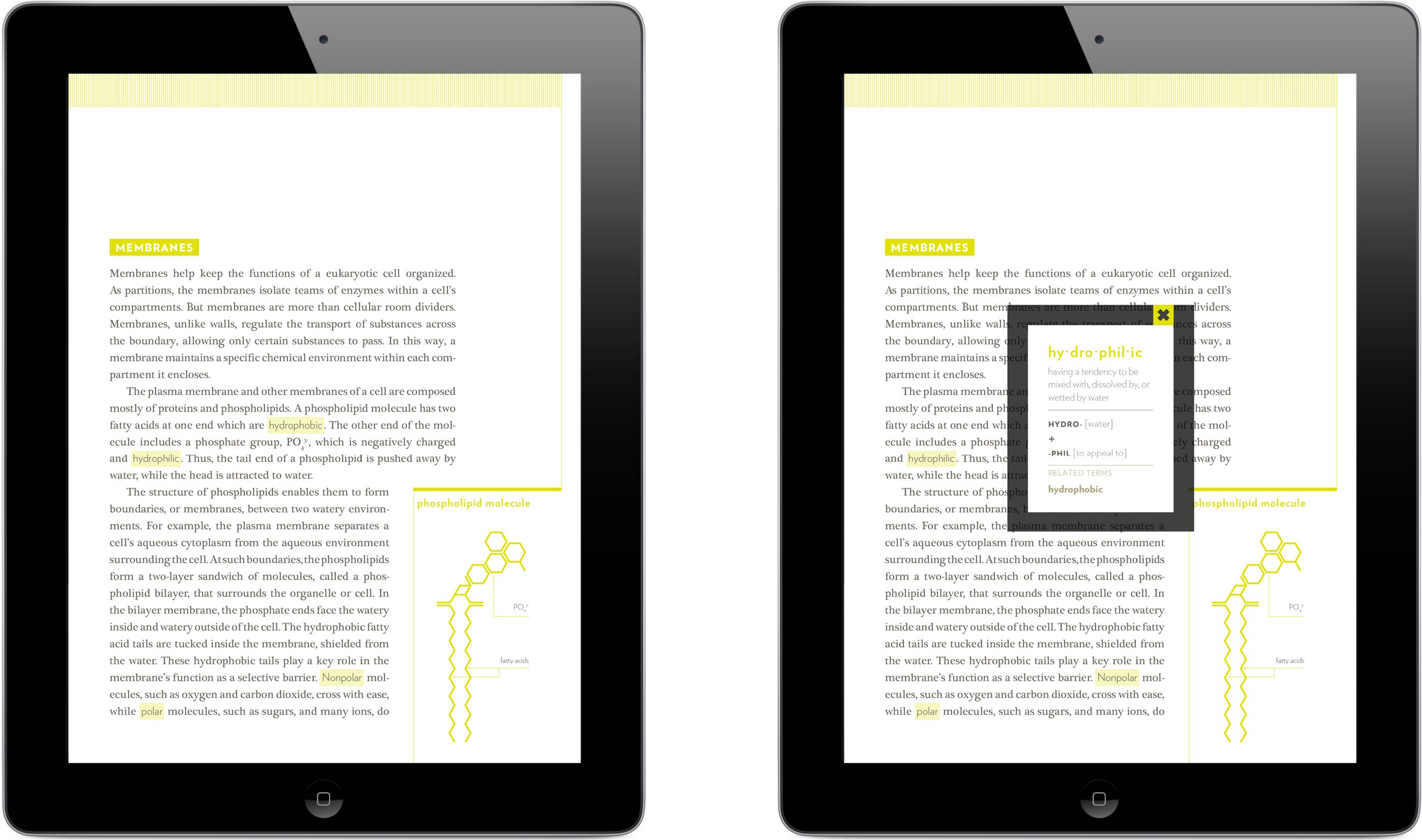
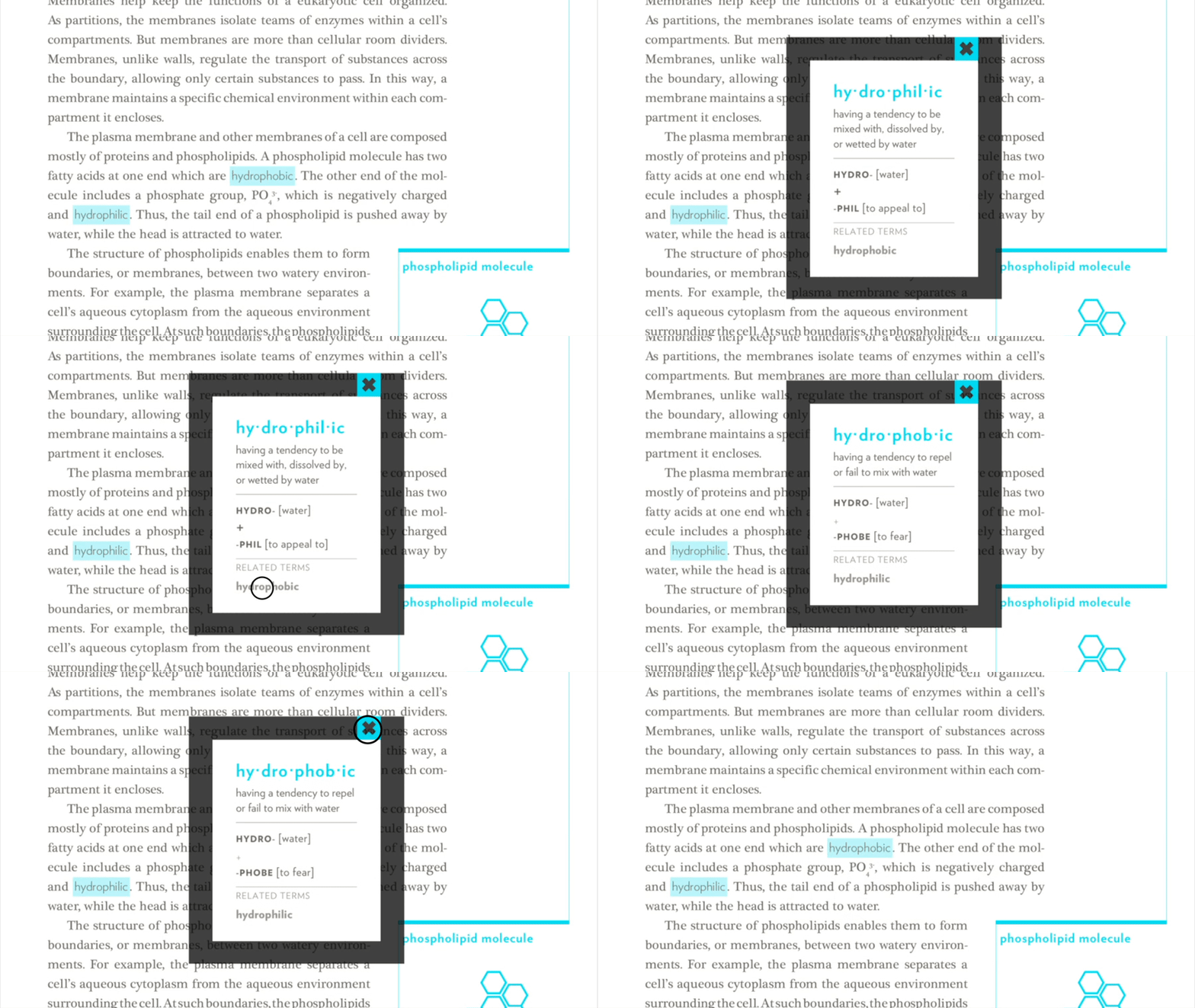
Unfamiliar, multisyllabic terms give any reader pause. Rather than break the flow of reading to look up vocabulary, students can tap on the word in question to open its definition. The root parts and related terms appear as well, to help students develop an understanding of similar words on their own over time.
A complete education enables students to understand how the content they’re taught applies to the bigger picture of their lives, and the world. The icons below can be found throughout The Study of Life, linking to a range of mediums that explore the main lesson from real-world perspectives.

ASPIRE Students can listen to interviews with professionals from various industries such as medicine, life sciences, and ecology, to develop a more comprehensive picture of possible careers in the science sector.
INVESTIGATE Knowledge is never static. The latest findings from scientific journals are introduced here—and in theory, could be updated regularly—adding depth and context to the curriculum.
EXAMINE Observable wonders of the natural world are everywhere: did you know a chicken egg is considered a single cell by most scientists? The Study of Life presents this assertion in detail, and explores other instances of perceptible science in the everyday world.
EXPERIMENT Digital tablets are portable and easy to use, making them the perfect lab partner. These recipe-like experiments walk students through each step with images and straight-forward instructions.
Live + learn
- Nearly all of the opportunities I chose to explore for this project were based on my own past experience as a textbook-laden biology student. The visual design program I was in at the time didn’t place any emphasis on research, and focused primarily on visual outcomes. But after having worked as an interaction and UX designer in the software industry for a while, I’ve developed a huge respect for and reliance on user research. I’d love to have tested this design and other iterations with real students. Short of that, developing a domain understanding around learning styles would have helped to inform and validate my designs.
- I love the art of illuminating ideas through illustrations, and wish I could have dedicated more effort to the ones I created for this project. At the same time, I acknowledge that creating over a dozen scientific renderings could have been a capstone project all its own, so in hindsight I wonder if I could have instead incorporated existing illustrations—several impeccable portrayals of the very concepts I sought to communicate accompanied the open-source text I used. An approach like this could have made concepts explained via visuals even more engaging, while allowing me to fully focus on the bigger picture of structuring the information and designing interactions.
