
Watson for Patient Safety IA
Objective: Plan the information architecture (IA) of the Watson for Patient Safety Product, reflected as an IA map
Timeframe: 2-3 weeks
Target users: Case processors and receipt coordinators in the pharmacovigilance space
Role: UX focal
Additional team members: None involved in this IA project
Opportunities
- Breaking down the many possible paths a user might take to complete a case processing task would inform my design team and I in the creation of cohesive, high-level design patterns that worked together to guide our users. An artifact mapping these decision points could help us to develop a holistic awareness of the bigger picture that we’d need to accommodate.
- In the same way, a visual architecture could act as a single point of reference for the design, development, and offering management teams. We’d all have one consistent source to consult which would aid in future, more nuanced decision making around specific features.
Process
When I joined the Watson for Patient Safety team, design and development had already started several months prior. I explored ideas for a number of user scenarios by first mapping out possible flows. While this was important for the design task at hand, it left my solutions feeling isolated from the context of the overall product. A fundamental, structural underpinning seemed to be lacking, making the simple act of determining how a feature fit in with the rest unnecessarily laborious: for every chunk of functionality I attempted to provide designs for, I first had to investigate which other aspects of the overall user flow it affected or interacted with, which often revealed enormous oversights and gaps in the experience.
Some user flows were more complicated than others, and with eight altogether, there was a lot I had to account for.
Starting instead with a holistic framework, encompassing all the microstructures I’d been mapping for each individual design problem, seemed to be an up-front investment that would pay out dividends in the form of more efficient design-decisions, less churn, and increased alignment across the team.
I read up on the practice of information architecture, which I came to define as the organization and presentation of information for efficient comprehension. I felt it would pay off to first focus on the organization end of the spectrum before beginning to refine towards the presentation part.
Establishing an information architecture for WPS proved particularly important, seeing as it was intended to support such a deep, task-based workflow wherein downstream actions were wholly reliant upon their upstream counterparts: without a way to reference these relationships, we ran the risk of missing important dependencies that could invalidate our original designs.
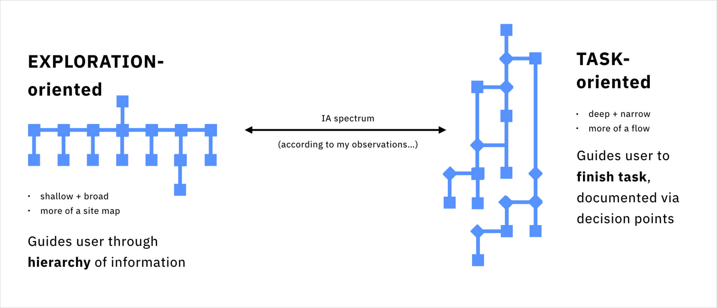
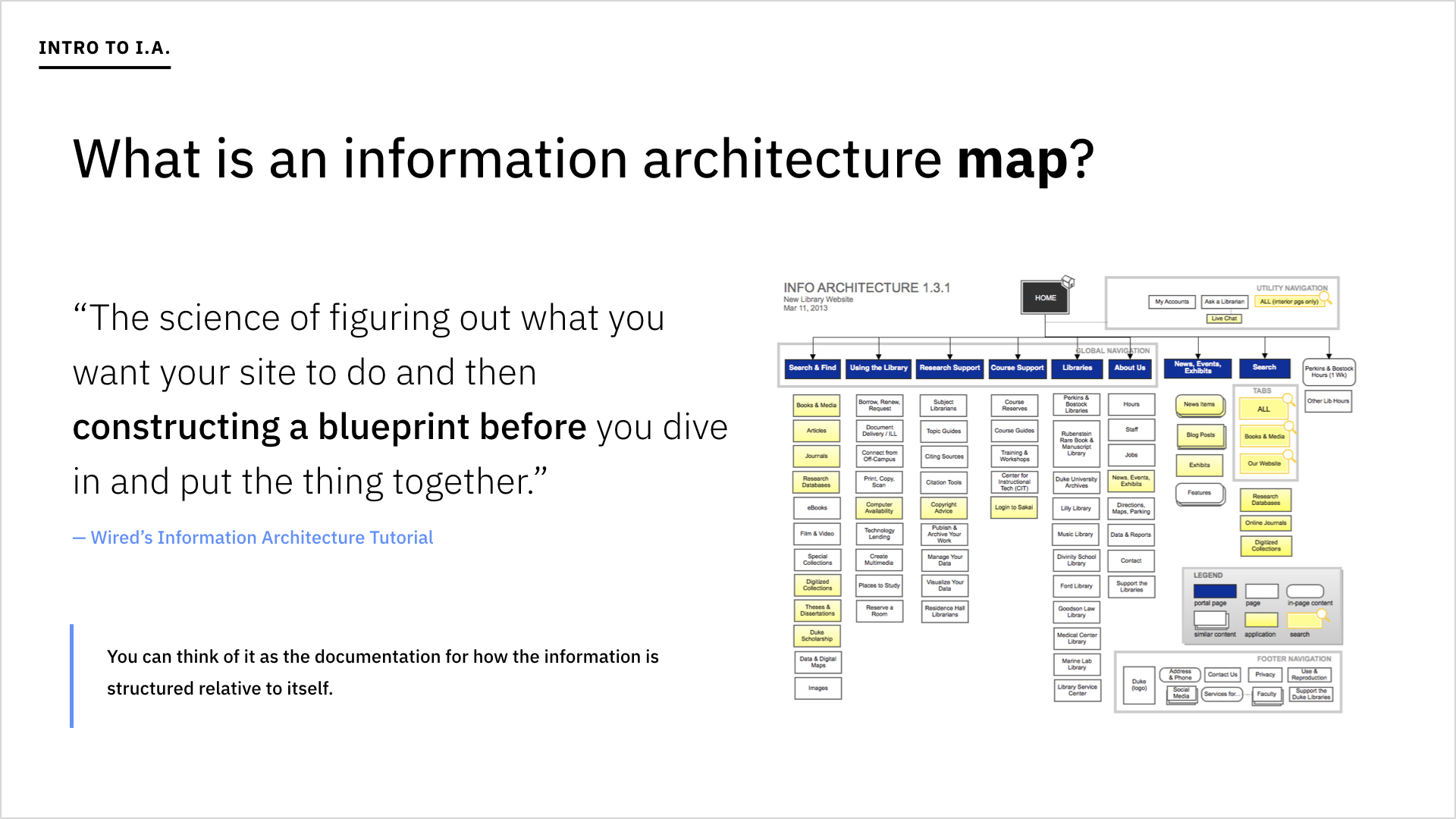
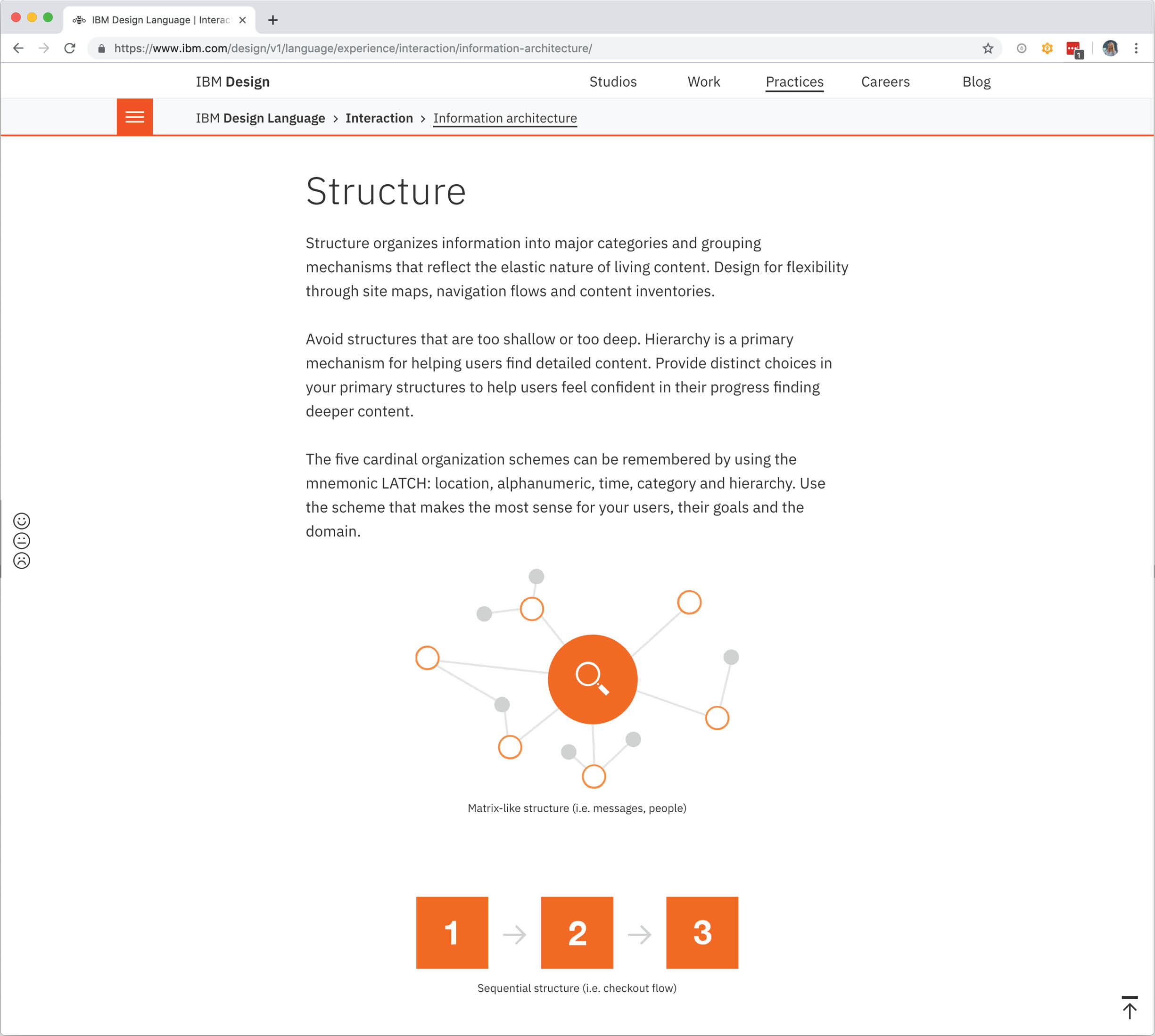
Other tools I’d worked on in Watson Health were much more discovery-centric than task-focused. We’d organized Watson for Drug Discovery’s IA to facilitate exploration, and as such, a high-level structure of its information organization revealed a shallow shape. Watson for Patient Safety, however, would be different, accommodating depth, focus, and cascading decision trees to enable efficient task completion. I created this visual at the end of my information architecture project-tangent, as part of a presentation I delivered to a UX guild in Watson Health.
Since I needed to know how the designs I was working on would fit together into the user’s flow overall, I began by sketching out maps exploring their overlap.
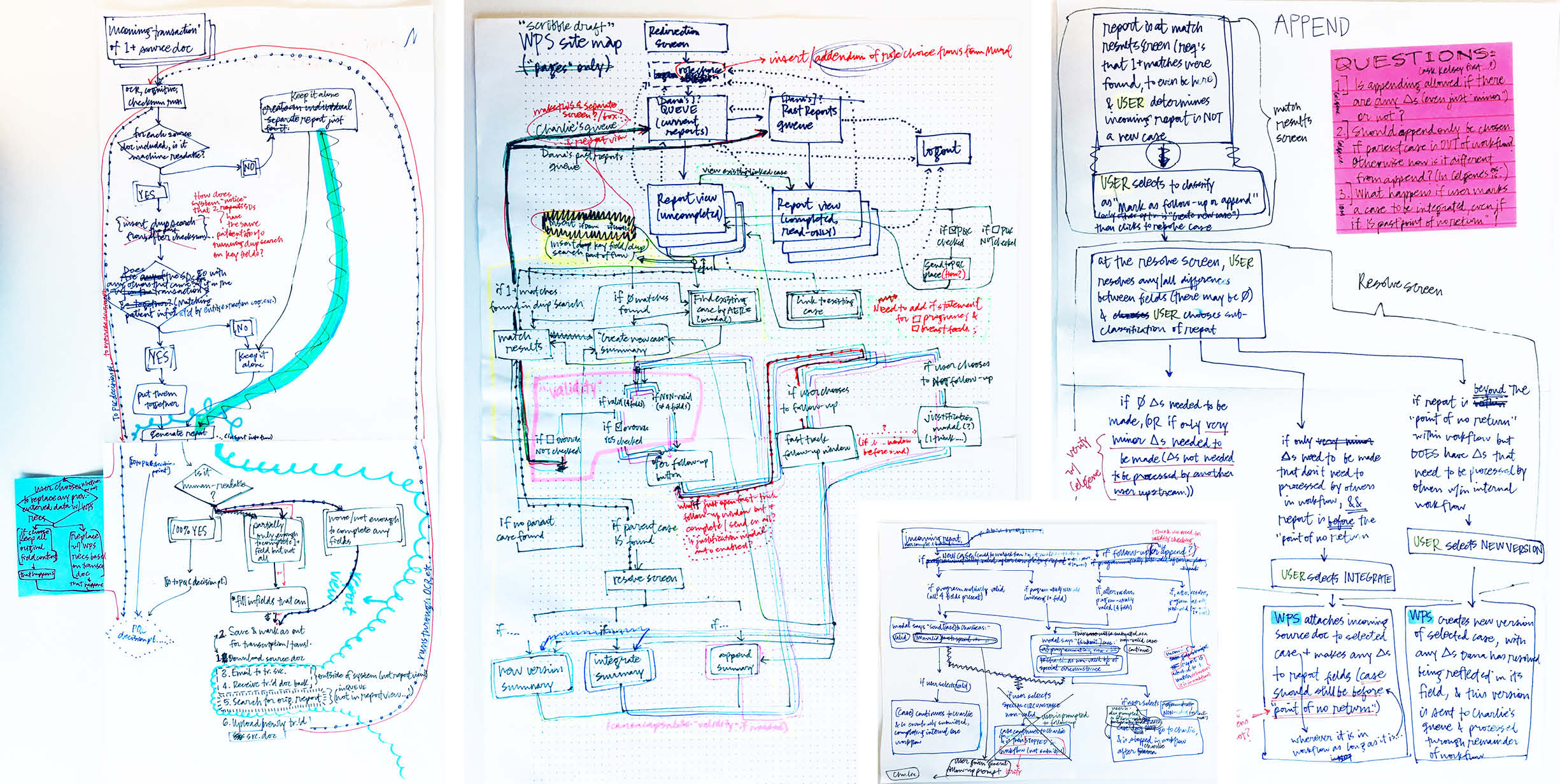
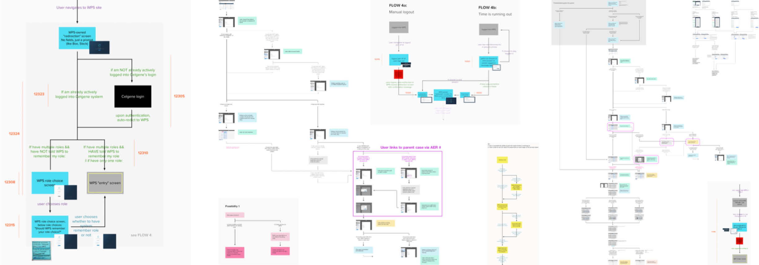
Once I had the structure in a semi-stable state, I brought it into Axure (a tool made for building IA maps). The sum of all my existing, detailed micro-flows proved extensive and difficult to view on a computer screen, so I printed them out on long rolls of paper where I could easily edit them as I grew my understanding of the product as a whole and what had already been designed before I joined. I repeated this process of printing a physical copy, amending it with the help of several colorful writing utensils, and updating Axure at least three times.
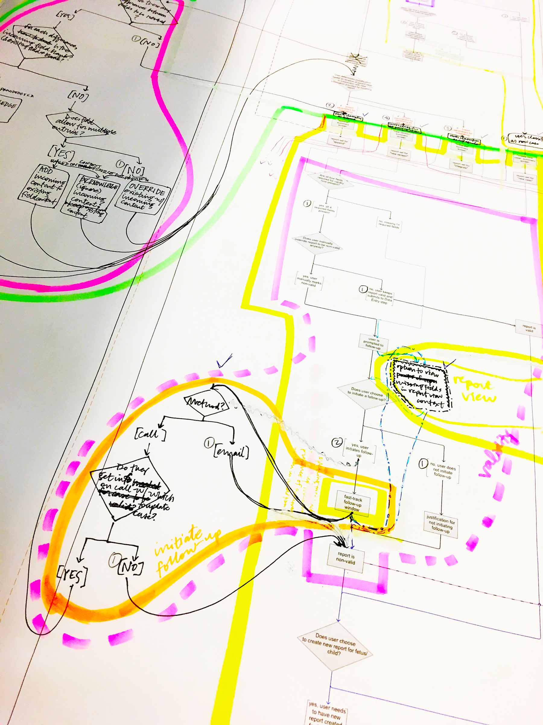
With each printed iteration I built in more detail—and micro-interactions—intending for the map to act as a tool through which to communicate these nuances to our development team.
The act of saving changes to a report is an important aspect of case processing, since it deals with edits to personal health information. As a designer, I needed to ensure that our developers would replicate this important aspect of the interaction experience exactly, so I grew my IA map to include micro-interactions like this, indicating where every possible outcomes leads.
At last, I had one humungous, holistic map of WPS and the touch points between its underlying technology and our users. However, it was undeniably difficult to extract any insights from the extraordinarily convoluted routes making up my enormous map. Ironically, the artifact I’d created to communicate the information architecture suffered from a serious case of information overload.
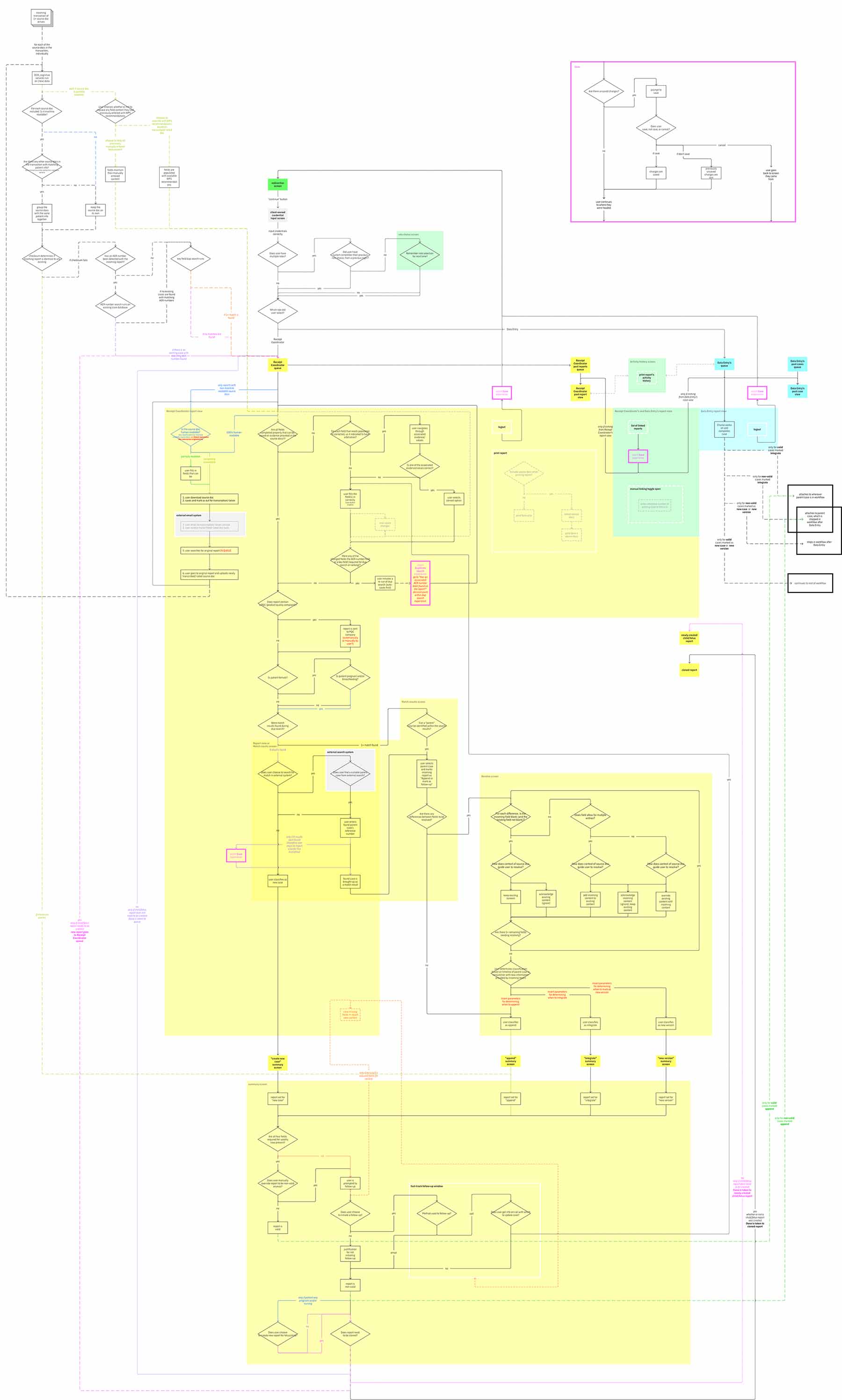
With more than 40 decision points alone, and many more interactions and paths, my map had no hope of accomplishing its intended purpose of inter-team communication and alignment unless it got a makeover.
I took a metaphorical step back (as well as a physical one—to have the whole map in view), and remembered the individual user flows I’d started with. They each explored a problem space specific enough to benefit from micro-interactions; in my comprehensive map, however, these details were mere clutter, and defeated the purpose of my original intent to identify relationships between the chunks of functionality themselves. A “master-map” that created connections between the major points along a user's journey through WPS would be much more practical and useful.
Outcomes
I distilled my initial information (overload) architecture map into a less granular overview that functioned more as a foundation for understanding Watson for Patient Safety from the user’s perspective. Then whenever a team member or collaborator needed more nuanced detail, they could drill down into one of several hyper-specific mini-maps.
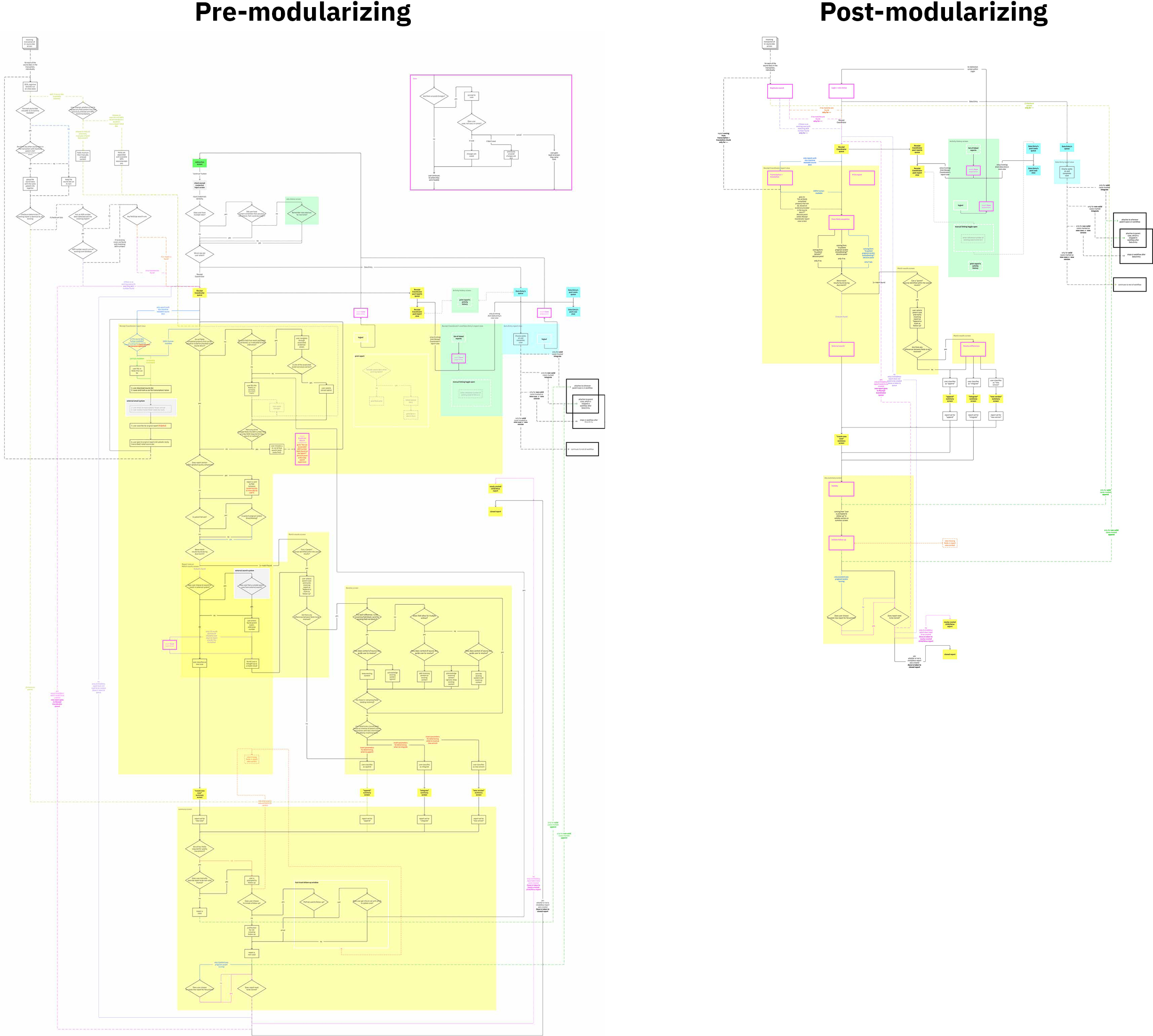
Although I’d worked hard to make my original IA map readable, it was just too detailed. The overhaul removed the detail into separate maps, allowing the master map to function as a higher-level overview.
-
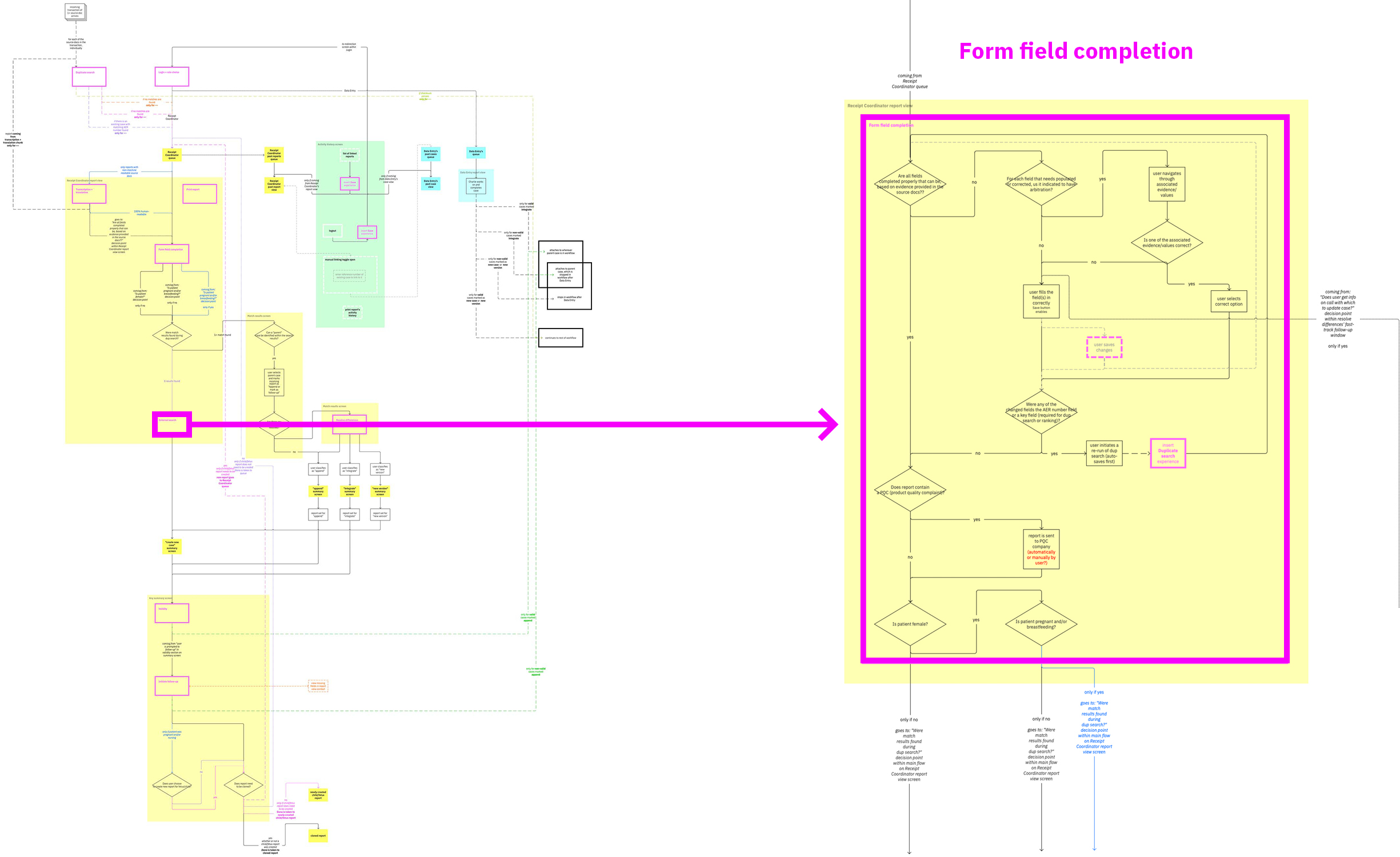
Each pink box within the master map indicates a more detailed map waiting to be drilled into for a deeper view. -
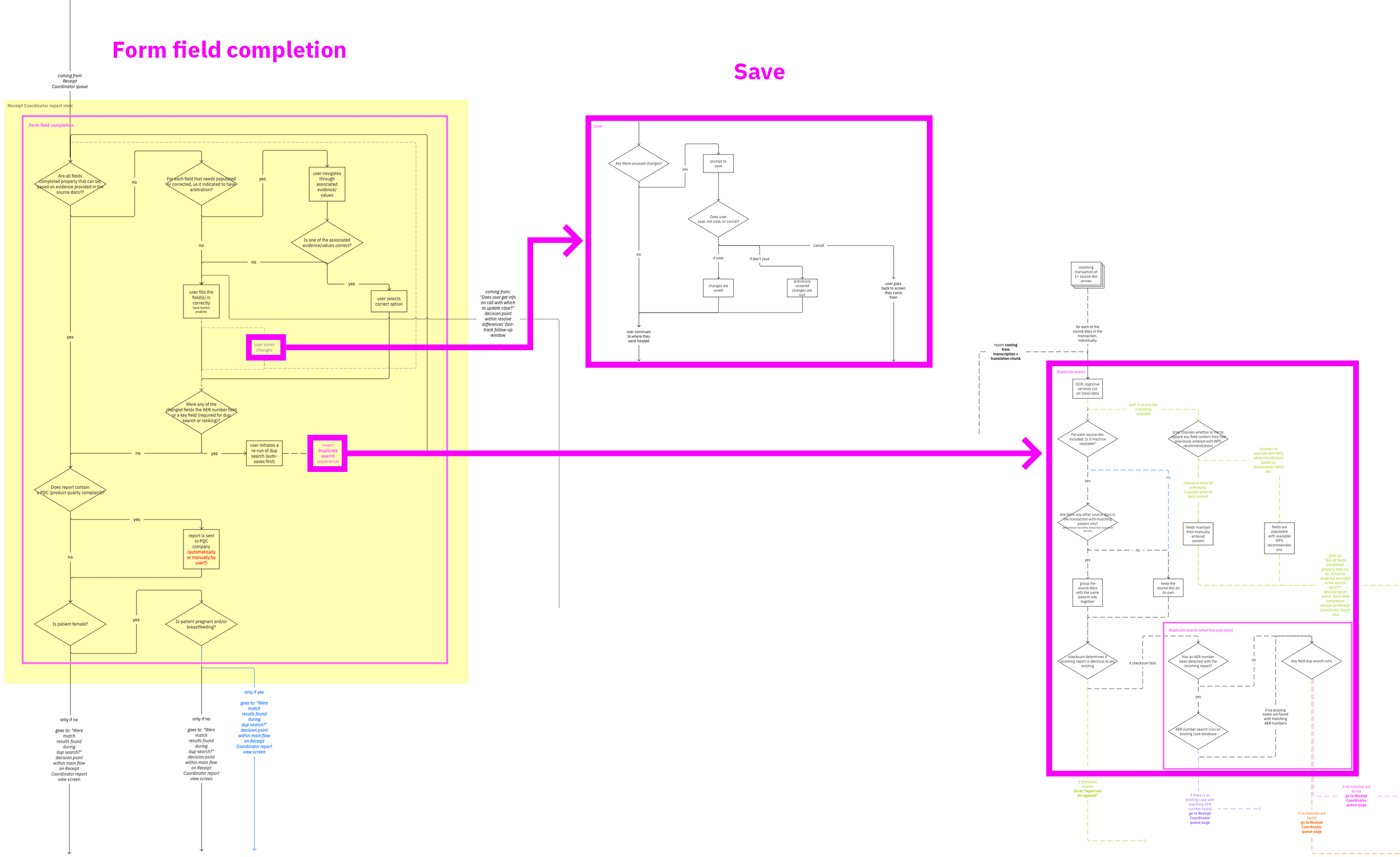
Occasionally, these detailed maps link to an even deeper level of detail themselves. For example, the “save” map is referenced many places in both the master and more detailed maps.
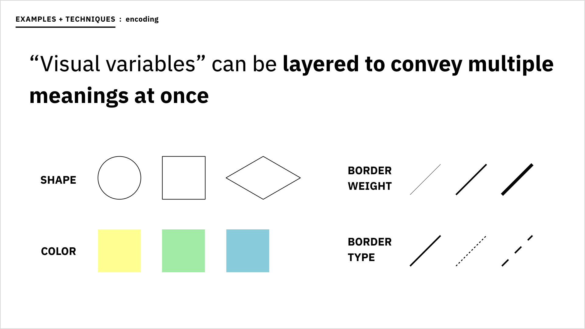
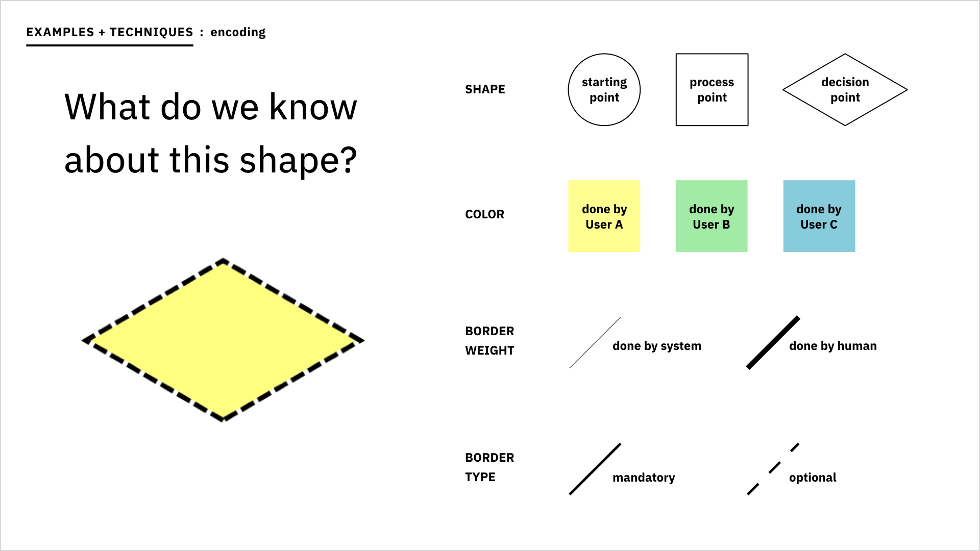
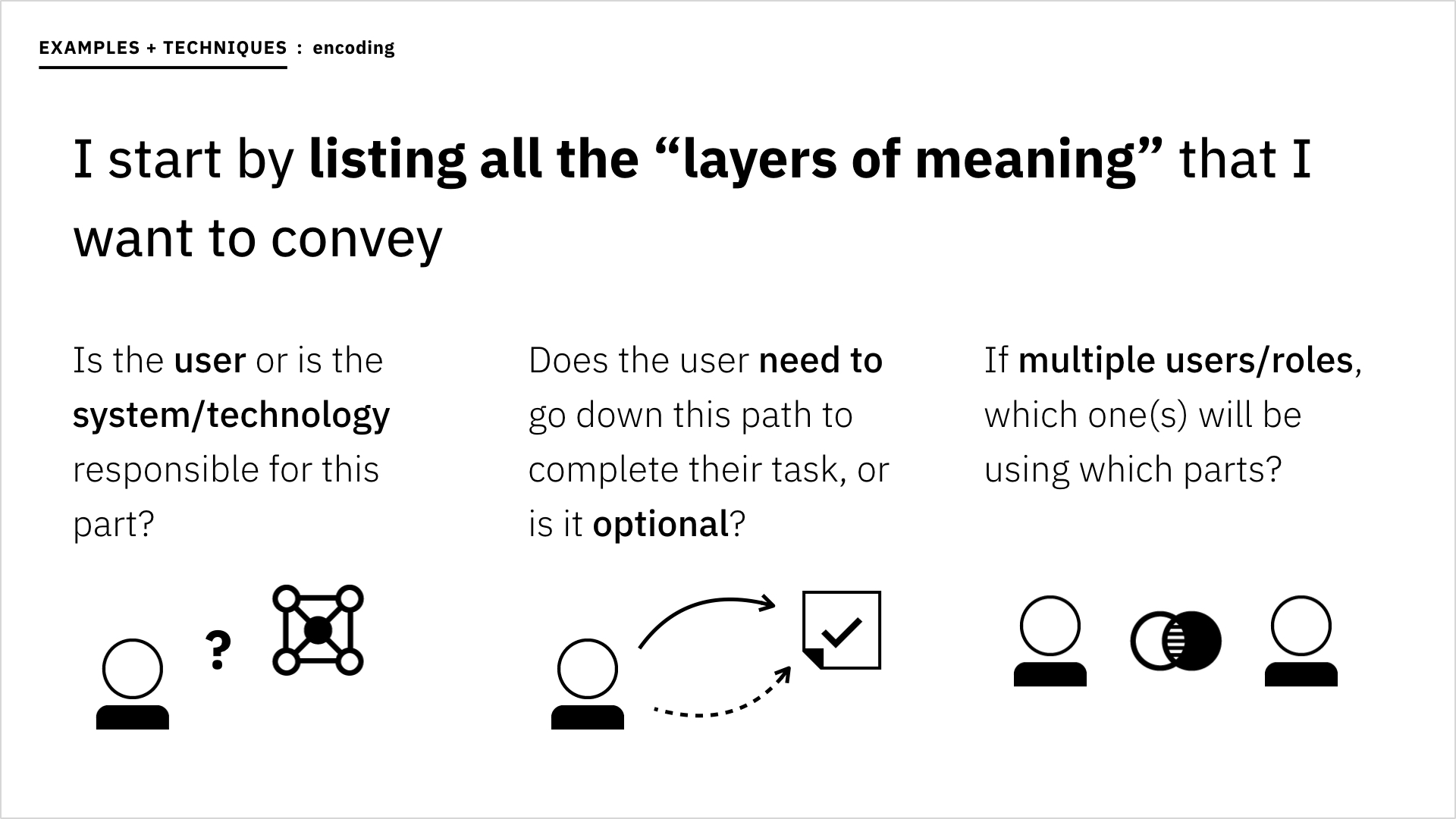
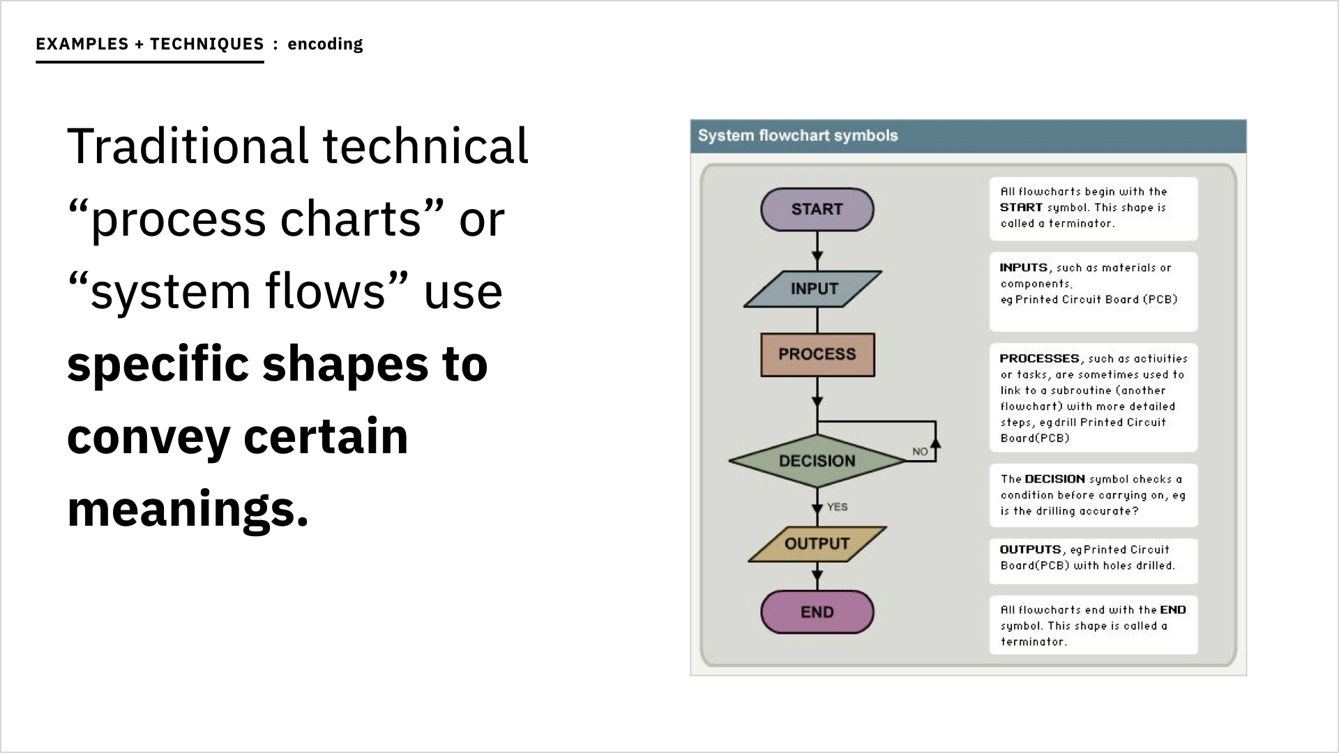
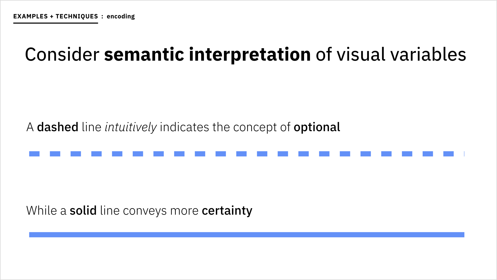
The IA map layered several types of information: indications of which user roles interacted with which parts of the product, whether Watson or a human completed a particular activity, and if a step was mandatory or left to the user’s discretion, just to mention a few. I represented screen interactions as boxes, decision points as diamonds, and paths between them as lines, then assigned each information type a different “visual variable” such as color, line or border weight, or texture.
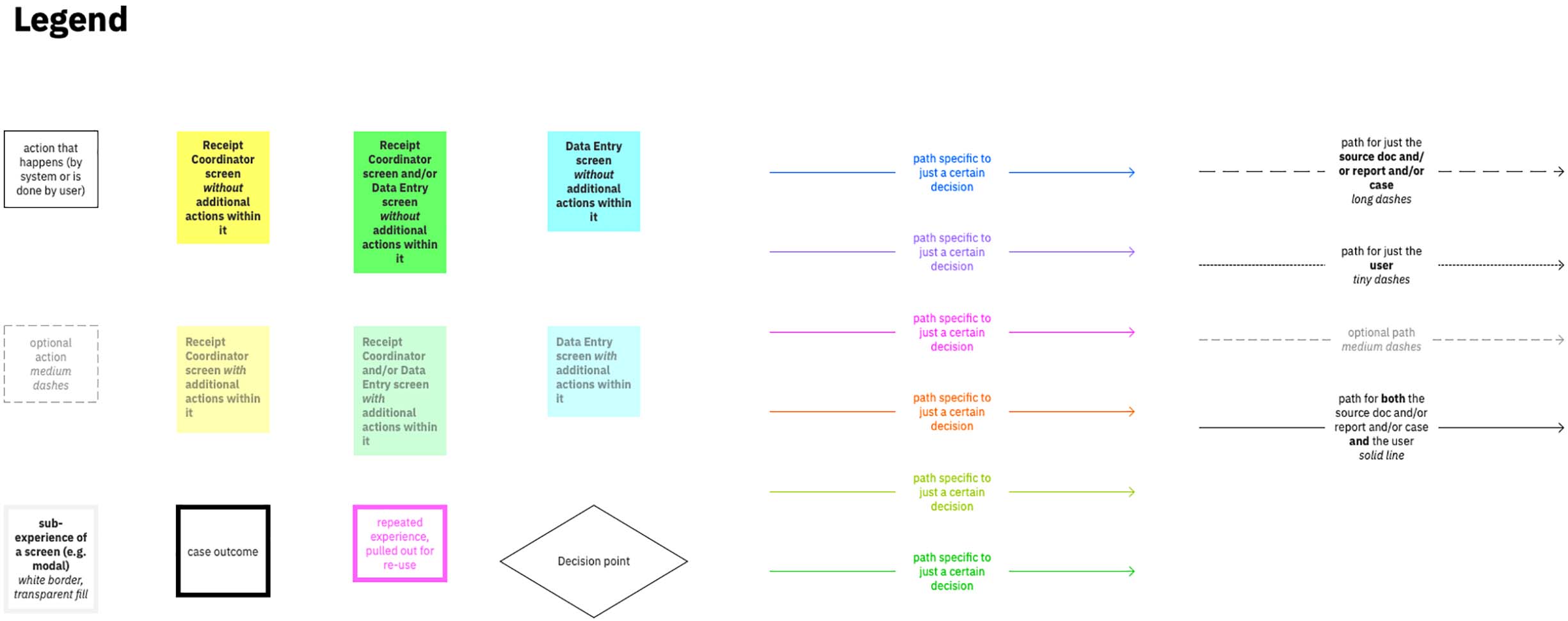
I used a box’s fill color to represent the user role(s) that had access to it, making it simpler to scan and follow the flow of a single role type. I also used hue to keep the plethora of paths somewhat separate visually, although it bothered me a bit to be using color inconsistently across the nodes and links of the map. It was important, however, to harness the saliency of color to enable easier path-tracking.
Both the act of creating the IA map, and the artifact itself served to help me better explain aspects of the user flow when I met with members of the development and offering management teams, other designers, and even clients.
When I met with a group of customers and case processors I relied heavily upon one mini-map and its surrounding context within the main IA map to help describe a specific design solution for dealing with follow-up reports. The first thing that must be done when an adverse event report arrives is to check whether it's a "follow-up" containing additional or edited information pertaining to a report received earlier. If the report is a follow-up—and whether it contains new or updated patient data, or both—all inform the route that the case will take. After I'd walked my audience through the sequential screens I'd designed, I presented the relevant mini-map to reference all the possible case trajectories, visualized as cascading design trees, and encoded areas of the workflow where Watson would step in to speed up the process. It helped to have one view mapping all outcomes so that the group could quickly perceive the impact WPS would have in helping them get through otherwise tedious tasks.
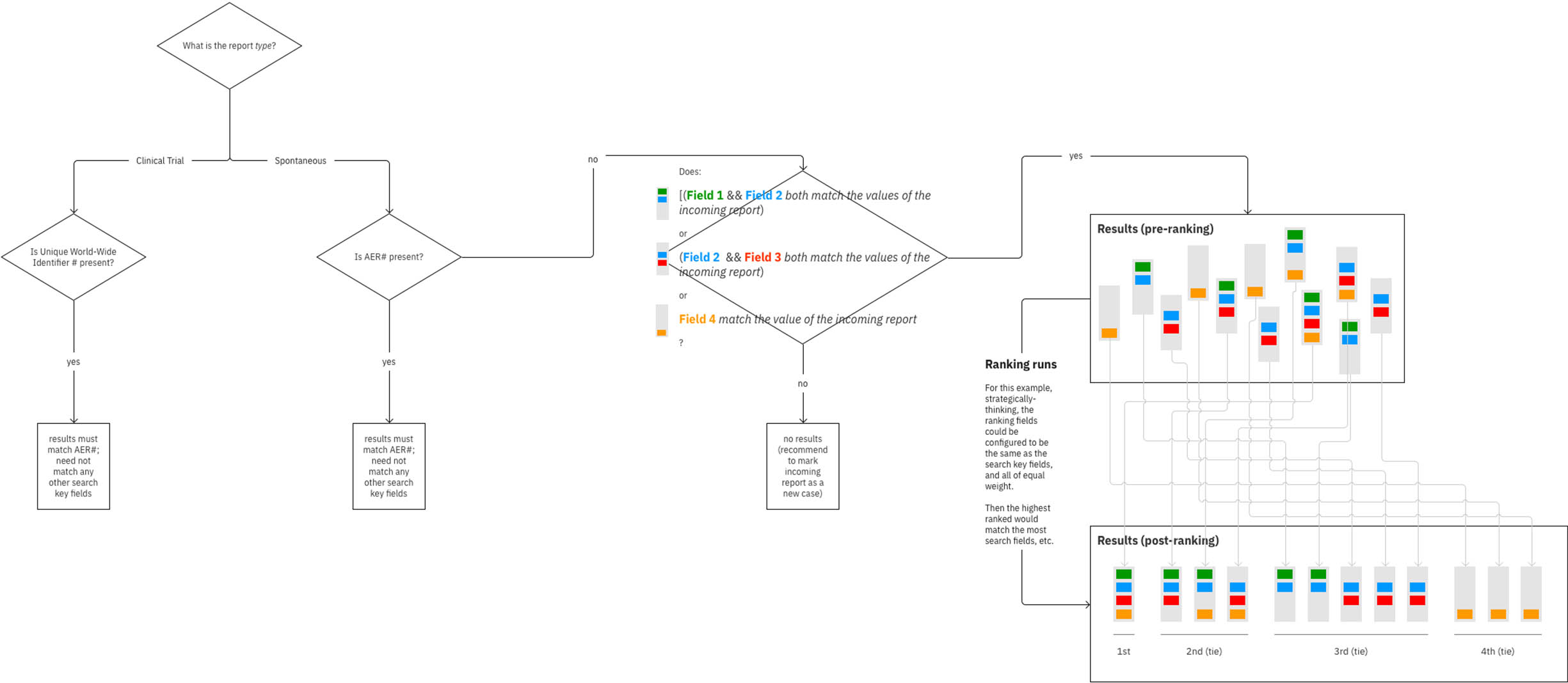
In my redesign for the duplicate search flow, Watson would run a search as soon as a new document arrived, using natural language processing to identify the necessary patient details to search on. Oftentimes, incoming reports—whether follow-ups or not—don’t contain all required patient information, or some of it is incorrect (hence the need for case processors to request follow-ups in the first place). Therefore, many existing reports in the pharmaceutical’s database may meet the searched criteria on some fields, but not others. My design enabled an administrator to specify the combinations of fields that should yield higher rankings within the collection of found cases Watson’s returned after running the automatic duplicate search.
“Lia, you read my mind for duplicate search. I am so jazzed.”
—Pharmacovigilance Director of Operations at Roche
Once I’ve learned something new (especially if my lesson was acquired the hard way), I like to share my findings with others. I pulled together what I'd read about information architecture and coupled it with examples from my own process, then presented it all at a UX guild meeting for other Watson Health designers.
This led to an increased interest in IA across our product portfolio, and I went on to head up a group that established IA-related guidelines and best practices for all of Watson Health.
Live + learn
- In hindsight, it seems obvious that if design work hadn’t have already been in full swing by the time I joined, it would have been ideal to start with a single, high-level IA map to help guide the development of the user experience. Then as we worked our way into solving for more specific problem spaces, we could iterate on the relevant area of the map modularly to begin establishing user flows. This approach is basically the opposite of the way I went about things, and it would inherently prevent the “information overload” issue from the outset, as long as detailed iterations of specific areas are maintained as their own individual maps to be drilled into independently.
