
Curiosity-Colored Glasses
Project pretext: Personal
Objective: Design and code my own blog
Timeframe: 2 years off-and-on from conception to planned launch (not counting the question gathering lead-up that started back in middle school)
Target audience: Anyone with a desire to better understand the world in which we live
Opportunities
- A blog, by definition, provides the ability to publish to a potentially limitless audience. If my readers were to walk away with comprehension at the very least—if not inspiration—I’d need to incorporate ways to welcome learners at all levels.
- Each post tells a different story, therefore requiring the freedom to be visually communicated in its own way as well. I had to design an interface that could accommodate varied illustration styles and detailed diagrams without coming across as busy or overwhelming.
Process
This project started as a simple collection of questions, partly because I like asking questions, and partly because I like collecting things. Then one day, my friend and I were chatting about blogs: what would we blog about if we each had our own? My friend said she’d have a cooking blog. I loved everything about the idea—visually and verbally breaking down one’s process, adding anecdotes from the experience, and encouraging onlookers—except for the cooking part. I wondered if just maybe my question collection and its subsequent investigations could serve as fodder for a blog of my own.
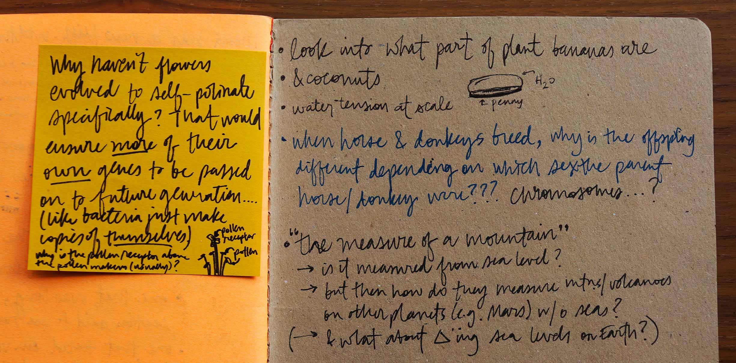
Note to self: look into what part of plant bananas are. And coconuts. These things scurry through my brain at any given moment, making their way onto the nearest scrap of paper and eventually into my compilation of questions.
A blog connected to the World Wide Web would mean I could share the fascinating findings my quandaries led to, rather than keep them all to myself. I thereby took on the challenge of communicating these explorations and results in a way that others could benefit from.
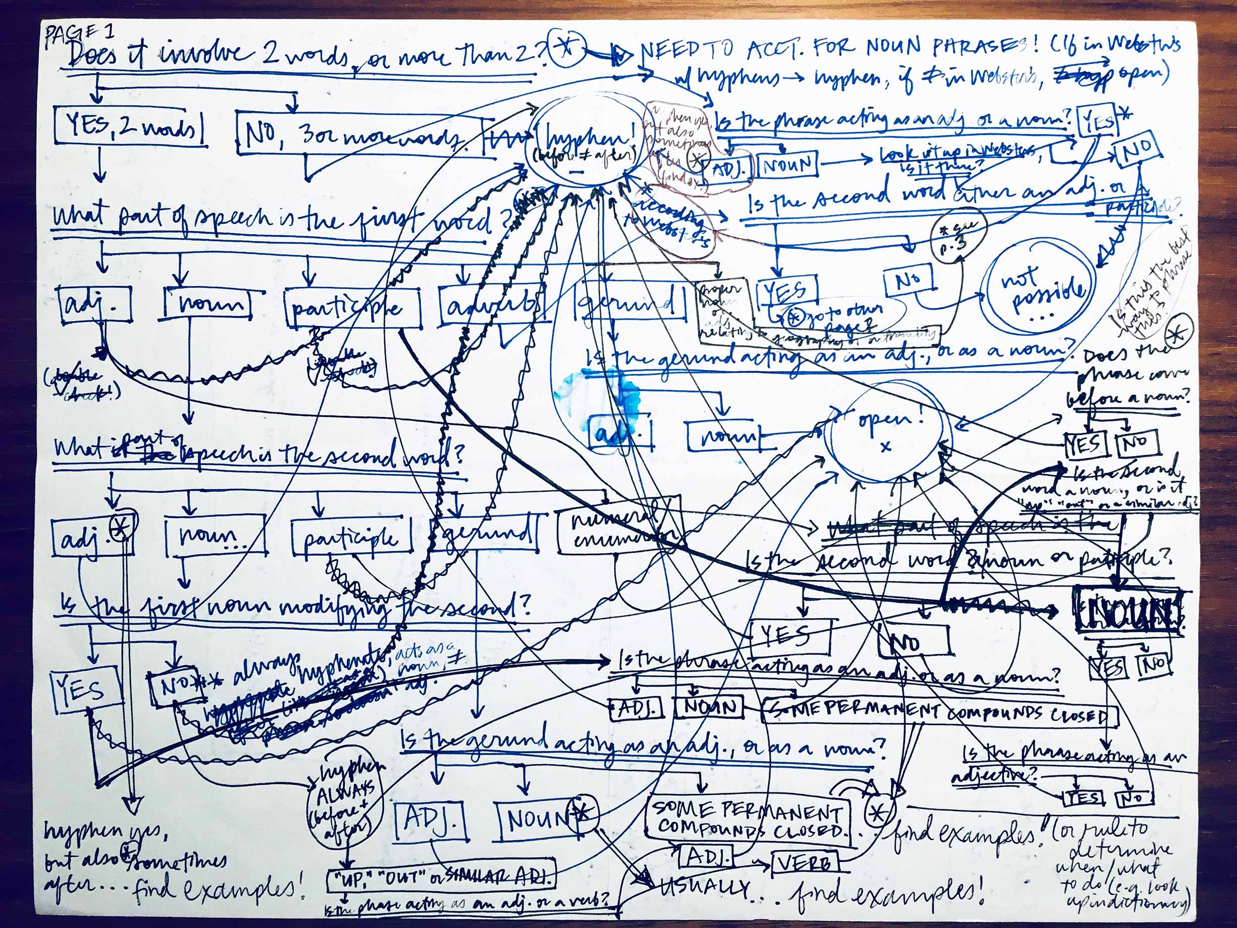
This monstrosity is the self-serving output of a hyphenation-related question. I was, in fact, wondering if my blog title needed a dash to be grammatically correct, and my research sort of spiraled out of control from there. But who hasn’t needed to know when to use a hyphen at one point or another? Others could benefit from my madness, as long as I committed to sharing it in a slightly more refined way.
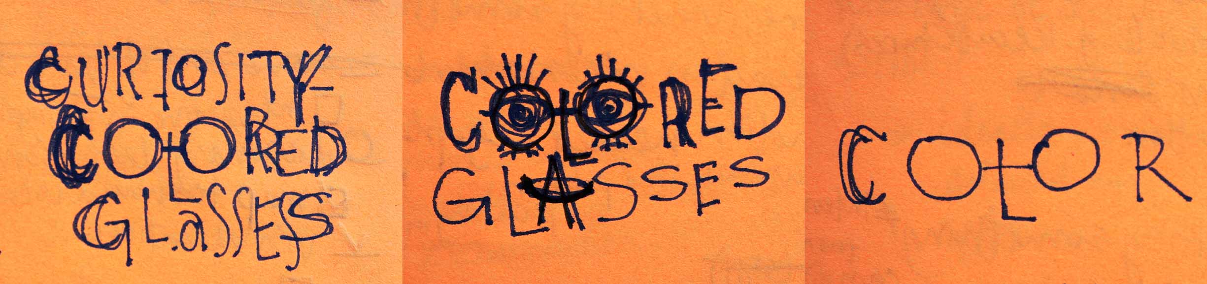
“Curiosity-Colored Glasses” summed up everything my blog stood for, from the lens through which it implicitly looked out at the world to the approachable optimism implied by the aphorism from which it was borrowed. I purchased the associated domain name and went to work exploring how to visually communicate my mission.
I explored illustrative ways to play up the title, but ultimately settled on a simple, blocky, black and white framework for my blog as a whole. This would allow me to explain concepts through potentially complex diagrams and varying illustration styles, without the blog’s brand adding clutter.
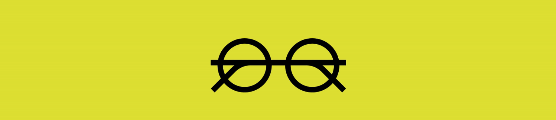
I sought out every opportunity to hijack the user’s experience with delight, adopting a simple eyeglasses motif and exploring how it could creatively recur throughout the UI in unexpected ways, with each occurrence reinforcing my blog’s mission to inspire curiosity.
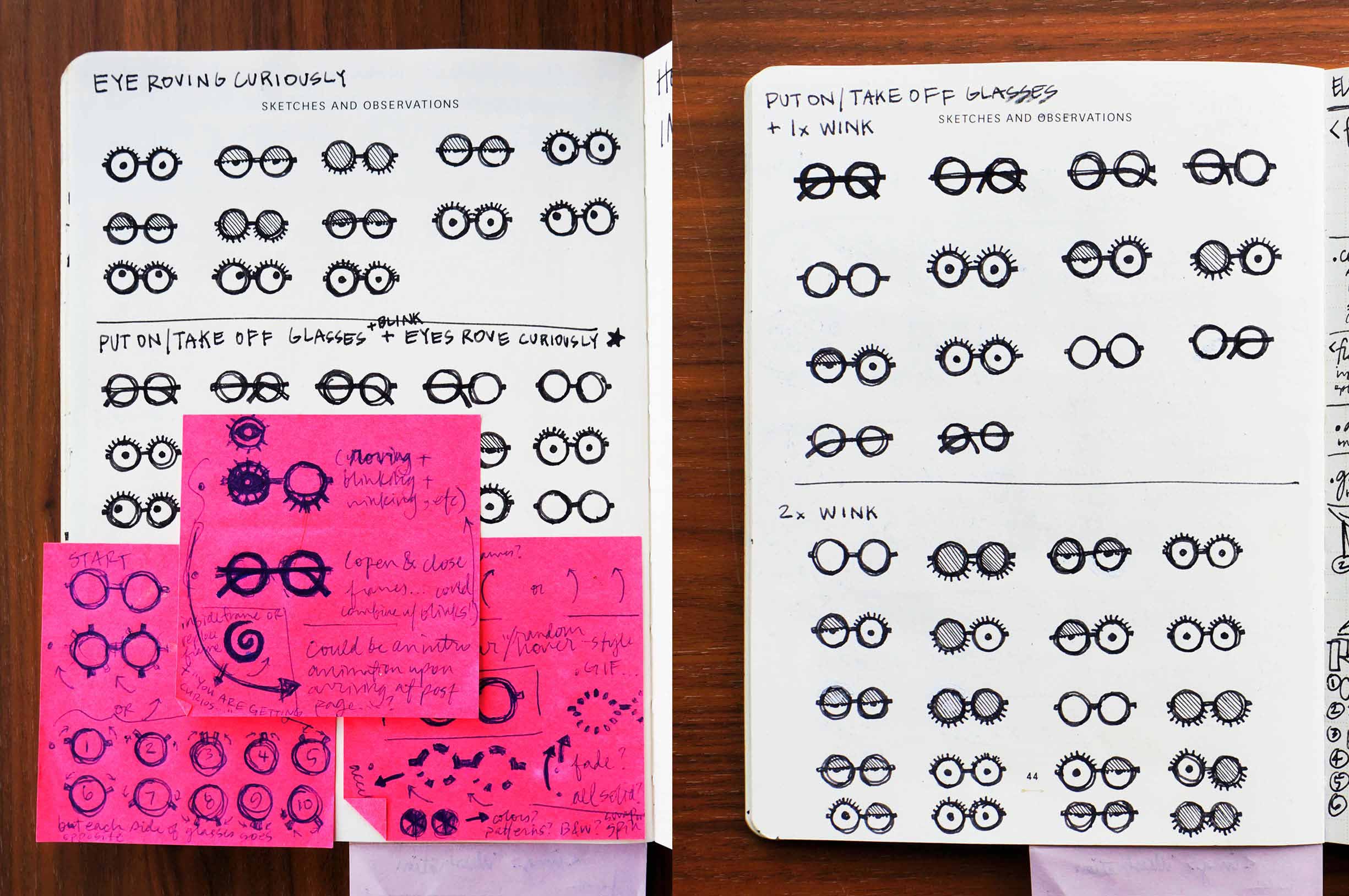
Storyboarding helped me document ideas for a custom loading animation. My initial thought had been to use two typical loading wheels side-by-side, suggesting spectacles. After continuing to iterate, I landed on a more imaginative idea: a pair of glasses’ arms would open, only to be occupied by curious, roving eyes that blinked expectantly.
I mocked up a rough .GIF in Photoshop too get a better sense of whether my idea for a loading animation would communicate properly.
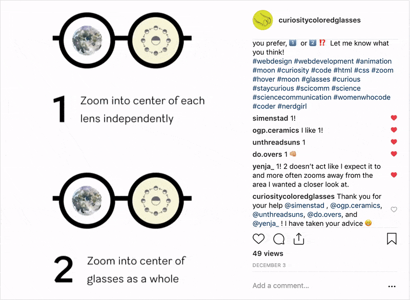
I planned to have a simplified eyeglasses icon represent each blog post on the home page, the lenses of which I’d fill with imagery alluding to the post’s content. Hovering would trigger one of two possible a zoom effects. But when I couldn’t decide which one to use, I built a quick prototype in code, shot a screen capture video, and consulted my Instagram followers for feedback.
Comment avatars featuring cat-eye, circle, and square frame options round out the eyeglasses motif.
I planned to code my whole site and its content management system (CMS) from scratch as an incentive to brush-up on my browser-based coding skills (but mostly so that I could have complete control over its every detail … muahahaha!). I selected a lightweight, file-based CMS called Kirby to provide the integrations between my blog’s coded structure and its content. This meant I’d have to learn new languages: PHP to make my site dynamic and link it to the content, YAML to create the CMS itself, and JavaScript to build out some of the behaviors my design called for.
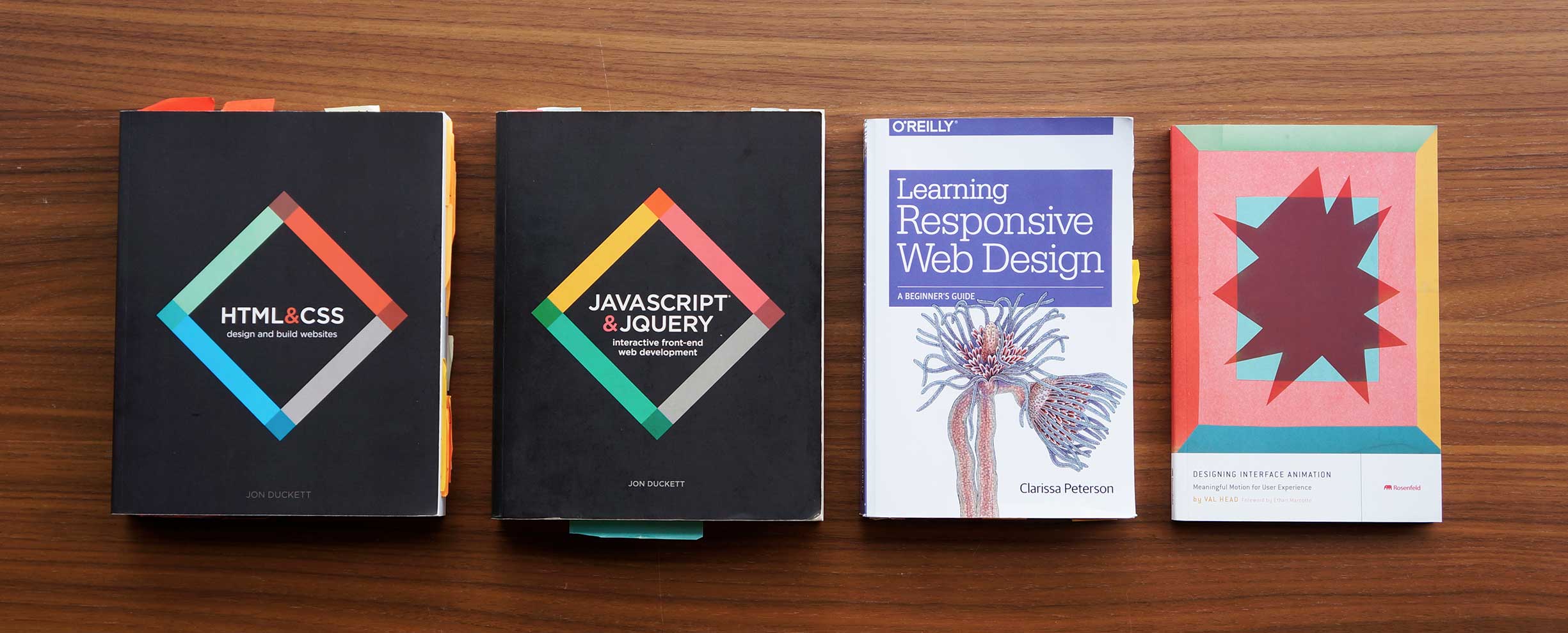
Learning by book is my preferred method for intaking this kind of information: HTML & CSS and JavaScript & JQuery by Jon Duckett; Learning Responsive Web Design by Clarissa Peterson, published by O’Reilly; and Designing Interface Interaction by Val Head.
Planning played a crucial role in my process. I routinely put pen to paper in an effort to make my code—and the time I spent writing it—more efficient and organized.
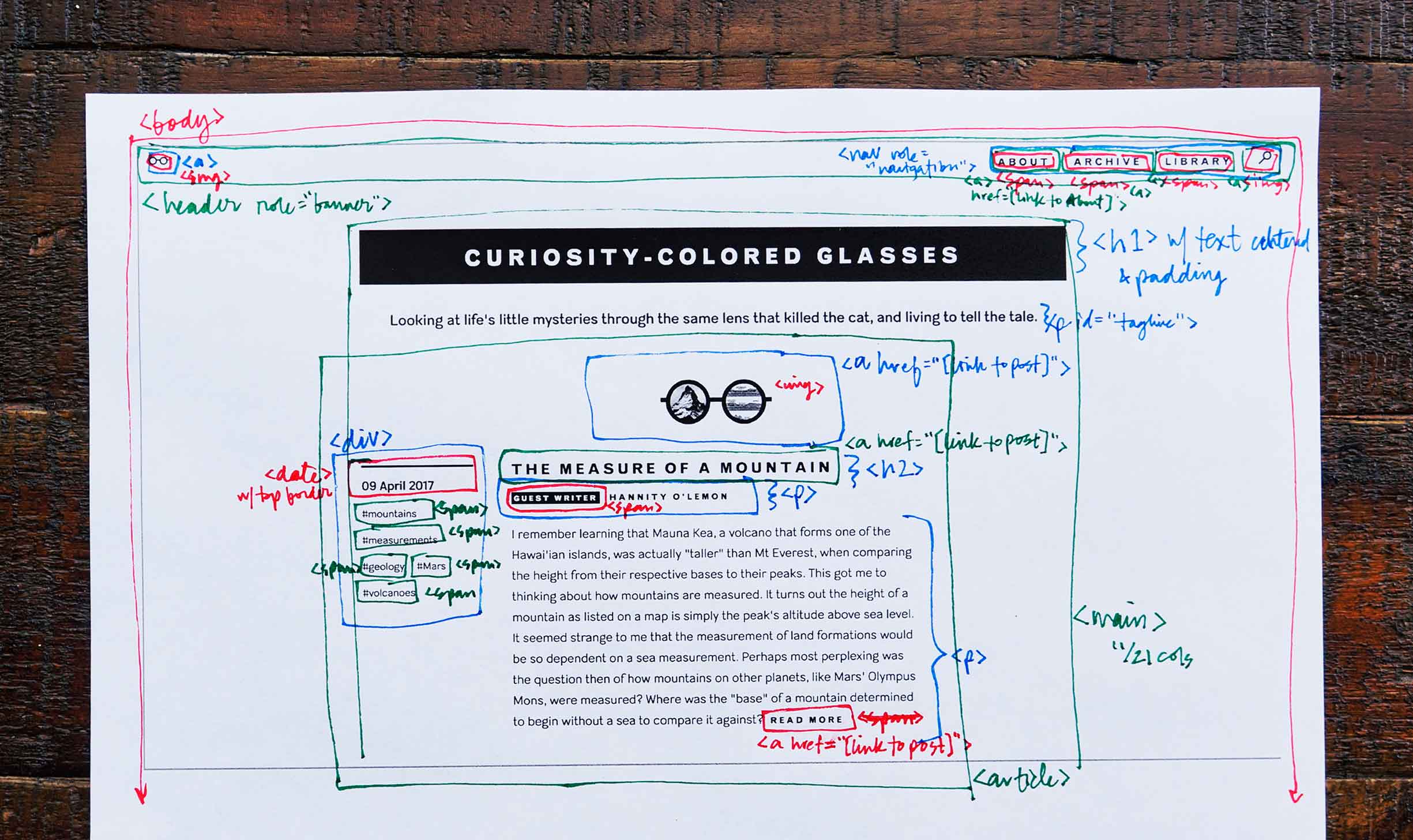
My tried and true method for mapping out a site’s HTML structure involves a brief hiatus from the computer. I draw and label boxes representing HTML elements atop printouts of the design, applying color-coding to better keep track of layers.
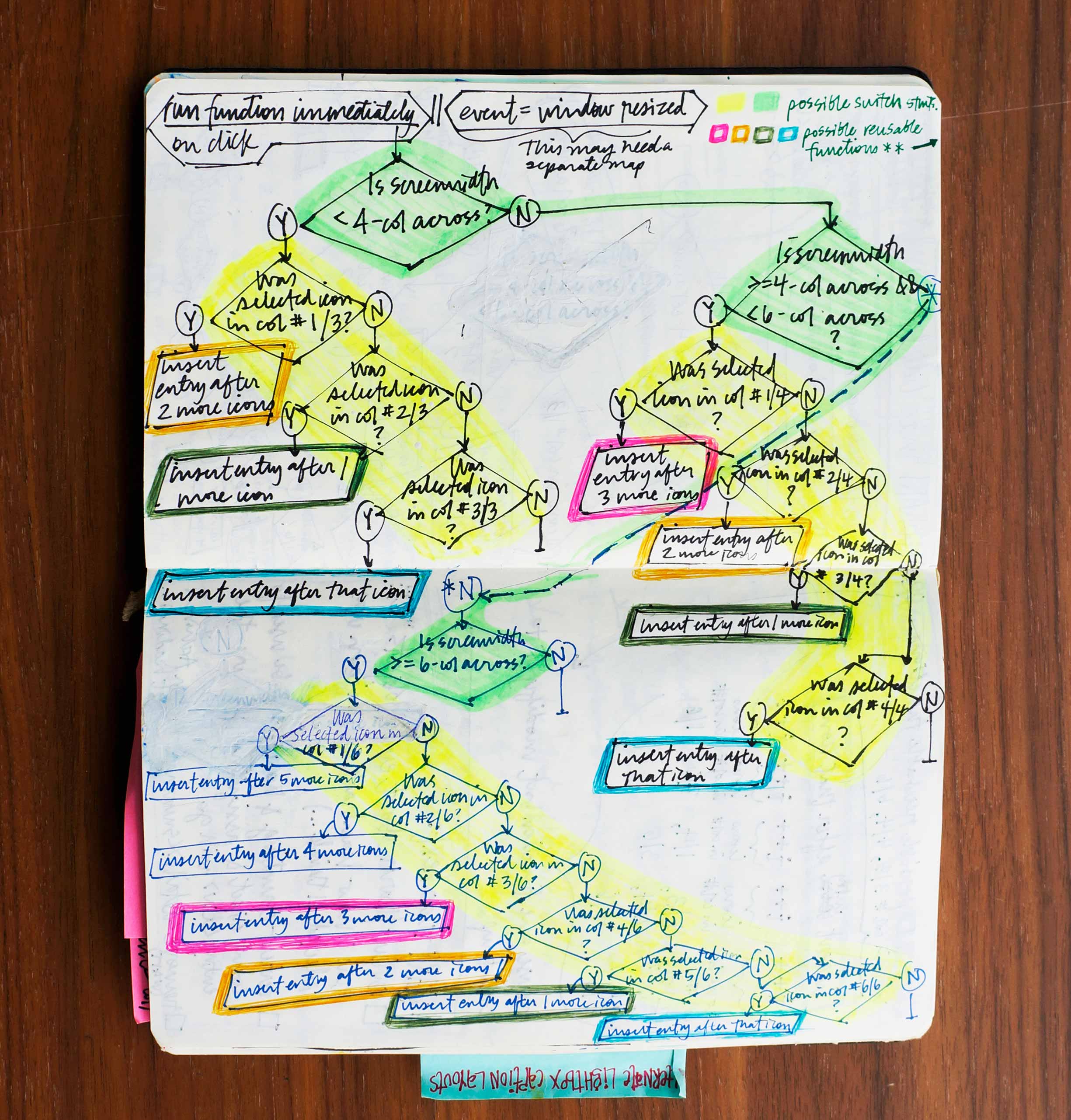
Colors helped me identify reusable functions when I drew out this decision-filled JavaScript flow. Ultimately, my investment in sketching before going to the keyboard resulted in much more performant code.
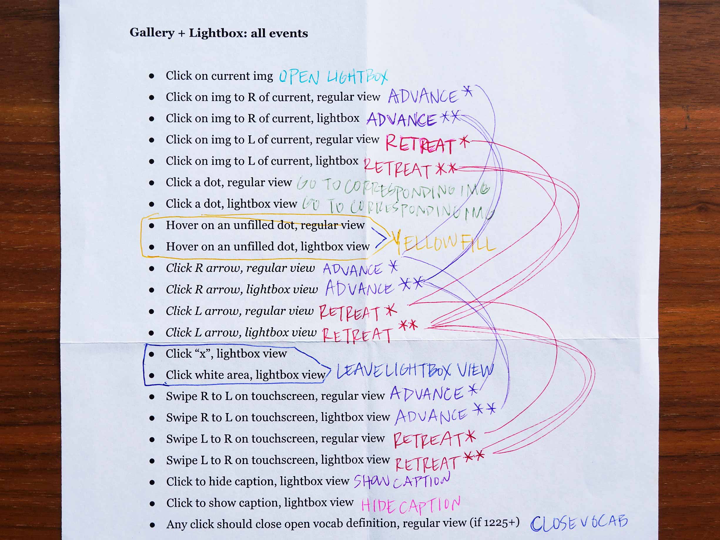
The interactions within my designs for galleries and lightboxes resulted in the most complex script I’ve ever written. I could have used any of the plethora of pre-existing libraries, but I was stubbornly determined to figure out how to do this all on my own! Once again, my 10-colored ballpoint came to my rescue, assisting me in identifying which common interactions could reference the same chunks of code, and ultimately saving me several lines of redundant characters.
A CMS is advantageous for any blog because it separates the content production from the code, providing a more conducive environment within which to edit text and images. After I’d built the structure and style of my site, I set up its CMS using a configuration language called YAML. This would pass my content to the previously coded HTML structure and enable it to appear on my site.
-
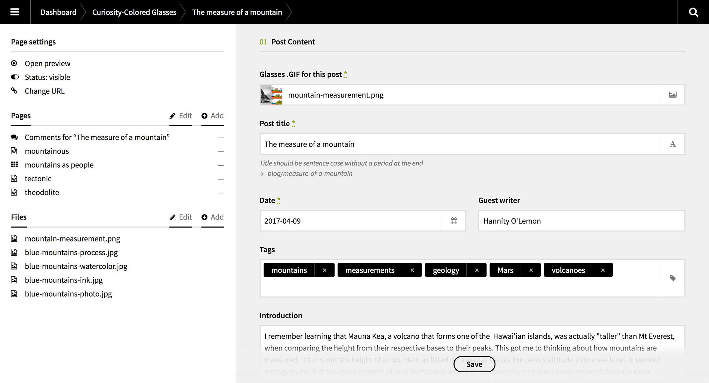
My CMS’s interface lists sub-pages and uploaded files, and helps direct content input. Common tags across multiple posts are easy to apply thanks to a type-ahead function that searches for tag names already employed on other posts, ensuring consistency. -
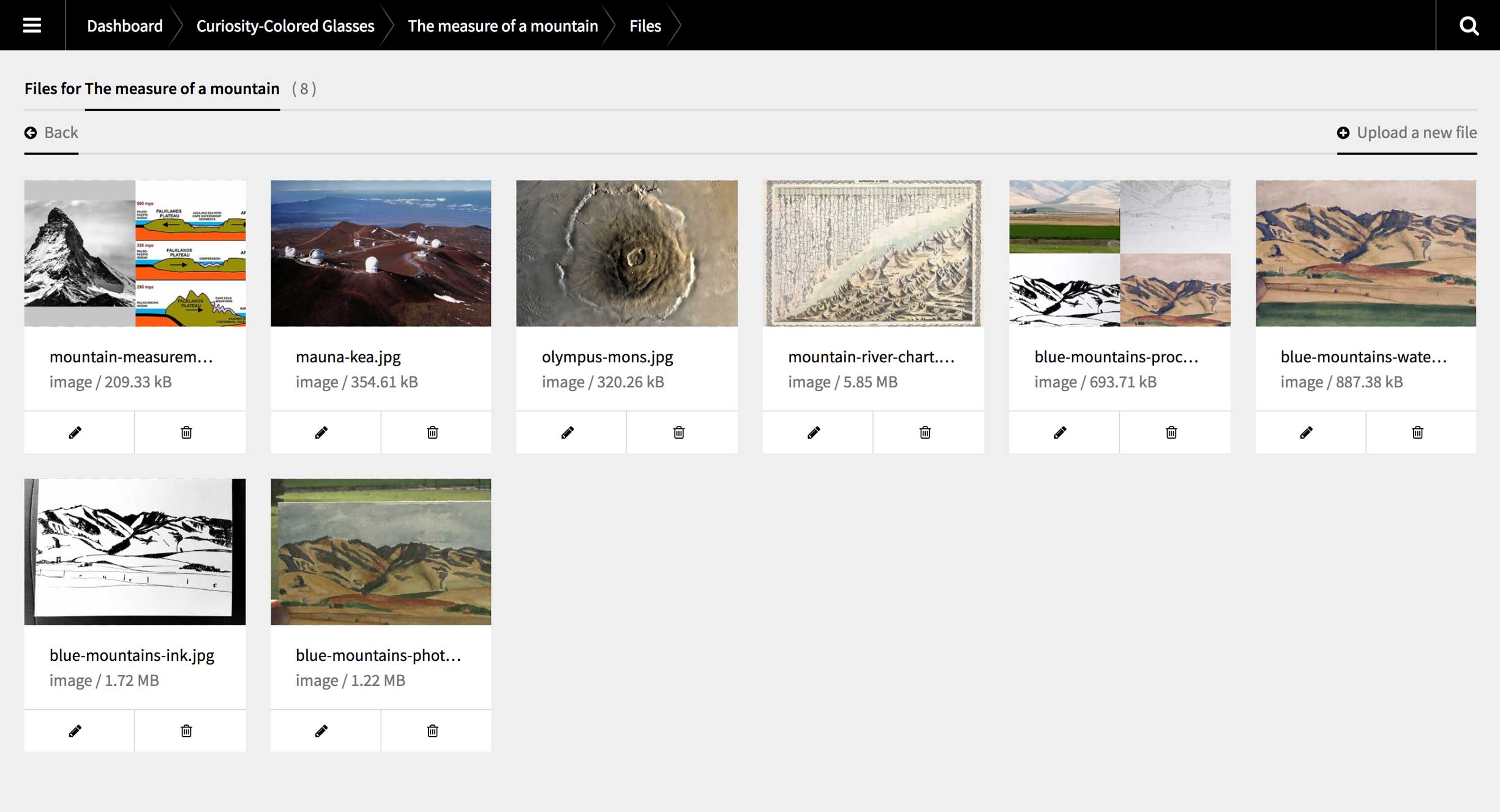
An overview of all uploaded files makes it easy to find and place the right one. -
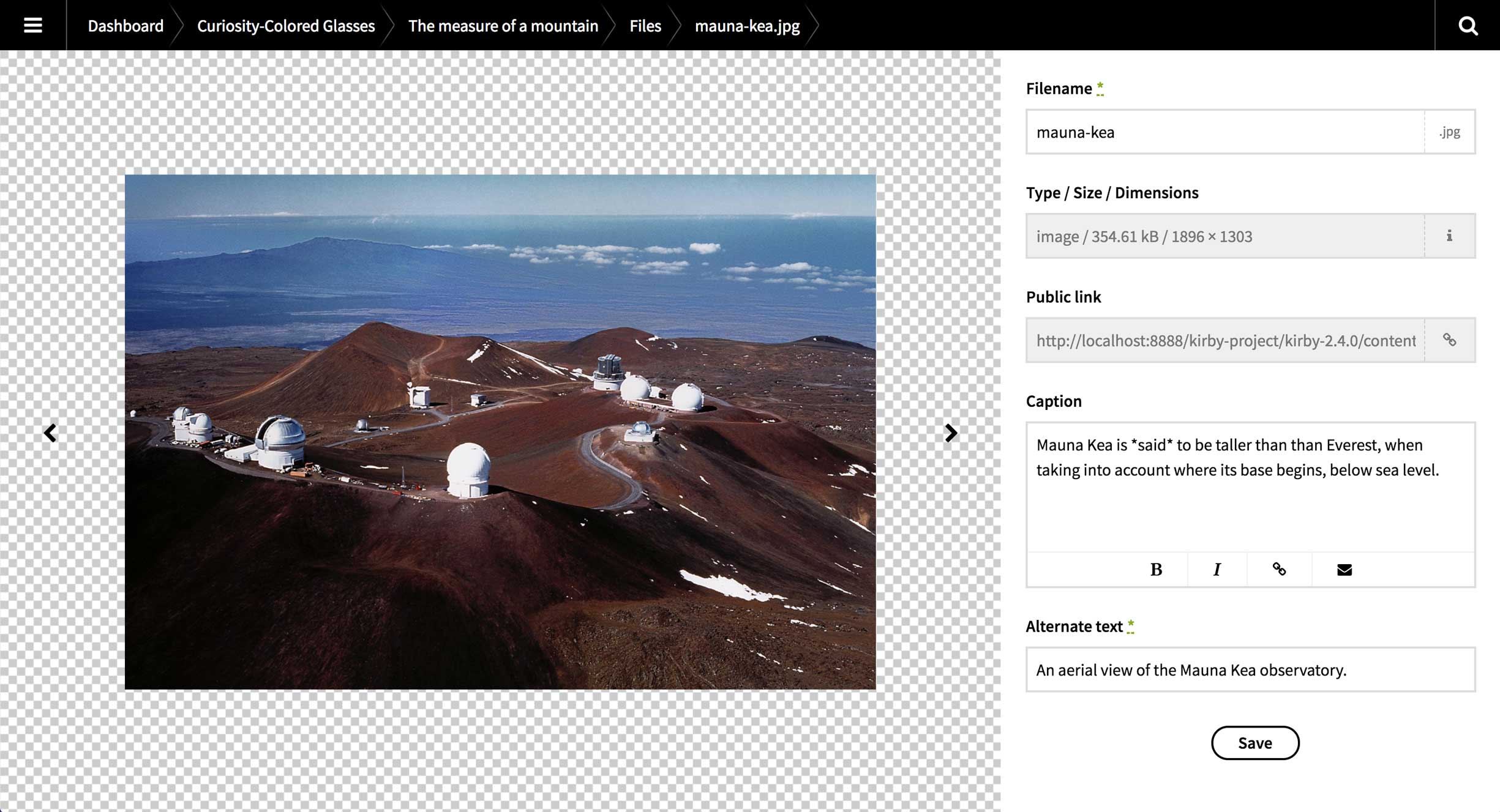
Each uploaded image has its own sub-page within the CMS, which I coded to include fields for an optional caption and mandatory alt text.
My blog wouldn’t feel like a modern member of the World Wide Web if its design didn’t respond to various screen sizes. I planned to promote it across Instagram and Twitter, the users of which would likely end up accessing it through links on their mobile devices. Adding media queries into my CSS was easy; the tough part came with creating cohesive designs that felt fluid between breakpoints, and that changed from size to size in ways that accounted for the content.
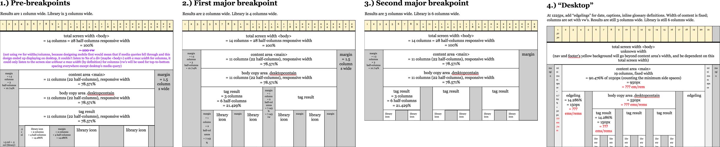
Merging columns and rows as needed, I used the table functionality of a Google Doc as a medium with which to diagram the grid-structure that held my design together at each breakpoint.
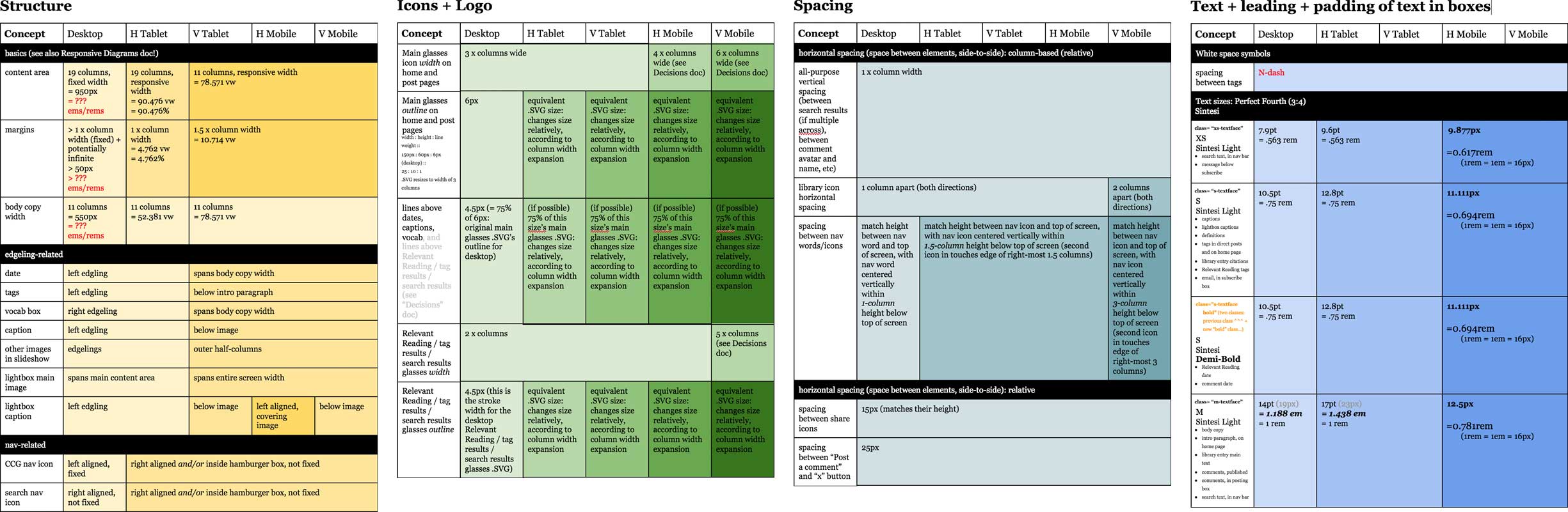
I created another Google Doc to track individual components’ behaviors across breakpoints, helping me ensure I’d accounted for every detail in my design.
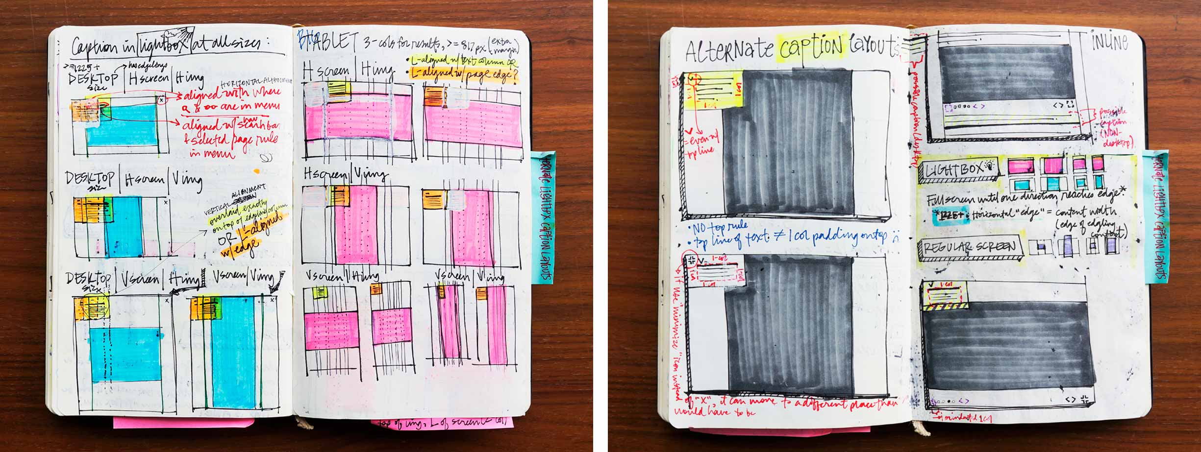
My ever-present quiver of colorful writing utensils helped me chart out possible layouts at each breakpoint. Here I explored how to render images of differing aspect ratios on vertically and horizontally oriented screens.
If the launch of my site was dependent upon perfection, my blog would only ever live on my localhost. I’ll continue to improve its code over time, relying heavily upon the troubleshooting experience I’ve cultivated so far.
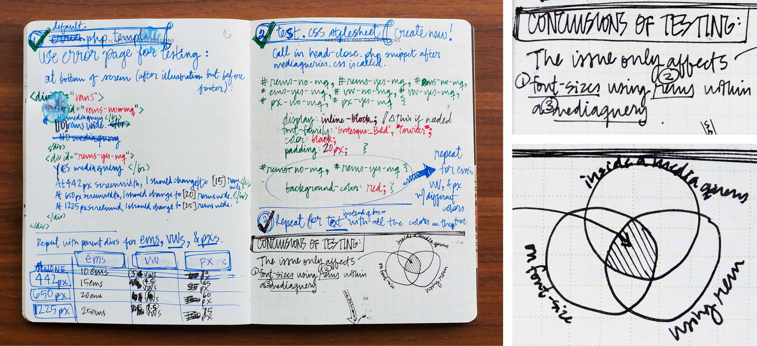
These pages log my plan of attack against—and eventual vanquishing of—a particularly nasty bug of the Safari-only strain. In an attempt to discern what was causing my content to render invisibly small at just 1 pixel tall, I systematically manipulated my CSS, HTML, and mediaqueries. Once I’d narrowed down the combination of variables causing the issue, it was just a matter of reconfiguring part of my code, thereby restoring my content to its proper height.
Outcomes
curiositycoloredglasses.com has launched and is now visitable! Alternatively, have a look at the screen captures below.
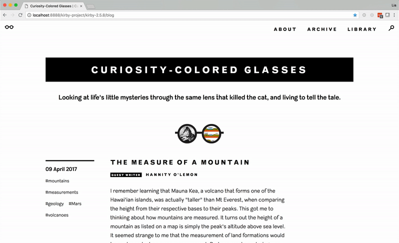
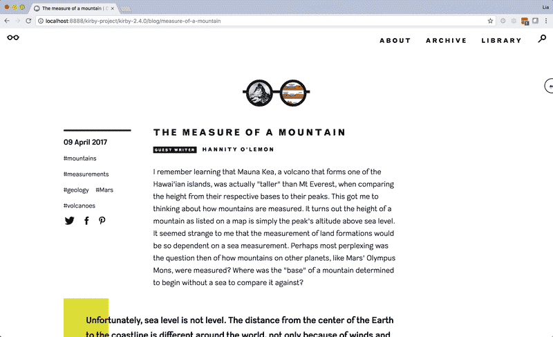
Curiosity-Colored Glasses is accessible on all screen sizes, from mobile devices to desktop monitors.
When I read books as a kid, every time I came across a word I didn’t know I’d write it down on the back of my bookmark so I could look it up in the dictionary later. This was only a partial solution, though—I still missed out on understanding my first encounter of the word in its context. I wanted to prevent this problem as much as possible for my own readers, so I built special functionality into my content management system that would allow me to add hidden definitions to particularly esoteric terms.
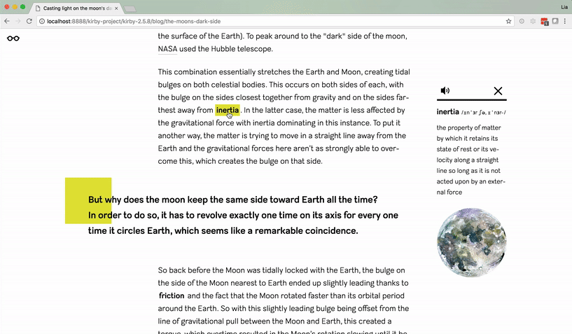
The pop-up definitions include space for written and audio pronunciations, as well as an illustration.
The Question Queue stores a list of my forthcoming investigations. In the future I’d like to add a voting system, so readers can up-vote the topics they’re most interested in.
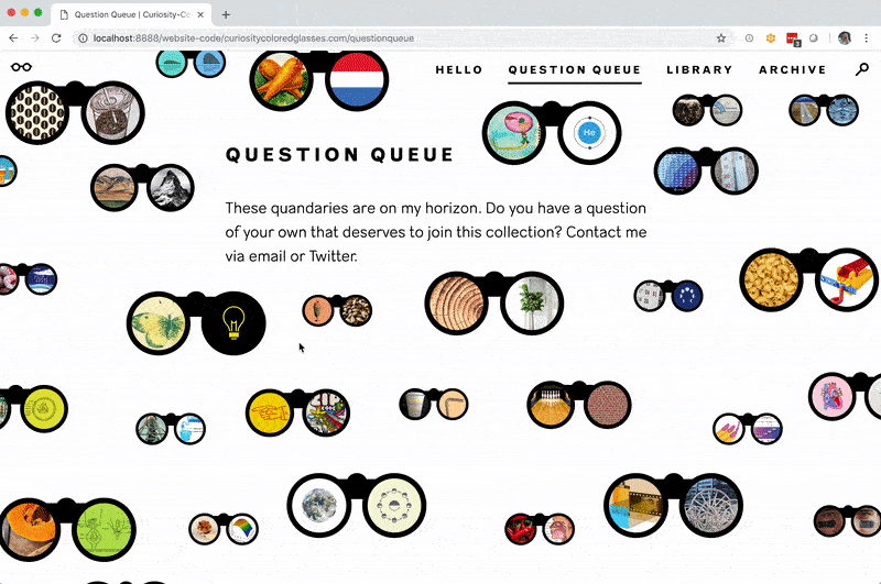
It was tricky, but I programmed this page so that I can continuously add more entries via my CMS as they pop into my mind. The question will then be automatically placed onto one of the parallax layers and the page as whole will lengthen accordingly. I used PHP to randomize each pair of binoculars’ margins so the page layout looks more organic. A long series of JavaScript if-statements carefully position the opened question boxes, preventing them from extending off the page.
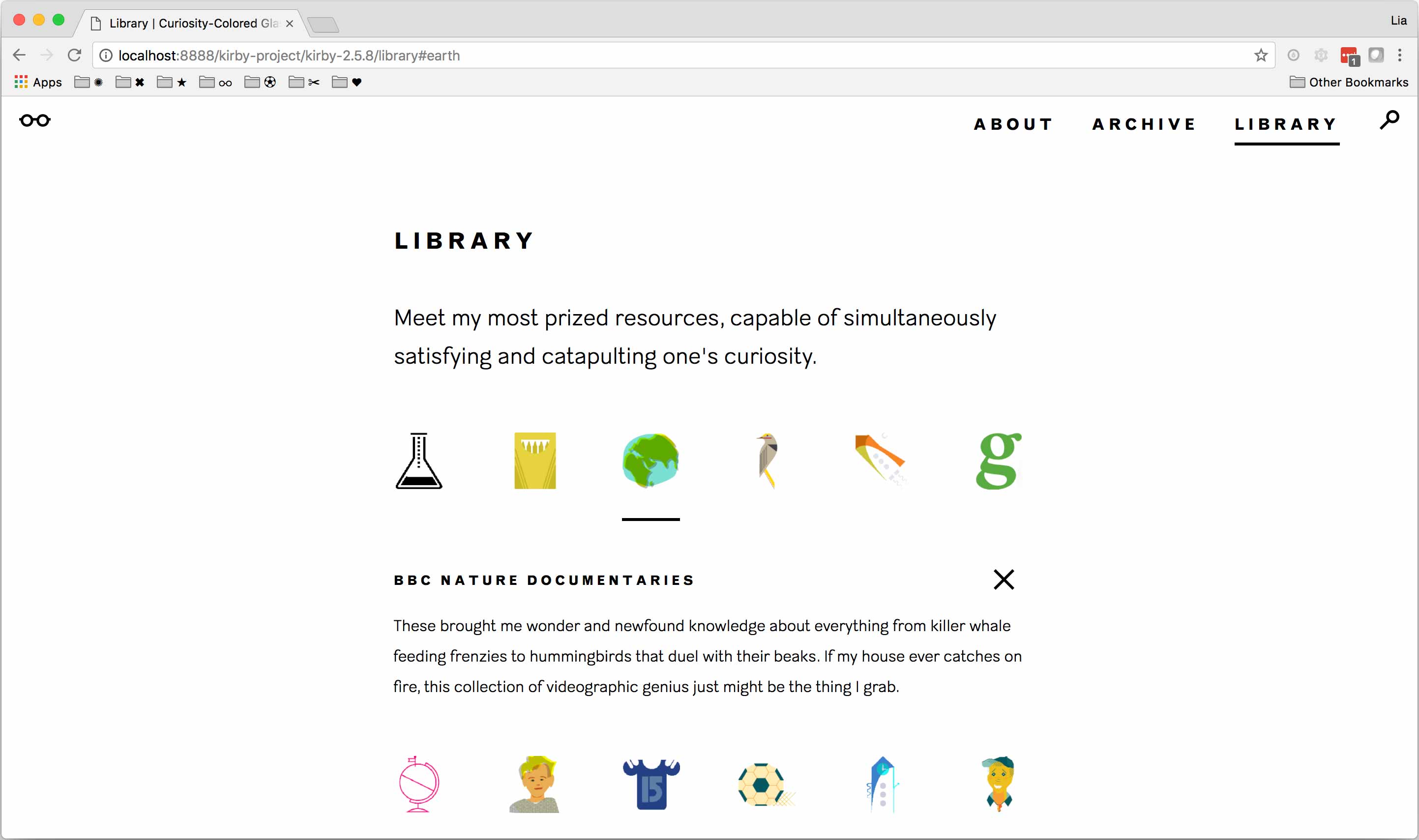
I decided to pay homage to my most trusted and consulted resources by way of a “library” page. Readers can explore an array of illustrations each standing in for a book, video, podcast, person, or other resource.
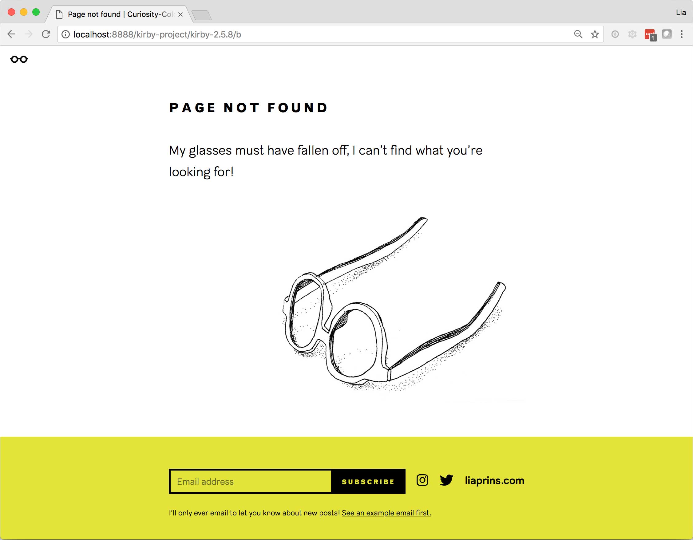
The eyeglasses motif makes one more artistic appearance on the 404 page.
Live + learn
- I relished this project as an opportunity to bring my vision into the world without compromise—so unlike the convoluted inner workings inherent to my position within an enormous organization, where the possibility that my designs never make it to market always lingers due to any number of factors beyond my control. However, the self-assigned nature of this project allowed me to be quite perfectionisty, which in turn decelerated its journey to my audience. I could have started acting on my mission much sooner if I’d taken advantage of a platform with templates or just used pre-existing plug-ins for some of the more complex parts in my code. But I broadened my context of front-end development and learned so many valuable skills that I can’t quite say I regret my stubborn insistence to code every aspect of the site myself.
