
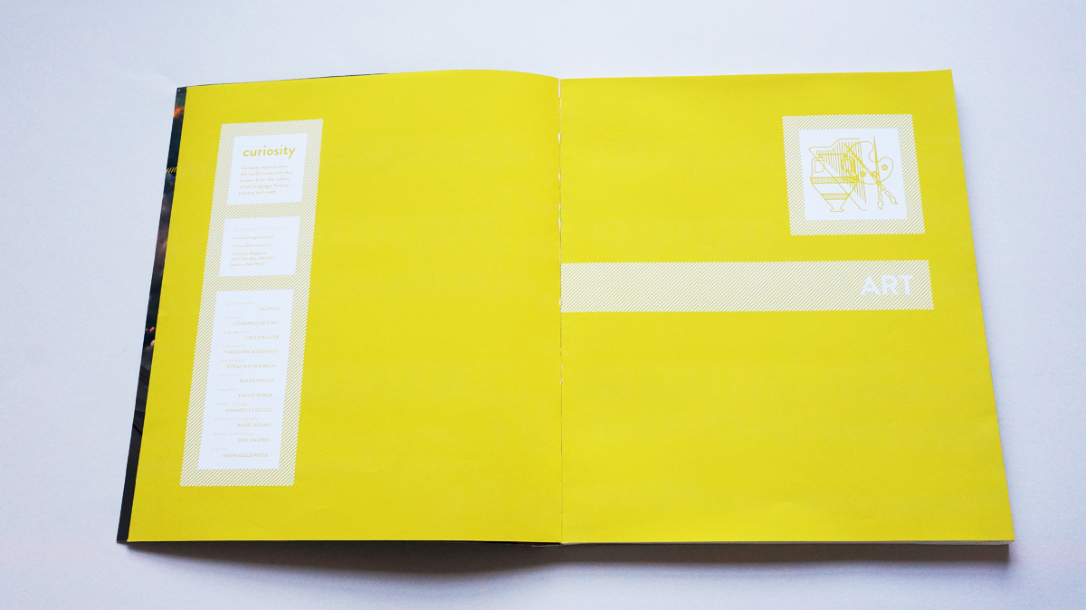
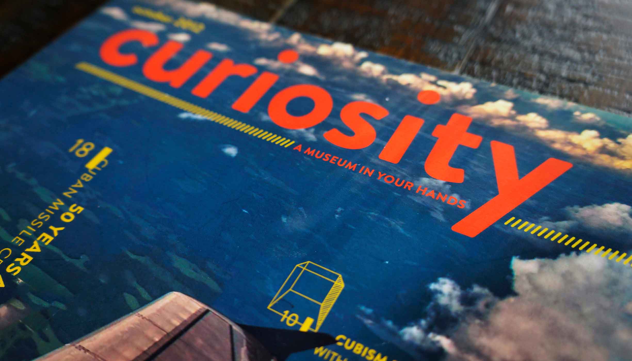
Curiosity
Objective: Design print and tablet versions of a fictitious publication
Timeframe: 8 weeks
Target audience: Anyone with a desire to better understand the world around them
Opportunities
- I needed to make my magazine’s objective explicit: it did not fit into the traditional niches of print publications and could cause confusion if would-be readers didn’t know what to expect from looking at it.
- Learning new things can be challenging, but magazines are meant to be enjoyed leisurely. I’d have to handle potentially complex topics with extra care, conveying them in an engaging, easy-to-understand manner.
- In order to curate cohesive content that could help to shape the mission of my magazine, I needed to establish criteria that reflected my publication’s intent.
- The future of content consumption is likely not in the form of paper alone: I wanted to explore how a publication’s subject matter and brand could be re-mapped to a tablet and potentially enhanced with interaction.
Process
When I attempted to present my topic idea during our first group critique, it was met with complete confusion and utter dismay from my classmates (admittedly I may have described it as essentially a rebranding of children’s textbooks for adult leisure reading; evidently no one else had the habit of studying simple machines over Sunday brunch). I still believed that my fundamental idea had entertainment potential, but it was clear that I needed to more carefully consider how I communicated it.
Charming illustrations coupled with the basic tenets of the physical world: what’s not to love about antiquated primary school books?
In an effort to identify the particular strain of readership that just might consider pulling the magazine of my imagining off the proverbial shelf, I took pen to paper, listing all the traits I presumed they’d exude. Inquisitive, analytical, investigative … but the adjective that resonated most was curious. In its noun form—curiosity—I had found a namesake: it seemed to describe a lifestyle and a natural state of being. In the way readers of other lifestyle magazines had hobbies in gardening or motorcycling, mine most certainly spent their spare time demystifying the ways of the world.
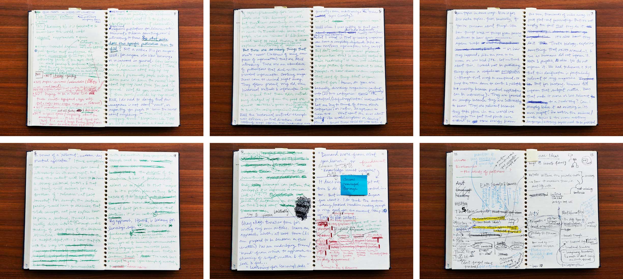
My notebook is my open frontier: I let my ideas roam wild before allowing the convergent part of my brain take over.
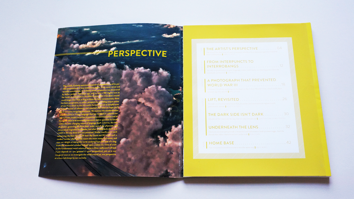
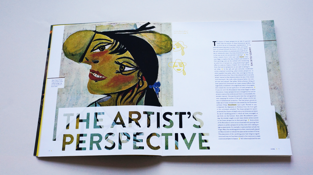
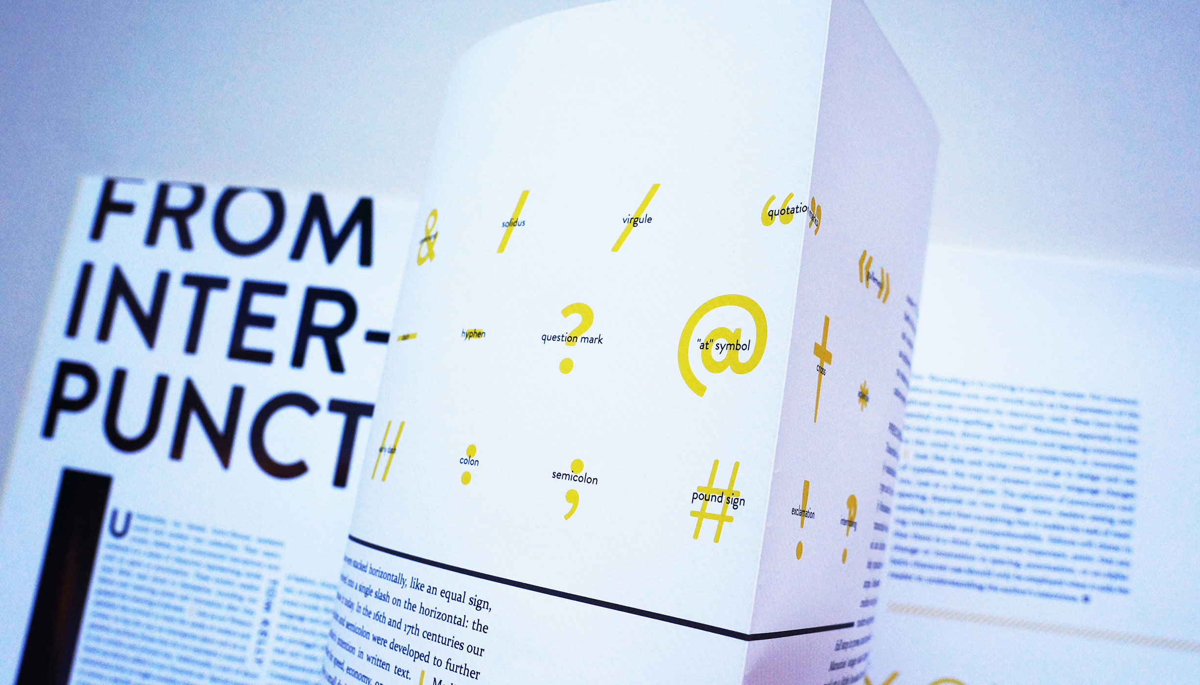
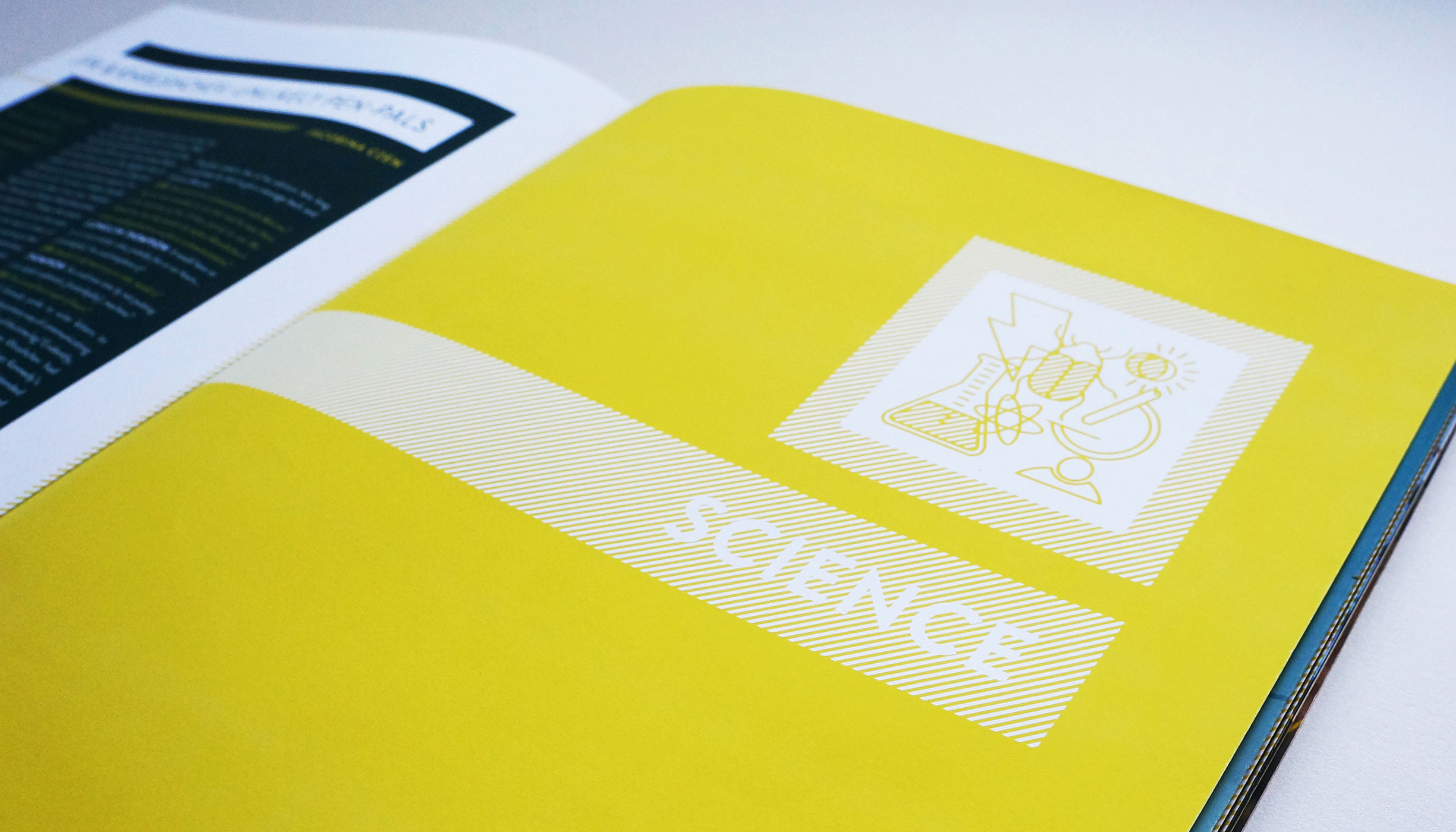
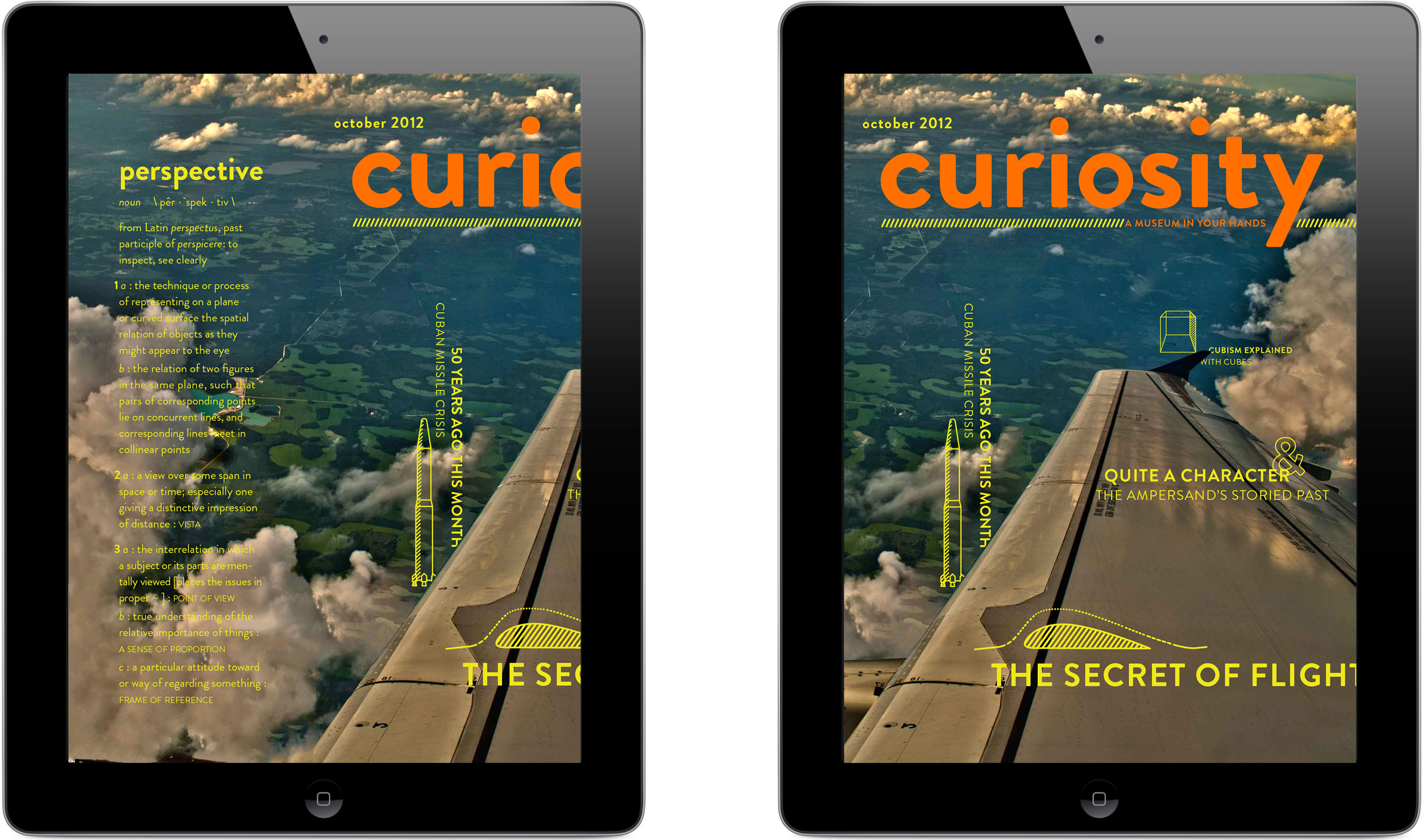
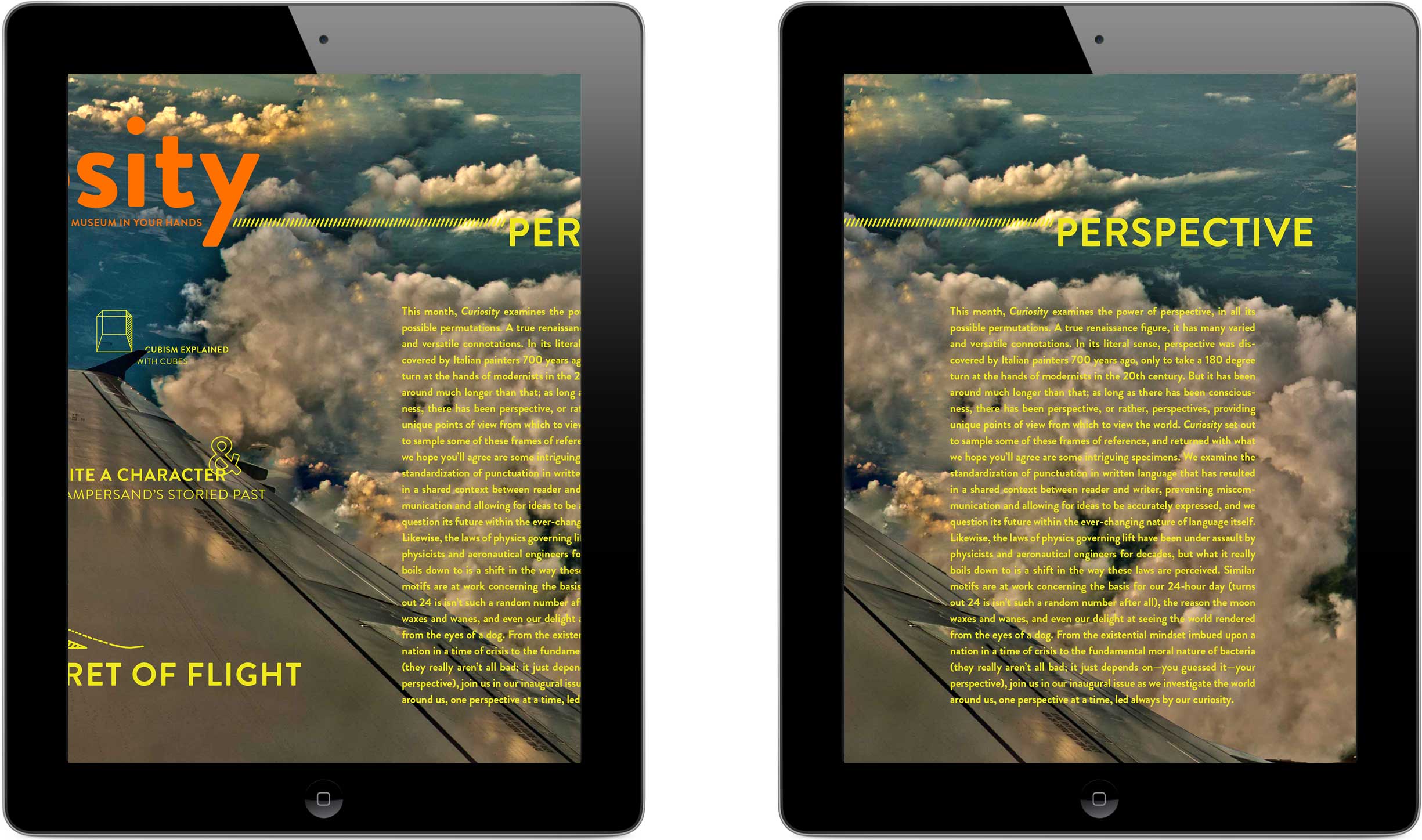
This was still not a typical topic for a magazine, though, so I went to work crafting a concise tagline that would crystalize the concept in viewers’ minds and validate it as legitimate and worthwhile. “A museum in your hands” alluded to the common educational activity that is museum-going, while simultaneously touting the relative convenience and portability of periodicals. From there I wrote a mission statement to clarify my publication’s philosophy and scope: “Curiosity explores how the world works and why, as seen from the realms of art, language, history, science, and math.” The straightforward categories afforded by school subjects would prove helpful when it came to organizing my content.
Meanwhile, style awaited: look and feel could also be employed to broadcast my magazine’s mission to viewers. I examined periodicals, deconstructing the way their visuals affected my interpretation of their subject matter.
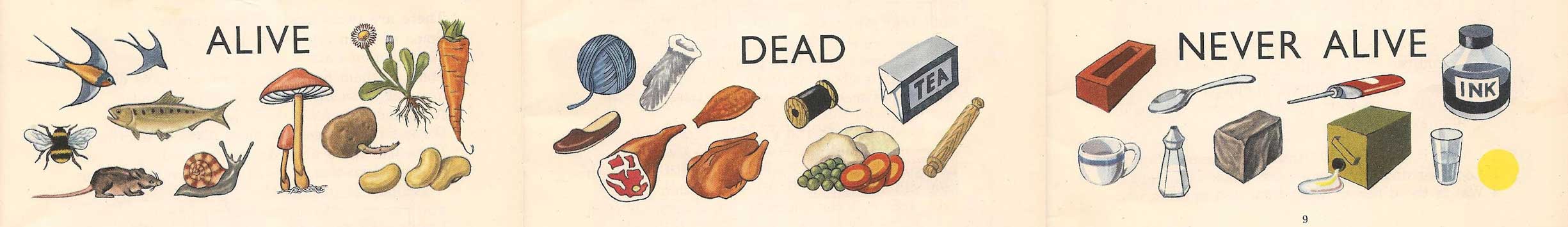
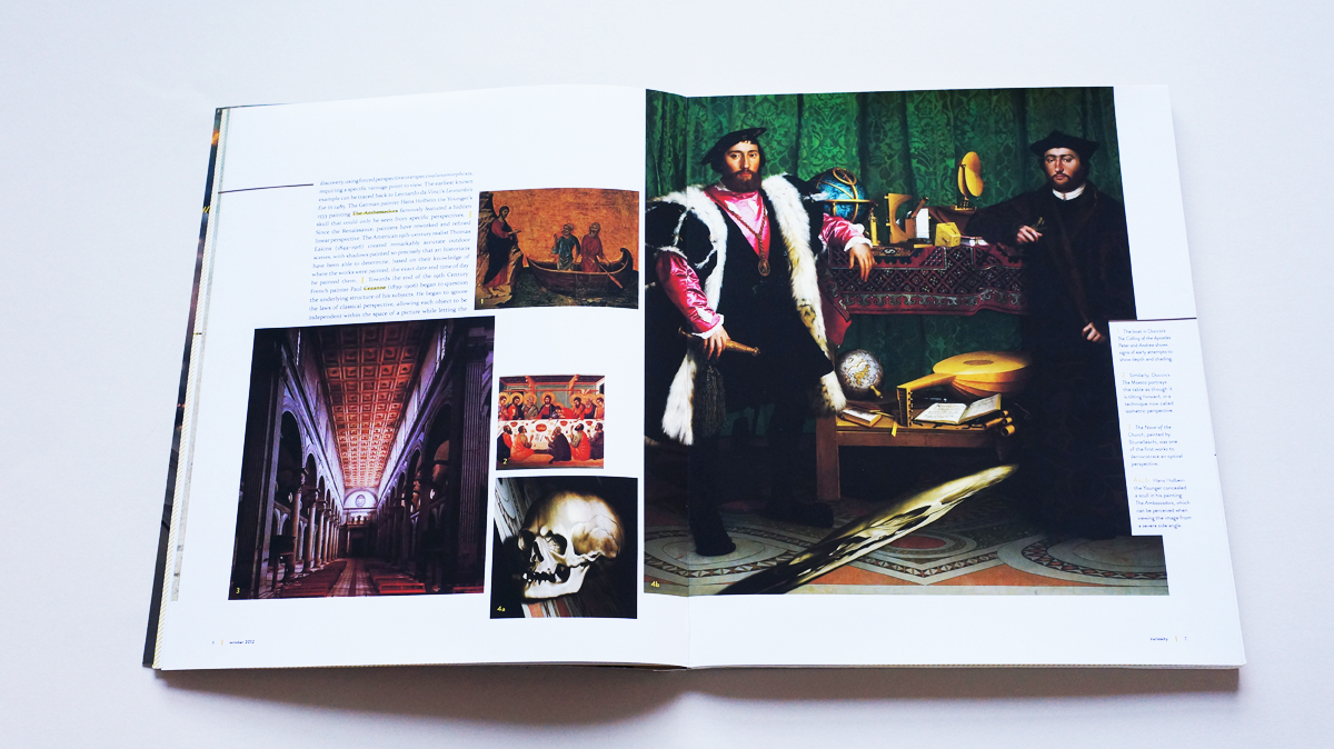
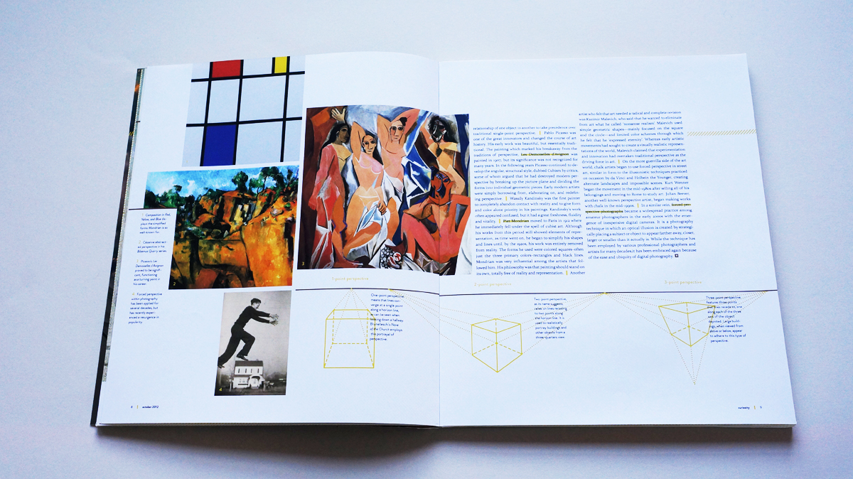
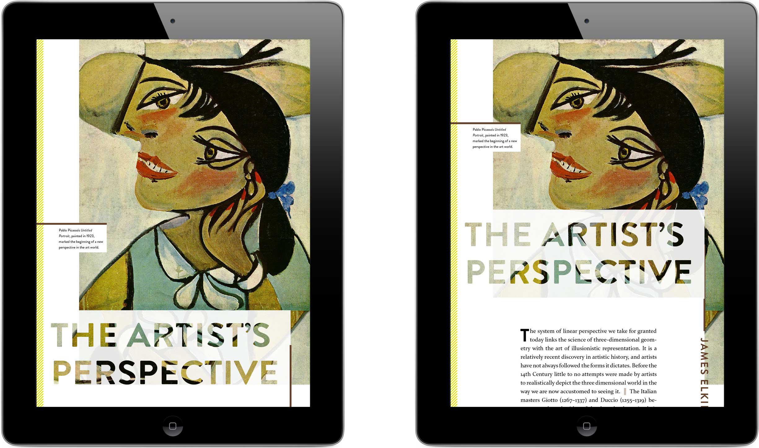
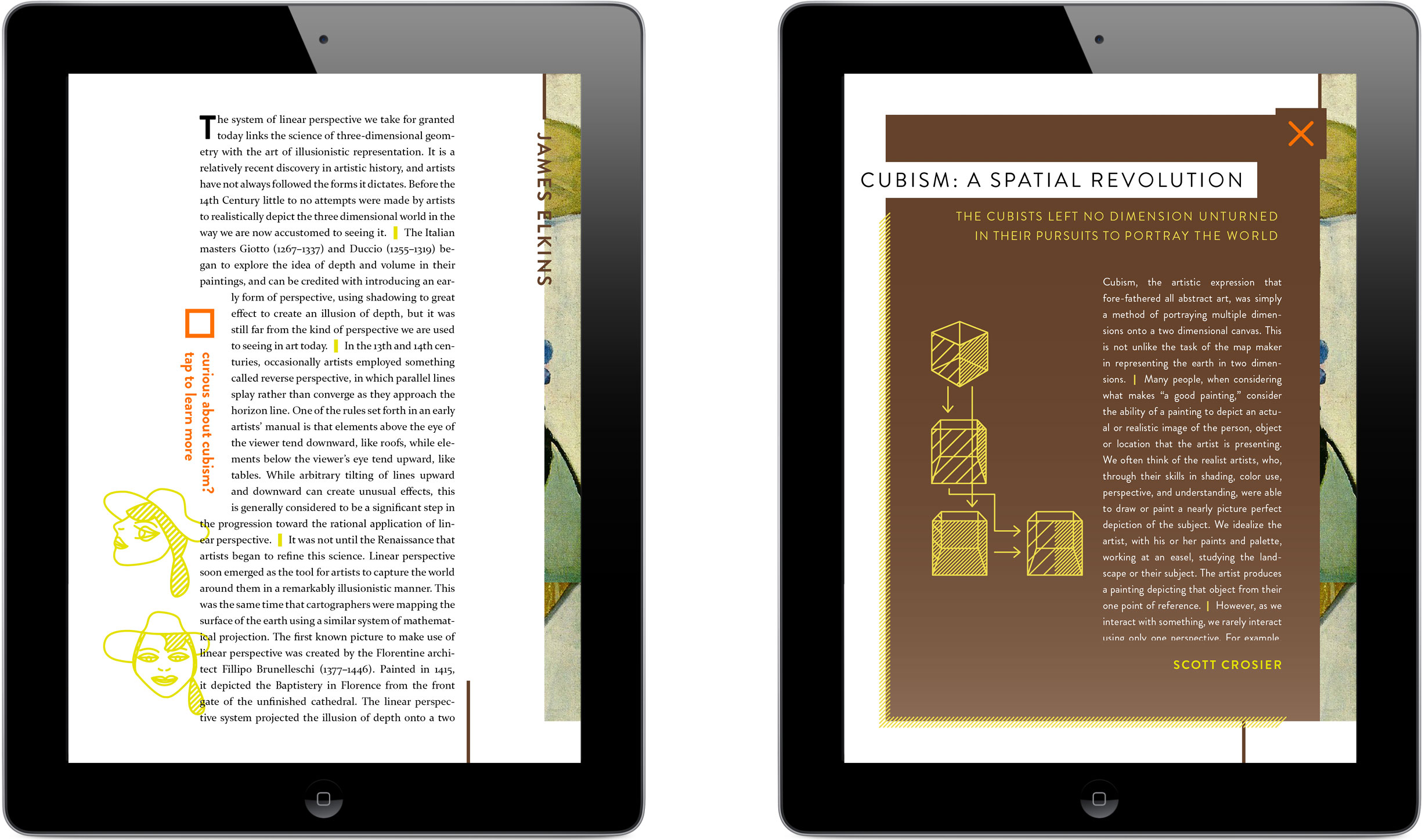
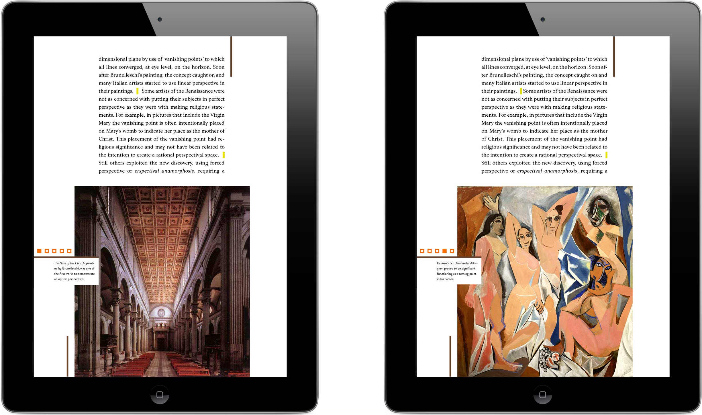
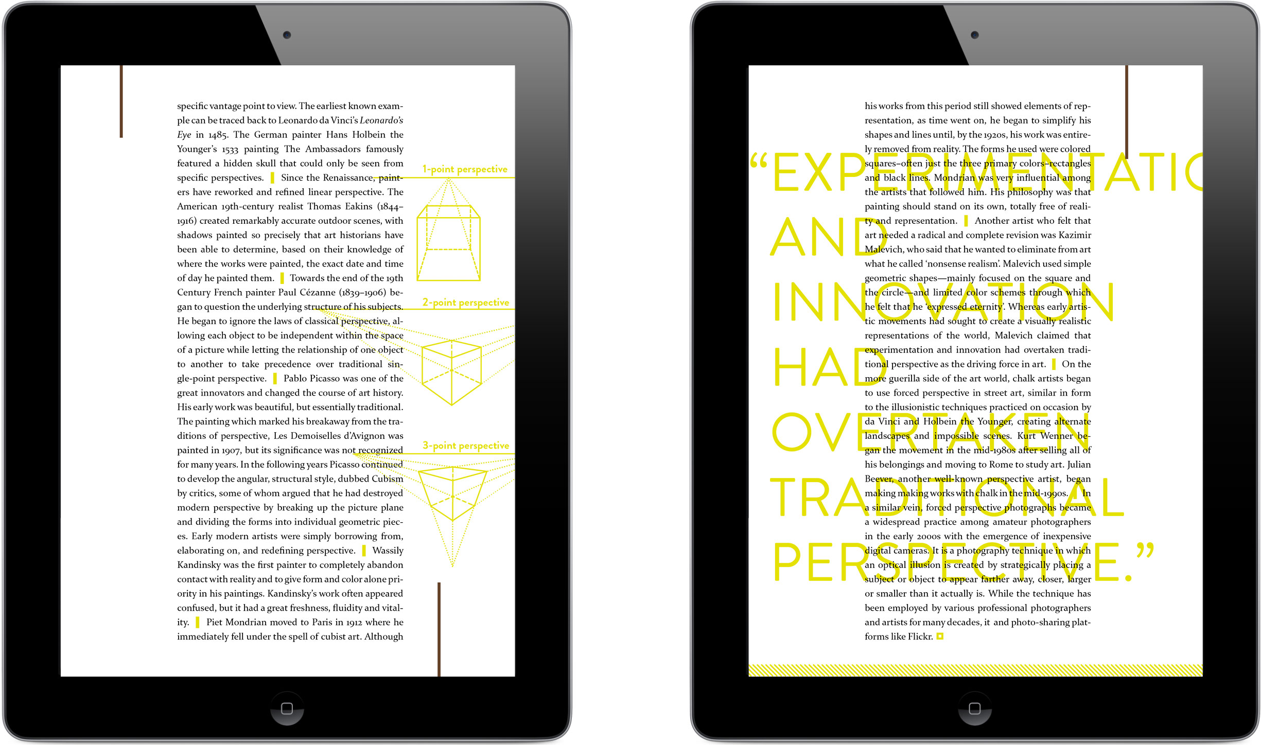
As I outlined a table of contents and searched for articles to populate it, I quickly became aware that this would be an exercise of what not to include: there was just too much intriguing information out there waiting to be reported. I assigned my magazine issue a theme to help filter and channel the content. The notion of perspective was flexible enough in its differing interpretations to be taken several directions. Meant metaphorically, it alluded to critical thinking by way of examining ideas from various view points to arrive at an informed understanding; this complemented my magazine’s mission perfectly. I wanted anyone to be able to crack open Curiosity without any pre-requisites and take away a nugget of new understanding, so I carefully chose articles that avoided delving too deep into esoteric topics, and in some cases I edited the text to fill gaps in knowledge that my readers might have.
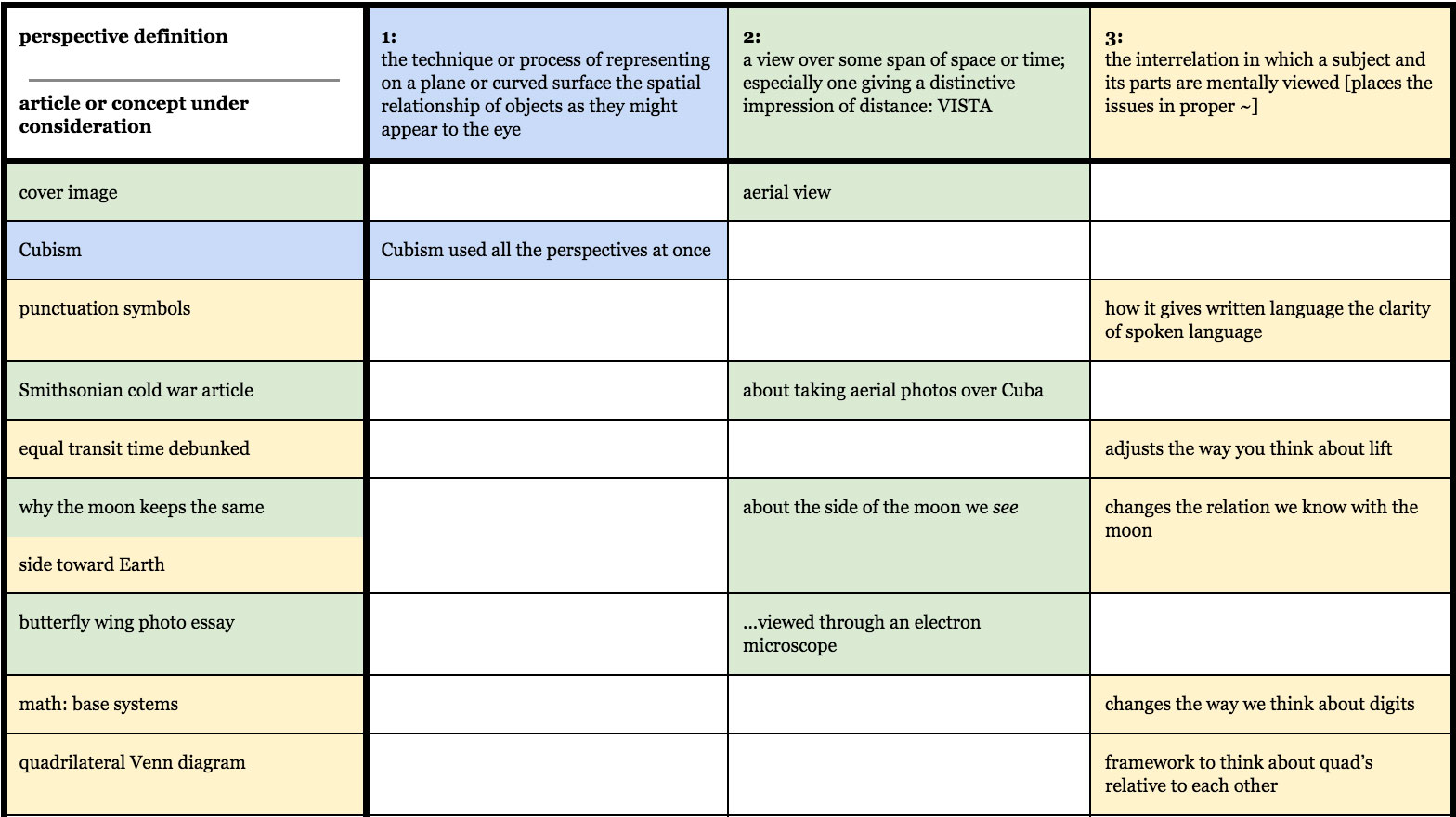
To ensure the content remained diverse in its approaches, I charted how prospective stories mapped to the theme’s various meanings.
Once I’d sorted my selected articles into the sections I’d referenced in my mission statement, I explored how to visually convey each category and the full breadth of ideas it represented.
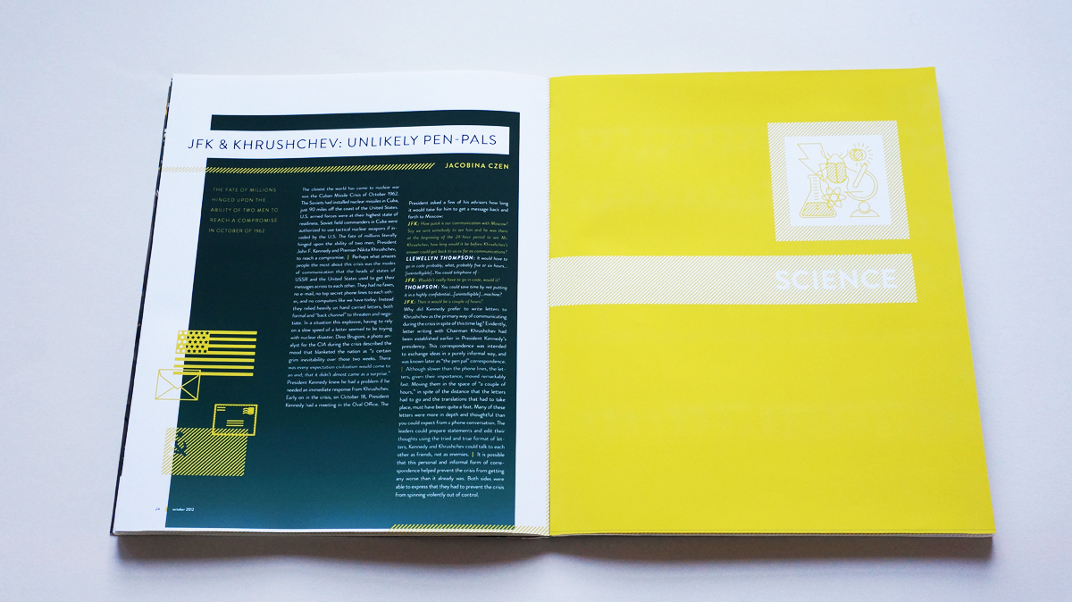
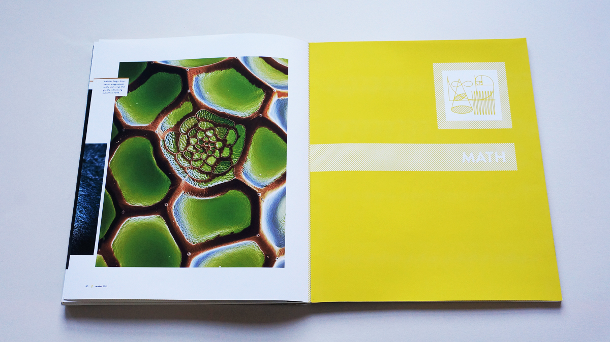
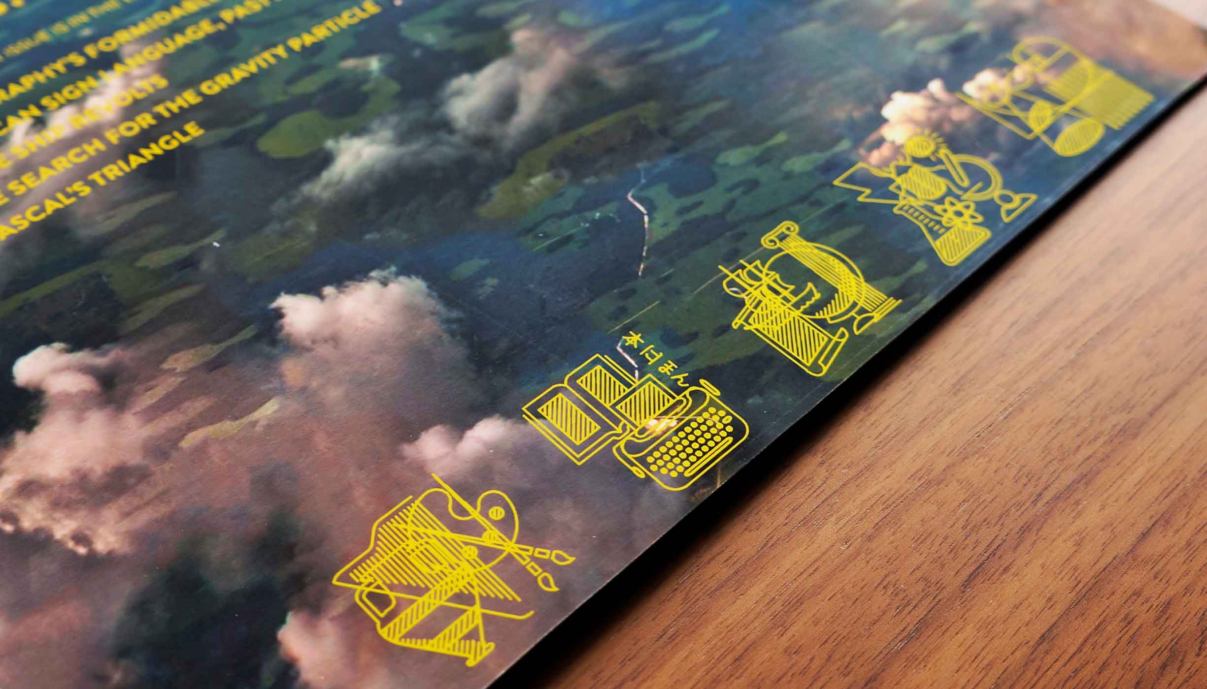
I brainstormed objects that symbolize various aspects of science—a lab beaker, an insect, and an atom, among others—repeating the exercise for the remaining subjects. I then took each list to the drawing board where I iterated how to best combine the objects into an emblem evocative of the domain they stood for.
I settled on a simple line-based illustration style, which acted as a visual foil to the bold photographs I planned to incorporate.
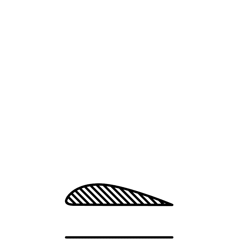
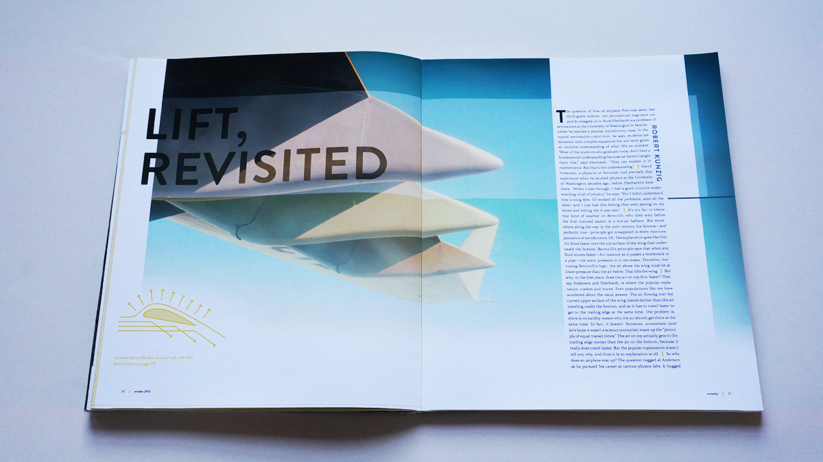
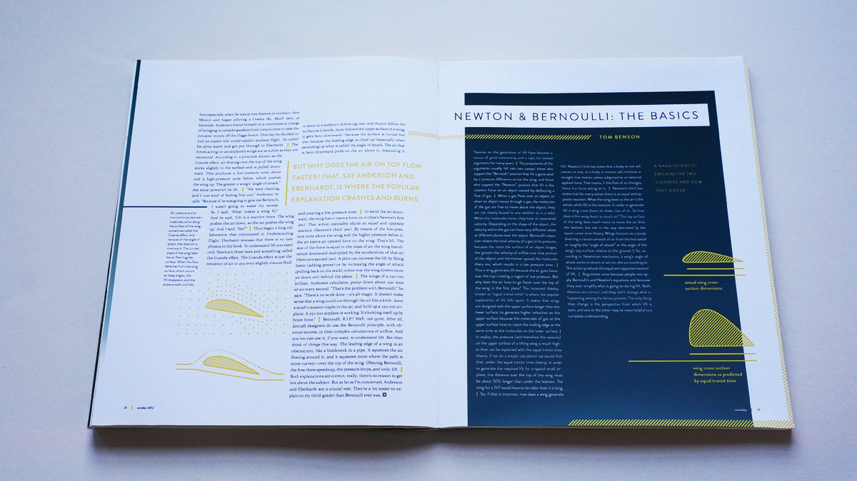
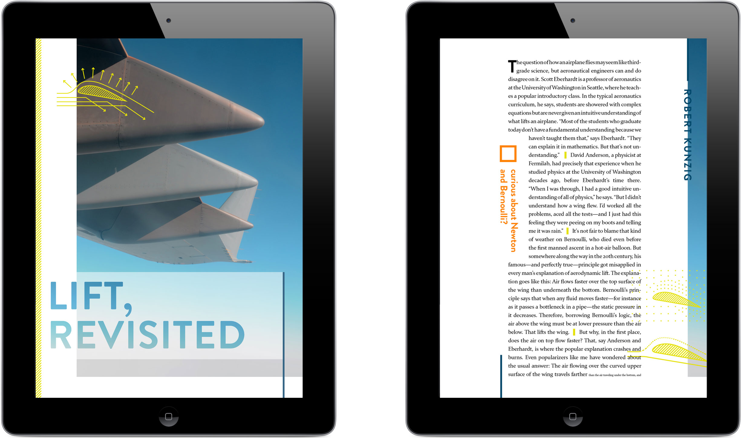
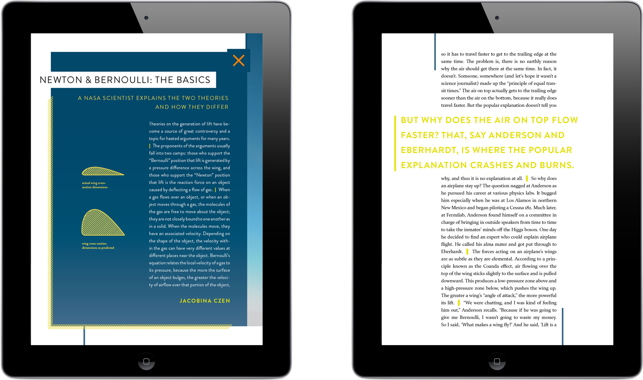
I wanted to use visual aids wherever I could to better communicate abstract concepts central to the the text. An article I’d planned to run regarding the real physics behind flight had personal significance: I’d never fully fathomed what I’d been taught in school about equal transit time 1. The alleged idea that lifeless air molecules were physically obligated to return to their original alignment, post-wing disruption, had always baffled me. In the article, a NASA aeronautics engineer myth-busts the belief by calculating the proportions a wing would need if the dubious theory was indeed responsible for lift—a 747’s wing would need to be taller than it is wide!—and goes on to provide the correct scientific models. If I could juxtapose the proportions demanded by equal transit time against actual wing proportions it would concisely sum up the issue taken on by the author, and compel the reader to learn the truth.
1 Equal transit time, also called longest path theory, claims that air molecules separated from one another when a wing slices between them must meet back up at the trailing edge of the wing. This purportedly results in a negative pressure zone caused by the upper molecules traveling a greater distance and therefore spreading further apart than their below-wing counterparts.
The cross-section most resembling a cartoon whale (on the right) shows the shape a wing would need if the traditional understanding of lift was in fact responsible for flight.
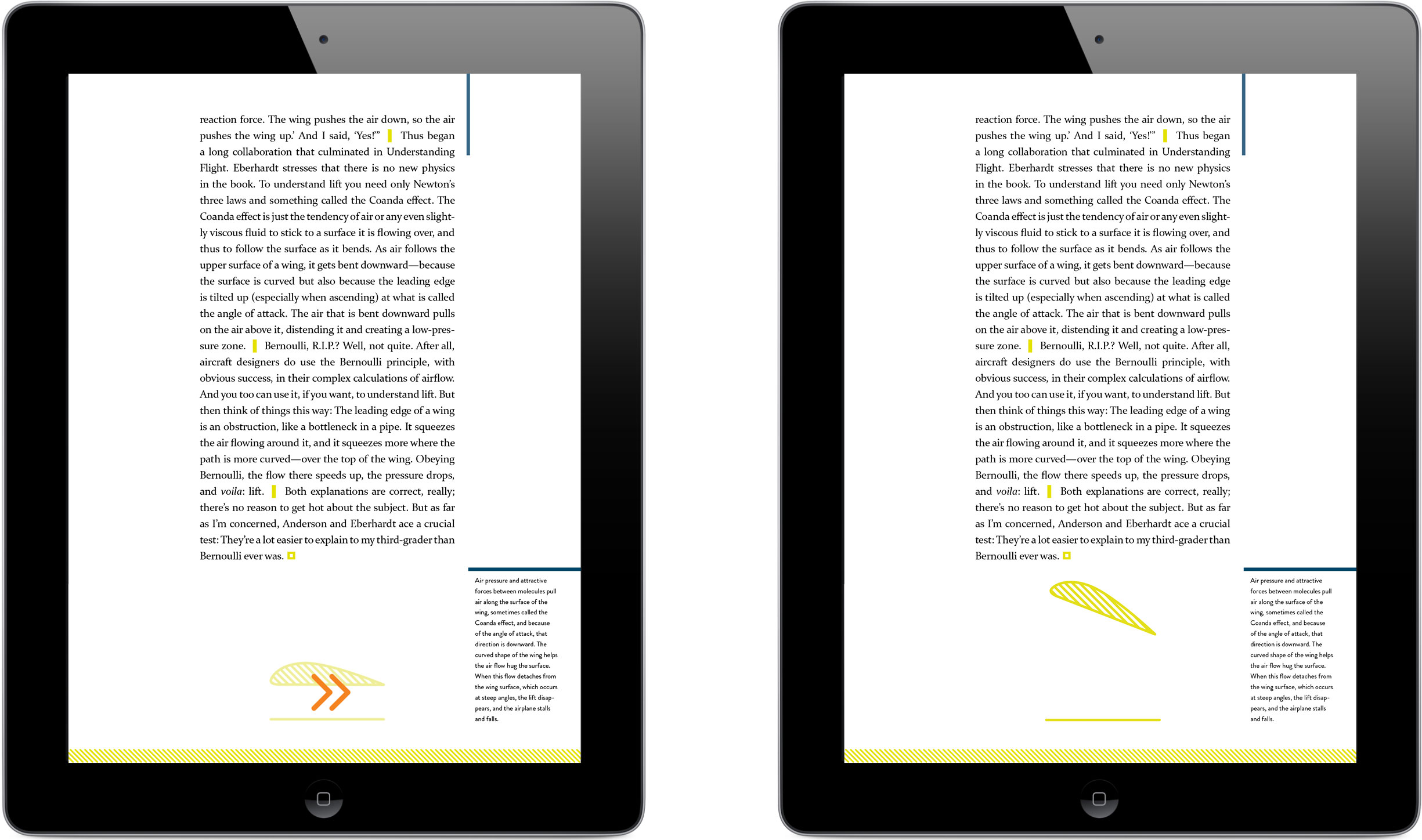
The article about flight also provided an opportunity for interaction within my publication’s digital version, the screens for which I’d been building with InDesign’s Digital Publishing Suite. Lift is determined by the speed of the wing through the air and its “angle of attack”. I created a flipbook-like module that animated through a series of images at a rate corresponding to the user’s swiping speed (which represented air movement); the changing angle of attack and lifting of the wing depicted in the flipbook frames followed, providing instant feedback to the user based on their action.

I built each frame of the flipbook individually before loading them all into InDesign and building the swipe-sensitive interaction.
A single swipe allows the user to observe a wing lifting and lowering based on changing speed and angle of attack.
I fully embraced my Editor-in-Chief responsibilities, balancing the consumability of individual spreads and screens with the pacing of the publication as a whole. Thumbnail sketches helped me set the foundational tempo of images, text, and white space at a holistic level before I solidified page layouts.
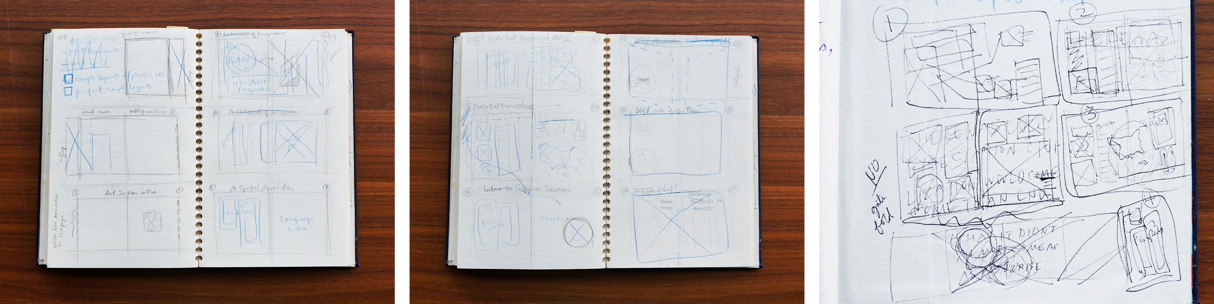
I am prepared to admit to having the doctor’s handwriting of the wireframe world at times. It’s just that I truly believe in establishing a strong storytelling structure; in this case that meant deconstructing potential page elements so I could then put them back together in a meaningful way.
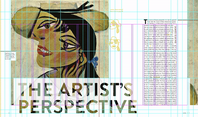
By the end I had plotted out 52 pages of text, titles, images, captions, and pullquotes—all of which would have fallen apart like a house of so many cards were they not anchored by a sturdy and well-tested grid system.
Outcomes
Peruse a PDF of Curiosity online, or download it for later.
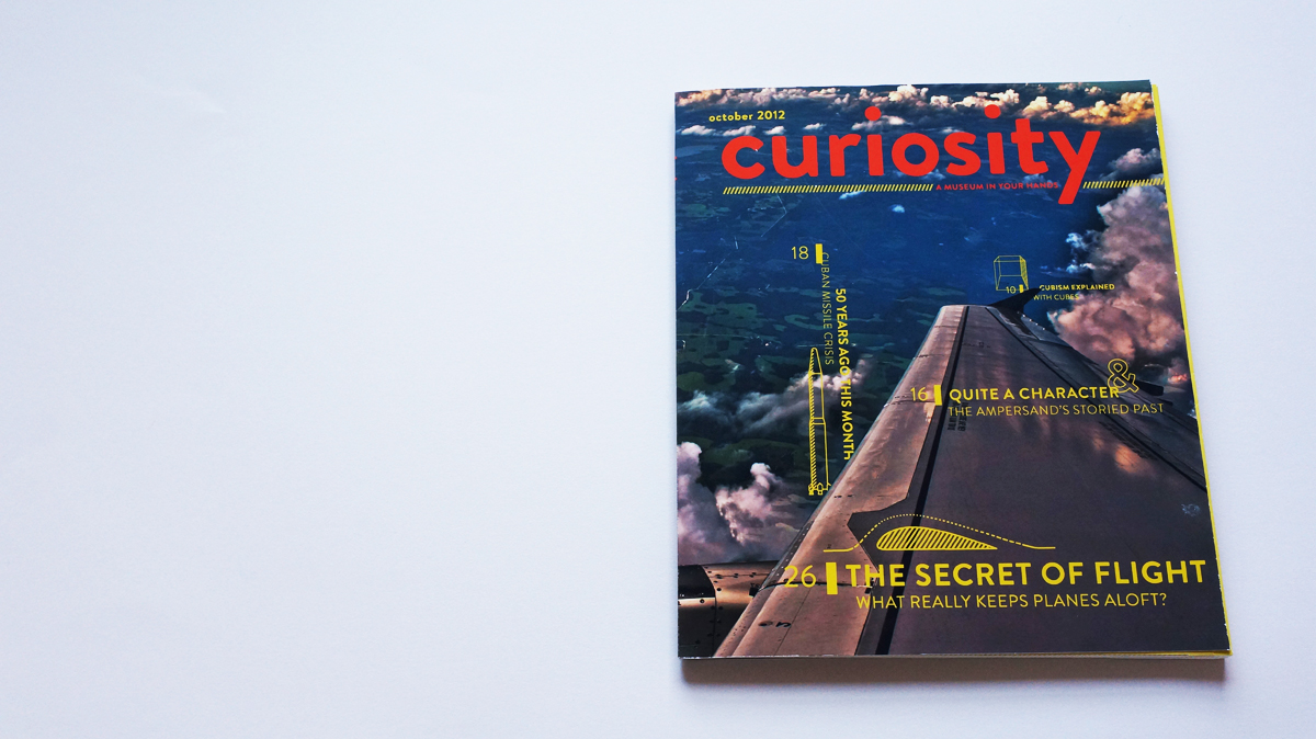

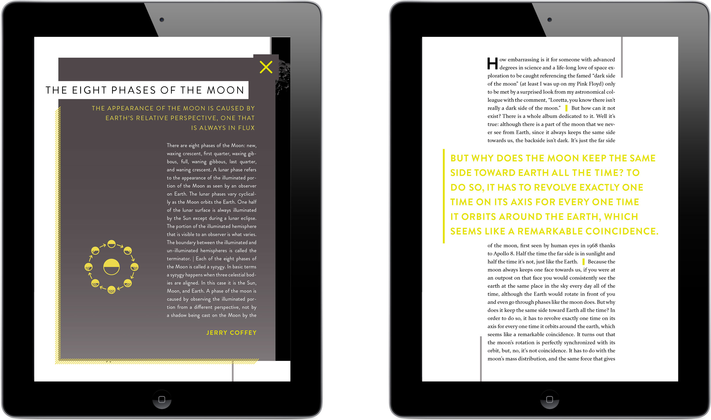
Curiosity is a print and iPad publication that explores and explains how the world works from the ground up, through approachable articles and illustrations.
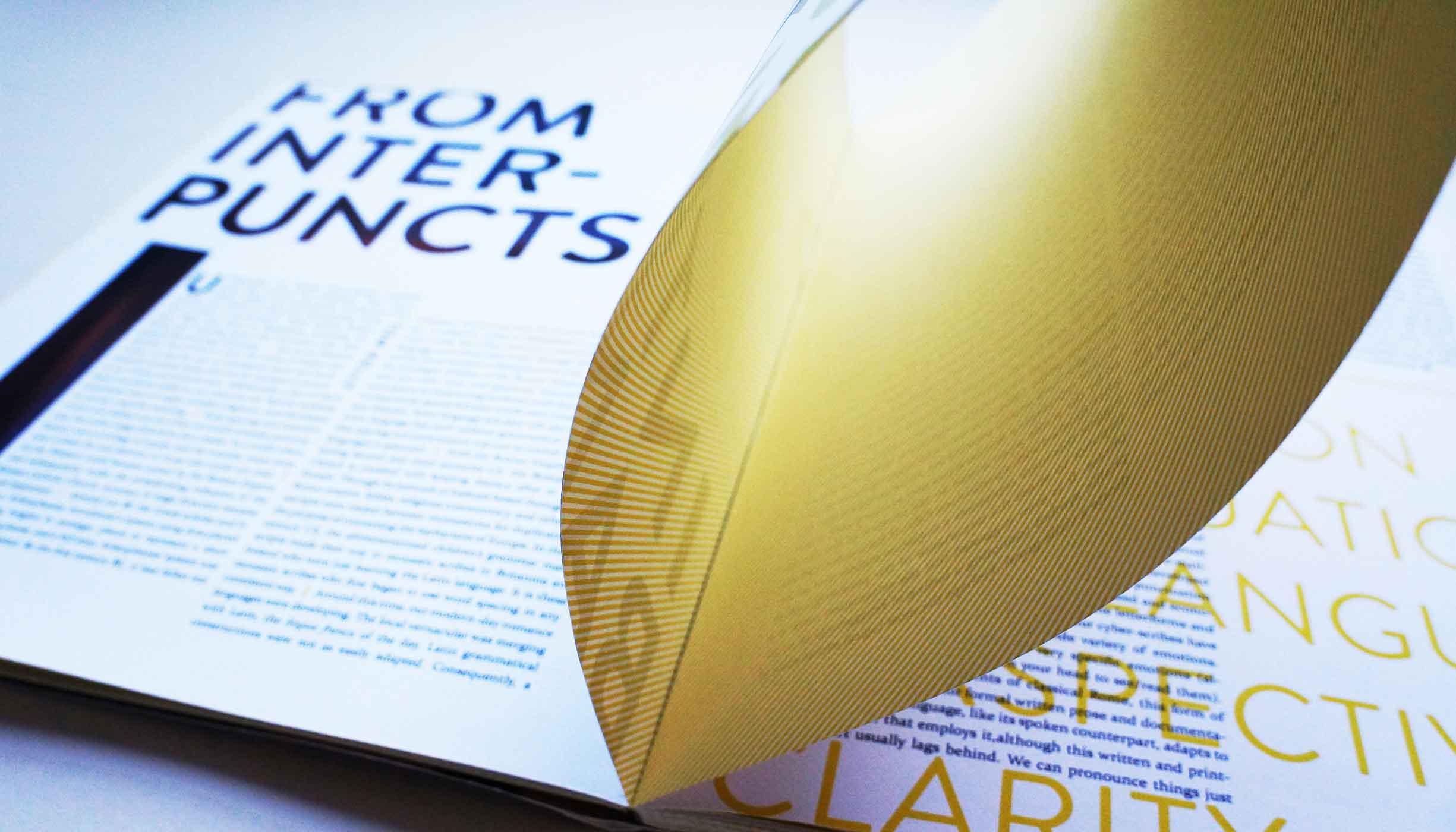
The print version’s page designs embrace the unique French-fold printing technique I’d settled on: I intentionally ran imagery over page edges to draw attention to the assembly method and printed a subtle pattern on their interiors.
Watch a tour of Curiosity’s digital interactions from the perspective of a (very fast) reader.
Curiosity’s iPad version introduces interaction as an aid to understanding. Users can play with simplified scientific diagrams that break down the affect of physical forces behind everyday phenomena like lift and lunar orbit.
Live + learn
- Let the record state: I am now hyper-aware of the measurable fact that yellow drawings and words are not accessible atop a white background. After having worked for over four years at a company whose internal accessibility standards are more stringent than those required by regulation, all I can do is cringe when I think of the ignorant effort I poured into finding the perfect Pantone yellow. However, when I later went on to take inspiration from this project in the form of both its philosophy and its color scheme for a similar undertaking, I also took away insights. See for yourself—my use of yellow as an accent color the second time around is much more accessibility savvy.
- I let quantity—in the number of stories and learning opportunities I insisted on sharing—overtake quality when it came to Curiosity’s tablet version. If I’d been less ambitious with the print version’s page count, I could have allocated my saved time and energy toward more (and more interesting) digital interactions. All’s well that ends well, though: my unsatisfied curiosity around interaction design drove me to design an educational digital publication for my capstone project.
