
Worldly Birds
Objective: Create an interactive digital data visualization
Timeframe: 5 weeks
Opportunities
- Visually, I needed to account for a number of variables. At minimum: time over a year, location on the earth, and bird species.
- I didn’t want to visualize migration patterns that had already been identified and distilled into cleaned-up models: this would be substituting a second-hand proxy for real migration events. So I’d have to find trustable data representing real birds, and plenty of it.
- I’d never yet used Processing or any coding language like it, but it was the perfect tool for the job, so I’d have to learn it from scratch.
Process
To learn how to use Processing, I built small “sketches”: Processing-speak for small, quickly made modules exploring single concepts. Each examined a different functionality available through the Processing language, such as random motion, counting, and click-functionality.
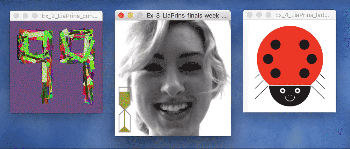
The first sketch illustrates the number 99 by generating a random number between 1 and 99. Once converted from float to integer, if the random number is less than 99, the background color will remain the same, but if it is the integer 99, the background will change to a randomly generated color. I coded the sketch to run at a frame rate of 99 refreshes per second, so theoretically, the background should change about once per second.The middle sketch is a timer counting down until the end of finals week at UW. Portraits of my various finals-week-related emotions flash semi-randomly: as the timer fills with “sand” the chances that a panic-stricken portrait will appear increases.The ladybug sketch explores interactivity: a click on any of the ladybug’s dots changes the pattern of its shell.
My search for quality data led me to the website of Cornell University’s well-renowned ornithology program. They offer a platform for birdwatchers all over the world to track their sightings, including data points such as the bird’s species, number of birds sighted, date/time, and precise location pinpointed by latitude and longitude. The dataset can be filtered by species and downloaded for free. My initial plan allowed my users to search and filter the app I’d build by any species they wanted, so I attempted to download the entire set of data for all birds ever sighted and recorded. But when my computer crashed every time I tried, I realized I’d have to work with a smaller set of data, so I chose a subset of species to represent various migration patterns.
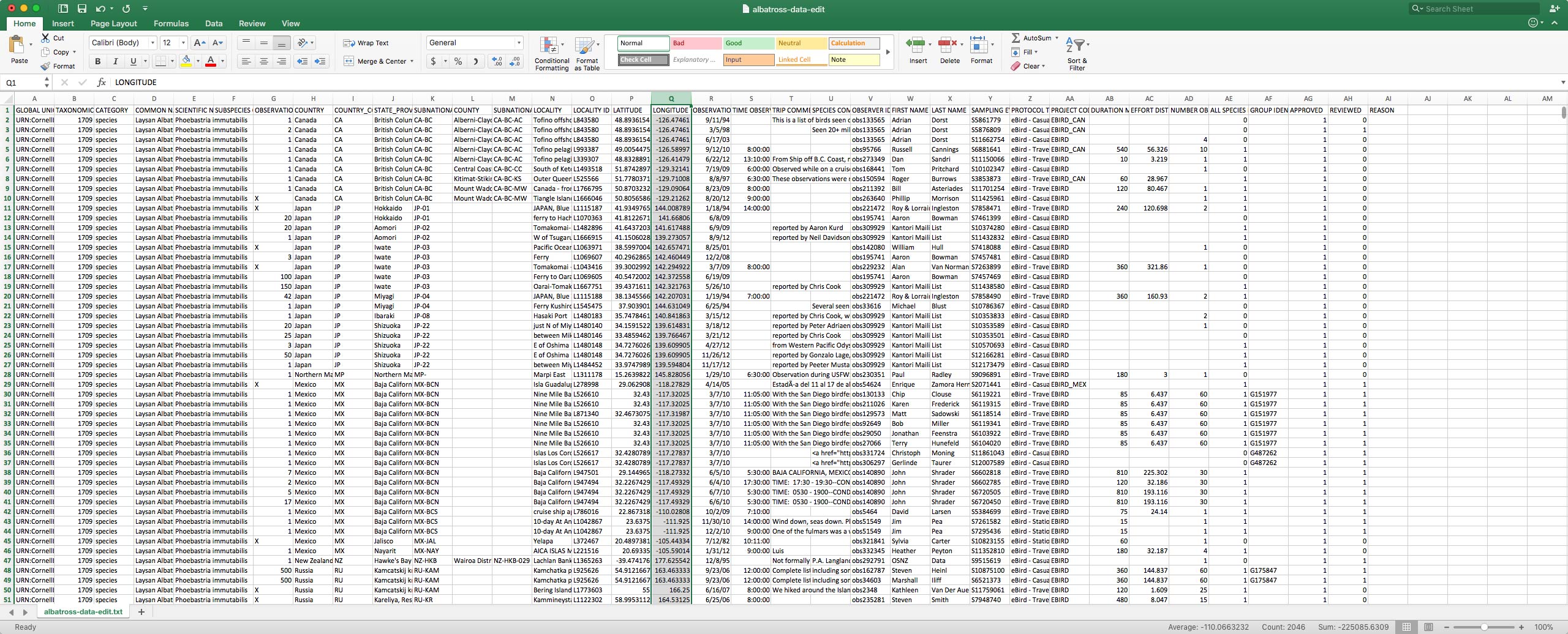
This small sampling of the data for albatrosses alone reveals the abundance of included metadata, much of which was irrelevant to my needs. I cleaned the data by deleting all columns except those listing species, date, and location in latitude and longitude.
Time, location, and bird species remained the most important pieces of data for the visualization. I sketched to explore how the relationships between this data could be laid out on a screen and considered what the user might learn if they could manipulate each of the data types in some way. Would the ability to change the speed at which time was visualized enhance the user’s understanding of migration? What about the capacity to zoom in or out of a specific area, or filter by species?
I iterated on the idea of showing location on a globe that the user could spin or zoom in on. The globe’s 2-D circle shape could double as a year-long clock, allowing the user to scrub around the perimeter that portrayed a year at their own pace, while dots representing bird sightings moved. The center of the screen could act as a search bar with a type-ahead system, where the user could look for various bird species.
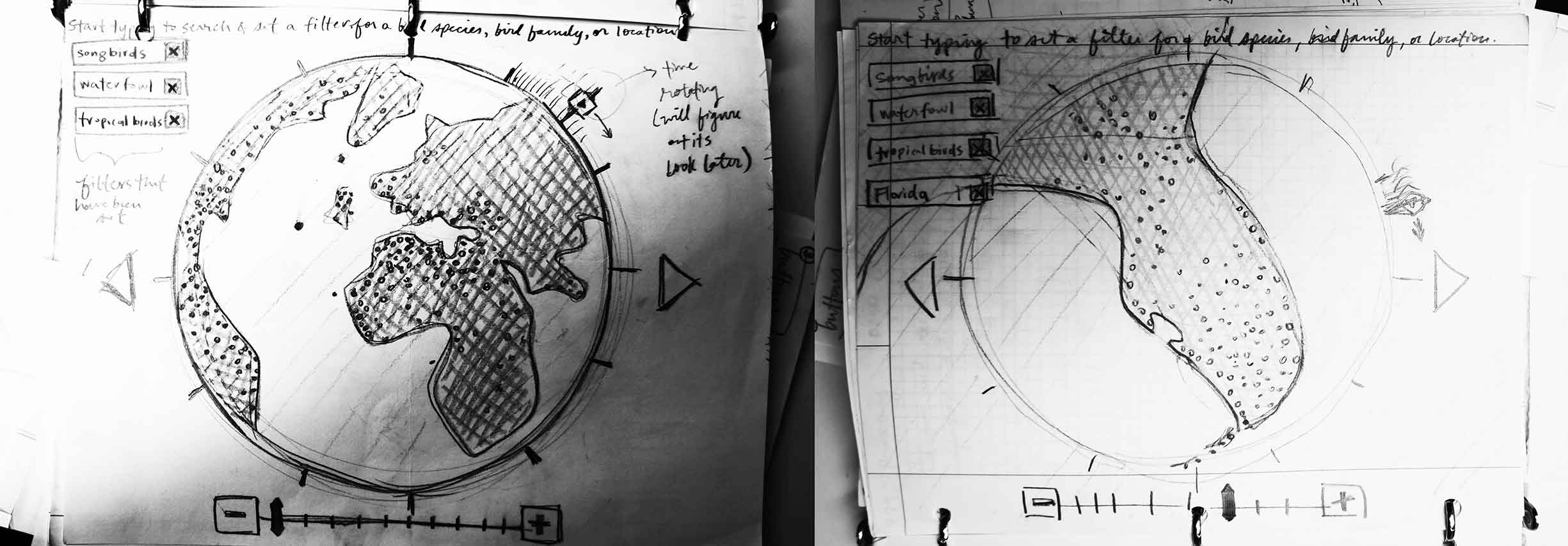
I start all my projects on paper, sketching to iterate quickly and cheaply, before I get too invested in a single solution. Here I examined how filtered species could be displayed as tags in the upper left, how zooming could be controlled, and a possible method to visualize time passing via a circular clock in the center of the screen.
My final design incorporated elements of my sketches, but lack of time and technical ability prevented me from building interactivity into all of the data’s dimensions. I prioritized interactions relating to which species were shown over interactions regarding clock speed and location-zooming: allowing the user to choose which migration paths they observed might encourage comparison and critical thinking about species’ behaviors.
I started building the visualization in distinct, rough sketches, each constituting a single chunk of functionality. After I refined each sketch individually, I incorporated them into a single Processing file.
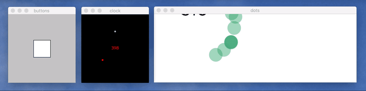
These early sketches explore the functionalities I’d need to incorporate into my visualization: actionable buttons, an analog clock, and dots depicting location that change over time.
Once I had pulled together all the functionality-related code, I identified repeated variables I’d need to visually refine, such as colors and the sizes of dots and buttons. Rather than modifying the individual RGB coordinates for a certain color everywhere it occurred in the code, I instead assigned it a named variable, such as cerulean. I made a separate file to hold these named variables’ values, which enabled me to quickly explore and tweak visual treatments: a single change to cerulean’s RGB value affected every place it occurred in the code.
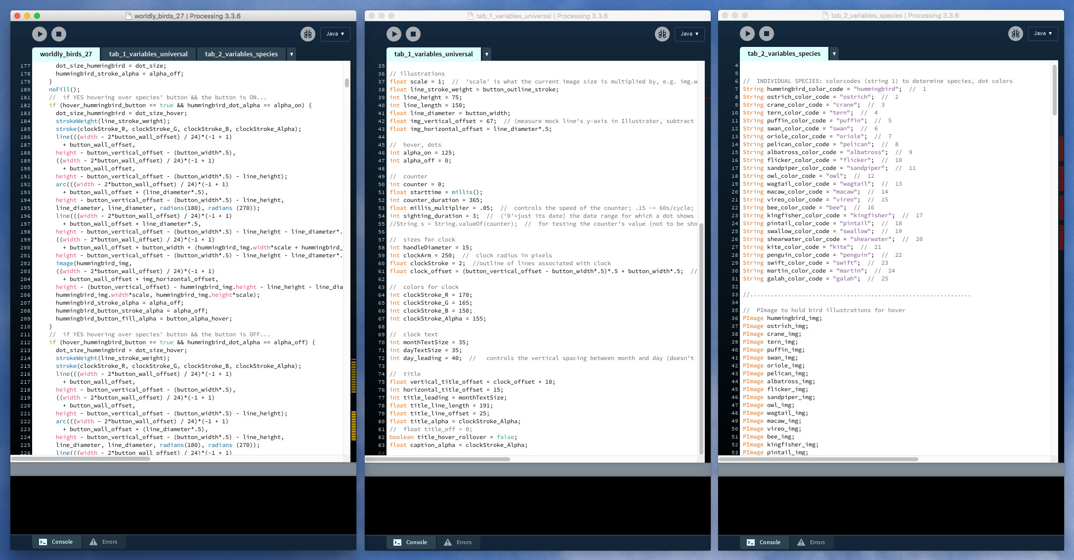
I wrote one large primary code file that referenced two other tabs holding named variables: one for colors and sizes, and another for species-related content.
As a self-identifying color nerd, I completely geeked out when I established the color scheme for the dots that portray each of the 25 bird species I had selected. Bright colors would easily stand out against the gray background I had assigned to the map, so I evenly distributed 25 circles around the perimeter of an RGB color wheel to ensure each color was as far from its neighbors as possible, thereby mitigating color misidentification on the map. Some colors, like the greens, were too similar to sufficiently distinguish from one another optically, so I manually adjusted them. Then I attempted to assign each of the bird species a color that complimented part of its plumage or alluded to its name, and made sure that neighboring colors went to birds with differing migration paths to prevent similar colors from overlapping and causing confusion.
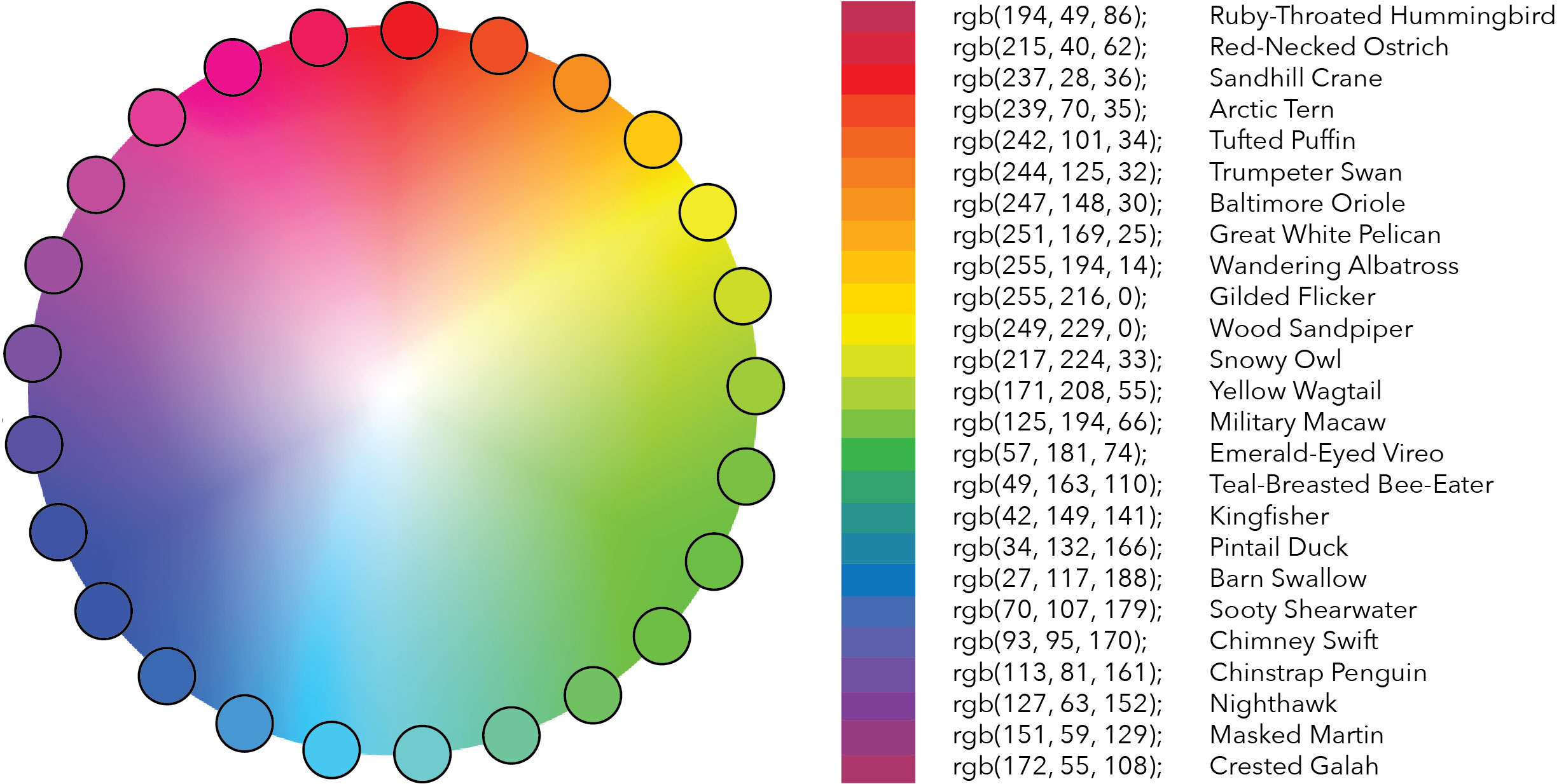
An RGB color wheel helped me establish bright yet relatively distinct hues with which to represent each of my selected species on the map.
I wanted to incorporate a visual depiction of each of the bird species to help users mentally connect the moving dots on the map to the animals they stood for. I created illustrations rather than using photos found elsewhere so I that could incorporate each bird’s assigned color and build a stronger association between it and the dots representing it. A playful, geometric illustration style appealed to me in part because it would blend in well with the UI’s other form factors like the circles of the clock and buttons, and the flat, vector-based map.
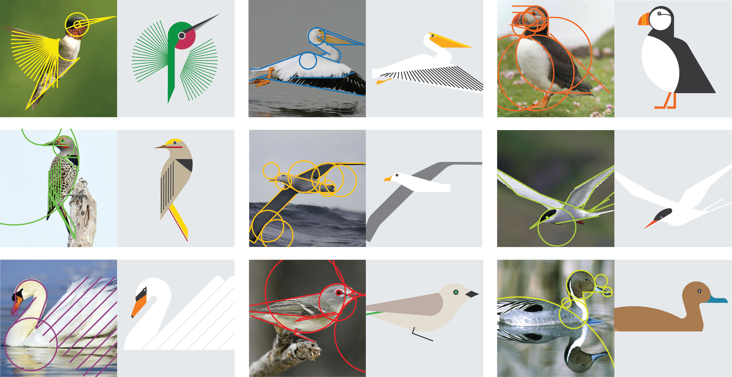
I used a geometric style to keep the illustrations simple, but I still wanted each bird to be recognizable by its signature posture or behavior. Photos helped me identify and ensure I captured these aspects, providing the structure behind the illustrations’ simplified silhouettes.
Outcomes
To try out Worldly Birds yourself, download an applet for your Mac or an extension for your Windows device.
Which birds go where, and when? Scientists keep track of the species they sight to learn more about migratory patterns. The seasonal sightings for this sampling of 25 birds can be compared by toggling their buttons on and off.
-
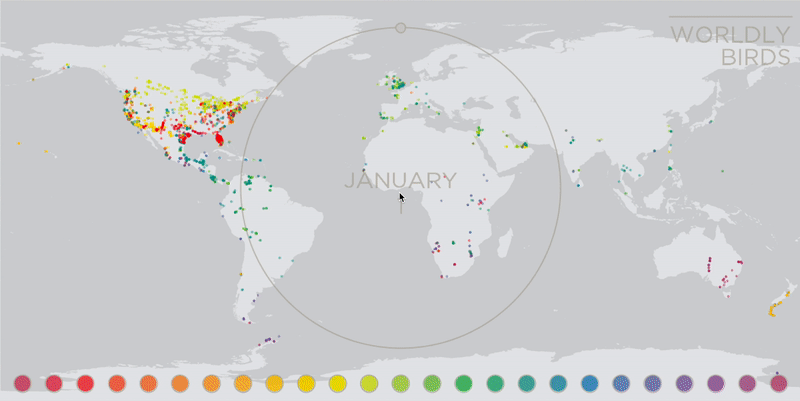
When several buttons are on, it can be difficult to distinguish specific species’ patterns. Hovering on a button enlarges its associated dots, making it easy to track. -
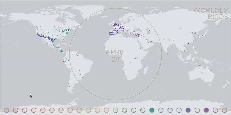
Buttons can be toggled off to minimize the number of species shown at a time, allowing for easier comparisons. -
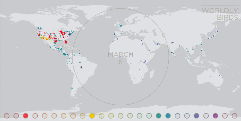
Hovering on a button even after it’s been turned off surfaces its species’ data points, enabling quick comparison to other birds on a whim.
The name for the visualization came to me in the middle of the project … and at the height of the Angry Birds craze (inspiration can come from anything, they say!). I felt the name Worldly Birds succinctly summed up the stories told by each trail of dots. I knew data visualization was capable of clarifying information and lending it context, but before I saw the numbers from my spreadsheets appear as roaming dots on the map, I didn’t fully realize the power that it also possessed for storytelling. I found myself imagining arctic terns stopping for snack breaks at island outcroppings and penguins preparing to dive in and lose sight of land for days at a time, all because of what the data revealed to me.
-
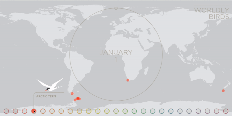
These sped-up single-species time lapses show the variation between migrants in the bird family, and reveal the narratives hiding within their data. -
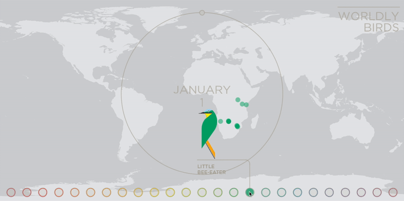
These sped-up single-species time lapses show the variation between migrants in the bird family, and reveal the narratives hiding within their data. -
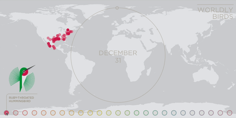
These sped-up single-species time lapses show the variation between migrants in the bird family, and reveal the narratives hiding within their data. -
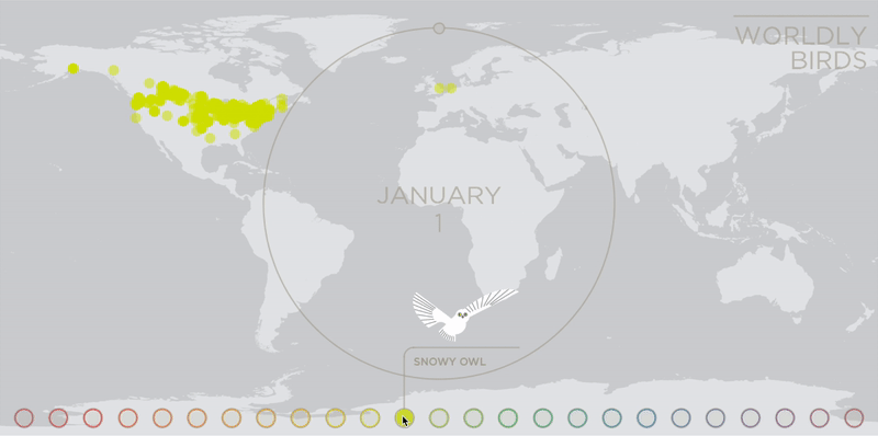
These sped-up single-species time lapses show the variation between migrants in the bird family, and reveal the narratives hiding within their data. -
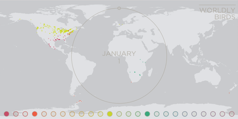
Comparing all four species simultaneously exposes the difference in each species’ needs over the course of a year.
Live + learn
- I wish I had tied in more of the science and rationale for why these birds migrate at all, and the physical traits they’ve evolved to efficiently do so. Along with names and illustrations, I’d love to have included information around how species’ habitats and feeding needs change seasonally, average body-length-to-wing-span ratios, and explanations of any other characteristics that help these birds on their journeys, like magnetoreception. Extra details like these would give the user a fuller context and help them make deductive connections between animals’ needs and the form factors they’ve evolved.
-
The existence of each data point on the map depends on a bird and a human (one who is semi-ornithologically savvy and a contributor to the data platform, at that) both having been present at the same moment. With that knowledge, it could be argued that some of these patterns are more indicative of human “migration” (or at least vacation) habits. I included a description of the app and the data it uses within the UI, but looking back, I’d like to have made this dependency of the data somehow more obvious in the design.

Dots only exist on the map at the intersection of bird and bird spotter. - Despite my painstaking selection technique, showing only 25 bird species still feels arbitrary to me. And as a self-proclaimed arbitrary-abolitionist, this does not sit well with my soul. The actual species-toggling functionality I built was a compromise given my constraints, but it maximizes the user’s ability to play, engage, and learn by comparing differing migration patterns.
