
Watson for Drug Discovery
1 As documented in MedicineNet’s Drug Approvals—From Invention to Market ... A 12-Year Trip article.
Project pretext: ProfessionalObjective: Design a data visualization to increase user understanding and productivity
Timeframe: 6 weeks
Target users: Biomedical researchers in pharma and academia
Role: Lead data visualization designer
Additional team members: 1 UX designer part-time, 1 developer part-time
Opportunities
- IBM’s Watson does not know biology. The results it surfaces are a product of the technology’s ability to parse sentences and identify patterns in text. Introducing Watson-derived data to biological researchers—themselves accustomed to obtaining information empirically—would mean establishing an entirely new epistemological model at the same time.
- By the same measure, information gleaned by artificial intelligence might feel arbitrary and untrustworthy to our users. The design would need to surface the evidence supporting Watson’s suggestions and make the methods used apparent.
Process
Opening the wet lab to a long list of genes suspected to be connected to a disease is expensive. One way to filter down the collection is to compare it to known genes—those with relationships to the disease that the research team is already aware of. Predictive Analytics (PA) is one of several tools available within the Watson for Drug Discovery (WDD) offering, and it aims to provide just that capability by searching for similarities between the way candidate and known entities 2 appear in publications. The way its results and the evidence that back them were originally conveyed, however, often left users more baffled about what to do next than they were before they opened the app. I was brought onto the WDD team to redesign the way this data and its insights were visually communicated.
2 When it concerns Watson, an entity refers to a single biological concept consisting of various synonyms in literature. Aspirin and acetylsalicylic acid both represent the same molecule, so they are synonyms of the same entity. The cognitive services that make up Watson look only at entities in order to make accurate but otherwise easily missed connections. The algorithms used for this project recognize entities resolved from synonyms that refer to a gene, a chemical, or a disease.
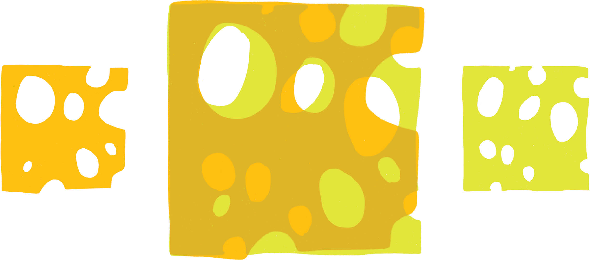
I always think of Swiss cheese for some (yummy) reason when it comes to semantic fingerprinting. The semantic profiles of two concepts being compared can each be represented by separate slices. If they’re overlaid to compare their profiles, their similarities will be wherever the light shines through (yellow in my sketch here). The more light shining through, the more similar the two are semantically.While this works well as a conceptual metaphor for the “fingerprinting” used by WDD, the actual algorithms used many more dimensions than could be accommodated accurately in a simple 2D scatterplot of Swiss cheese holes.
At a high level, a biomedical researcher can query WDD as to which of their hypothesized gene targets are semantically similar to gene targets already known to be related to their disease of interest. Their hypothesized genes and the known gens would each have "semantic fingerprints" representing the way they were collectively discussed in scientific publications, and the terms they were co-mentioned with. These semantic fingerprints from each group could then be compared, to predict which of the user’s hypotheses most resembled the known genes.
The data science behind PA is complex; it goes far beyond simply surfacing sources wherein searched entities co-occur. Before I could design a way to better present the results of the data model to users, I needed to understand it myself.
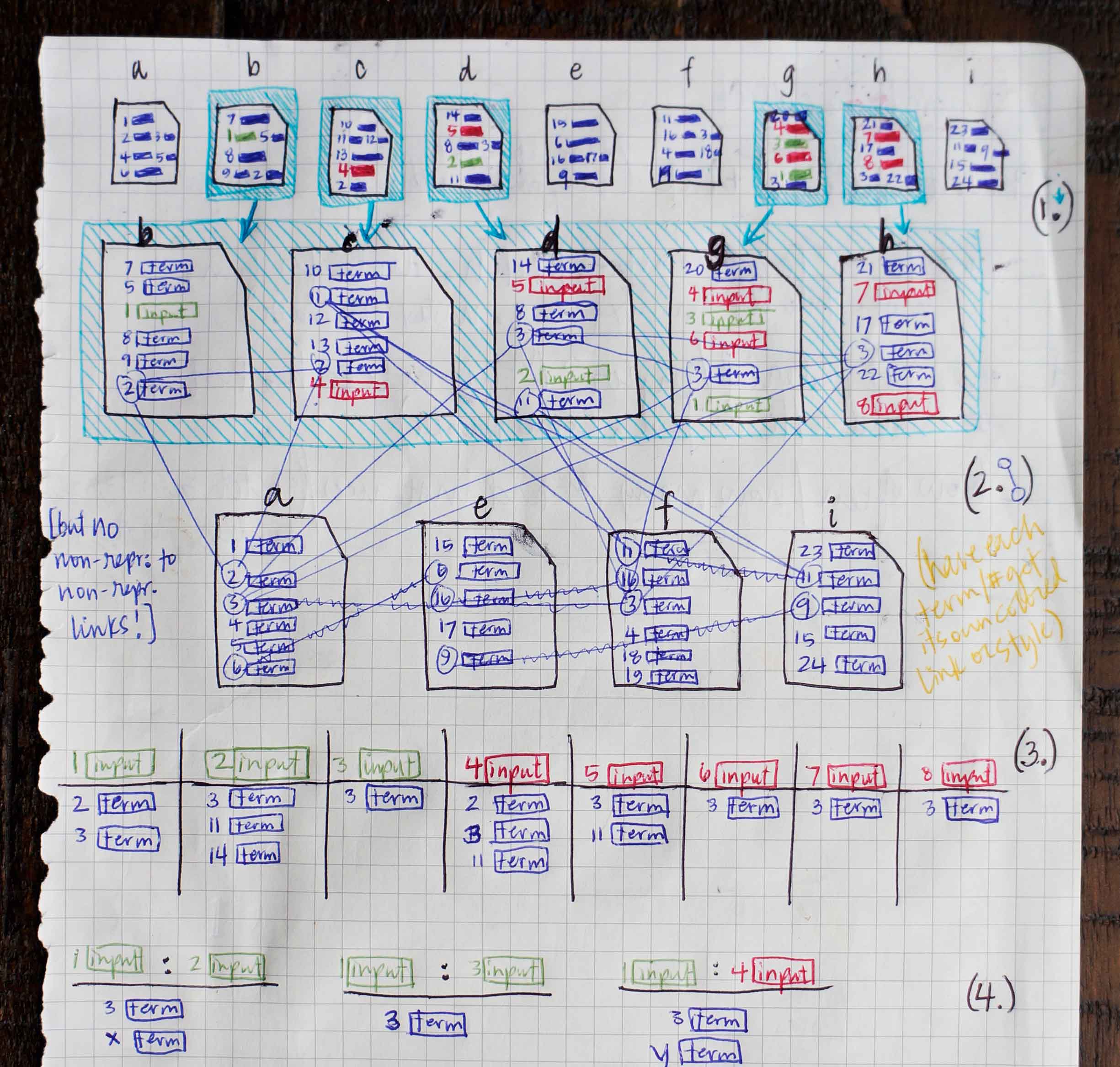
I met with the data scientists who’d created PA’s data model and its original visualizations. Once I had an abstract understanding of the steps that happen behind the screen, I came up with a simple scenario and sketched out conceptual illustrations. This helped me gain a more tangible grasp on the way results were generated.
-
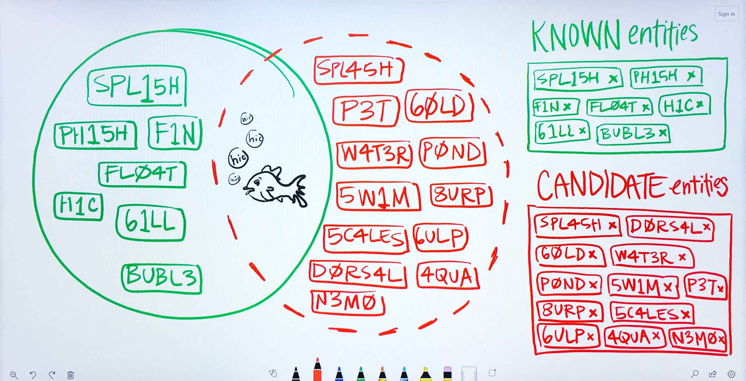
Ms. Carassius is a microbiologist researching potential genetic causes for chronic goldfish hiccups. She is already confident of several genes linked to the condition: these she puts into PA’s known entities field. She’s also gathered a long list of potential genes (with the aid of other WDD apps) that she suspects might have a bearing on the disease as well. She lists these in PA’s candidate entities field. -
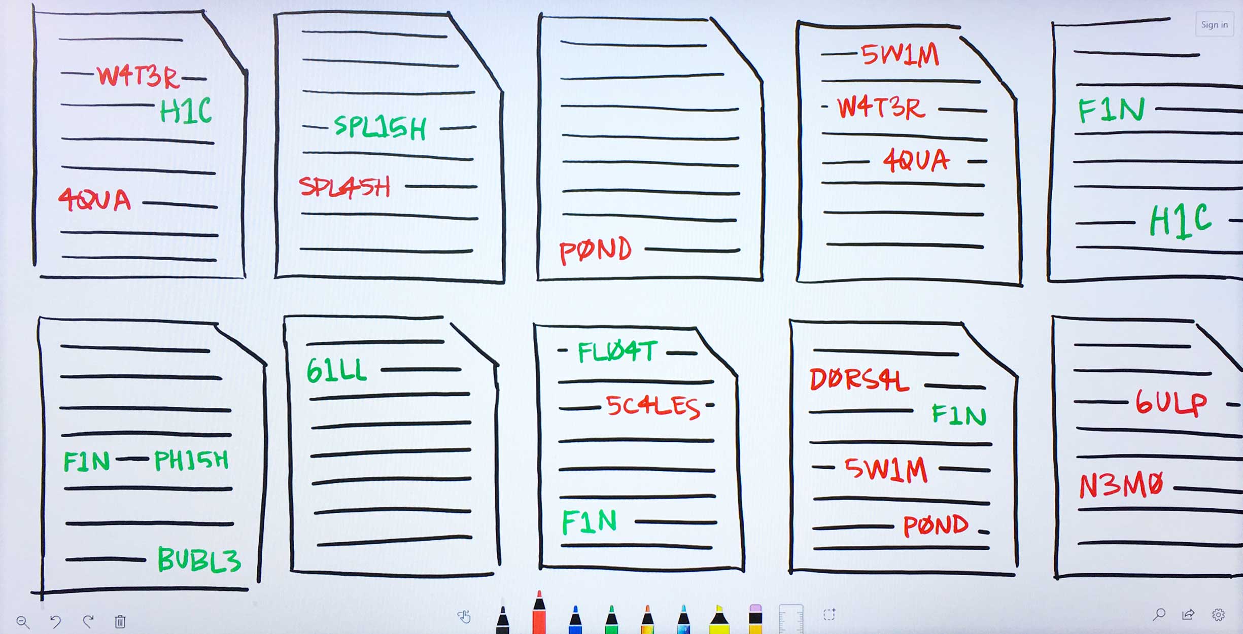
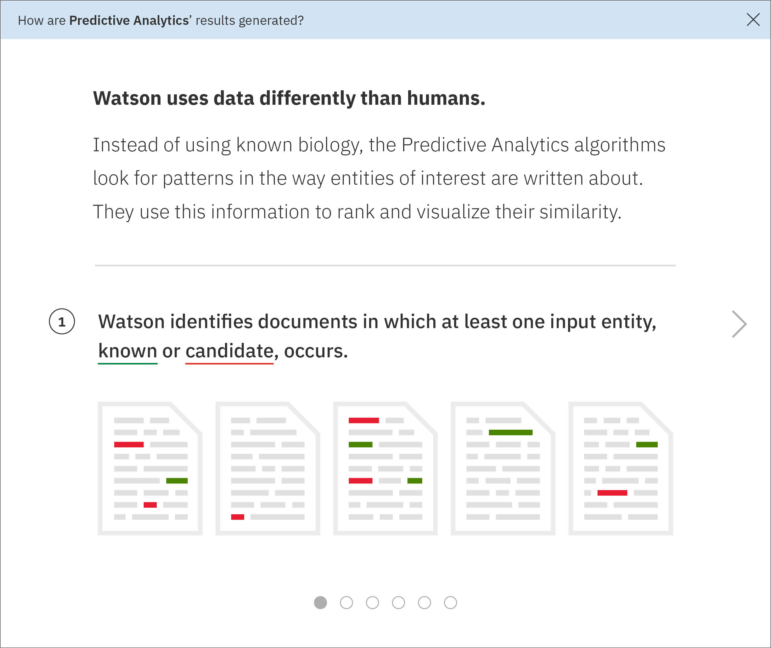
The Predictive Analytics algorithms filter through Watson’s corpus of scientific journals, patents, and proprietary databases, identifying documents in which at least one of Ms. Carassius’ input entities—known or candidate—occurs. -
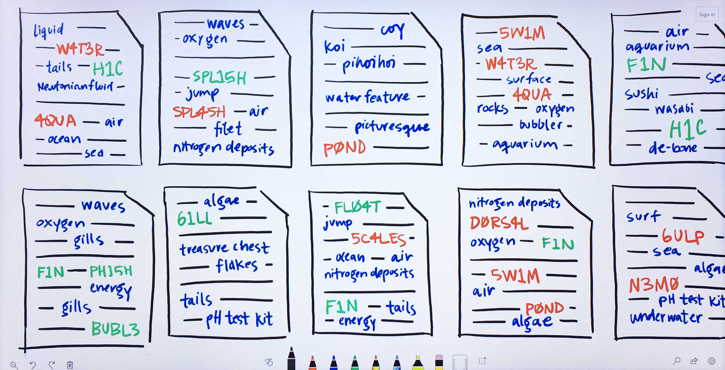
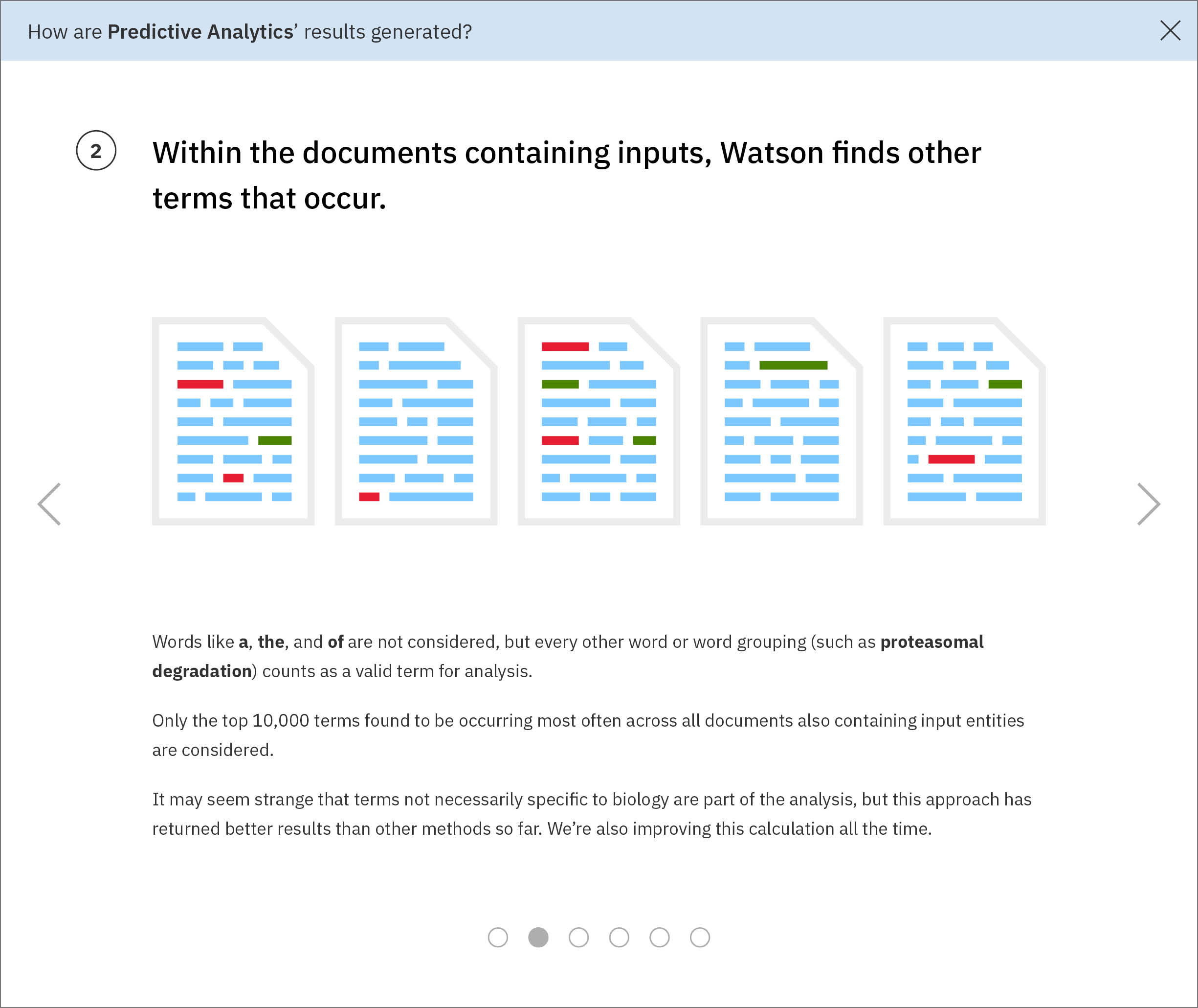
Within the filtered down set of documents that contain input entities, Watson finds other terms that occur. These terms need not be genes, drugs, or diseases, but they can be. -
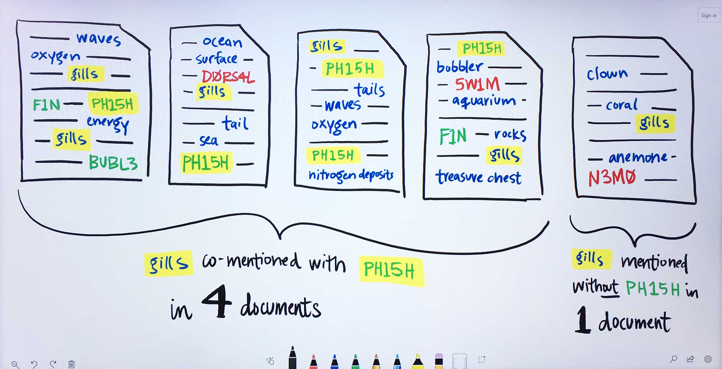
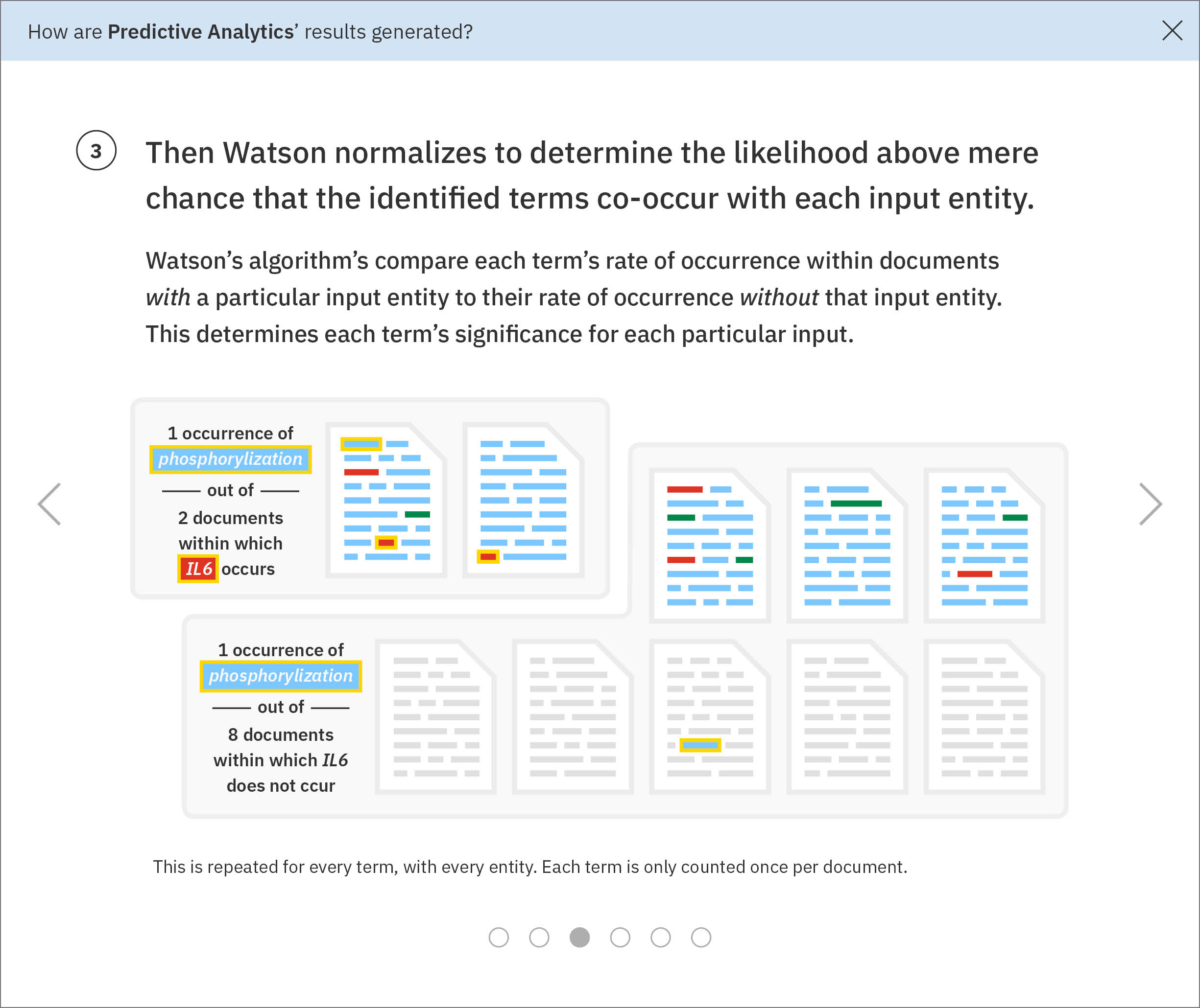
For each found term independently, Watson determines the likelihood above mere chance that it occurs with each gene Ms. Carassius had entered:1. For the found term gills, Watson looks at how often it appears on average in documents that also mention the input gene PH15H.2. Then Watson looks at the average occurrence of gills within documents that do not make any mention of PH15H.3. Next, Watson compares these rates of occurrence. Gills are written about very rarely, only showing up in 5 documents. However, in 4 of those documents, the gene PH15H also appears. This means gills and PH15H correlate strongly in the literature.4. Watson repeats this process for all the remaining genes Ms. Carassius had entered, comparing their rates of occurrence with gills versus without gills. Now Watson has established ratios representing the likelihood for gills to co-occur with each input gene.5. This entire process of comparing gills co-occurrence with every input and collecting their resulting ratios is repeated for all found terms. Several ratios indicate no significance between a term and a gene. Tails occurs with 5C4LES in 719 documents, but without 5C4LES in 736, meaning that regardless of how often tails is talked about in literature, it is not more likely to occur with 5C4LES than without 5C4LES. -
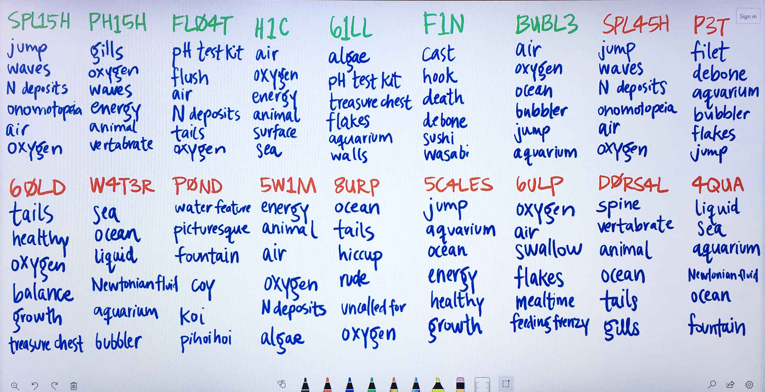
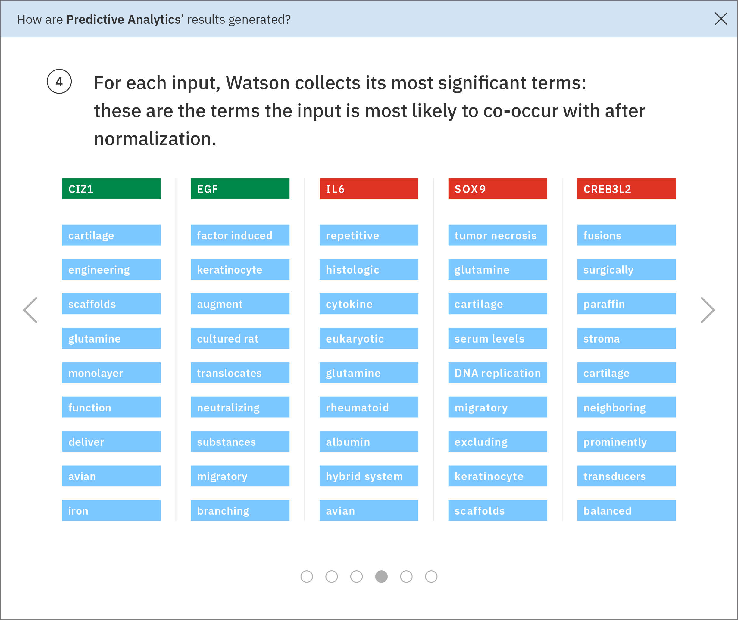
Using the ratios found through the previous normalization step, Watson determines each input gene’s most significant terms. -
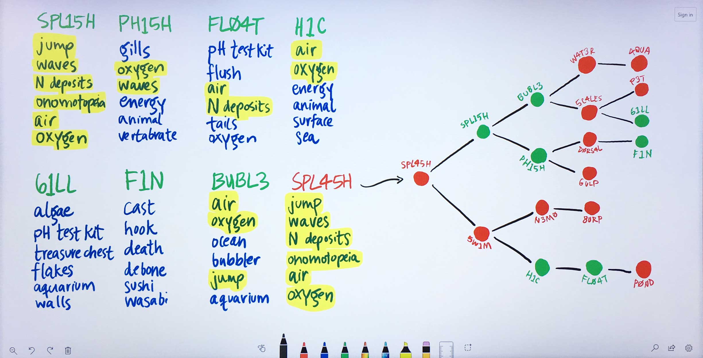
Some of these significant terms appear across multiple input genes. Watson looks at the terms and ratios listed with Ms. Carassius’ known genes and compares them to the candidate genes’ terms. The candidate gene SPL45H has more terms in common—and at similar ratios of occurrence—with known genes than any of the other candidates. Watson finds the two input genes that are most similar to SPL45H: SPL15H and 5W1M. Then Watson looks amongst the remaining genes for those most similar to SPL15H and 5W1M respectively, continuing this pattern until all genes are placed into a tree-like diagram visualizing these relationships.
And that was about as far as I got with my understanding of Predictive Analytics’ as-is state. Its tree visualization felt suspiciously arbitrary on several levels. It was built on the idea that similar entities would accumulate near each other—but nodes within each layer were stretched so far apart to accommodate their own children nodes that physical proximity was not a valid metric of measurement at all.
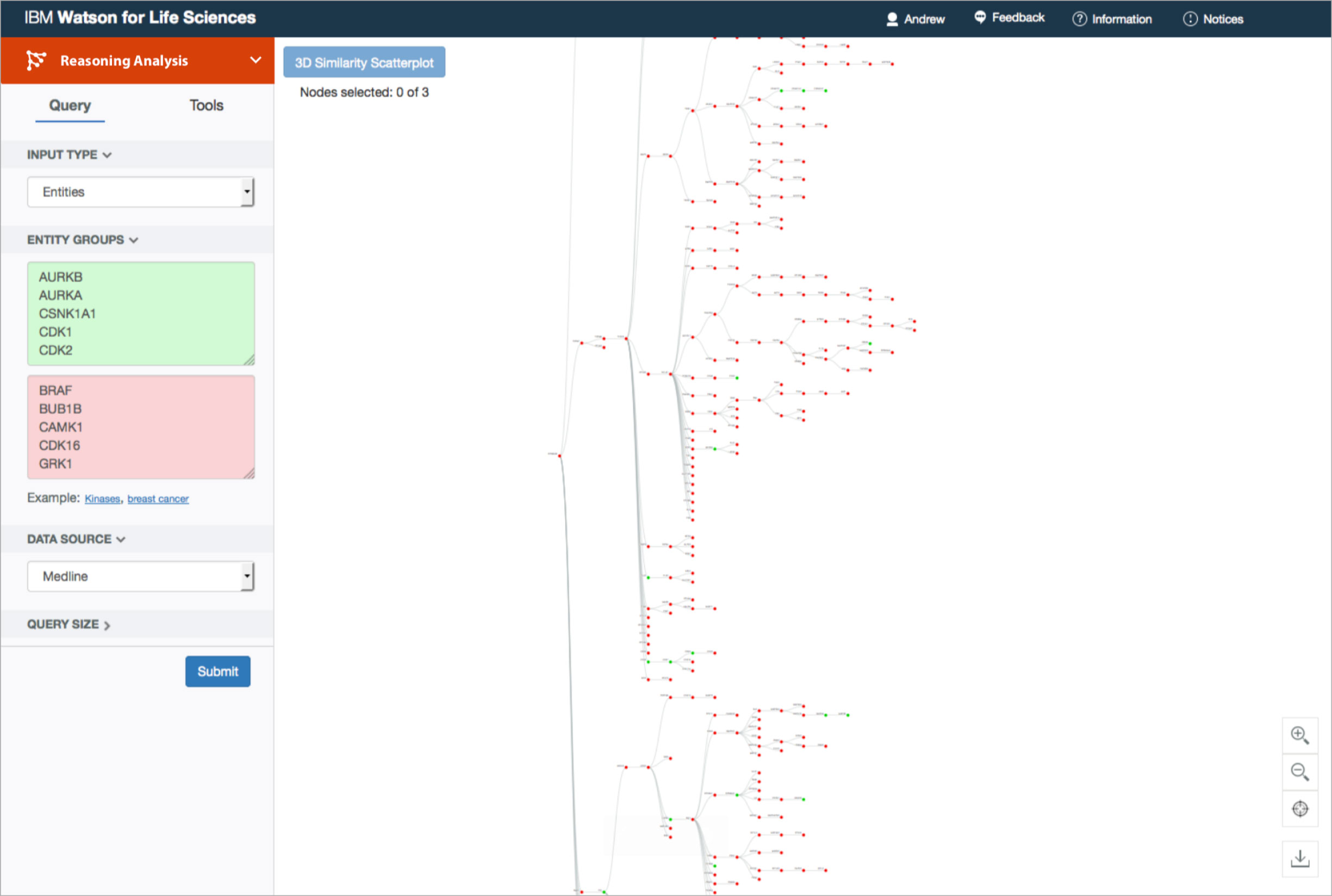
The original visualization was a branching tree, the primary node of which represents the entity whose found terms and ratios are most similar to those of the known inputs. From there, its children nodes consist of the genes—candidate or known—most similar to the the primary node specifically. Subsequent nodes follow, chosen exclusively for their similarities to the previous layer’s nodes. It seemed like a stretch to claim that this format helped researchers narrow down which genes to study in more depth.
It came as no surprise that the tree routinely intimidated and perplexed users. Its focus on hierarchy seemed to them to suggest natural order. Nature branches as it evolves, conceptually leaving tree-like fractals of change in its wake. From taxonomies of living organisms to the structural similarities between chemical molecules, humans organize newfound knowledge of the natural world into nested sub-divisions. To a biologist, a branching framework intuitively suggested results of empirical origin.
“Given that it [the tree] only has these two-way splits at every node leaves open the possibility that things that wind up far apart on this tree are actually not so dissimilar, or maybe they have a closer relationship than it would appear … I became really quite confused about how I was to properly interpret the tree and discouraged that I might be missing things.”
—biologist, after having had access to Predictive Analytics in its original form for 30 days
Furthermore, a hierarchy fundamentally failed to communicate the data accurately. It forced the results into a veritable corporate reporting structure, whereas the actual data model used to find similarity treated all inputs equally throughout the process, comparing them round-robin style. A network or force diagram would more accurately reflect these relationships in the data, while allowing the user to explore their inputs’ relative similarities. A quantitative method like a list could be used to rank the candidates genes based on their similarities to the known genes, and would more directly inform users as to which entities might be worth pursuing further.
I worked with a developer to prototype a force diagram, using real data. Attractive forces are programmed into each entity’s node, based on their similarities to every single other entity. The nodes, with their physics-mimicking forces, jostle and sort themselves out accordingly. In order for every node to be in the perfect position as demanded by its similarity measurements, the visualization would have to exist in a world with n-1 dimensions (where n = number of nodes). That means that this design functions as a flattened approximation, potentially useful for our users as an exploratory starting point.
“There are always, always going to be outliers and errors in our data, that is just the case with big data, but the principle of our analytics is that we try to find the signal that shines through the noise — that is really clear in this visualization, where the outliers and errors are so clearly off to the side.”
—IBM data scientist providing feedback on my design concept
Our users might need to assess several facets of the data simultaneously, to accurately compare and gain context. My favorite part of designing a data visualization is working out which “visual variables” (as I affectionately and alliteratively call them) to employ together, in order to provide these layers of meaning to the user. Sketching allowed me to quickly explore all sorts of shapes, colors, and other visual aspects that could be layered onto the nodes, thereby conveying multiple attributes of the data simultaneously.
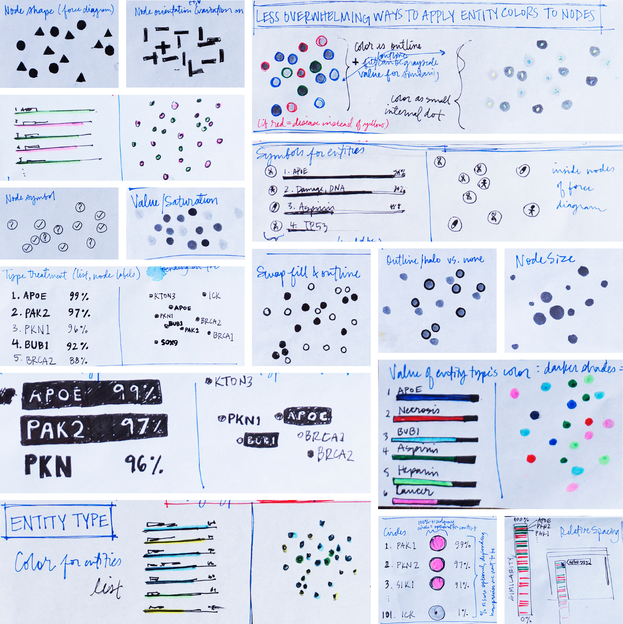
The user would need to quickly differentiate their known entities apart from their candidate entities, to easily identify similarity patterns between them. They might also want to know at a glimpse which candidates ranked highly in the list, or if a node represented a gene, a drug, or a disease. These attributes of the data could be represented at once through the layering of “visual variables”.
Some aspects of the data could not be encoded visually, such as the evidence specifically supporting an entity’s particular location in the visualization. In the original design, if users had wanted this information, they would have had to select exactly three entities from the tree. They’d then be greeted by a spinning 3-D cloud of colored pixels symbolizing individual documents that mentioned one of the selected entities. The only way to actually drill into the supporting literature itself was to click on a swirling colored speck at random, which opened the document it represented.
In addition to being inaccessible to color-blind users, the swirling mass of colored pixels standing in for documents didn’t portray the data model accurately or transparently: no mention was made of the found terms that formed the basis of the similarities between entities.
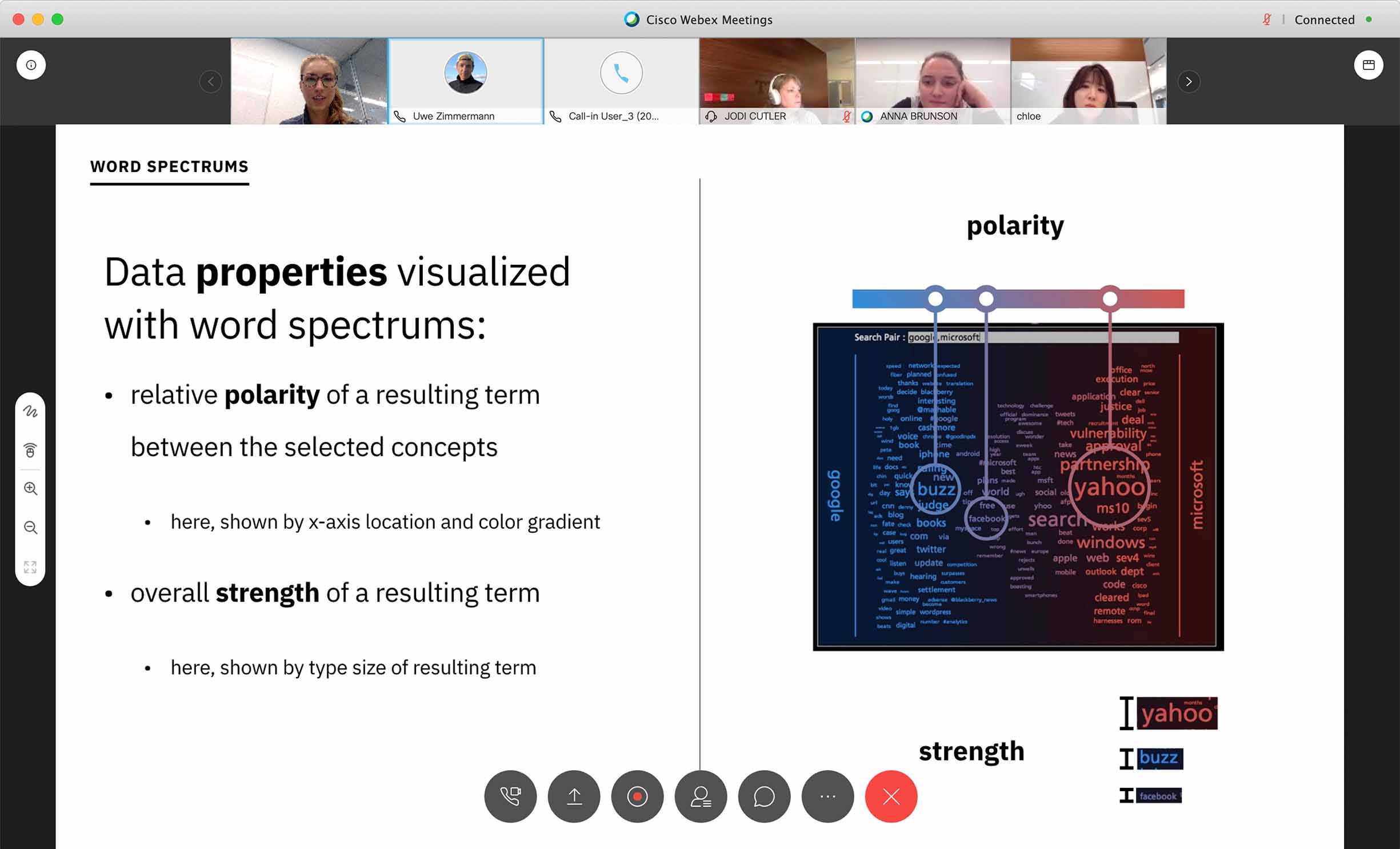
A far more accurate depiction of the data seemed to be in the form of a word spectrum. Typical word spectrums place two concepts being compared at opposite ends of an x-axis, while terms common to both fall on the spectrum between them, their left-to-right location dictated by their relative association strength to each of the two concepts.
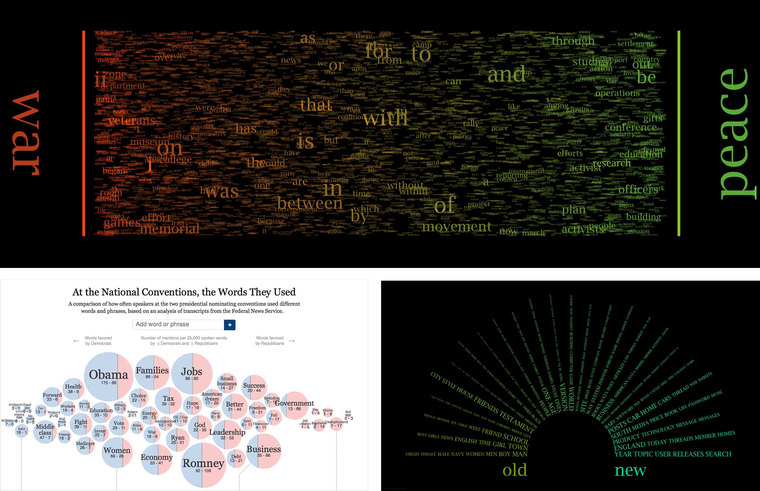
I started my endeavor into improving the evidence visualization by researching various takes on the word spectrum concept.
Armed with inspiration from my research about word spectrums, I turned to the drawing board to help me think divergently, exploring every manifestation of the data I could come up with.
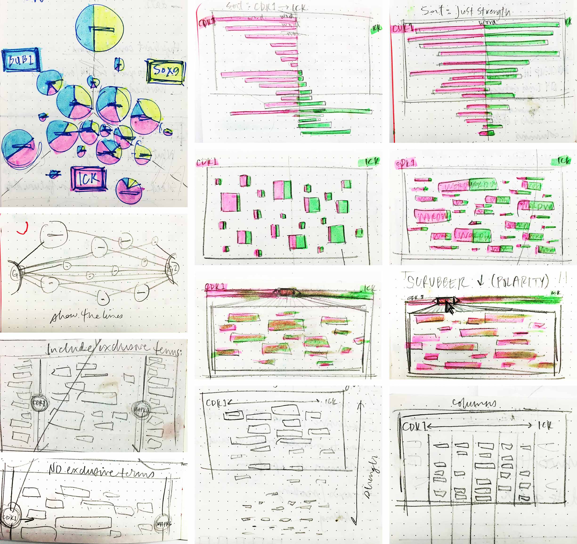
My first thought was to increase the number of entities being compared at once, from a pair to a trio, as seen in the top left sketch featuring pie charts, the diameter and breakdown of which represent occurrence. But this concept muddied the true data model upon which the list and force diagram results were built: it did not transparently communicate the fact that each entity was compared to every single other entity at an individual level. Keeping the word spectrum to just a pair of inputs enforced this, so I continued to explore. Another idea I had featured a scrubber that allowed the user to scan resulting terms by their polarity along the x-axis.
I consulted a fellow UX designer for feedback on my sketched ideas to narrow them down for concept testing with users. We built out three of the most promising ideas and asked five WDD users for their thoughts.
-
Typical word spectrums use a term’s height to stand for its strength. However, a word’s length intuitively contributes to its interpreted size as well, which can throw off the reading of its strength. I hypothesized that assigning a shape to stand for each entity might eliminate the confusion. We also experimented with a “line of best fit”, so to speak, that could help to suss out patterns in relationships between selected entities: if terms clustered toward the center, their two entities shared more in common than pairs with terms that tended to stick to the edges, indicating less overlap in literature. Users responded positively to the bubbles symbolizing terms’ strengths, but didn’t intuitively make sense of the line intended to surface similarity patterns. -
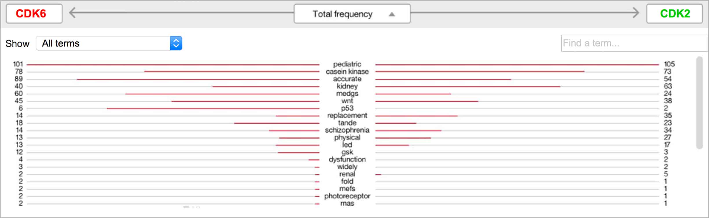
Users found the butterfly chart we tested to be intuitive. It listed all significant found terms, their strengths to the selected entities indicated by bars stretching to either side. Additionally, they could sort by terms’ overall strength or by their strength to one of the selected entities. -
The typical word spectrum layout made sense to users we tested with. I’d experimented with it a bit further, adding a graded bar next to each word to theoretically help distinguish its total strength, in addition to its height: the more red that showed on a bar, the more that term occurred in the documents with either selected entity than without. However, this detail proved not to be apparent or intuitive to users.
The initial pass with users helped us to narrow down our direction further. I wanted to know how the terms would communicate their occurrence strength if we rendered them as bubbles versus simply relying on their font size. I worked with our developer to mockup prototypes connected to real data, which my teammate and I tested with three more WDD users.
-
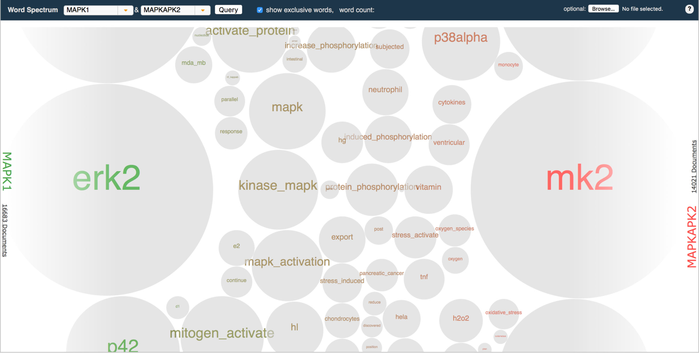
The bubble-based visualization helpfully provided distinct, easily scannable shapes with which to measure terms relative to each other. However, they also crowded the space, meaning users had to scroll much more to skim the collection of terms as a whole. -
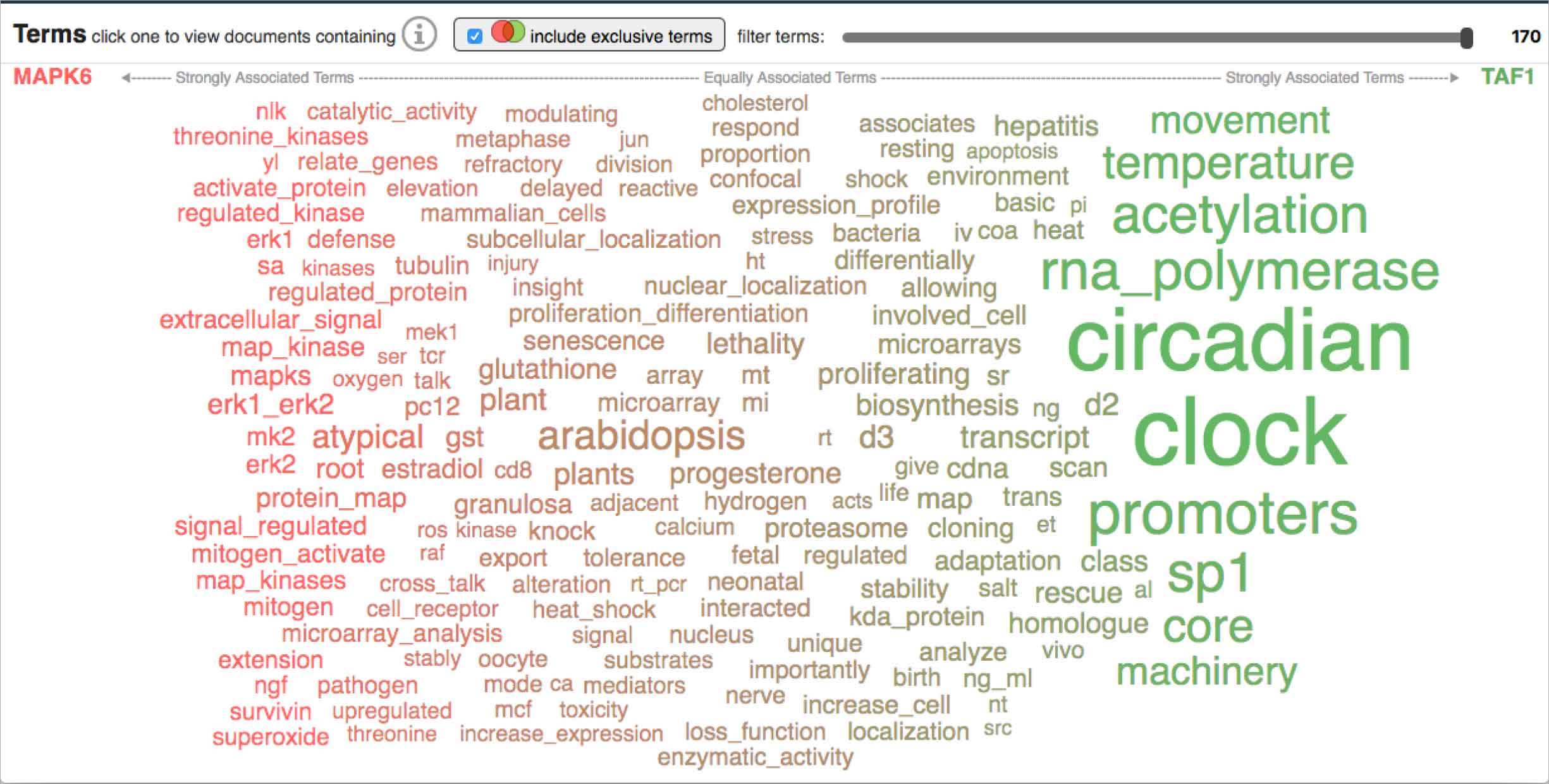
Our more customary word spectrum iteration relied on font-size to communicate occurrence and was therefore much more economical in its use of space compared to the bubble option. However, this proved to also be a detriment: terms mashed up against each other making them difficult to discern and scan.
Both renderings had strengths and weaknesses, but in ways that complemented each other: it seemed to me that success might be found by combining the distinct outline afforded by the bubbles with the more economical shape of the words.
To determine the best way for the user to interact with the ranked list of their potential targets, the distance matrix, and the word spectrum acting as its evidence, I sketched out possible layouts and sequencing between all three visualizations, then assessed the pros and cons of each exploration.
-
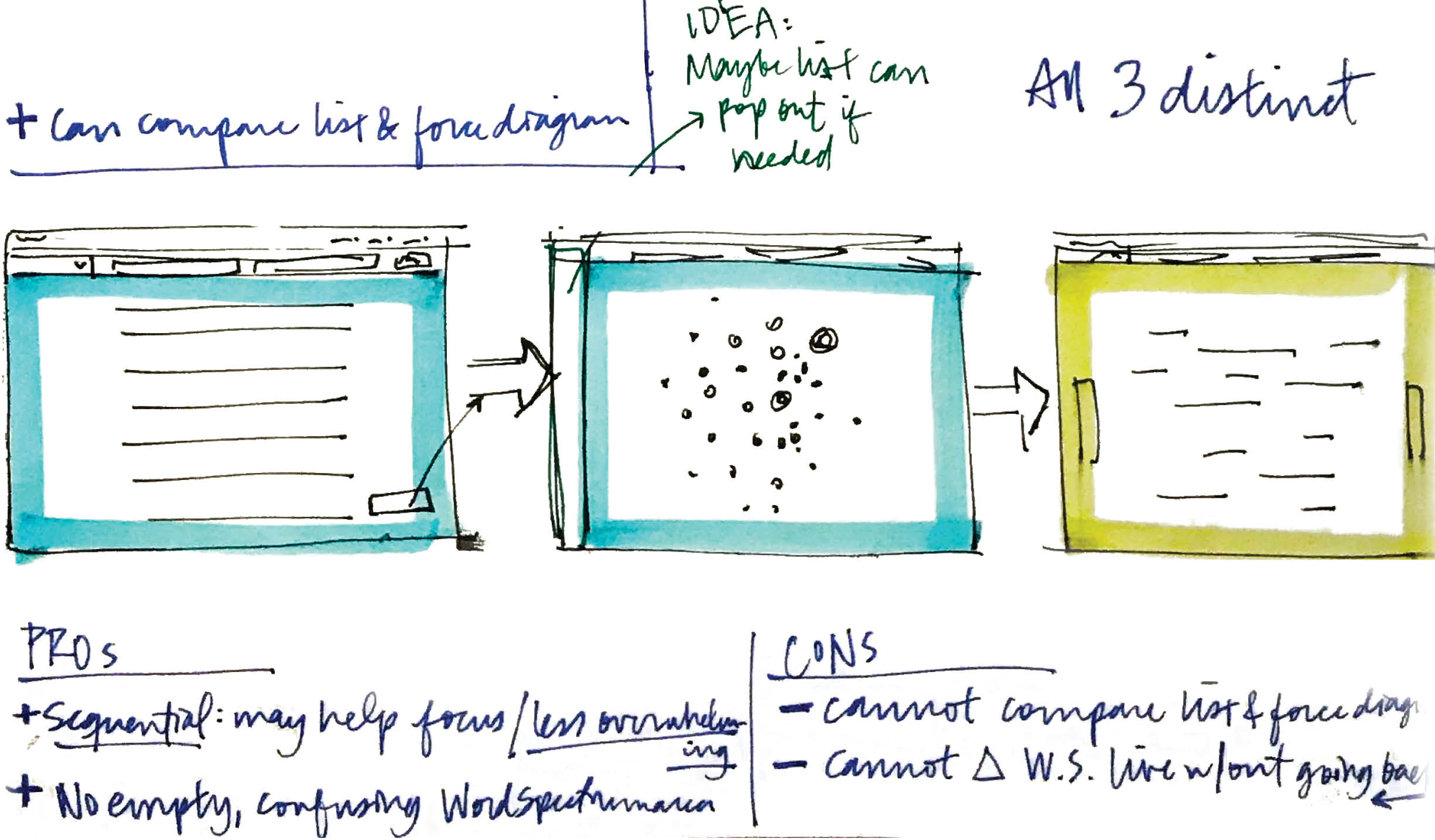
Pros to keeping the visualizations distinct steps included the fact that the sequential nature of experiencing each individually might help the user focus, and not overwhelm them. If the word spectrum was shown from the get-go, it would be empty until the user selected two genes from the list or the force diagram, which might be confusing.However, the user could not compare the list to the force diagram in a single view. They’d also have to continuously navigate back and forth between the list or force diagram and the word spectrum to select new genes. -
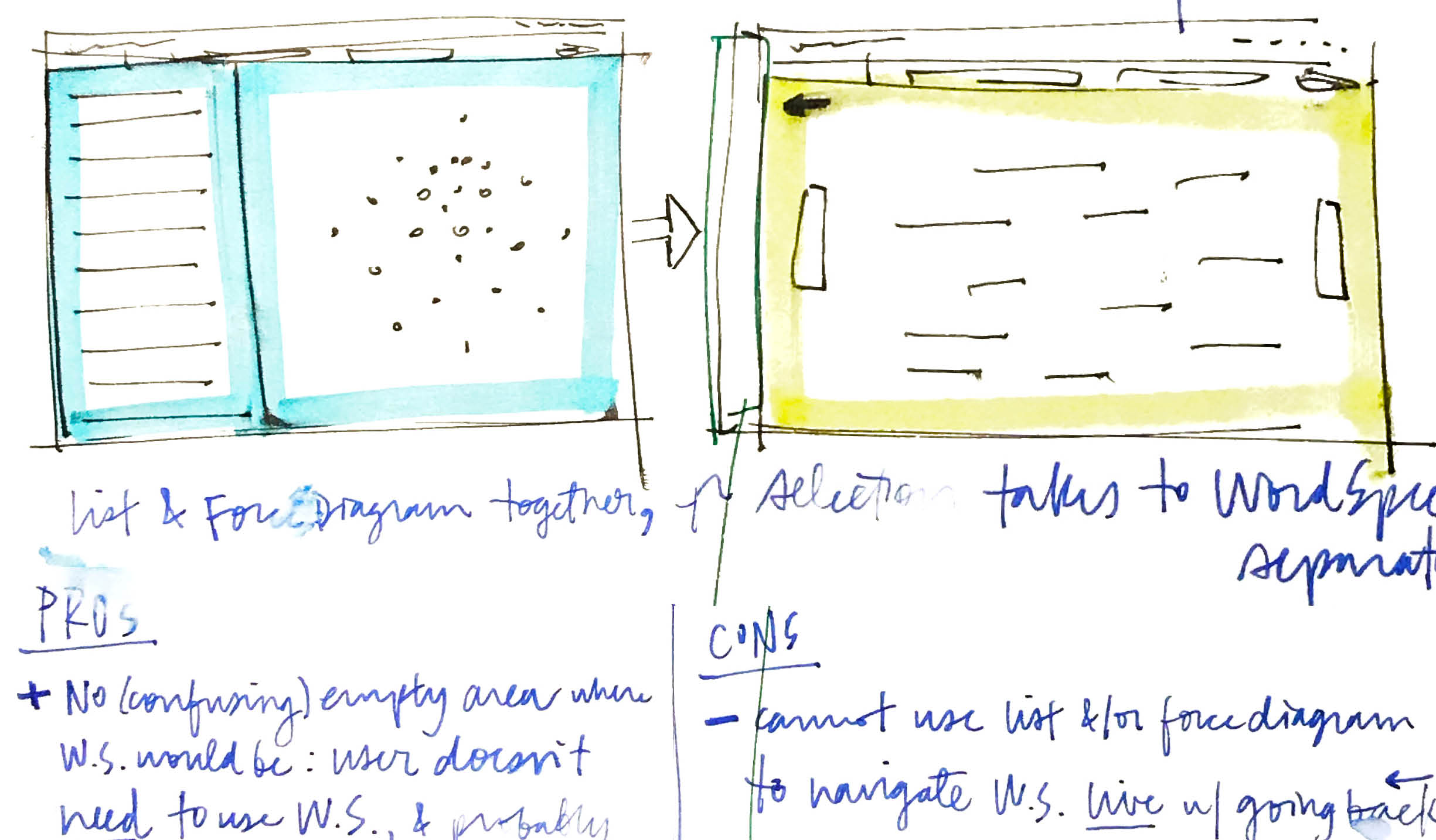
Another tactic I explored was to keep the list and force diagram together in a single view, since they both derived from the users’ inputs directly, and functioned as alternative views. Showing them together might help to build this understanding as well. Drilling into the word spectrum as an optional second step, in a second screen, would keep the workflow sequential enough to help the user focus and not overwhelm them.One problem still remained, though, in that the user would need to return to the list or force diagram over and over to change the genes they examined evidence for in the word spectrum. -
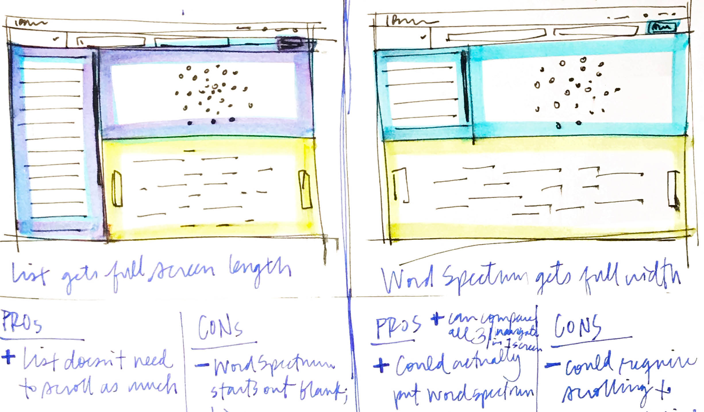
Two more ideas I had both incorporated all three visualizations simultaneously, which mean all three could be compared against each other at once.But starting with the word spectrum in the initial view meant it would be strangely empty before the user selected any genes to view the evidence of, and it could be a bit overpowering to be greeted by all three data-heavy visualizations simultaneously.Of the two layouts with all three visualizations shown at once, the one on the left, with the list taking up the full view, would be helpful in that the user could scan more results at once, and without the need to scroll.The sketch on the right, however, explored the word spectrum at full-width, which would allow it to take the room it needed as a horizontal, spectrum-based visualization.
At first, the options I’d sketched up seemed irreconcilable, the cons of one constituting the pros of another. But after examining them more closely, I realized that the best aspects of a couple of my ideas could be combined to solve most of the drawbacks.
-
I developed a new method by which to supply “redlines” to the FED I worked with; I grouped together all related specifications, rather than applying all spec types (color, spacing, sizing, typography, etc) in one place. This was based on my own in-depth understanding of CSS and its classes: the project’s front-end dev could create a class for each style I described, and simply apply it as needed across the UI. -
Although the front-end developer on this project was based remotely, I worked as closely with him as I could, setting up several calls throughout my design process to get his input, especially in terms of feasibility. Once my designs were final, I documented every last visual detail as redlines (well, lavender-lines, since pale purple stood out best from the colors in the design, which included red).
Outcomes
Predictive Analytics is a tool within the Watson for Drug Discovery offering that analyzes semantic similarities between genes, drugs, and diseases. It outputs a ranked list of inputs to help researchers narrow down long lineups of potential targets and determine which are worthy of further exploration. Additional visualizations allow users to analyze specific similarity relationships as well as the reasoning and evidence backing them.
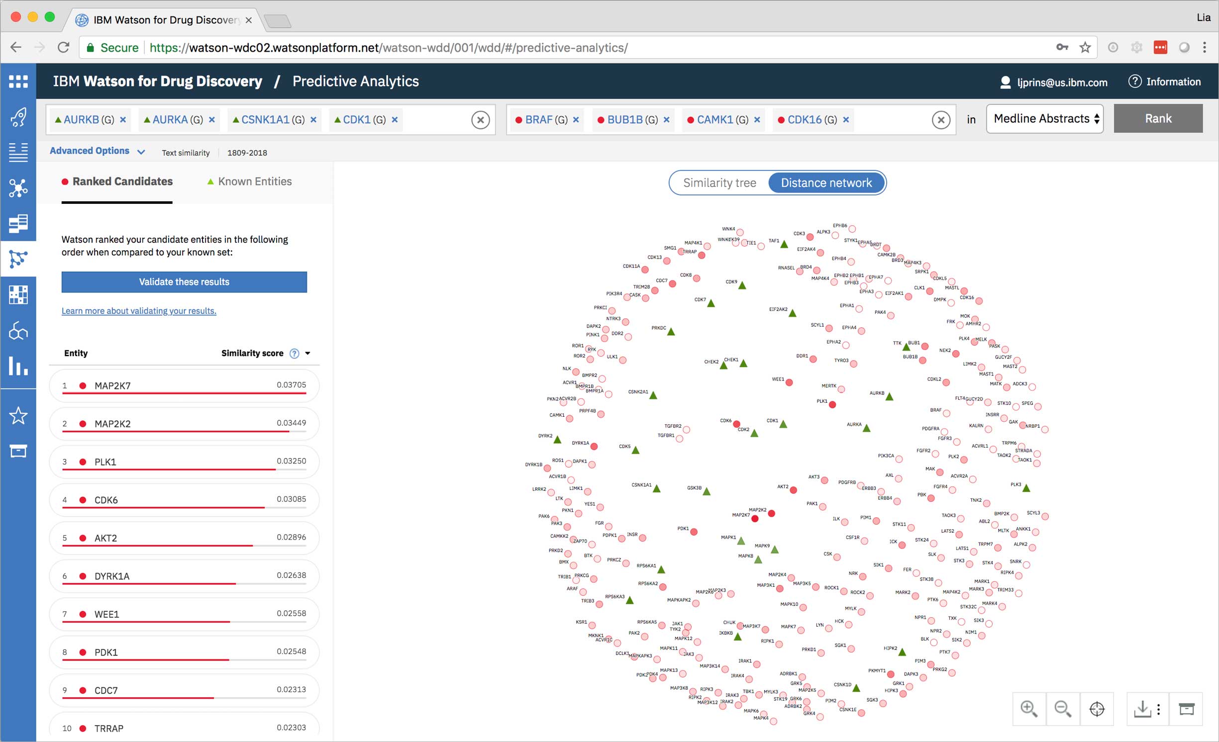
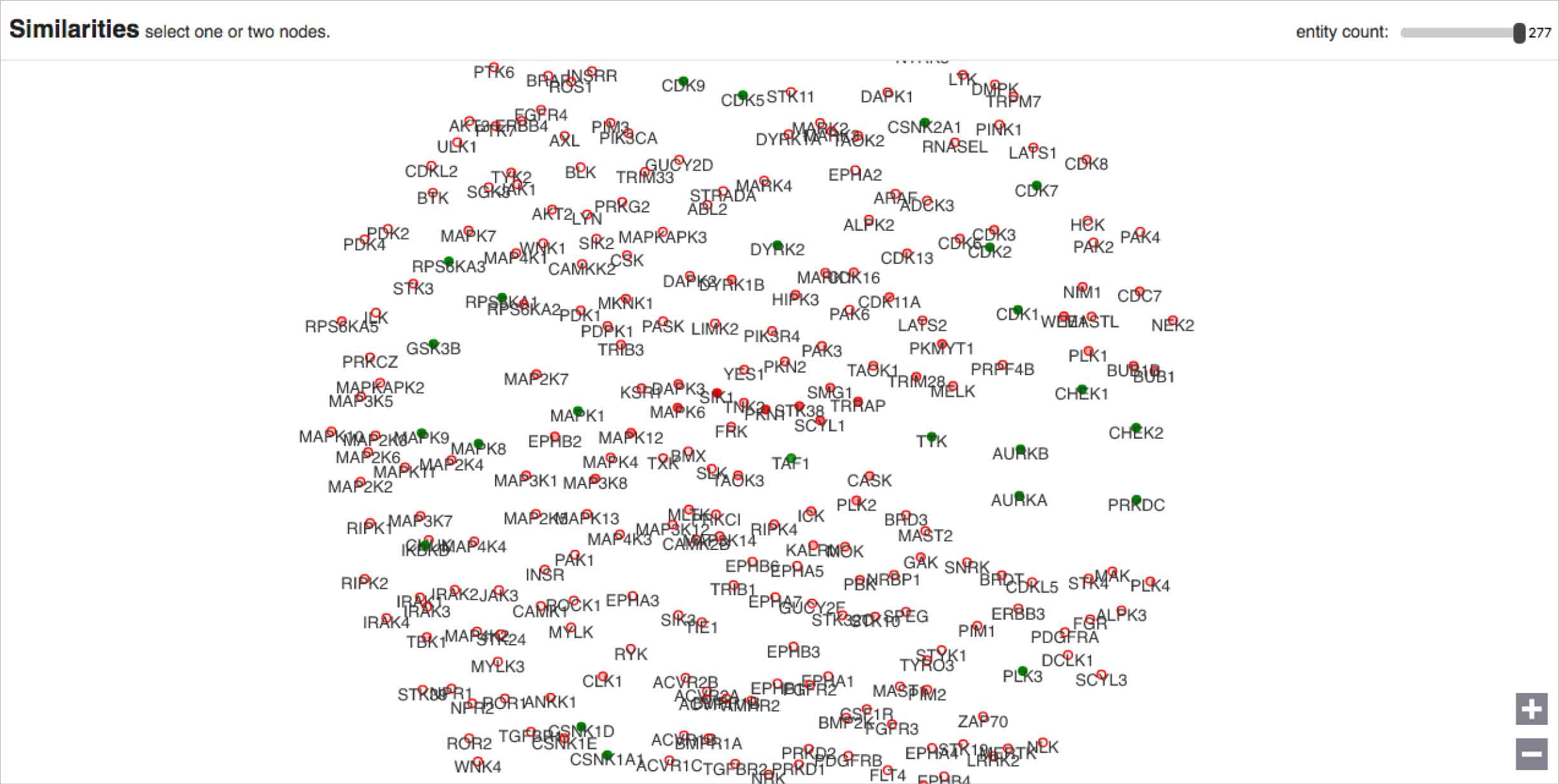
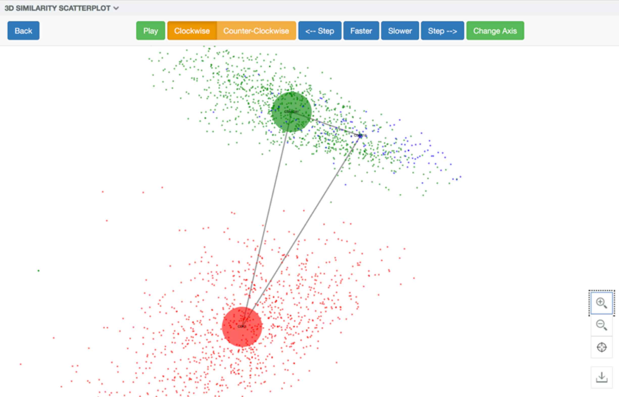
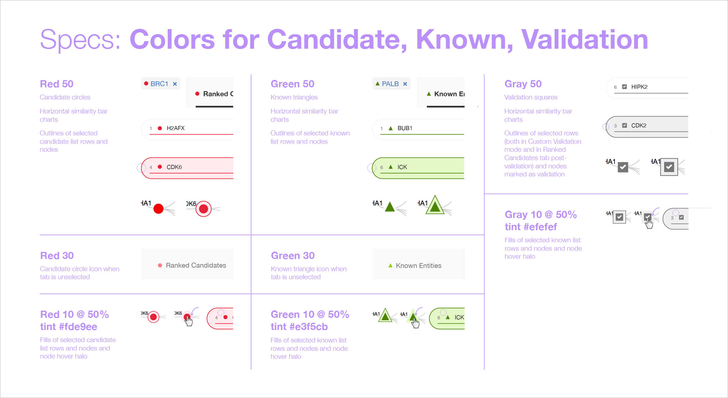
The list on the left ranks candidate entities by their similarity to all known entities, the relative strength of which is visualized by horizontal percentage bars. This same similarity measurement for each candidate is surfaced in the distance network: fully saturated red nodes represent entities most like their green counterparts, while nodes with white fills are least alike.Each node possesses attractive forces correlating to the similarity between it and every other node. The relative strengths of these forces draw some nodes together and distance others, resulting in a landscape that symbolizes the inputs’ collective similarities.
The collection of technology and algorithms that make up “Watson” interpret data differently than humans do; in the case of Predictive Analytics, rather than using empirical evidence, Watson looks for patterns in the way entities appear in literature. The potential value to this approach lies in the idea that the author of a paper or patent may embed biological attributes within the phrases they use to describe entities.
This is a completely different method than most life sciences researchers are accustomed to. Given the historical confusion caused by Predictive Analytics, coupled with its users’ natural inclinations as scientists to question how all things work, I felt it was imperative to educate users upon entry.
-
I built a short series of conceptual illustrations walking new users through the technological processes that go on behind the screen, drawing upon sketches I had made for my own sake in an earlier effort to understand the data model myself.The single front-end developer assigned to WDD ended up not having time to implement a carousel, so it didn’t make it into the product. These are from a mid-fidelity draft I made around my concept. -
I built a short series of conceptual illustrations walking new users through the technological processes that go on behind the screen, drawing upon sketches I had made for my own sake in an earlier effort to understand the data model myself.The single front-end developer assigned to WDD ended up not having time to implement a carousel, so it didn’t make it into the product. These are from a mid-fidelity draft I made around my concept. -
I built a short series of conceptual illustrations walking new users through the technological processes that go on behind the screen, drawing upon sketches I had made for my own sake in an earlier effort to understand the data model myself.The single front-end developer assigned to WDD ended up not having time to implement a carousel, so it didn’t make it into the product. These are from a mid-fidelity draft I made around my concept. -
I built a short series of conceptual illustrations walking new users through the technological processes that go on behind the screen, drawing upon sketches I had made for my own sake in an earlier effort to understand the data model myself.The single front-end developer assigned to WDD ended up not having time to implement a carousel, so it didn’t make it into the product. These are from a mid-fidelity draft I made around my concept. -

I built a short series of conceptual illustrations walking new users through the technological processes that go on behind the screen, drawing upon sketches I had made for my own sake in an earlier effort to understand the data model myself.The single front-end developer assigned to WDD ended up not having time to implement a carousel, so it didn’t make it into the product. These are from a mid-fidelity draft I made around my concept. -
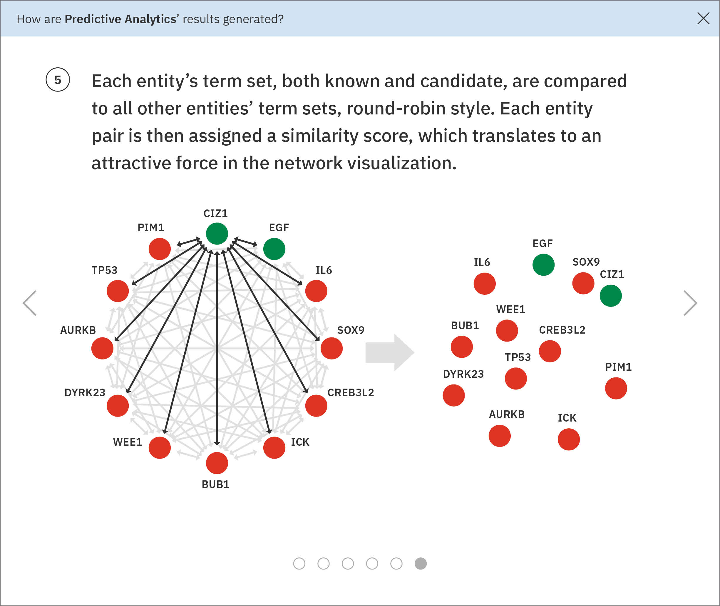
I built a short series of conceptual illustrations walking new users through the technological processes that go on behind the screen, drawing upon sketches I had made for my own sake in an earlier effort to understand the data model myself.The single front-end developer assigned to WDD ended up not having time to implement a carousel, so it didn’t make it into the product. These are from a mid-fidelity draft I made around my concept.
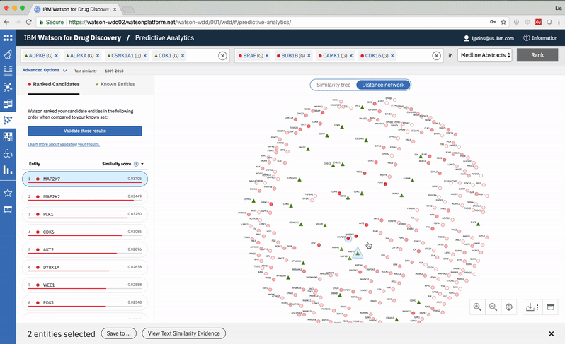
Hovering on a node in the distance network reveals the top five inputs most similar to it. Selecting a pair allows the user to dig deeper into the nature of their semantic similarity via a word spectrum.
-
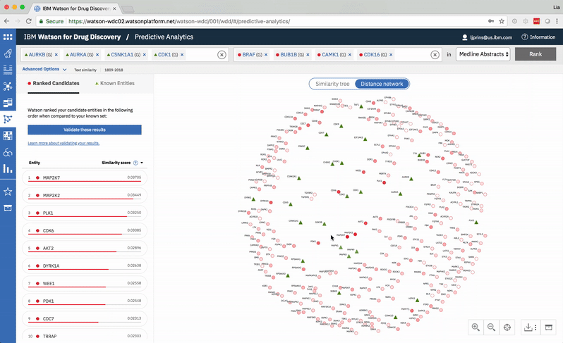
Due to the push-and-pull nature of the nodes’ attractive forces, the distances between them won’t always perfectly reflect their actual similarities. A user can get a more accurate output by hovering on a specific node to see its top five similarity scores quantified. -

The user can select two entities from either the list or the 2-D visualization in order to drill down into the pair’s similarity evidence. -
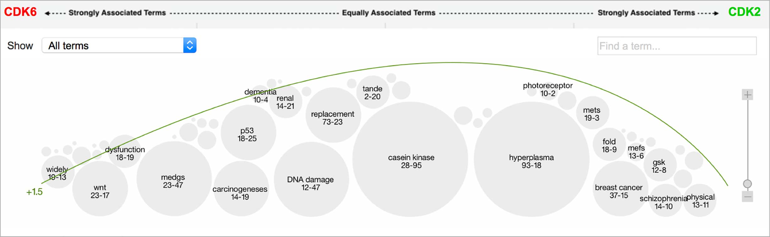
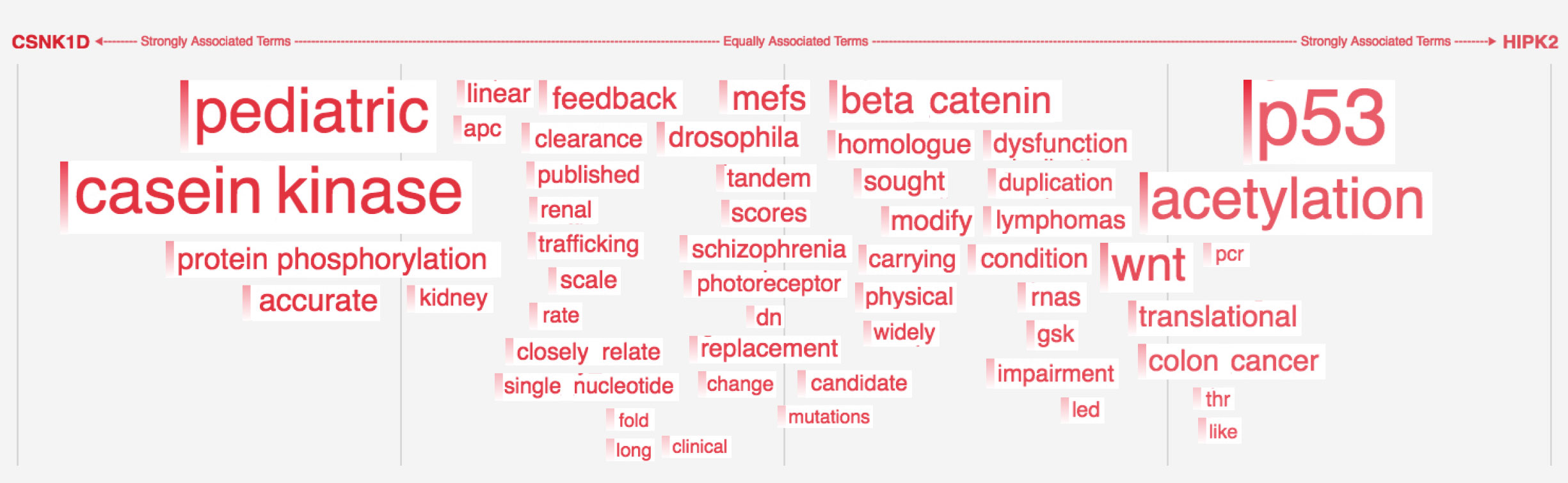
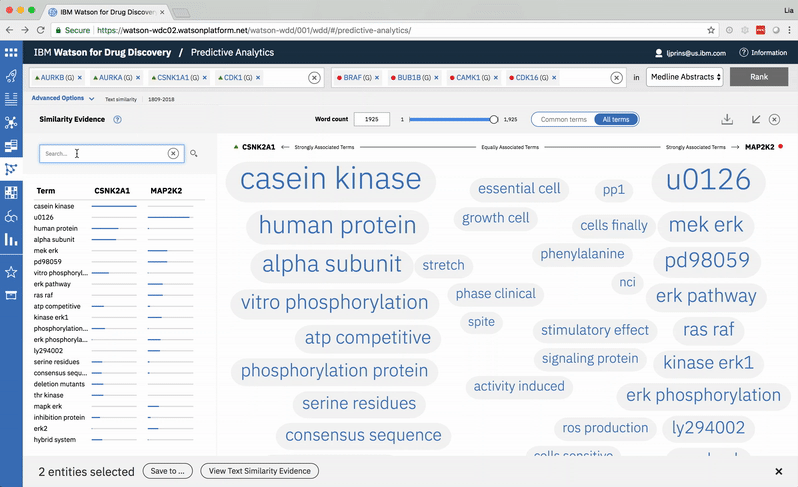
An entity pair’s similarity is evidenced by a word spectrum that visualizes terms that the two co-occur with in literature.
Words appear along the spectrum’s x-axis according to their relative occurrence in literature with the selected entities, which occupy either end of the x-axis. A term’s height symbolizes its likelihood above mere chance of co-occurring with either entity in the literature, relative to the other terms in the spectrum.
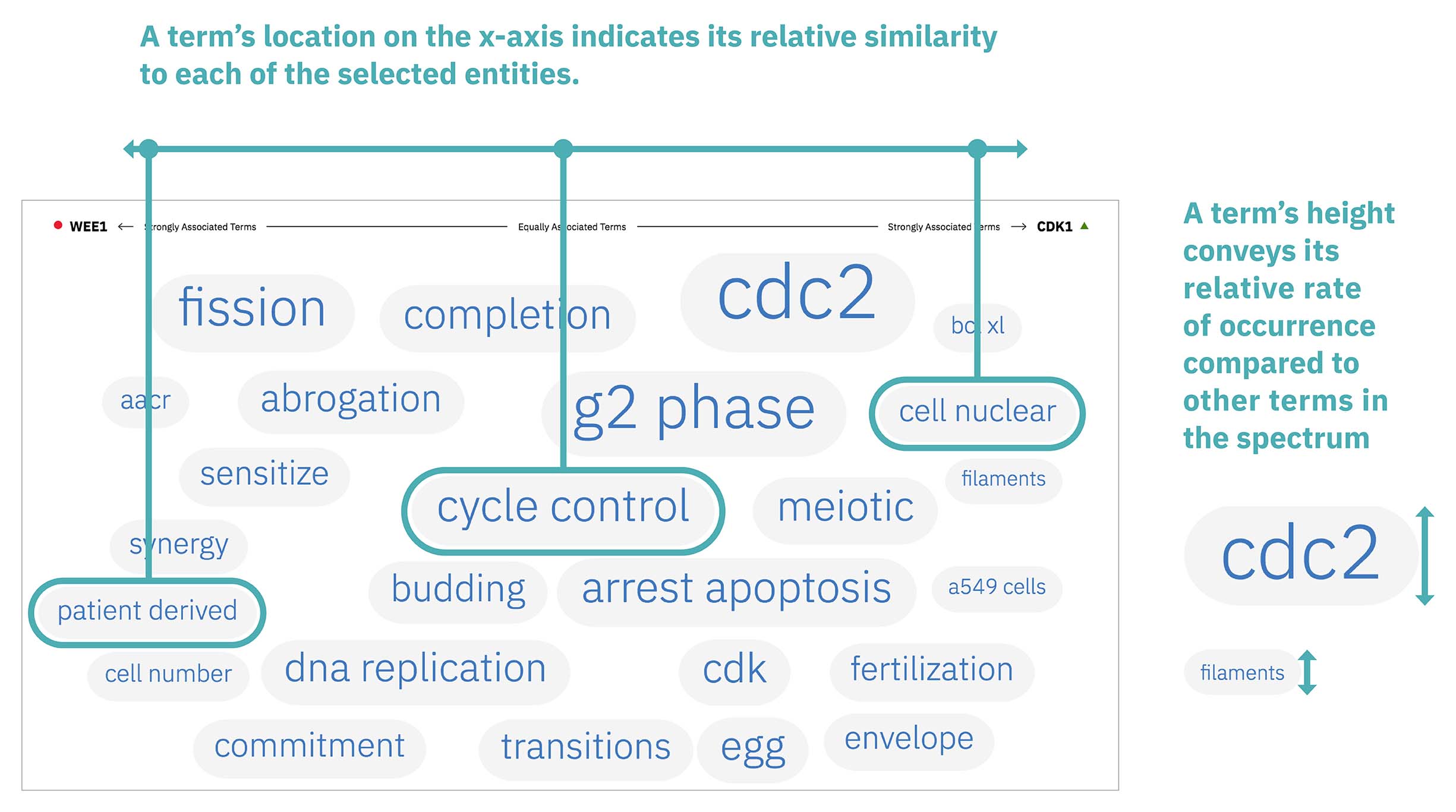
Patterns formed by the collection of terms in the word spectrum can be significant. A gathering of terms near the center indicates that the selected entities notably overlap in the literature; terms that stick to the fringes suggest less similarity.
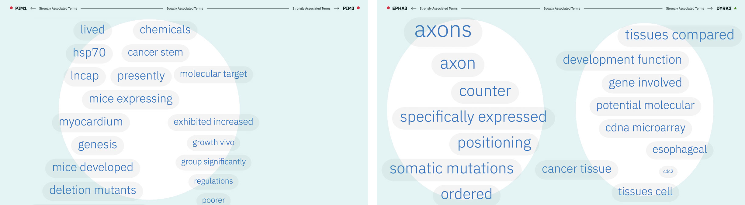
The central location of terms associated to the entities PIM1 and PIM3 indicates that the genes share several common words and ratios of occurrence. EPHA3’s and DYRK2’s terms are more clearly clustered into two groups on either end of the spectrum, revealing that the way these genes are written about in literature differs significantly.
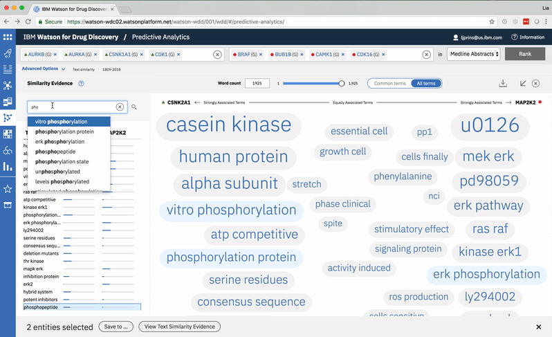
A modified butterfly chart accompanies the word spectrum; the user can search for a specific word or word-part and see matches highlighted in both visualizations. Selecting a term from the list or spectrum drills down into the supporting literature.
-
Typing into the search bar highlights terms with matching character strings. -
Searching for a specific term in the list scrolls to its location in the spectrum. -
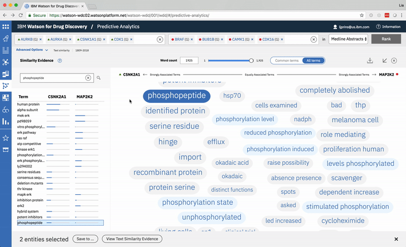
Choosing a specific term reveals a comprehensive list of the publications in which both the selected term and at least one of the user’s two chosen entities are mentioned. -
The user can opt to view or hide entities that Watson found within any document.
Once I finish a project I always share my takeaways with others. In this visualization-heavy case, that meant developing and delivering a presentation all about word spectrums for the data vis guild I led within IBM Watson Health popup: yes).
Most of the Watson Health team designers are located in Cambridge, Massachusetts, with others in New York, Raleigh, Shanghai, and elsewhere, so I’ve gotten used to presenting via screen share!
Although Predictive Analytics follows a vastly different epistemological model than the traditional, empirical approach to drug discovery, the unique perspective it offers has proven to be helpful. Scientists at Baylor used it along with other WDD tools to validate two p53 kinases 3 in just two weeks, when the industry average is just one per year, globally. Up to this point, only 28 of these specific proteins had been discovered in the past 35 years. Meanwhile, to quote IBM’s 2016 Annual Report, researchers studying amyotrophic lateral sclerosis (ALS) at Barrow Neurological Institute “employed Watson for Drug Discovery to study nearly 1,500 genes in the human genome, and found five that had never before been associated with ALS.”
3 According to the IBM Research blog “the p53 protein reacts to the detection of genomic problems by increasing the expression of hundreds of other proteins to try and fix these issues, and can even instruct potentially harmful cells to destroy themselves. It gets these calls-to-arms from another set of proteins that chemically modify p53 in response to particular biological conditions.”
“So, it’s [Predictive Analytics] really been a sort of hypothesis generating tool for us. But, a very useful hypothesis generating tool because it’s led us … in quite reasonable directions.”
—biological researcher, after having used the newly designed Predictive Analytics visualizations for 30 days
As such, Watson for Drug Discovery has been mentioned in a number of news articles and has been the subject of several scientific publications.
Press
International Business Times: Here Is IBM’s Blueprint For Winning The AI Race
Information Week: IBM Watson Speeds Drug Research
Scientific publications
IBM Watson: How Cognitive Computing Can Be Applied to Big Data Challenges in Life Sciences Research
Automated Hypothesis Generation Based on Mining Scientific Literature
Live + learn
- The layers of complexity intrinsic to this tool—in the process through which it arrives at results, the inherently different approach it takes to chipping away at the problem of drug discovery, and the specific needs demanded by the user in order for it to produce useful outcomes—require an equally robust system of education and onboarding. Currently this is solved in a very unscalable way: individual subject matter experts from IBM work full-time with new and potential clients to bring them up to speed until they can use the tool productively on their own. This inhibits the product within the market, and leaves the end user wholly dependent upon another human being to learn. The educational materials I built for PA aren’t fully fledged enough to support an untrained user, but they have proven to help trained users recall what they’ve already been taught in-person. This led me to successfully lobby WDD’s offering management and development teams for a more comprehensive, guided onboarding experience over the addition of new features, and provided the fodder for my next project on the team.
- Subsequent user testing has revealed the desire for drilling into the evidence of more than just two input entities at a time: users want the ability to select a sub-group of results to see their relative similarity and its reasoning visualized. In hindsight, it seems obvious that limiting the comparison of common terms to just two entities at a time is restrictive. Even though the current design most accurately reflects Watson’s true data model, I do wonder if a different visualization that accommodates more simultaneous entity selections may have ultimately helped our users to gain a more complete understanding of their inputs’ similarities.
