Sketching for Ideas
Objective: Study my own process to learn, and ultimately share, how sketching serves as a superior medium for idea generation
Opportunities
- Reflecting on my own process would allow me to become more self-aware of the practices I find helpful and those that I don’t; I'd be equipped with the knowledge needed to refine the way I work and would ultimately end up a more informed and efficient designer.
- Others I worked with didn’t share ideas via sketches all that often, but if I could suss out what exactly made sketching such an effective medium for me, they might be inspired to reap its benefits as well.
- I wanted to practice public speaking and presenting to audiences of varying design backgrounds and levels of knowledge; this topic was one I could dig into and that held the potential to provide insights for those across the design-experience spectrum.
- The channels through which and the audiences with whom I shared my learnings would each impose their own limitations, forcing me to reconsider how I told the story and what its main takeaways were. Testing my topic and insights this way would reveal what resonated and what didn't, compelling me to develop and push my concept further with each imparted iteration.
Process
Based on the 4-inch-high stack of sketches I’d produced in as many years at work alone, I realized that the act of sketching served as a more suitable medium for conducting ideas than most other approaches and tools I’d tried. To learn why, I analyzed my lofty pile of potential evidence for clues.
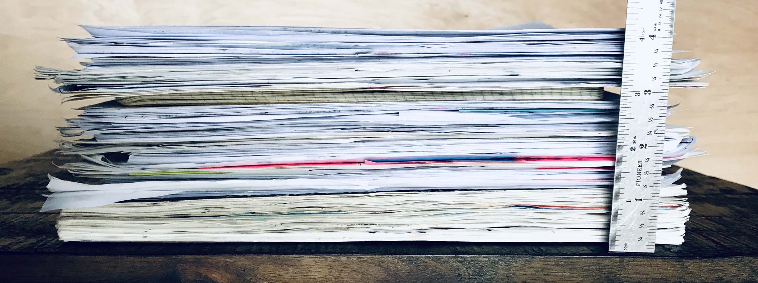
Death by a thousand papers: RIP (in all senses of the term) flimsy little file folder.
I examined the sketching techniques I’d adopted to convey my ideas, as well as shortcuts I’d developed as I became more relaxed and familiar with my materials over time. I’d found it helpful to start small when sketching screens and interfaces, because it physically forced me to leave inconsequential details by the wayside. Another pattern I took note of across my work again and again was the way I used color: I tended to abstractly encode meanings through hue in several different ways, rather than communicating the literal brand colors that the interfaces would ultimately end up taking.
-
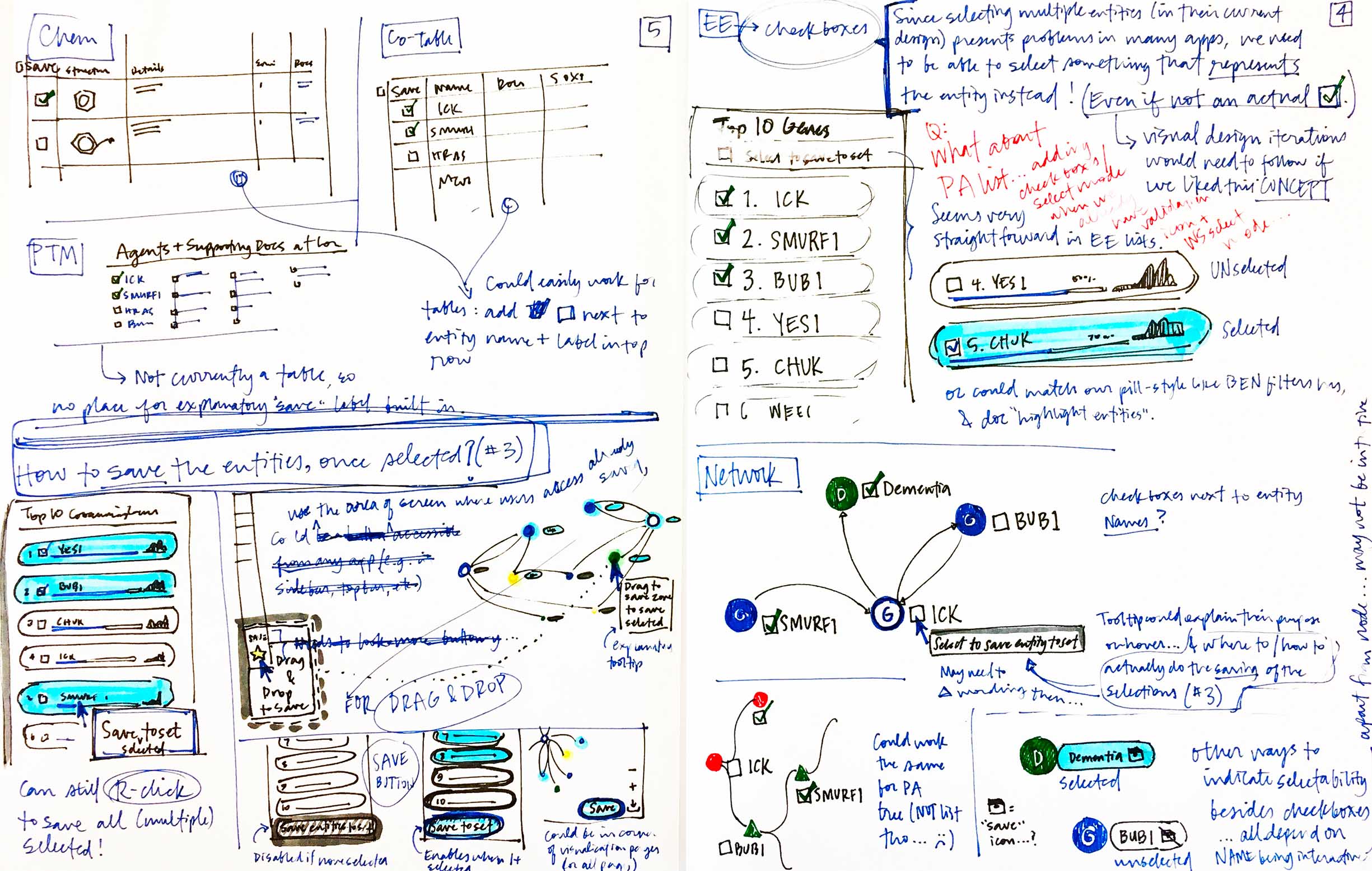
When initially exploring possible interactions, it’s faster for me to draw them than to digitally prototype them. The sketches in the bottom left show how I imply movement and change through both layering and sequencing. -
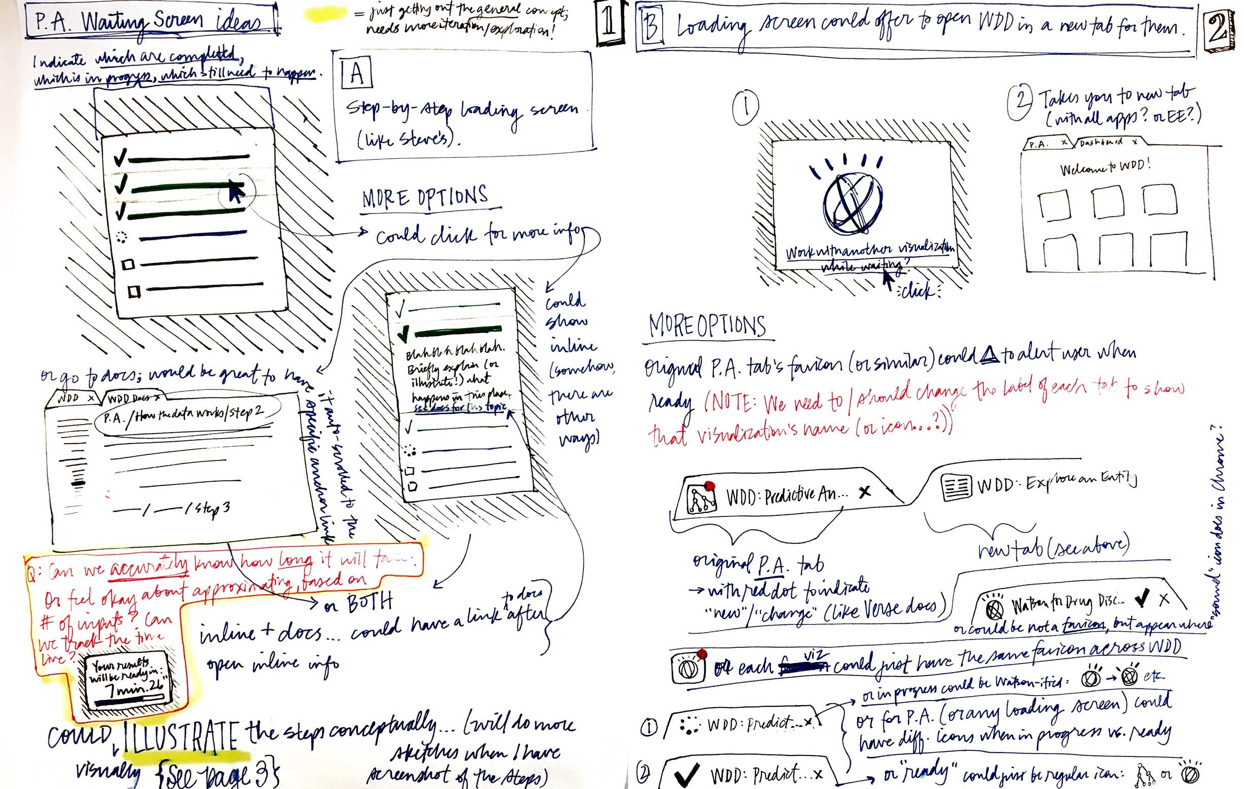
Sketches can be very useful when I’m exploring just one part of a screen: I can focus on that area alone, repeating and iterating as needed. -
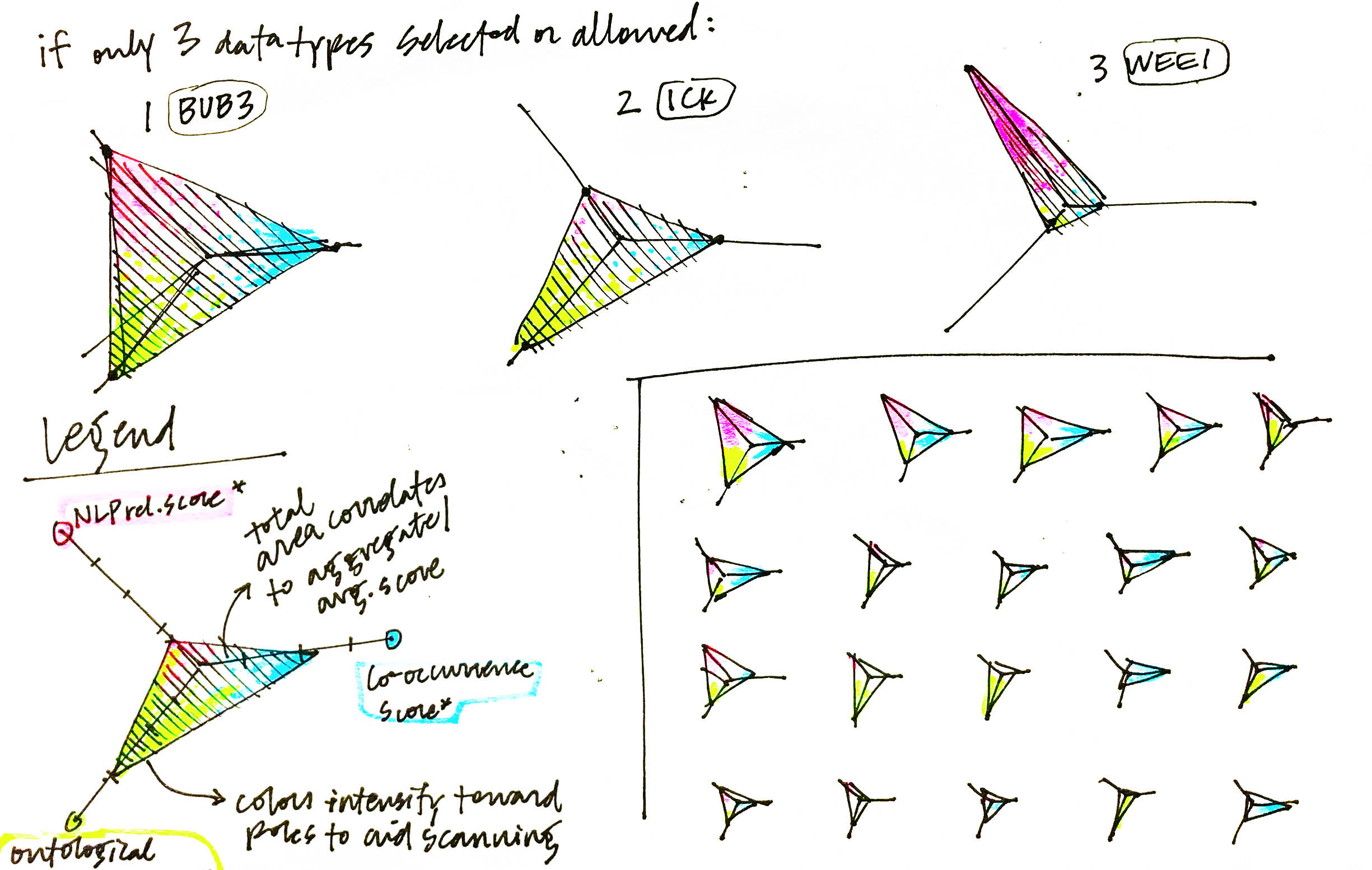
I use color to clarify and create consistency so comparison is easy. Regardless of the shape taken by each instance of the visualization in this sketch, the ones with greater total area equate to a higher score. However, dual-encoding each dimension with a unique color makes it easier to compare instances. -
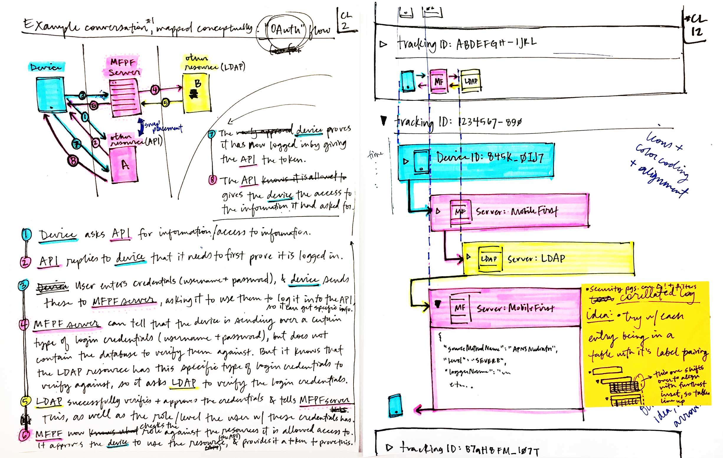
Here I used color to communicate the parts of the back-end flow (on the left) that affect the front-end interface (on the right). -
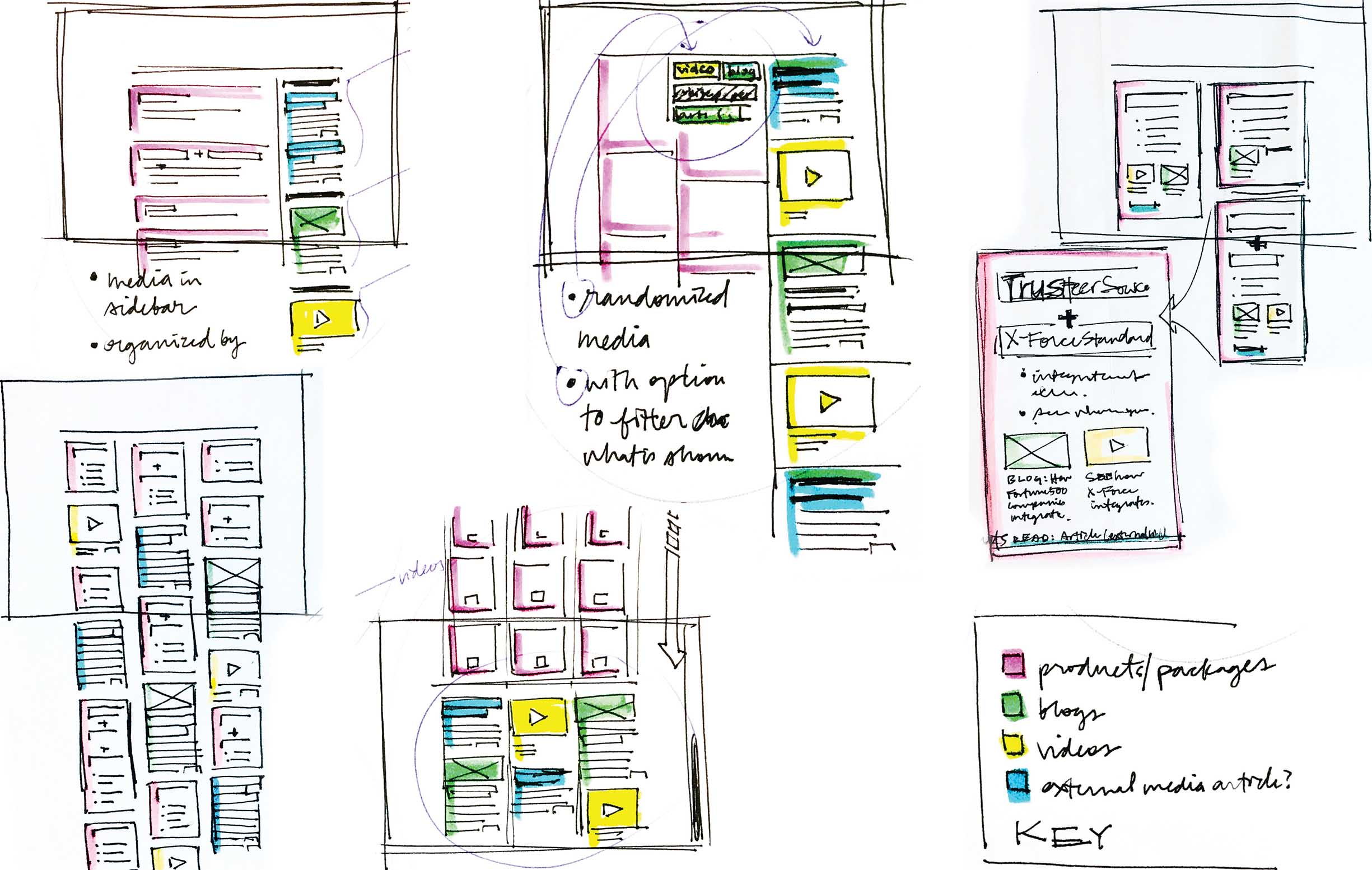
When I explored layouts for a security portal, I mapped color to each type of content, to make the options easier to compare.
The launch of a new project or problem solving endeavor guaranteed that I'd reach for my mug of drawing utensils—once I'd even sketched over 70 pages within the first week of starting a new project—but in retrospect it became clear that wasn’t the only time.
-
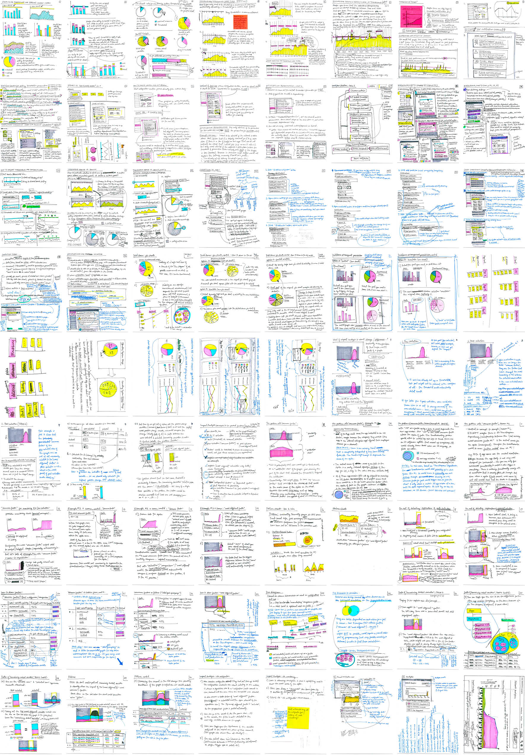
One week I produced 72 pages of sketches exploring ways in which users could set thresholds for alerts on their analytics. -
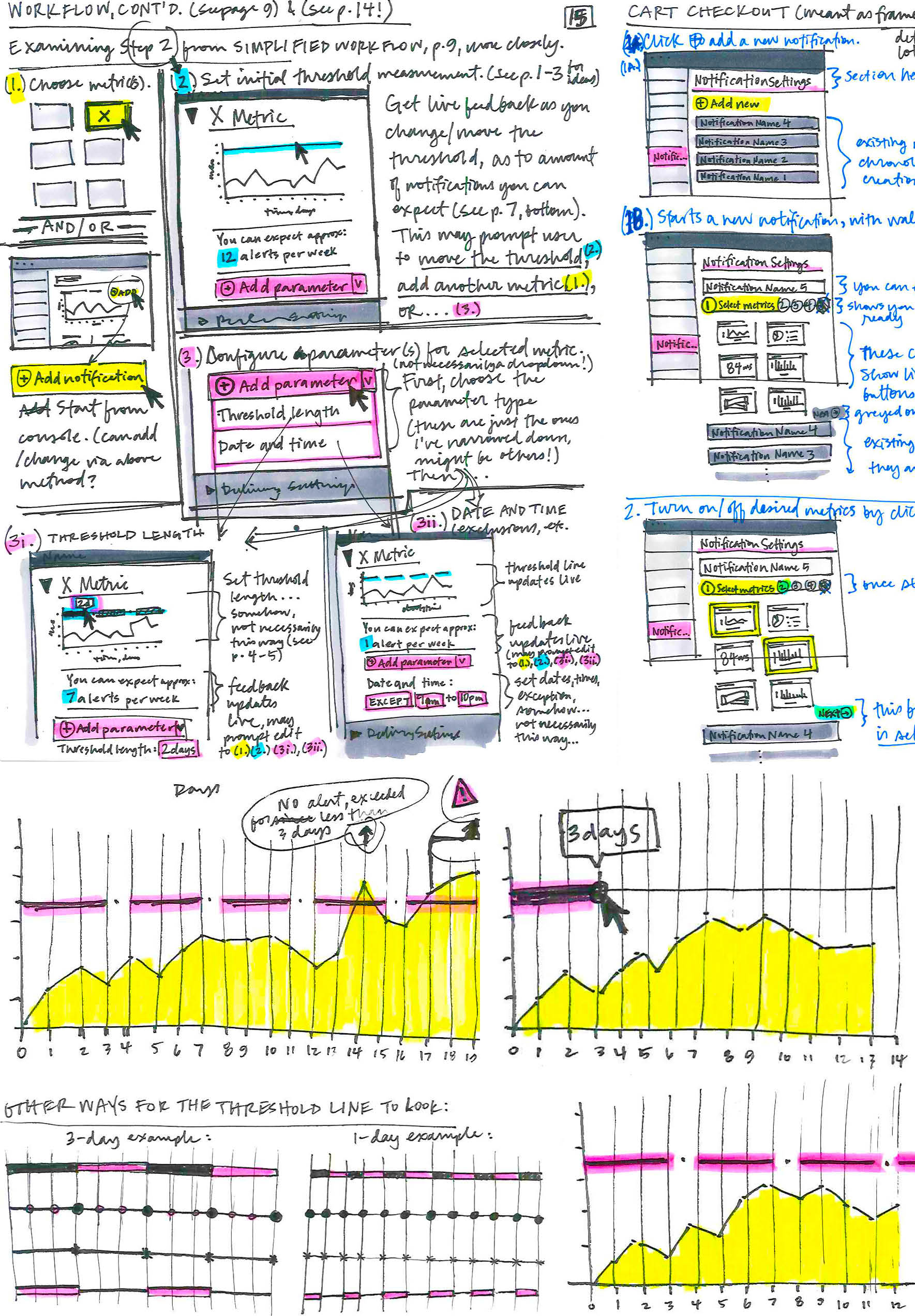
A user might only need to be alerted about their mobile app’s usage when a certain combination of metrics met given criteria. They might also want to account for known lulls or expected spikes on weekends or evening hours. I developed a number of ideas to accommodate these specifications and documented them as quick sketches.
I used sketches as a way to more thoroughly explore and understand a problem, but also drew upon them to communicate ideas to others. Paper prototypes worked well to that end, because they conveyed interactivity and allowed anyone with whom I shared them to test out my idea themselves, rather than just looking and listening. This helped my collaborators better understand my concepts, which in turn enabled them to provide better feedback and even grow my initial ideas further.
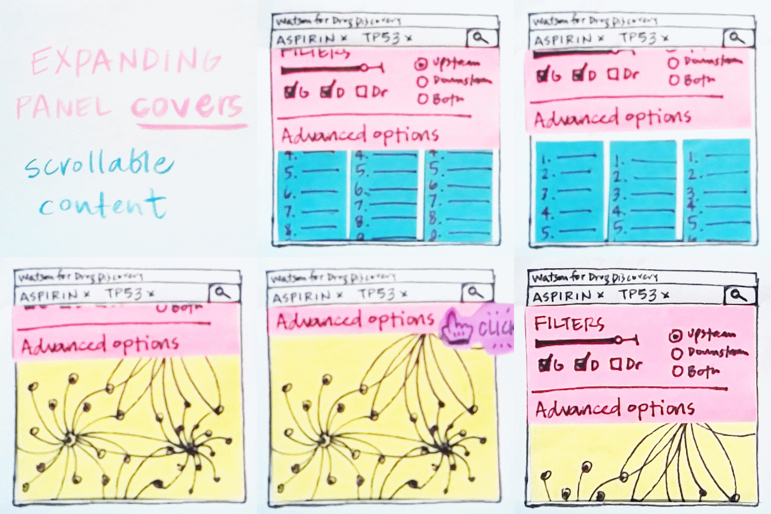
I built a quick paper prototype out of Post-its to explore a couple distinct mindsets to approaching the way an expanding panel within a UI interacted with the existing content: it could cover the content like a window shade—existing on a plane above, or it could live on the same level as the rest of the content and effectively push it down. I explored what these physical metaphors meant with tactile pieces of paper, making it easier for others to understand when I communicated these two options. It was helpful to explore both analogies in the context of the types of content the panel would apply to, as well—one was simply scrolling lists, while the other was a network diagram that could be panned and zoomed. To me, it didn't make sense for the panel to push down anything but scrollable content, but the window shade metaphor suited either content type equally well. The tangible prototype helped me to visualize my reasoning for this as well.
It was a sure sign that I’d return to my notebook with pen in hand if a design direction or a detail within it felt precariously presumptive: consciously—and often subconsciously—I knew that the problem space and its possible solutions needed to be scrutinized more thoroughly. My stack of sketches contained a considerable tally of sticky notes that had once made their home as part of a Post-it pad that still resides in my nightstand; I can fuzzily remember awakening in the night a number of times to hastily jot down an idea for a design problem that wouldn’t leave me alone, even in my dreams!
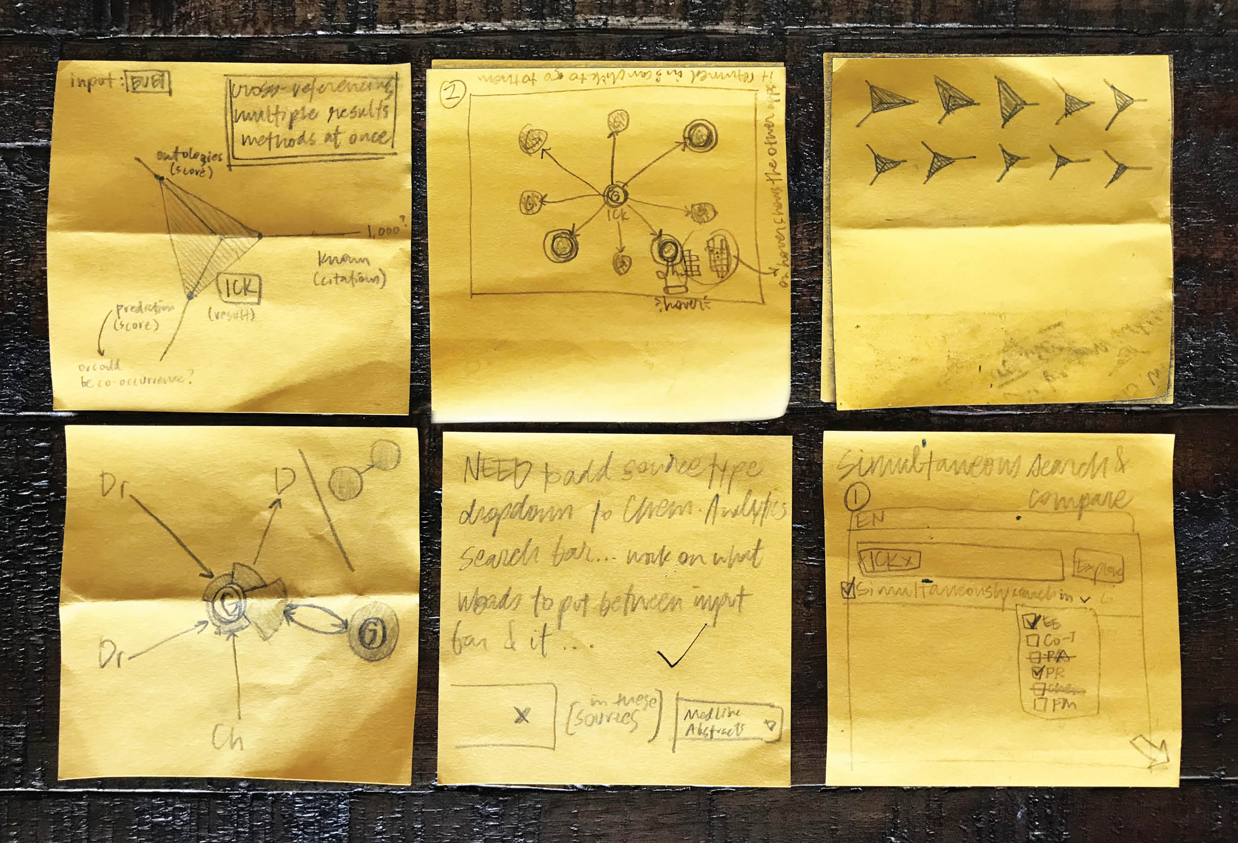
I’ve learned the hard way to always take advantage of my nightstand Post-it notepad—too many of my ideas have been lost to the night when I’d somehow believed I would still remember them in the morning. For the same reason I always bring a few sticky notes and a pencil with me on my lunchtime walks.
I found that as my familiarity with sketching design ideas grew, so did my comfort with drawing for the sheer fun of it. Outside of the formal design process I've come to rely on sketching as a mechanism through which to examine the world around me in detail, communicate concepts to others visually, and investigate questions.
-

A seaside village on the island of Santorini, Greece intrigued me with its mix of organic and geometric motifs. -
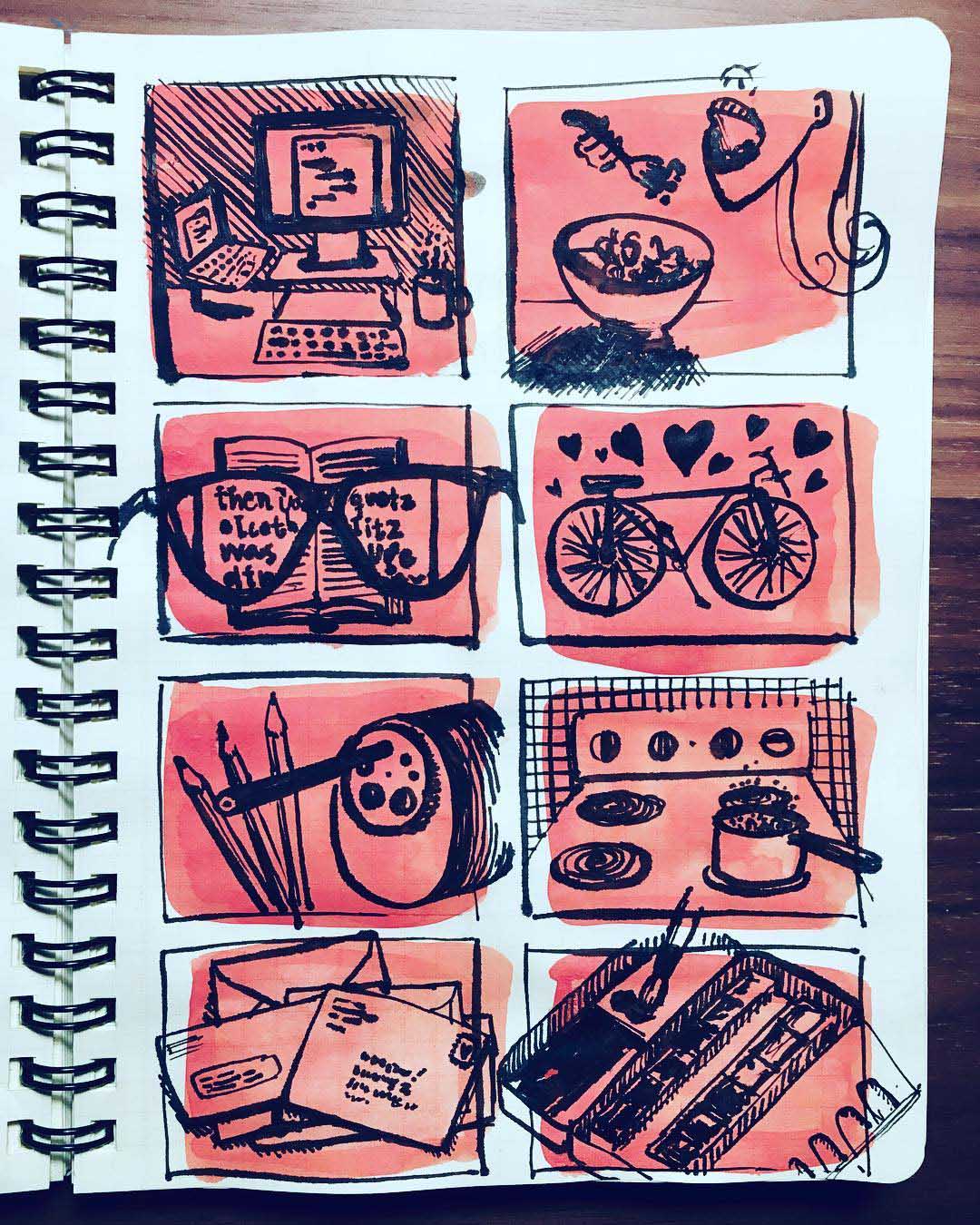
When I feel like drawing but can’t figure out what to depict, I cover a page with a grid of boxes, then focus on filling each with a highlight from my day. -
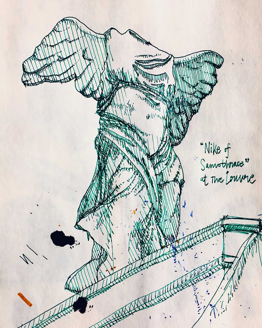
On an extended trip to Europe for work, I became so busy preparing presentations for our client that I got a bit out of my sketching habit. But a trip to the art museum of all art museums—the Louvre—inspired me to put my pen back to work, and helped me to transition back into using the medium as a design problem solving tool again. -
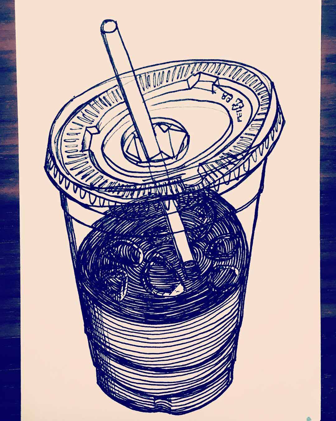
One of my favorite ways to unwind on a weekend involves my favorite Lamy Safari fountain pen, a stack of blank postcards, and iced coffee (functioning as both a beverage and a still life subject). -
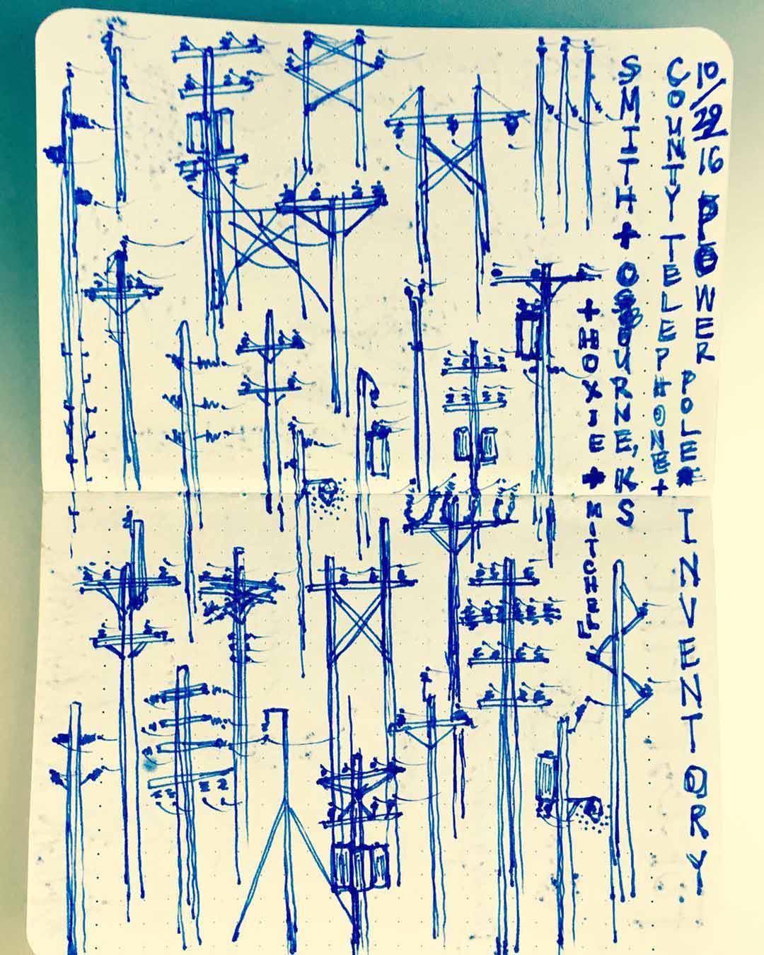
I captured a taxonomy of telephone pole types on a road trip through Kansas, where they stood out from the flat plains like candles on a birthday cake. -
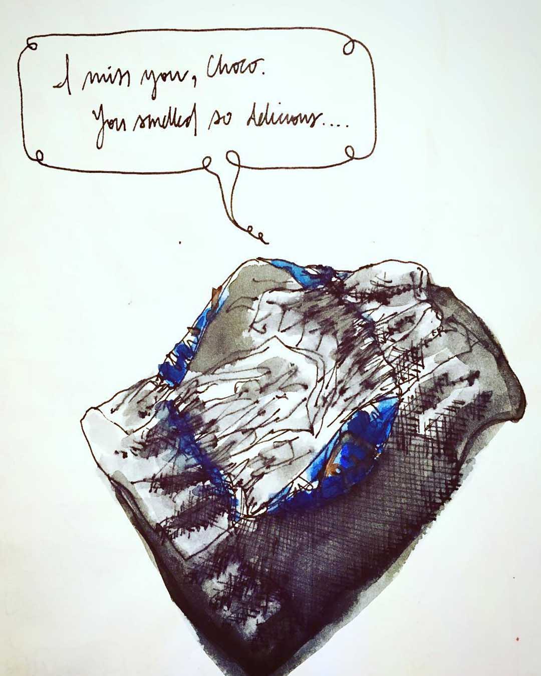
It helps to not take any sketch too seriously: bringing everyday, inanimate objects to life is one of my favorite ways to stave off potential sketching stodginess! -
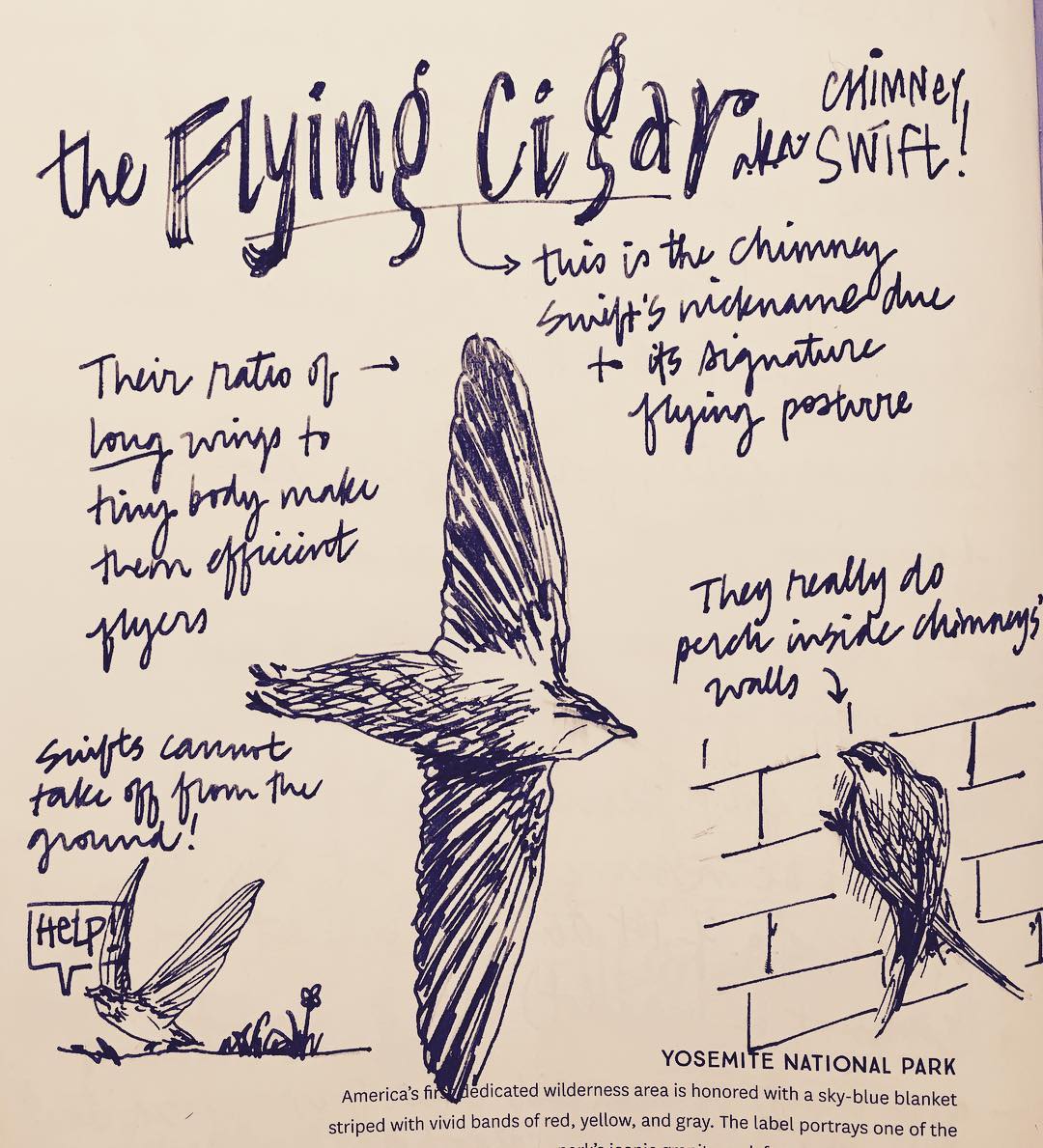
I love to explain how anything related to nature works, so I took the opportunity provided by the Inktober prompt “swift” to learn about chimney swifts and visually share the most interesting facts I discovered.
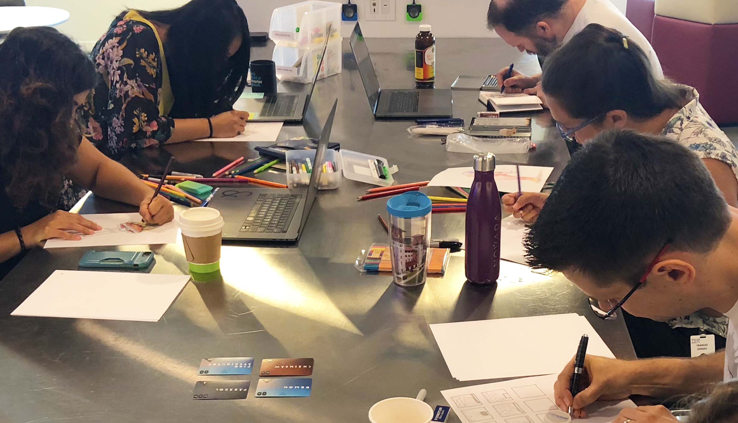
Once I'd analyzed my stockpile of sketches (and safely filed them away, distributing their collective weight across multiple sturdy hanging folders), I decided to start a sketching club at work: it held the promise to help me learn more about others’ drawing habits while also allowing me to share a bit about what I’d picked up myself during my time as a diligent design-sketcher. The club started out strong but after a while began to fizzle out; it was hard to arrange times to meet that accommodated everyone. A teammate suggested we start with our immediate team at a regularly occurring time each week, making it something our smaller group could commit to and pull into our culture. Since then, passers by from other product teams have joined our sketching routine.
As I became consciously aware of the contexts in which I turned to sketching and the ways in which I manipulated the medium to help me, I began to plan ways to more deliberately share my insights. My first move was to condense my main points into a 20-slide, 6-and-a-half-minute Pecha Kucha that I presented to incoming designers at IBM.
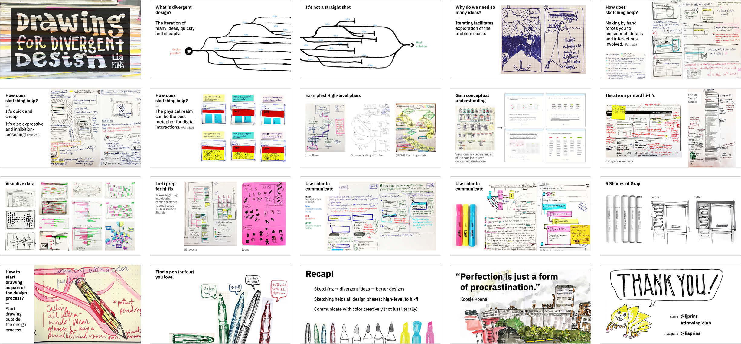
In a Pecha Kucha, each slide stays on the screen for exactly 20 seconds. I tried to use the fleeting time wisely, starting with an introduction to the concept of divergent design and idea generation, then transitioning into how the medium of sketching acts as an aid to this part of the process, and ending with tips to help onlookers start sketching more themselves.
Every time I presented my thoughts and approaches around the relationship between sketching and idea generation, I re-examined the way I told the story for my various viewers. And each time I finished sharing, I learned a little more from the questions my audience made me consider, and the connections they drew between my concepts and tangential topics. The time had arrived to build my insights into a more robust presentation that I could share beyond the walls of my workplace.
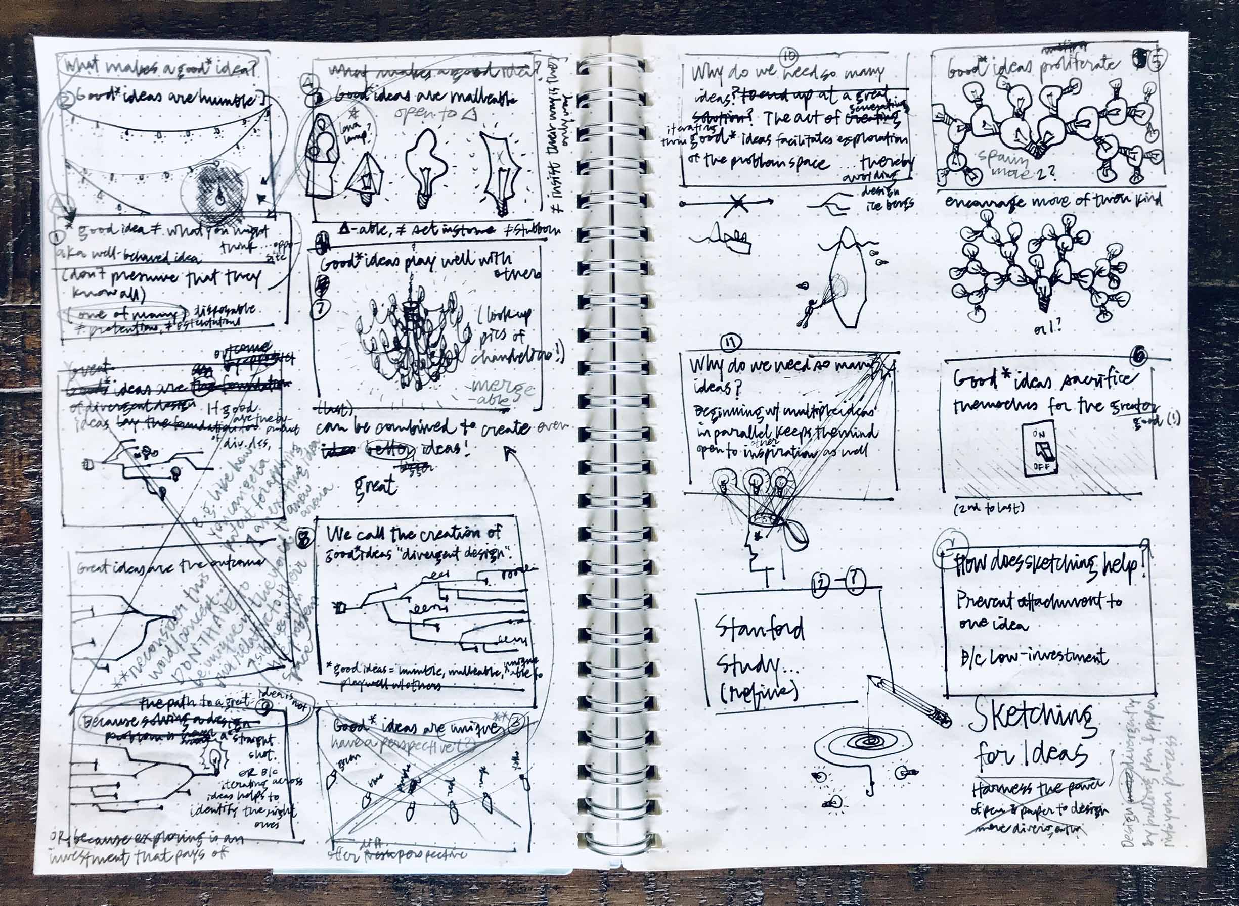
It was a bit meta to be sketching about sketching when I outlined a talk I planned to give at World IA Day, but it helped to document visuals that referenced each of my more abstract concepts. Some of the sketches that had simply started as a shorthand to myself made their way into my final presentation as illustrations.
From there it was just a matter of identifying opportunities to distribute the insights and advice I’d collected through my sketching practice and that I’d been pushed to discover as I developed my talk and experimented with it around the studio.
Outcomes
After introspecting my stack of sketches and testing the resulting takeaways with others, I’d come to some conclusions around sketching as it fits into the larger practice of design. I'd also thought a lot about the ultimate output of sketching—divergent ideas—and their contribution to a solution.
-
These slides highlight a few of the main points from my talk covering the connection between ideas and sketching. -

-
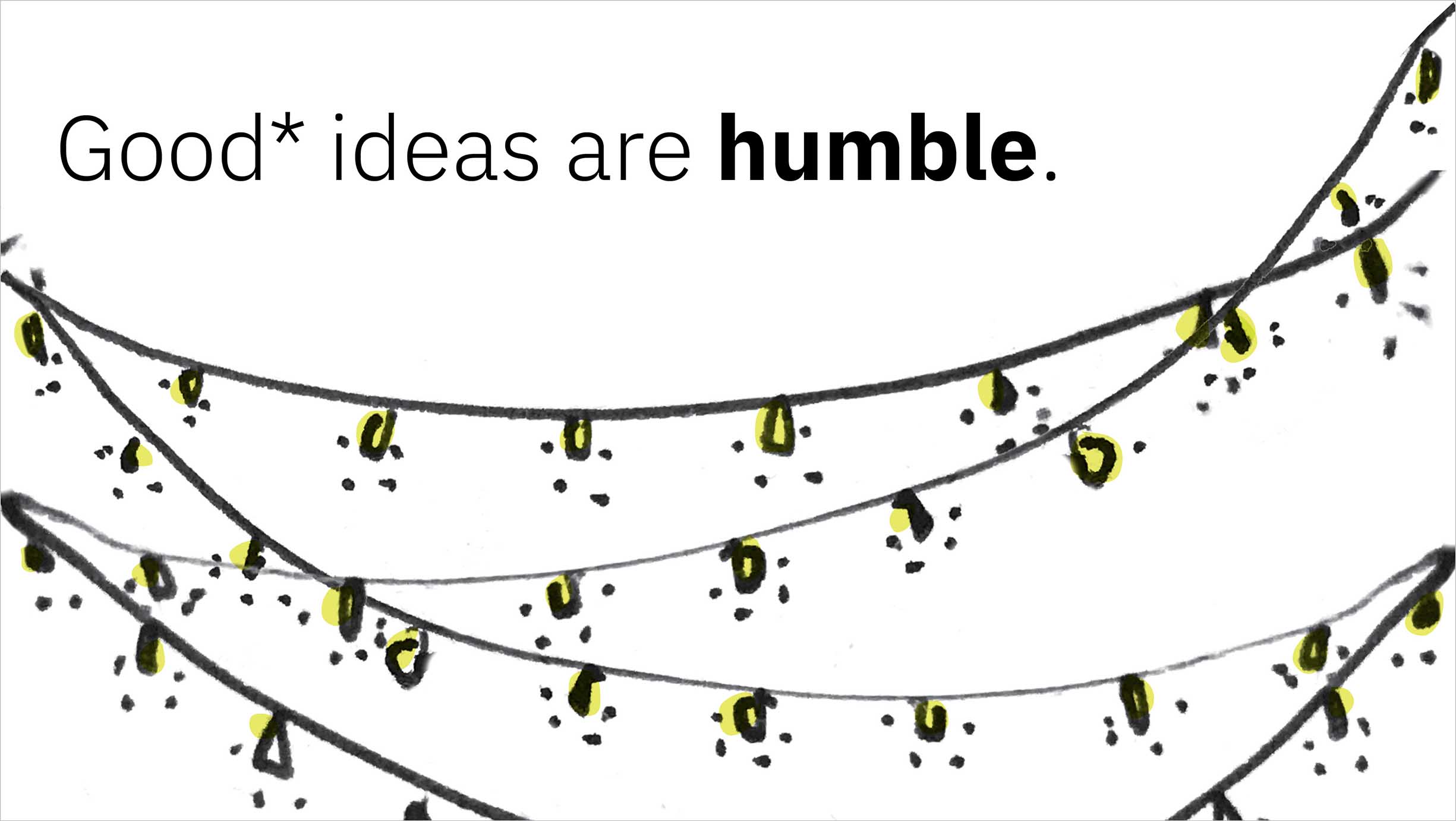
Good* ideas—according to my newly proposed definition—are ideally just one of many others, and don’t assume that their way is the only way. -
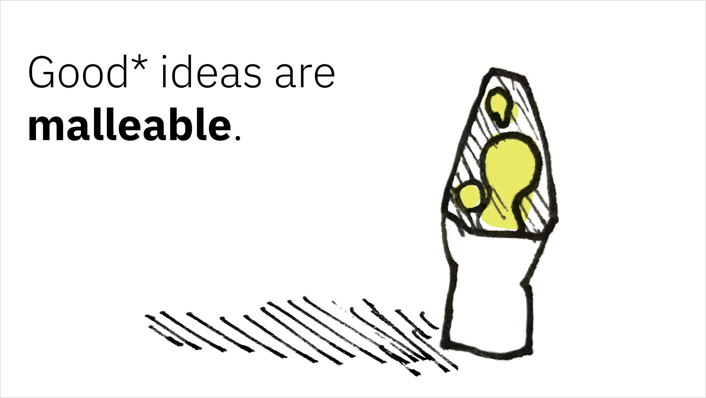
They’re also capable of change, and are not stubbornly set in stone. -
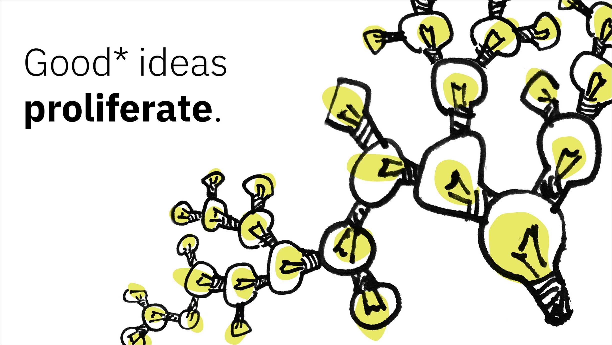
Good* ideas fearlessly spawn more ideas, even though it may mean that their “children” ideas outlive them when it comes time to converge on a final solution. -
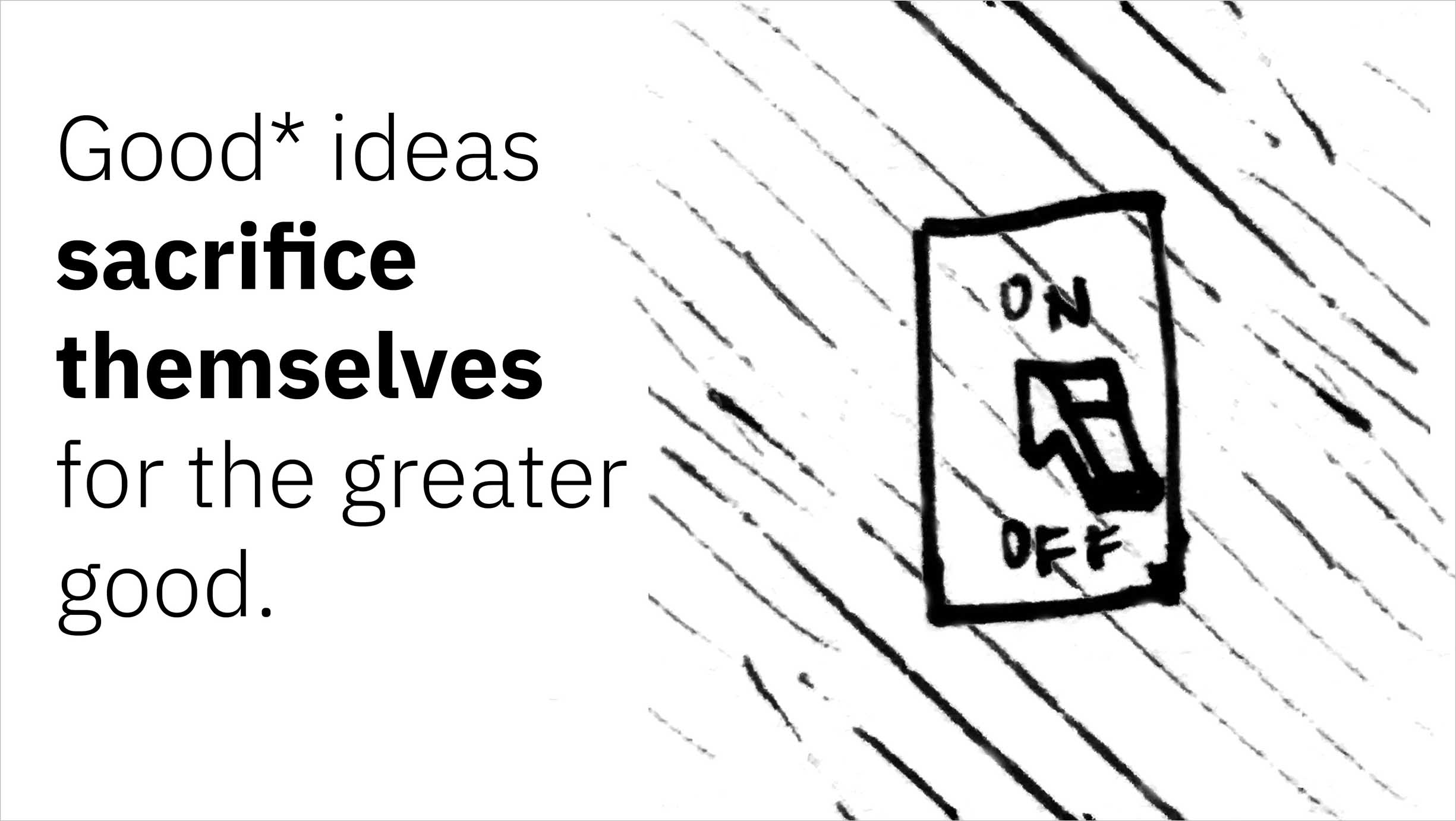
A truly good* idea knows when it’s time to let other ideas shine. They may be resurrected for a future problem, but they may not. -
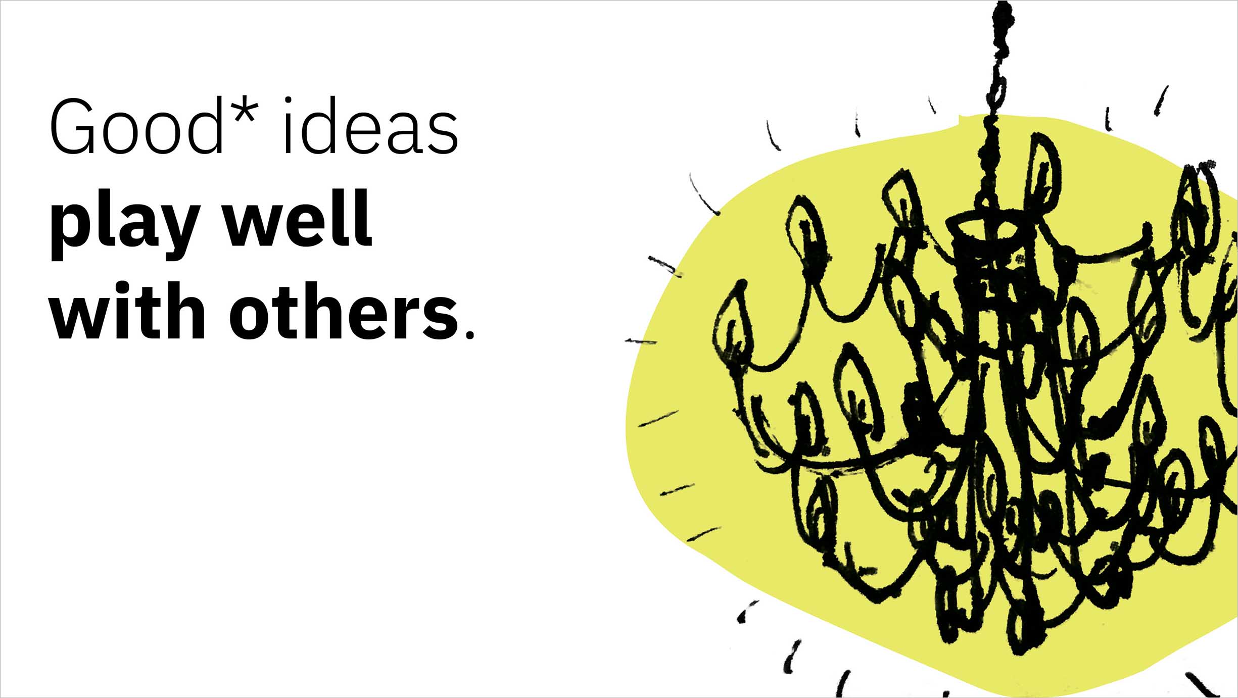
Good* ideas work together selflessly to create even better ideas. -
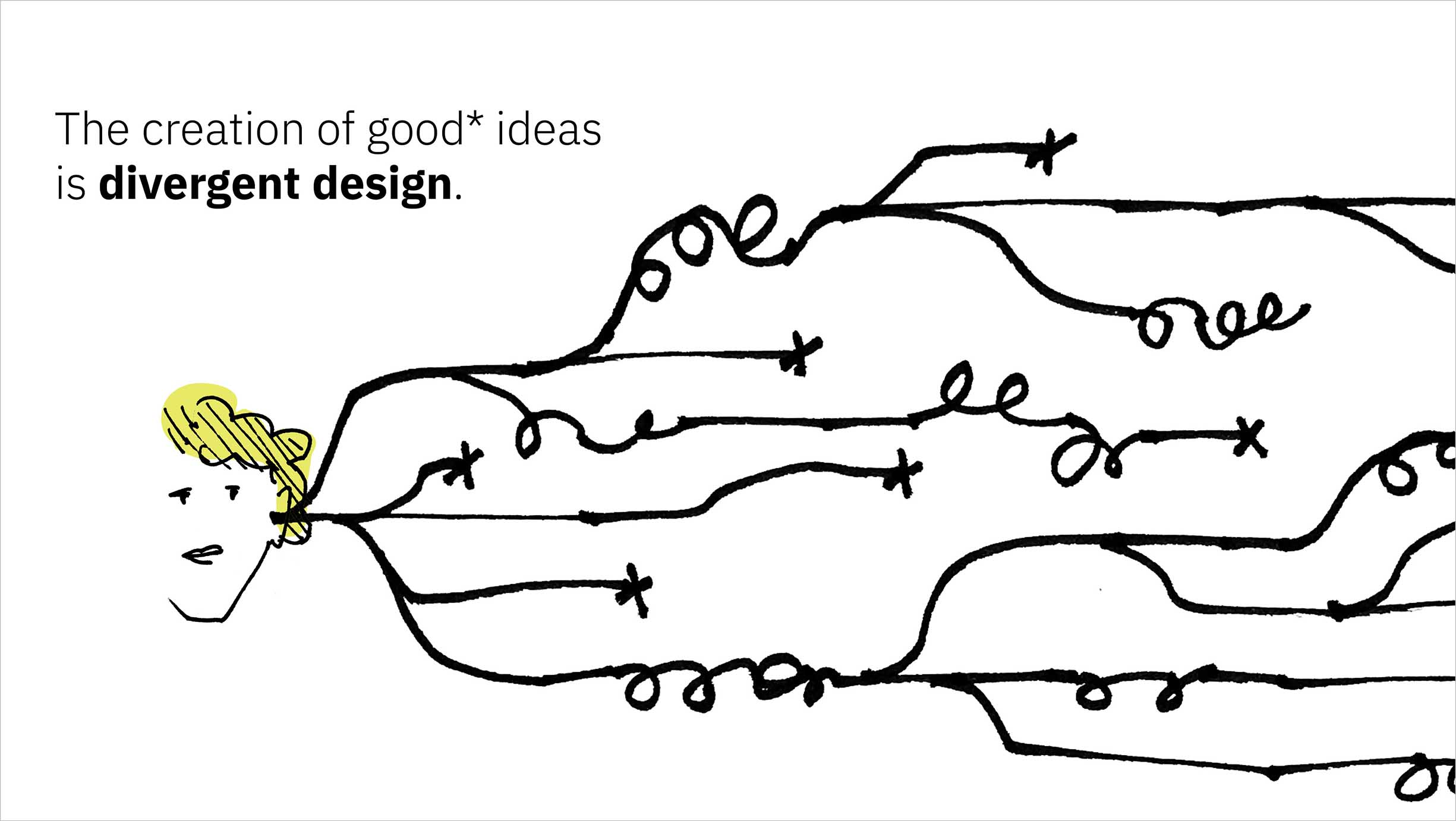
Divergent design comes by the practice of developing this type of good* idea over and over—and allowing them to fizzle out, adapt to change, grow, and combine as needed. -
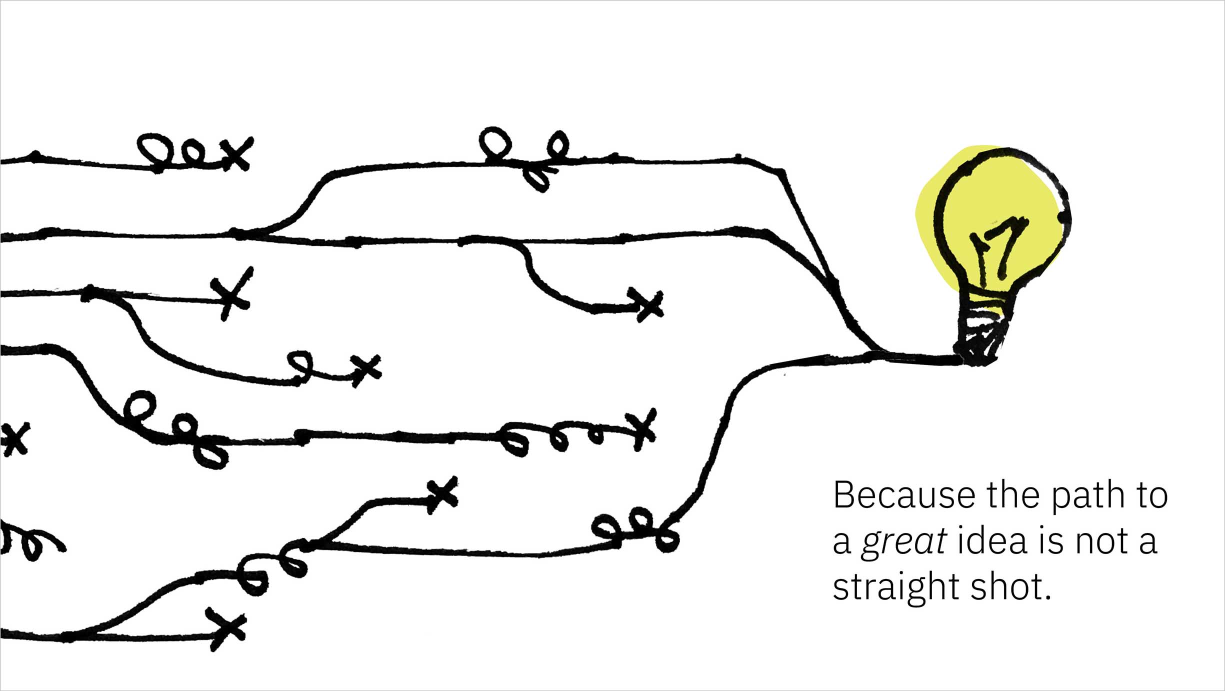
Ultimately, the more ideas one starts with, the more likely they’ll uncover a solution that accounts for all aspects of the problem. -
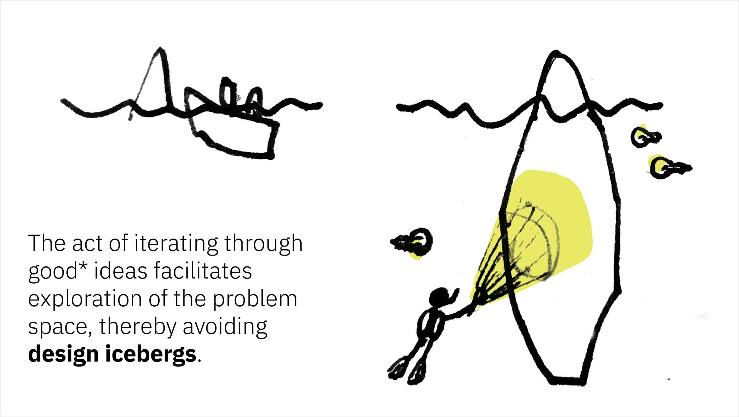
Even if you think you know exactly how to solve a problem, more likely than not, you’ll start to realize many more nuances as you begin to test your initial solution out. The more ideas your throw against the problem, the more you’ll learn about it. -
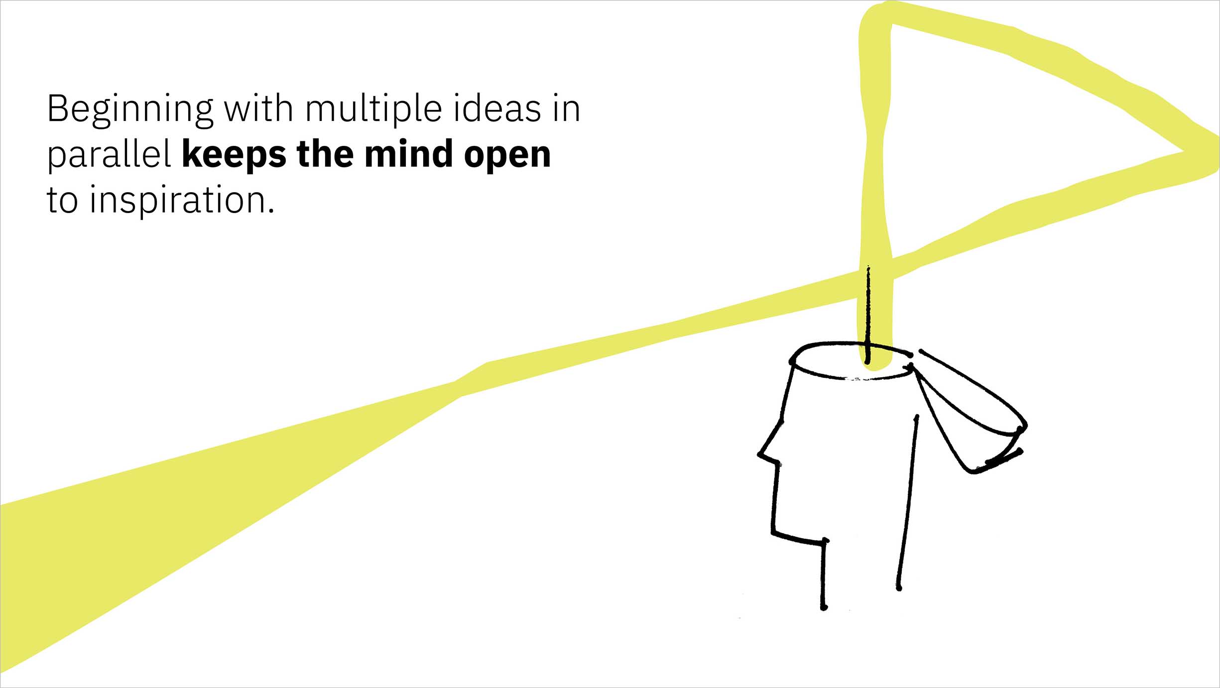
Following one path single-mindedly from the get-go means you’re investing all your time and effort in that direction rather than exploring other options, but it also means that your mind is closed to finding serendipitous connections between the problem at hand and the world around you. -
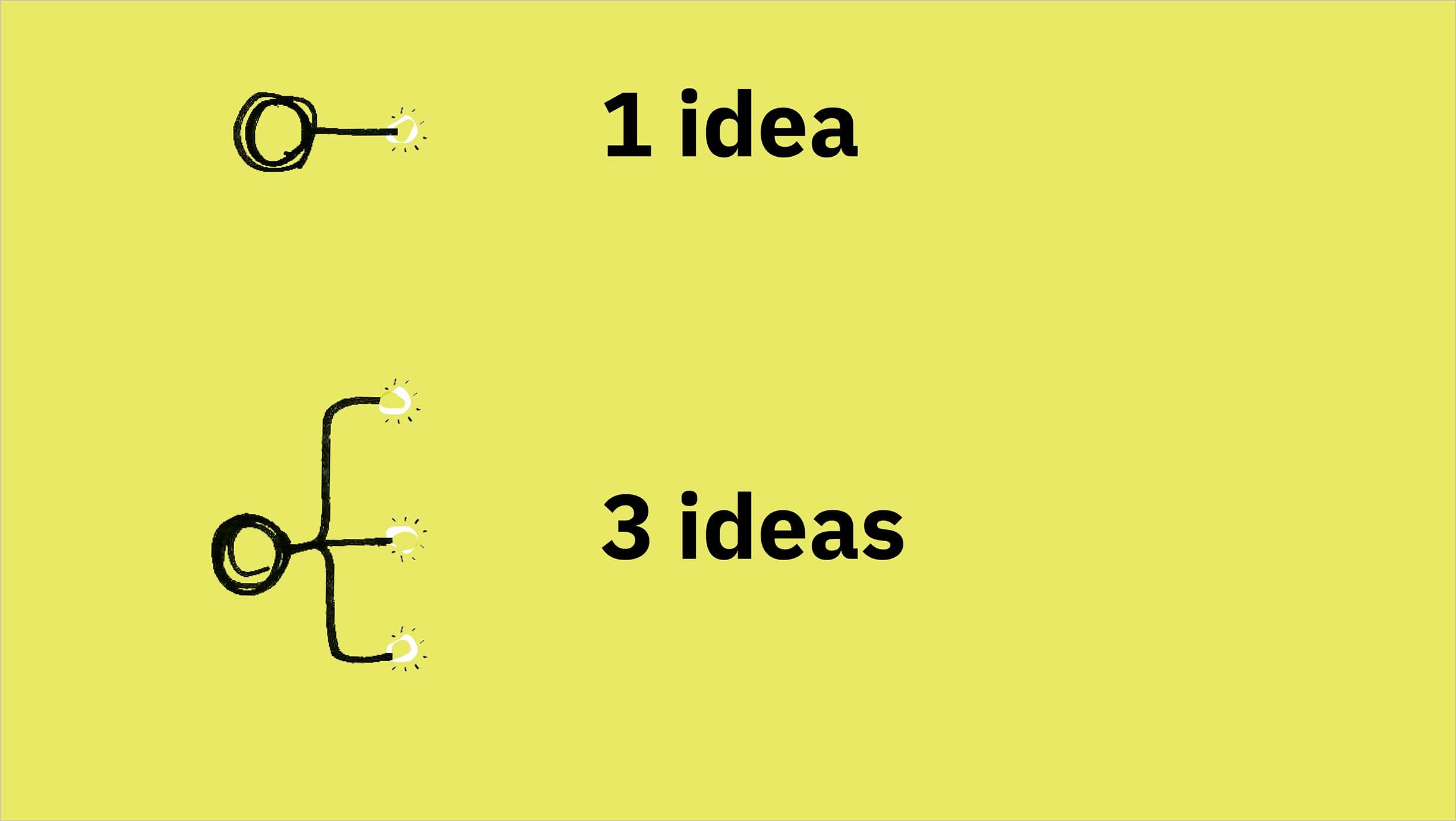
This specific notion has been studied by the Stanford Graduate School of Education. They assigned two groups a design problem, then gave the first a single idea as a sort of spark to get their minds turning, and gave the second three distinct ideas to consider. -
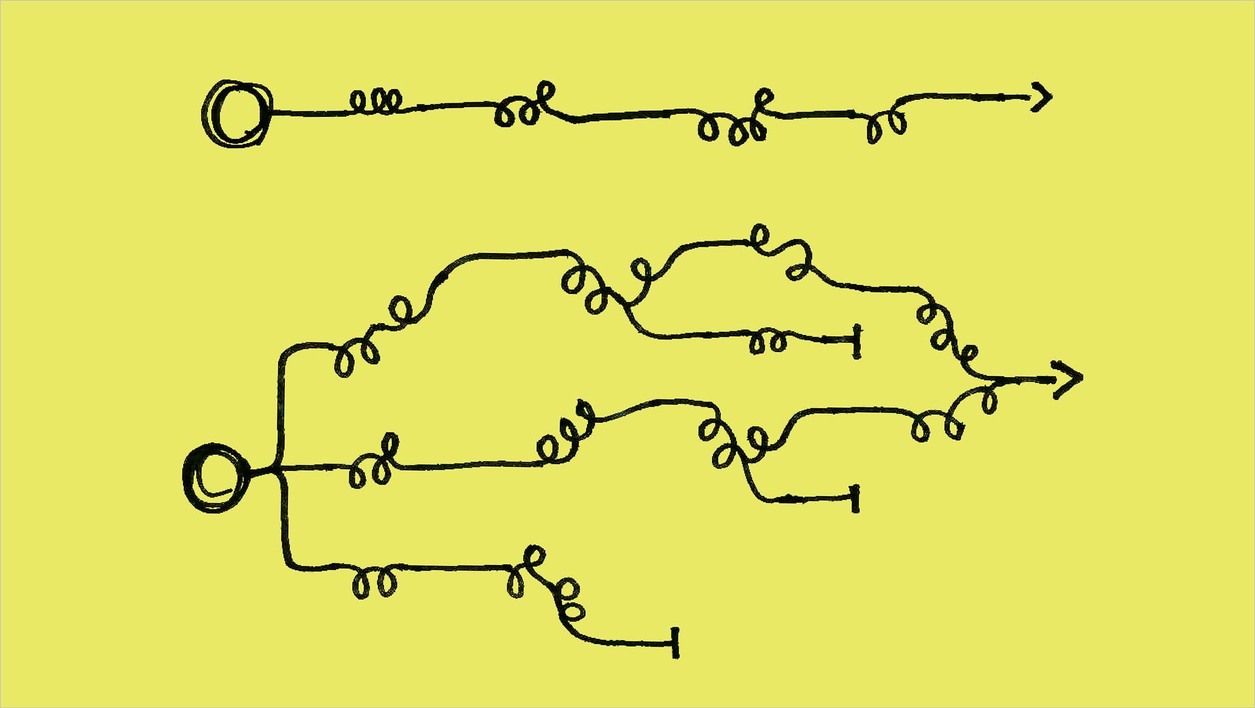
Neither team was limited to using the idea(s) the facilitators had given them. Both iterated on their way to a final solution, but the first group barely strayed from the concept that had been planted in their minds. The group that had begun with three ideas from the start, however, developed even more ideas on their way to a significantly stronger ultimate solution, as determined by the study’s criteria. -
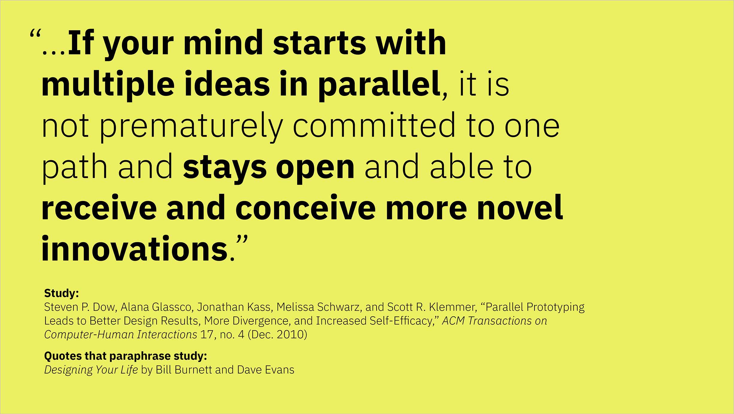
The study concluded that simply starting with a couple of extra ideas meant that a would-be problem solver’s mind remained more open to other ideas and inspiration. -

-
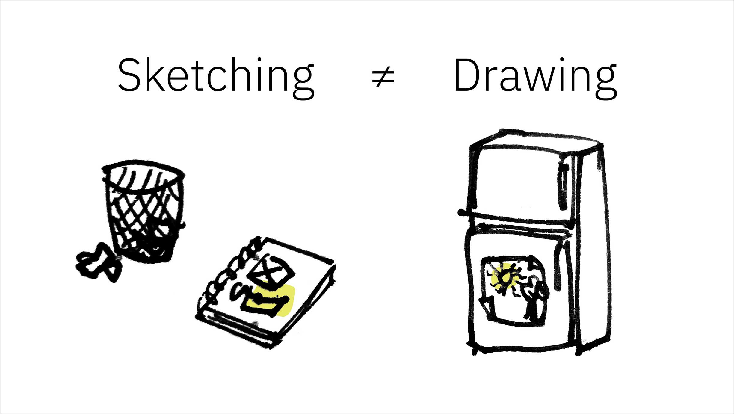
I clarified that, at least within the context of my talk, sketching was not simply a synonym for drawing, wherein the ultimate focus is on the output of an artifact. -
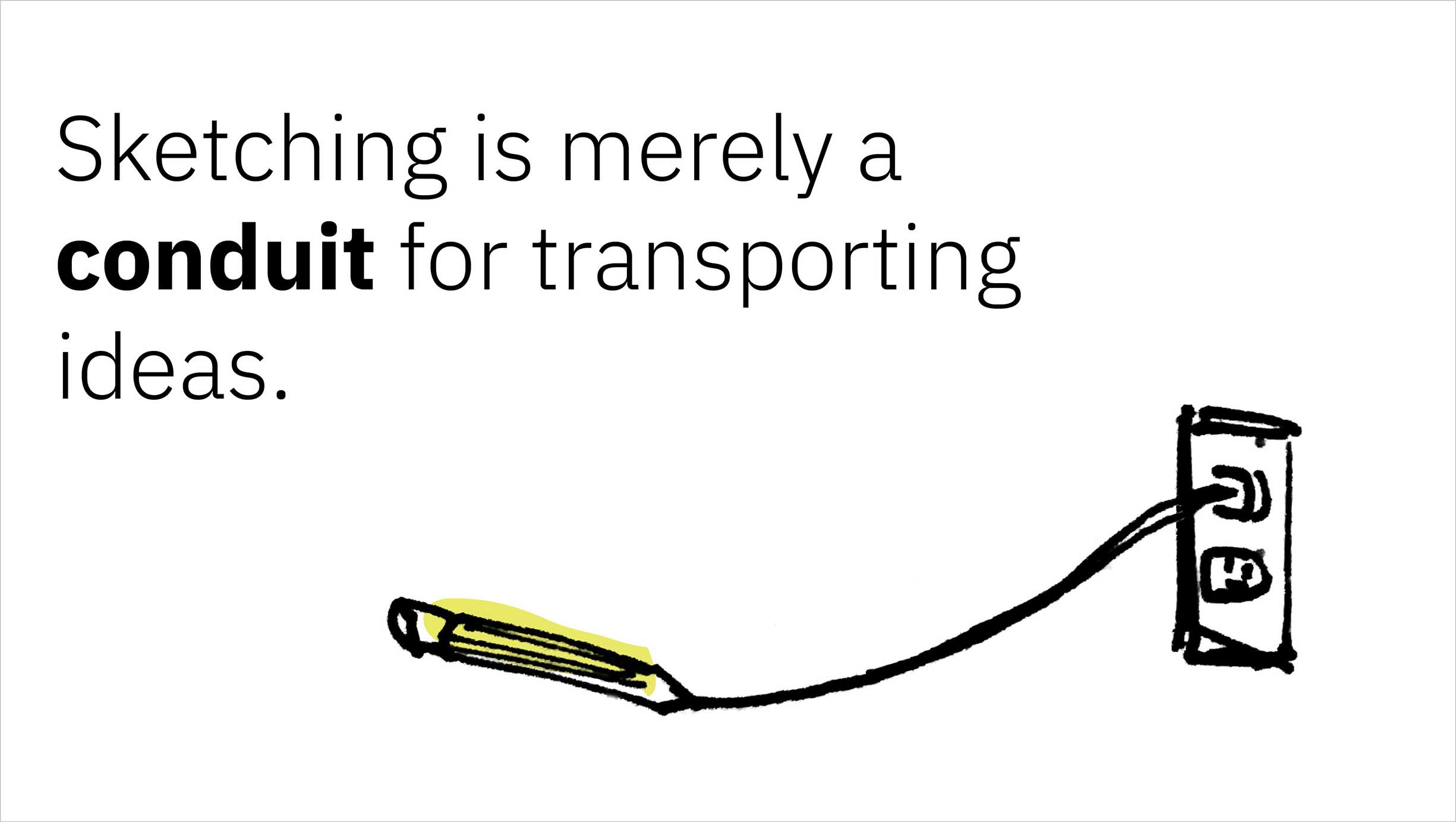
Instead, the outcome of a sketching session should be ideas. The act of sketching should simply be a way to transport ideas from one’s mind out into the real world, and the artifact—the sketches—should be used to communicate one’s ideas to others. -
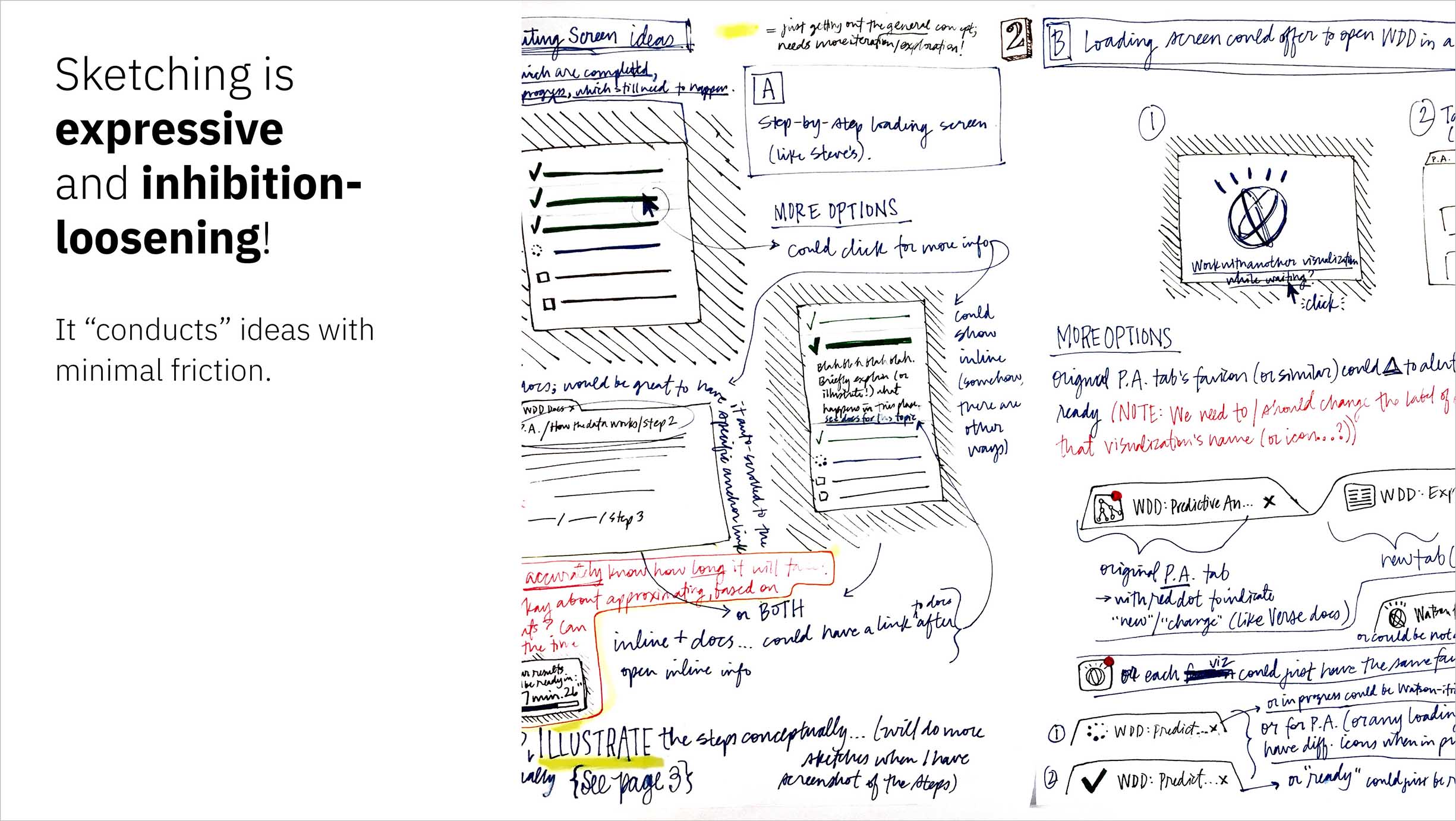
This is the primary reason I’m drawn to sketching over more inhibiting methods like digital tools. -
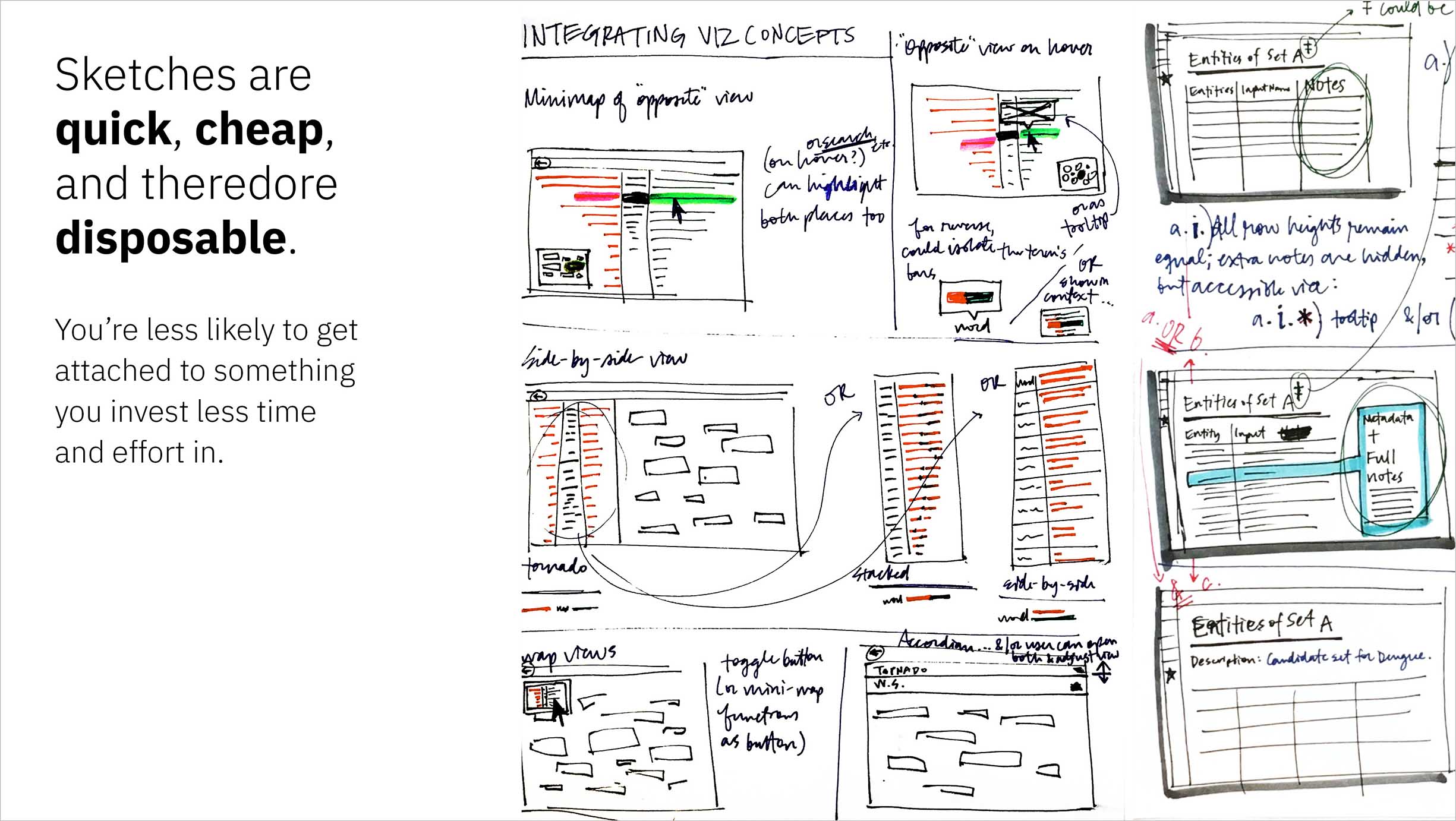
The quicker you can make something, the less time you waste on a direction that might not make the final cut, and the less likely you’ll invest in that idea prematurely. -
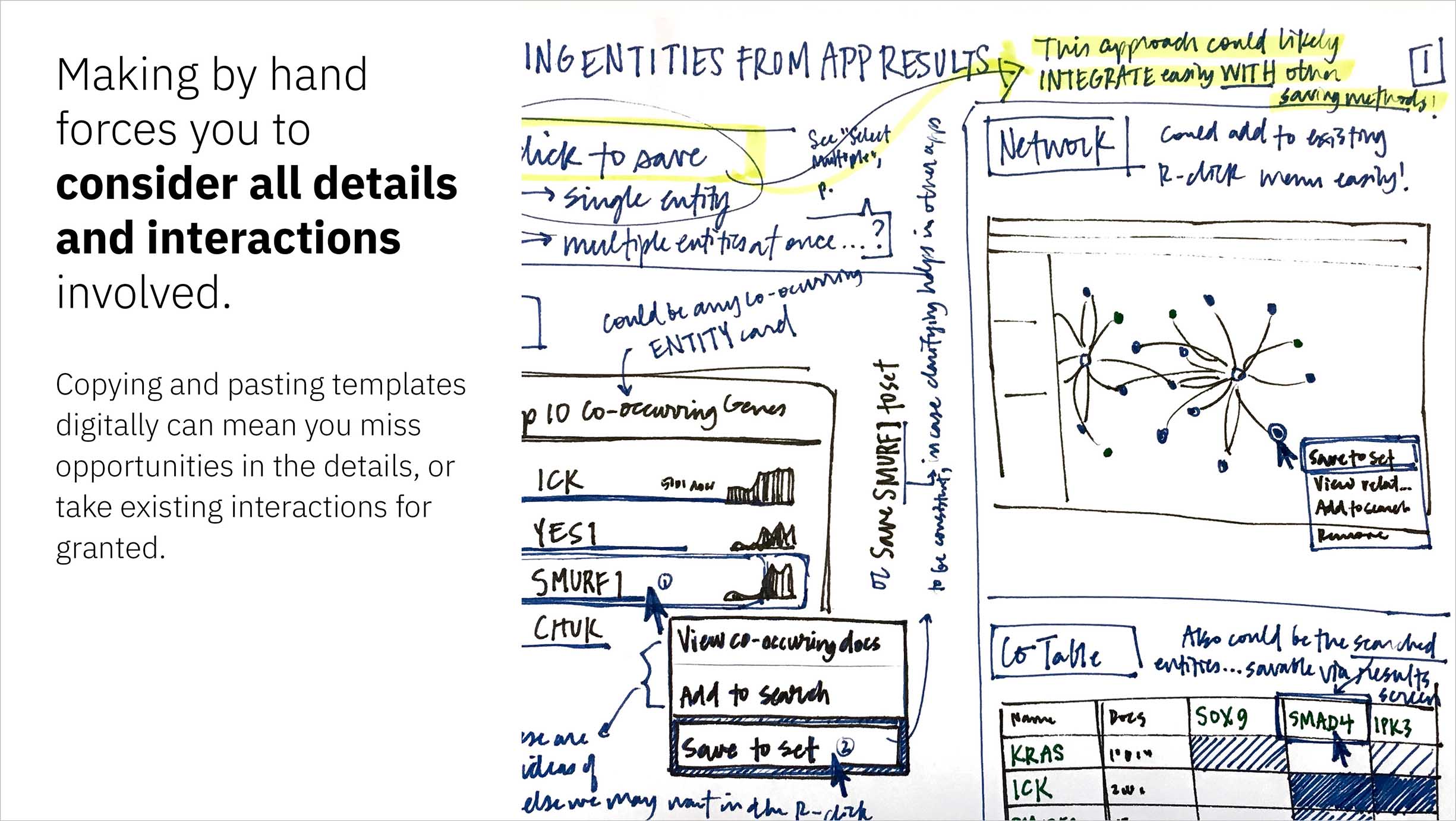
Starting with a blank slate keeps you from taking any previous designs for granted; everything you include is there for a reason. -
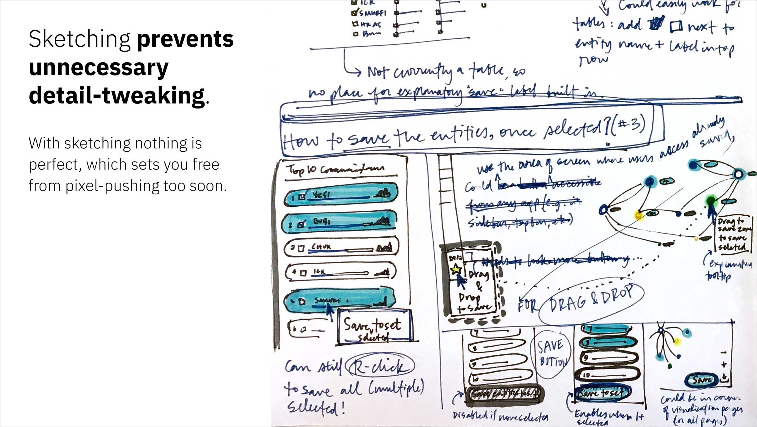
On the flip-side of the coin, the inherently messy nature of sketching can keep you from being tempted to perfect details that might not even make the next cut: you can’t kern your own handwriting, after all! -
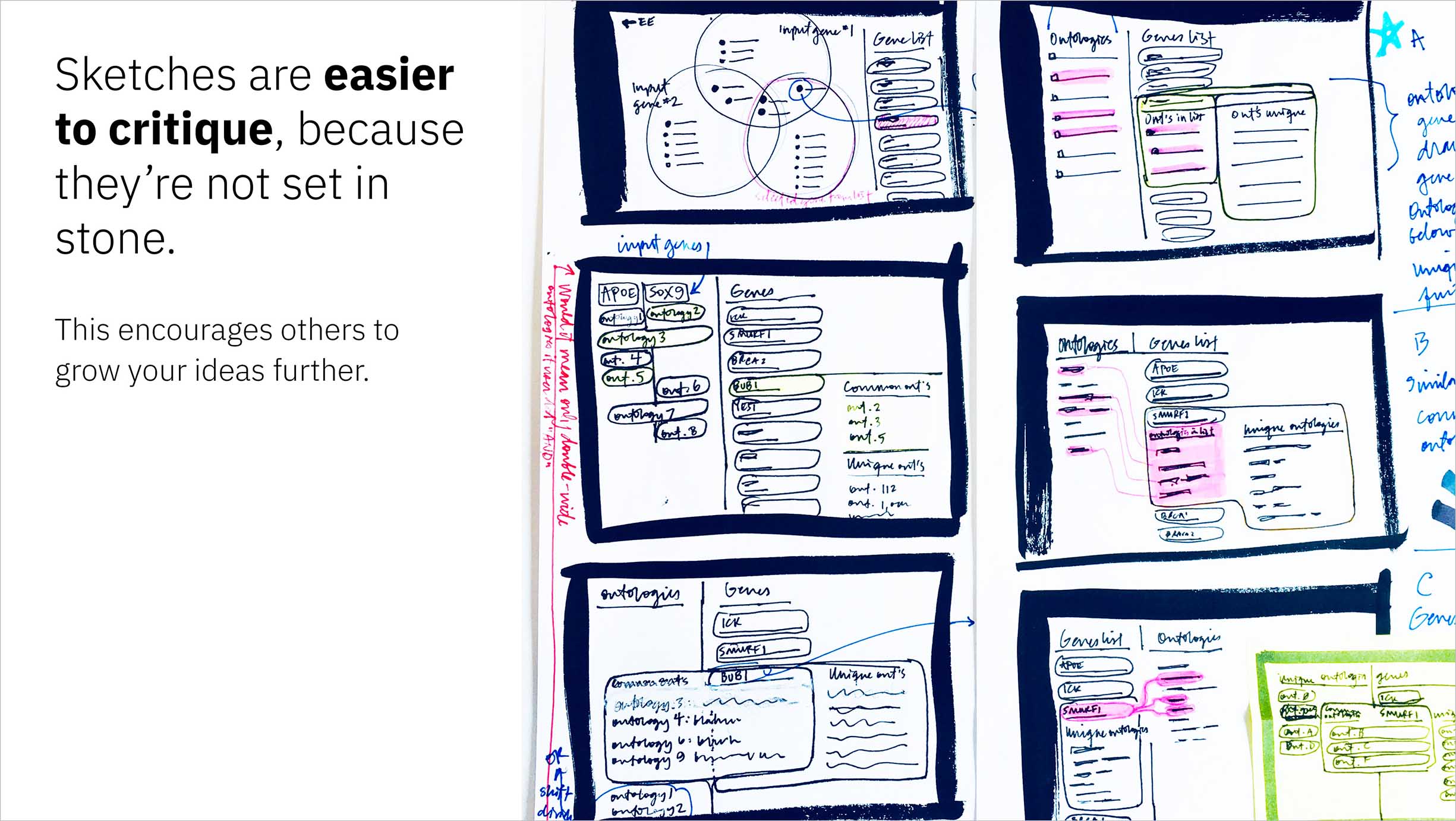
An idea presented as a sketch is easy to provide input on: the format focuses feedback around the concept rather than the details. Furthermore, the fact that sketches aren’t huge investments helps others to feel more open to suggest ways in which the idea could change or grow. -
I ended by providing tangible methods to help my listeners pull sketching into their own process. -
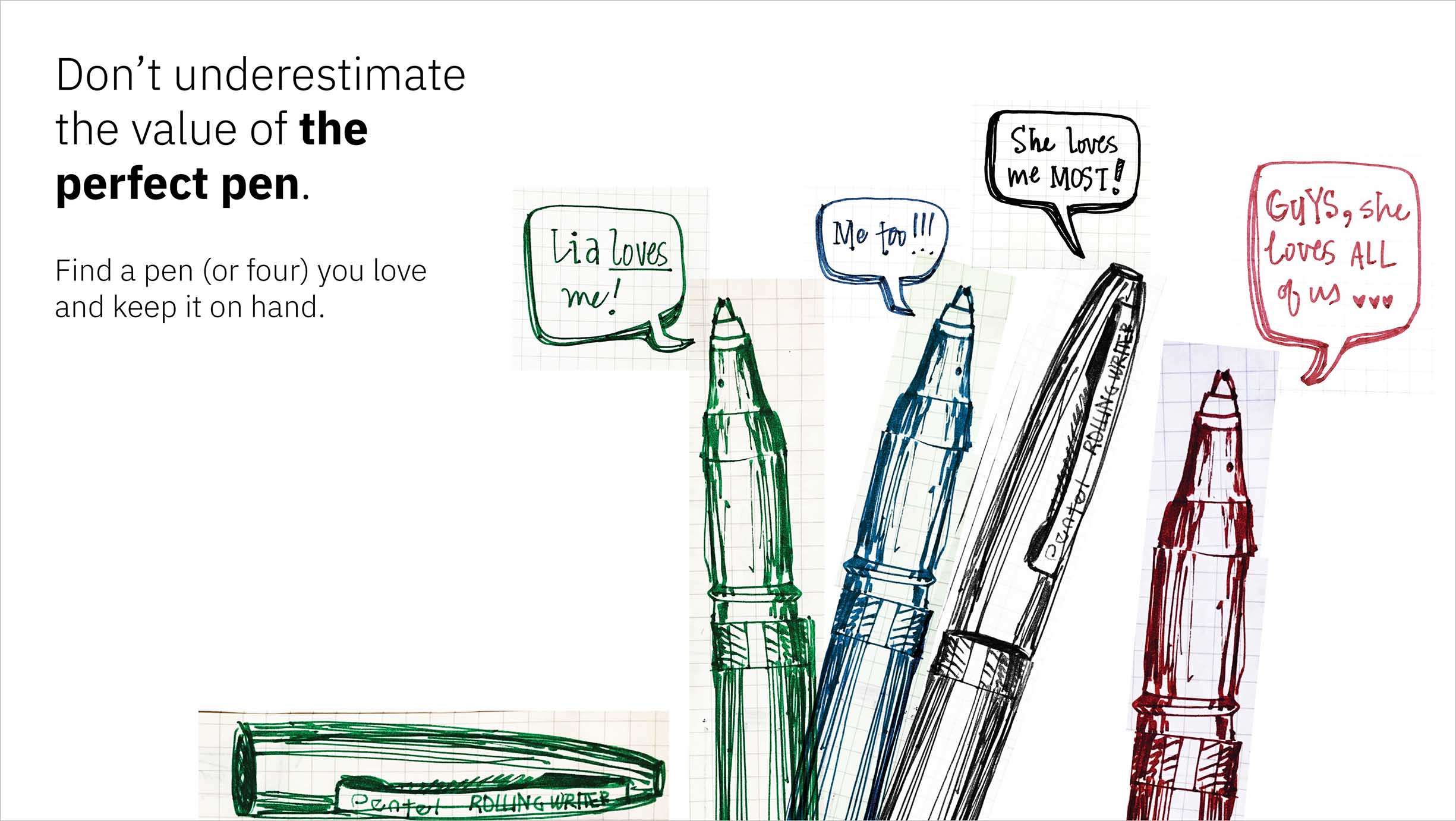
This slide serves as a not-so-subtle ode to my most beloved drawing utensil, the Pentel Rolling Writer, available in four classic shades, and ever-accessible at just 17 cents each! -
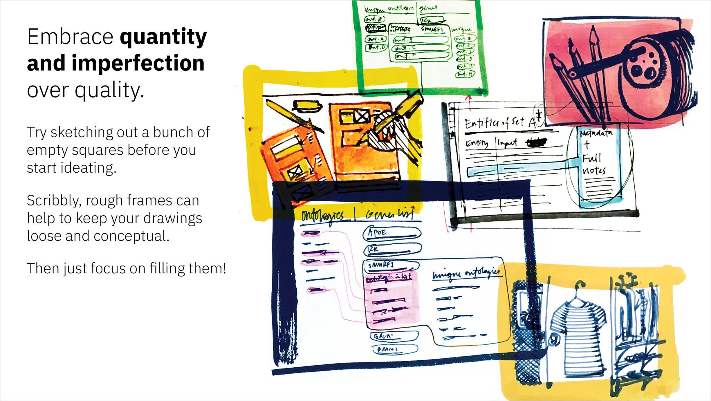
Divergent thinking prioritizes quantity far above the tenet of quality hailed by the later convergent design phase. -
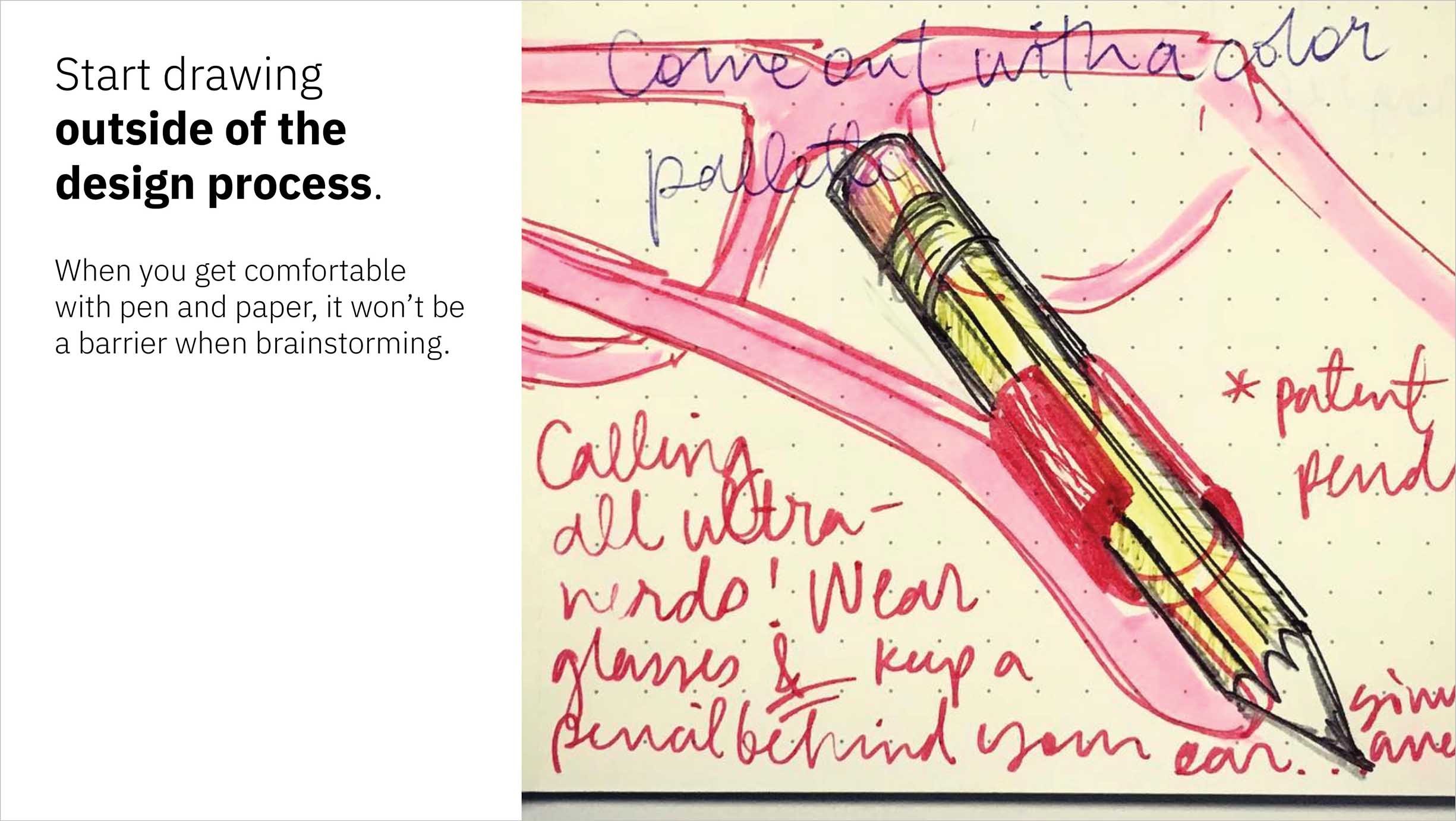
For those new to the idea of sketching or out of the habit, jumping straight into it as part of the design process may be intimidating and might yield unproductive results. But I do believe it’s worthwhile to get comfortable with pen and paper. Drawing out any ideas, outside one’s design process—even an idiosyncratic invention—can help to build the association between sketching and idea creation.
Of the many possible paths to a solid design outcome, nearly none are straight, short, or flat. Instead—comprised of vigorously winding routes that trail-blaze through previously unexplored territory—these trajectories to a final resolution are fraught with forks that veer out of sight and postulations that fizzle out. But if we are well-practiced in the creation of oodles of ideas, the very fact that we take an unpredictable path at all should be by design, as only through exploring the true extent of the problem space can we hope to arrive at a satisfactory and thoroughly considered design solution.
I introduced a new way of thinking about good ideas in my talk at World IA Day.
I distilled my conclusions into a comprehensive collection of illustrated takeaways and supplemented them with tips exemplified by real process sketches, which I presented first at Austin Design Week and, after more introspection and iteration, again at World Information Architecture Day.
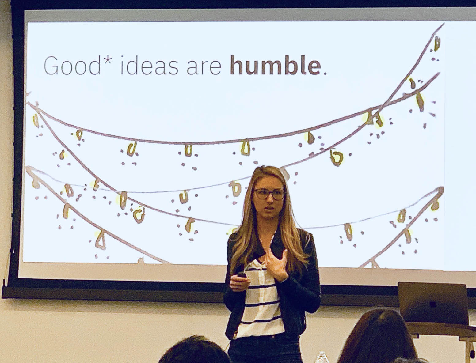
It was an honor to be selected to share at World IA Day, especially after I’d gotten so much out of the event myself as an attendee the previous year.
“Lia, that was a marvelous presentation! I have so much to think about now.”
—World IA Day attendee, Rackspace UX Research Lead
Sketching makes for a superb idea-eliciting medium in part due to the unfinished feel of its outputs; compared to digitally rendered wireframes, sketches of interfaces and even interactions seem to reserve room for growth and change, which prevents both the sketcher and those they share their work with from getting too attached to a single direction too early on.
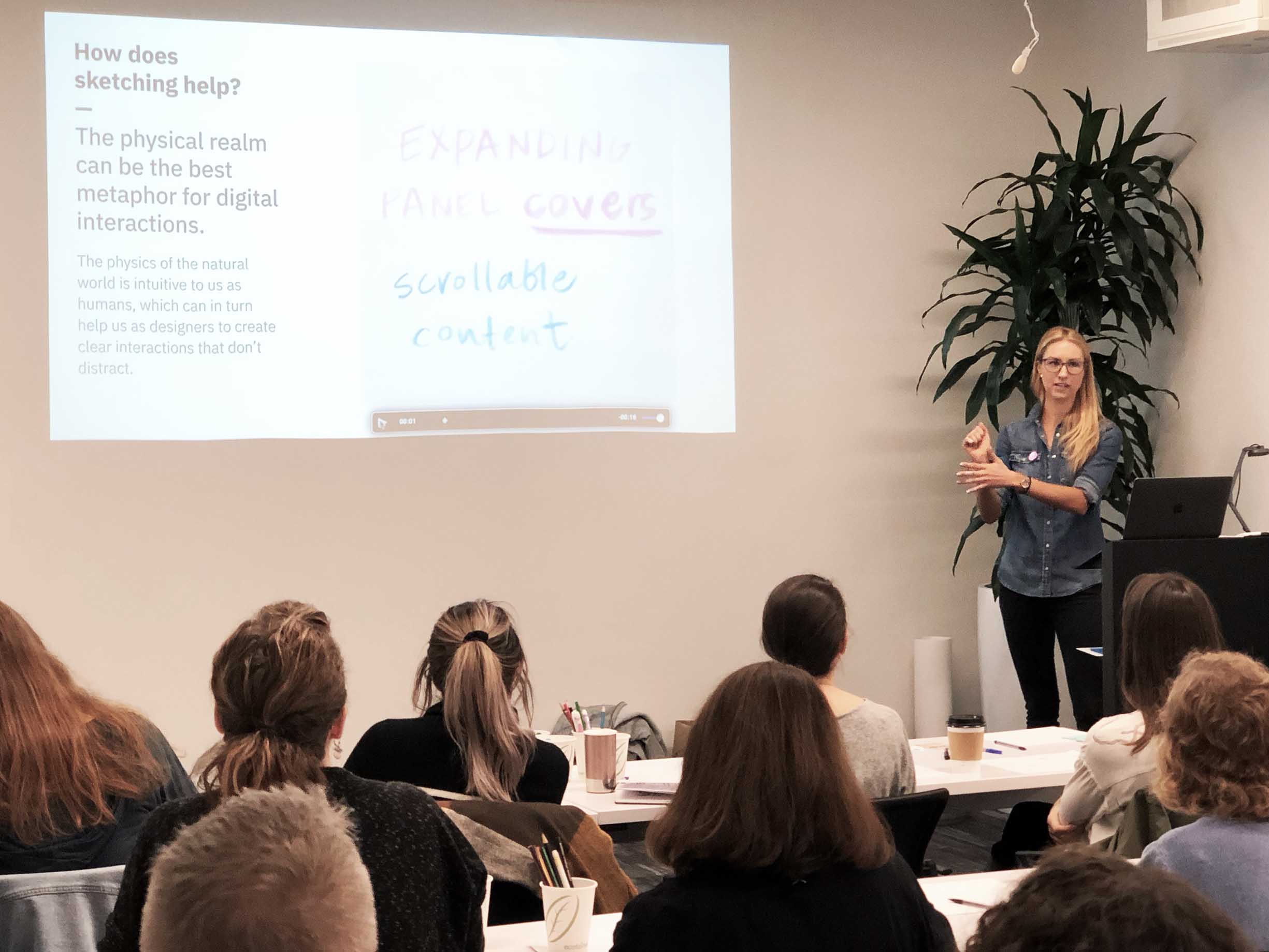
Discussing paper prototypes with the Austin Design Week audience.
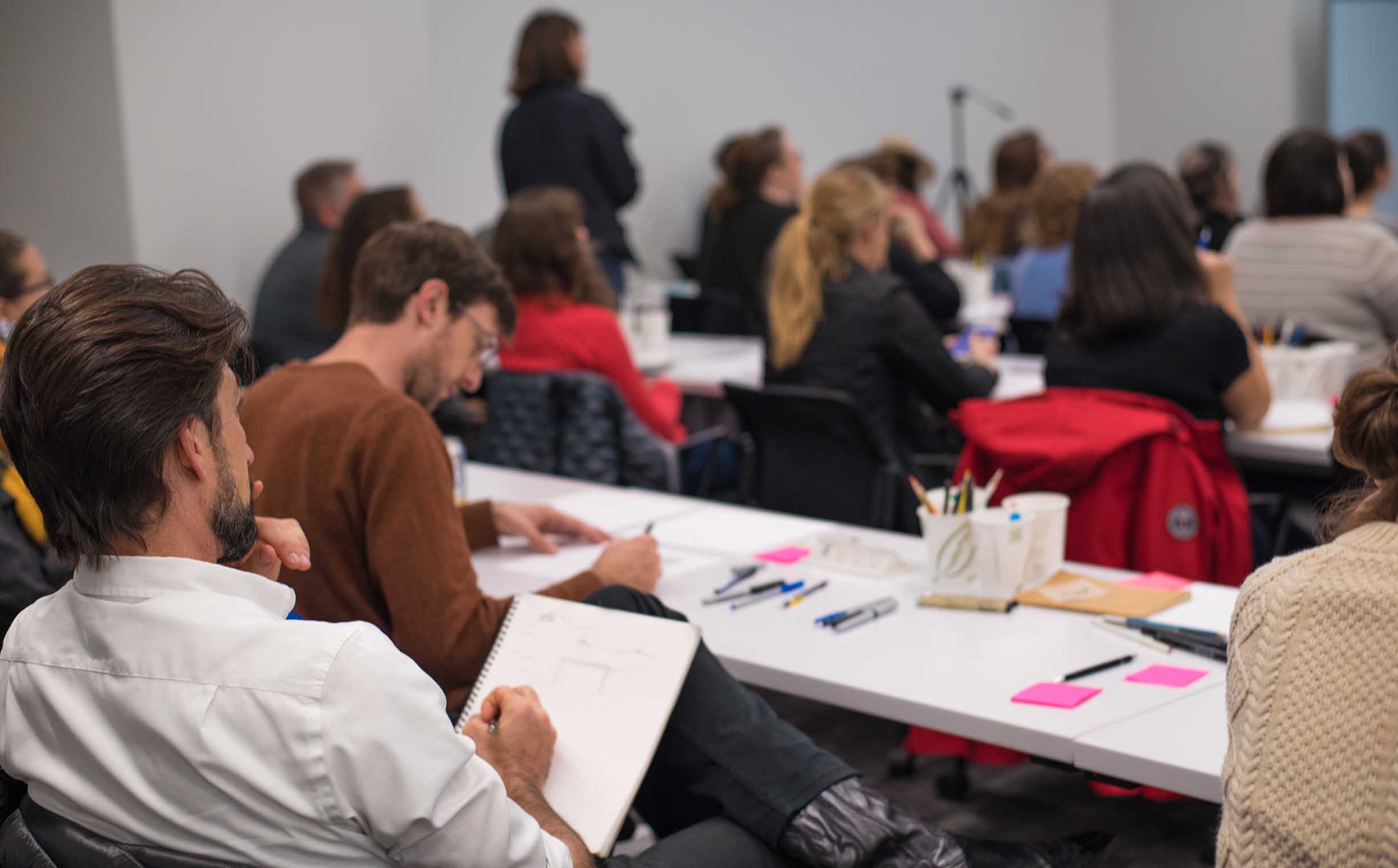
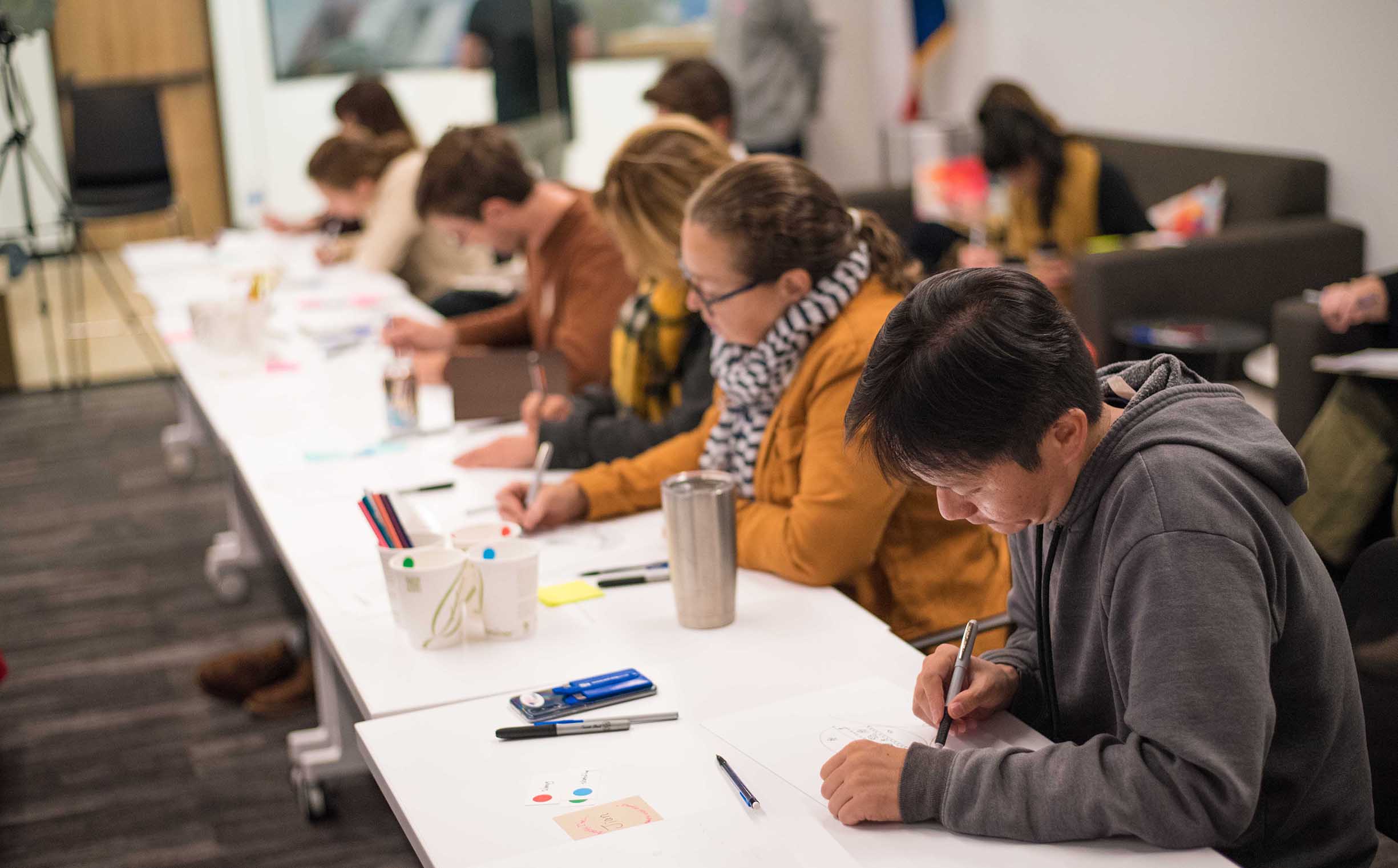
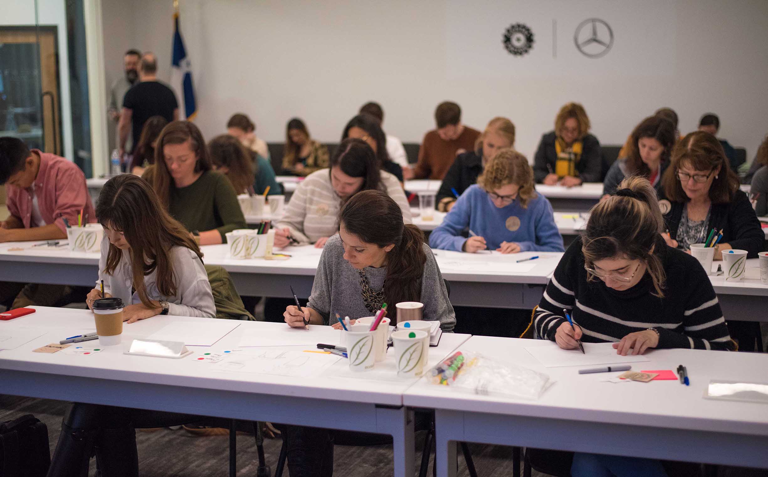
I wanted to tangibly coax others into adopting the practice of sketching—or at least give them a great first impression of its potential—so I developed sketching exercises, and following my talk, led a workshop aiming to help others get comfortable with sketching, wield it as a force for divergent thinking, and put it to use communicating their concepts to others. You can even have a look at the exercises to try them out yourself.
The unrefined messiness of a sketch is one of its biggest boons, and I believe that this quality should be embraced. However, when first attempting to apply sketching to their process, some expect their drawings to be beautiful, perfect renditions of the idea living in their mind. In my talk and workshop I aimed to help attendees get past the superficial layer of their sketches' visual styles, and instead to use lines, shapes, and shading to convey their ideas in a number of ways that can consumed by others.
“I loved all of your sketching activities. I had been trying to sketch whenever I start a project, but these really helped me get past the fear of what my drawings look like and, by the end, focus just on being able to communicate with sketching.”
—Austin Design Week workshop attendee, UX design student at the University of Texas
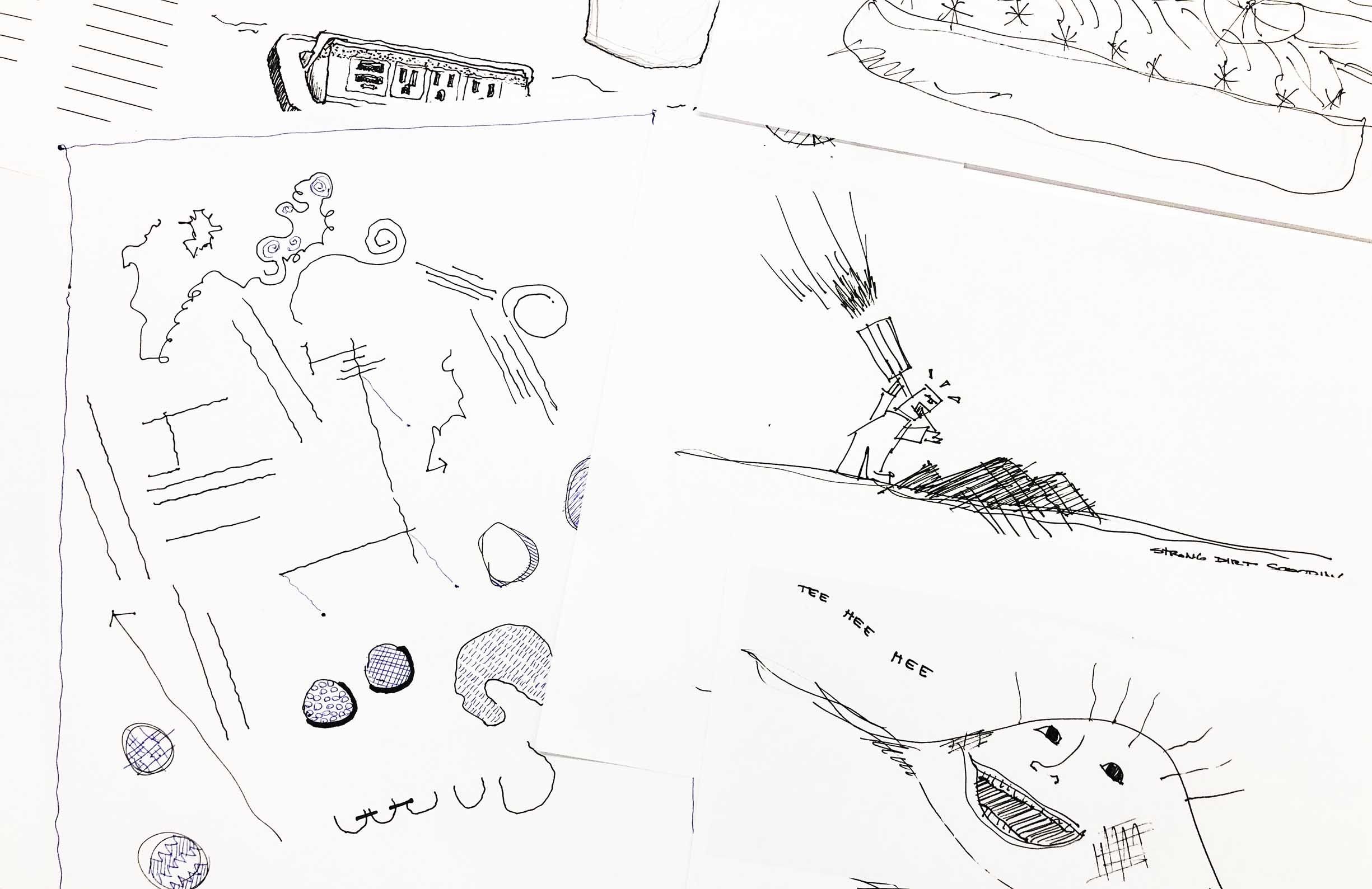
Live + learn
- What I’ve learned so far from this ongoing effort is that if you see an unmet or as of yet un-encouraged need in your community—or your workplace culture—be the one to fill the gap! Even if you don’t start out as a domain expert in the area of question, learn more about it, share your discoveries as you go, and encourage others to join in your educational efforts.
- Limitations force iteration, which leads to deeper understanding. This notion—that reassessing ideas leads to a much more holistic awareness of the problem space—ended up as one of the main points in my talk, but ironically I learned it myself many times over in the process of recalibrating my story for various situations, mediums, and audiences.
